 Shomnipotence
commented
2 years ago
Shomnipotence
commented
2 years ago Open miguelsolorio opened 3 years ago
Shomnipotence
commented
2 years ago  sylveon
commented
2 years ago
sylveon
commented
2 years ago Yes, I've made a PR to vscode before with the feature but it was rejected due to support concerns.
Shomnipotence
commented
2 years ago support concerns
what are the support concerns
sylveon
commented
2 years ago  yvvt0379
commented
1 year ago
yvvt0379
commented
1 year ago Such a pity 😓
 tinydogio-joshua
commented
1 year ago
tinydogio-joshua
commented
1 year ago Has there been any ideas thrown around a more minimal experience (besides zen mode)? I've found myself trying to hide as much as I can as often times the current experience can be a little distracting and difficult to parse. Perhaps something that can be toggled on a first run? That, or maybe a configurable zen mode where I can enable just what I want without having to hunt down everything I need to turn off?
 mightbesimon
commented
1 year ago
mightbesimon
commented
1 year ago https://vscode.dev has rounded button corners... Wish there's the same for the app 🥺

 gjsjohnmurray
commented
1 year ago
gjsjohnmurray
commented
1 year ago @mightbesimon what version of the app are you running?
 widersky
commented
1 year ago
widersky
commented
1 year ago @mightbesimon Rounded buttons are in the application from version 1.72 or 1.73, update VSCode 😉
 DenisWASD
commented
1 year ago
DenisWASD
commented
1 year ago I love the concept! Tho, I would make the window head a bit smaller, like this:

 bigplayer-ai
commented
1 year ago
bigplayer-ai
commented
1 year ago I love the concept! Tho, I would make the window head a bit smaller, like this:
How can I get this theme?
widersky
commented
1 year ago I love the concept! Tho, I would make the window head a bit smaller, like this:
How can I get this theme?
It's just a mockup
 mike-lischke
commented
1 year ago
mike-lischke
commented
1 year ago I'm a bit late to the party (just now had a moment to read this issue) and I'm probably in a minority of users, but I have to say that I really dislike putting UI elements in the title bar of a window. I dislike how browser occupy that space with tabs and also dislike putting a search bar there. The title bar has it's own UI function (be it to name a window, to give additional information, to grab the window and move it, to provide OS immanent functionality like the traffic light and the close button etc.). IMO it's a terrible design decision to misuse the title bar for anything else.
 Meligy
commented
1 year ago
Meligy
commented
1 year ago I also don't like the "Run" and "Split Editor" buttons. What's there now in this area is just enough (and extensions seem to respect not putting much stuff there, like "Version Lens"). I appreciate keeping as much of that for the tabs.
I'm on Mac if this makes a difference. And of course for me the main app menu in Mac's menu bar.
 ghost
commented
1 year ago
ghost
commented
1 year ago I'm a bit late to the party (just now had a moment to read this issue) and I'm probably in a minority of users, but I have to say that I really dislike putting UI elements in the title bar of a window. I dislike how browser occupy that space with tabs and also dislike putting a search bar there. The title bar has it's own UI function (be it to name a window, to give additional information, to grab the window and move it, to provide OS immanent functionality like the traffic light and the close button etc.). IMO it's a terrible design decision to misuse the title bar for anything else.
That's from a macos standpoint. Where to put Menu if not in the window title?
mike-lischke
commented
1 year ago The menu on other platforms is usually below the window title:

IMO the best solution.
bigplayer-ai
commented
1 year ago I find this https://github.com/illixion/vscode-vibrancy-continued I wish someone can just enable auto light/dark vibrancy theme(acrylic/mica backdrop) based on visual studio theme(change extension settings based on system theme or visual studio application theme).
 xezrunner
commented
1 year ago
xezrunner
commented
1 year ago The menu on other platforms is usually below the window title:
IMO the best solution.
VS Code currently provides an option to change where the menubar resides, which is good to see. I think the default behavior being the menubar residing inside the application is ideal as well.
I personally prefer menu bars not taking up the vertical space. macOS does it best with its global menubar. I don't mind apps putting their menubars into the titlebar on Windows, as seen on the concepts here, as long as there's plenty of room to grab the window somewhere.
Search bars can be visually confusing, I would agree with that, but as long as they're grabbable for window movement, not much harm is done.
Tabs are a different story though - most browsers usually compensate for the taken space by adding extra padding above the tabs acting as grabbable space, but it's often not enough, and if it were any more, it would look bad. You can't make tabs act as dragging space either, as they can detach and attach to windows.
 plashenkov
commented
1 year ago
plashenkov
commented
1 year ago The menu on other platforms is usually below the window title:
IMO the best solution.
@mike-lischke You use VS Code on large screens only, right? :)
Personally I like the main menu is on the titlebar since we have more useful space inside the window (to work with code). We also have really enough space to the right of the menu to drag the window and to display the title. This is especially important for smaller screens such as 13-inch laptops, etc. But really enough controls in the titlebar, there should be enough free space to drag the window, etc.
P.S. It's great to see you here. I used your GraphicEx and VirtualTreeView a lot in the good old days.
mike-lischke
commented
1 year ago hey @plashenkov glad you liked my work :-) For the design: it's definitely a matter of taste and preferences, which is why most people state what they like, not what they believe is the best. These days things should probably be configurable.
 Kroc
commented
1 year ago
Kroc
commented
1 year ago To all doing mockups: Now switch to 1366x768.
If your design doesn't work in the most common resolution, it needs adjusting. I hate having to fight with loss of code space because devs with 4K screens had empty space to fill!
mike-lischke
commented
1 year ago You probably have the overall screen resolution average in mind, which includes all kinds of mobile devices. For desktops (VS Code's domain) the situation is different. The 4K resolution is now most common (~25%): https://gs.statcounter.com/screen-resolution-stats/desktop/worldwide. And the trend goes clearly to 4K: https://gs.statcounter.com/screen-resolution-stats/desktop/worldwide#monthly-201801-202301. But anyway, as I wrote above, it should all be configurable. While on a low resolution you have to decide what to show (and more importantly: what not), it makes a lot of sense to utilize higher resolutions for additional stuff.
 WntSumMo
commented
1 year ago
WntSumMo
commented
1 year ago The menu on other platforms is usually below the window title:
IMO the best solution.
Fire
Kroc
commented
1 year ago For desktops (VS Code's domain)
You know what they say about assumptions :P 1366x768 still remains a minimum, widely used resolution. For corporate laptop fleets the user may have had no choice over spec/screen resolution. If VSCode doesn't consider this to begin with then users suffer. "Mobile first" applies here; start with the smallest resolution and add more in larger resolutions rather than starting big and hacking away to get it down to a sub-par experience on smaller resolutions.
 zelosleone
commented
1 year ago
zelosleone
commented
1 year ago The menu on other platforms is usually below the window title:
IMO the best solution.
Let's hope by the end of 2026, we get this.
 carlocardella
commented
1 year ago
carlocardella
commented
1 year ago It is already available (but honestly I don't like it, I prefer the compact menu)

 wildybytes
commented
1 year ago
wildybytes
commented
1 year ago i like the concept beautiful and elegant
 Diegorro98
commented
1 year ago
Diegorro98
commented
1 year ago Recently Mica and Acrylic support in Windows has been pushed to electron repo (and backported to v24 and v25). It would be awesome to see some of the concepts posted here become real! See https://github.com/electron/electron/pull/38163
 EmrecanKaracayir
commented
1 year ago
EmrecanKaracayir
commented
1 year ago Also there is another design language proposed by Microsoft, Microsoft Edge UI. I thought VS Code can benefit from tabular design that Edge concepts show.
Here is an experiment. https://github.com/microsoft/vscode/issues/183486
 wyatt-herkamp
commented
9 months ago
wyatt-herkamp
commented
9 months ago I love the concept! Tho, I would make the window head a bit smaller, like this:
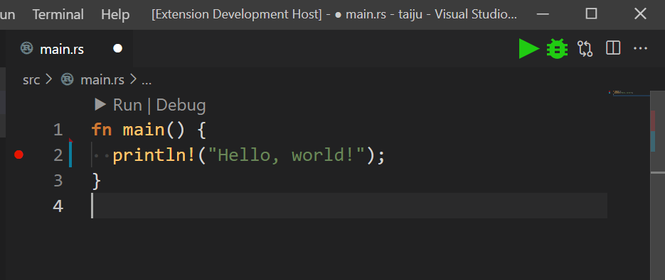
I recently migrated from using JetBrains to VSCode (Because how bad Rust Rover got) and the only thing I despise about VS Code is the lack of the run button and run menu.
I would do anything VS Code to get a run button and drop down in the top row of the editor.
Meligy
commented
9 months ago I would do anything VS Code to get a run button and drop down in the top row of the editor.
@wyatt-herkamp, I saw this and thought "There must be some extension that does it!". So, I searched extensions for: debug button.
The first result was Quick Run and Debug Buttons.
It adds 2 buttons "Start Debugging" and "Start Without Debugging":
The next one was Launch Buttons:
And there are also many extensions that run/debug active file.
 shafayetejaman
commented
9 months ago
shafayetejaman
commented
9 months ago
This looks awesome, I wish we could apply this theme
 MOMINUR-R
commented
9 months ago
MOMINUR-R
commented
9 months ago The transplant design looks perfect. The external extensions are too bugy, it will be nice to get a built-in theme that is more seamless.
 TheBlckbird
commented
9 months ago
TheBlckbird
commented
9 months ago @MOMINUR-R

I really like this design but what about Linux and macOS users? This design is very fitting for Windows but would look totally out of place on th other OSs.
 Daydreamer-riri
commented
6 months ago
Daydreamer-riri
commented
6 months ago Is there any progress here? I want to know if the vscode team has any plans for the new design.
yvvt0379
commented
6 months ago Maybe they has completely ignored this issue, I suppose. 🙁
Daydreamer-riri
commented
6 months ago Maybe they has completely ignored this issue, I suppose. 🙁
Based on the roadmap, it's possible that the vscode team really has no plans for this at the moment.
 spatel96
commented
2 months ago
spatel96
commented
2 months ago Any way to get this prioritised? Would surely be a simple change but would certainly help my "plugin scawl".
 Natriss
commented
2 days ago
Natriss
commented
2 days ago The menu on other platforms is usually below the window title:
IMO the best solution.
I do wish Microsoft would apply WinUI 3 more in there bigger apps. I love the concept and wished it was real.
 ntdash
commented
11 hours ago
ntdash
commented
11 hours ago Make Floating Terminal Like IntelliJ IDEA 👀👀
1 level up, let consider the whole panel instead [output, error, ..., terminal]
Overview
This design exploration aims to improve the overall experience for new users while also providing value for existing users. Going through feedback from new and existing users we've heard that:
We also wanted to take the opportunity to explore updating the overall aesthetics like:
Demo
Below is an example of this exploration. Here's a few ideas that we tried:
https://user-images.githubusercontent.com/35271042/106675880-c02c4e80-656a-11eb-8f5f-ead5e96300ba.mp4
Feedback
Here's the feedback I've received on this concept from our team. I'll break down the concepts into individual issue for those we are interested in pursuing more. Note: since this concept touches several ideas at once, it would be good to break down some changes (like density changes and showing more/less UI should be separate).
Pros
Cons
Happy to hear any additional feedback others have on this concept.