 Thaina
commented
7 years ago
Thaina
commented
7 years ago I think any pair of color would have the same problem for other colorblind people who have different type of colorblindness
I agree with you that it should improve but maybe with with more difference icon or shape, not color. For monochrome people too
 nbering
 This is just one example through a simulation with the Sim Daltonism app on the Mac. One of the other red-green confusion types was actually even closer to each other in shade.
Differentiation by increasing the contrast in colour intensity would probably have been more effective.
This is just one example through a simulation with the Sim Daltonism app on the Mac. One of the other red-green confusion types was actually even closer to each other in shade.
Differentiation by increasing the contrast in colour intensity would probably have been more effective.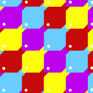 maths22
 bpasero
Steps to Reproduce:
(AKA, the new choice of logo colors is very bad for color blind users who have both stable and insider builds installed, because the logo does not allow for the products to be distinguished)
Reproduces without extensions: Yes