 herper
commented
6 years ago
herper
commented
6 years ago The background is opaque!

Closed herper closed 6 years ago
herper
commented
6 years ago The background is opaque!
 tailgo
commented
6 years ago
tailgo
commented
6 years ago It's very ugly!!!
 akoufa
commented
6 years ago
akoufa
commented
6 years ago The old one was perfect. The good thing is, that if you have it pinned on the macOS Dock and you update it, the icon does not change immediately to the ugly new one.
 genwolff
commented
6 years ago
genwolff
commented
6 years ago The old icon look better.
 karthikeyan5
commented
6 years ago
karthikeyan5
commented
6 years ago yeah!! ugly Logo and Shitty colour....
 David-Else
commented
6 years ago
David-Else
commented
6 years ago The old logo was better, no idea why anyone wanted to change it. Seems like change just for the sake of change.
 enjikaka
commented
6 years ago
enjikaka
commented
6 years ago I hate the new logo. The old one was glorious!
 Fpckalk
commented
6 years ago
Fpckalk
commented
6 years ago I'll get used to it! Thanks for all the updates VS Code team/contributors
 0xdeafcafe
commented
6 years ago
0xdeafcafe
commented
6 years ago Yeah, the new logo is horrific. Please, can it be reverted to the old logo by the next release?
 billinghamj
commented
6 years ago
billinghamj
commented
6 years ago Looks like an Office application 🤢
billinghamj
commented
6 years ago Could always fork the project to get rid of it though? I kinda doubt Microsoft will listen to anyone here...
 robinbentley
commented
6 years ago
robinbentley
commented
6 years ago The colour change is fine but really preferred the old logo 😞
herper
commented
6 years ago @billinghamj Yeah,background of icon colour is too deep,choose other colour will be perfect!Or,become transparent and look better!

herper
commented
6 years ago @0xdeafcafe I don't think so!
 isergey
commented
6 years ago
isergey
commented
6 years ago Bring back the old blue icon!
 HRK44
commented
6 years ago
HRK44
commented
6 years ago See https://github.com/Microsoft/vscode/issues/6607 for more information about the new icon...
 daniel0101
commented
6 years ago
daniel0101
commented
6 years ago Please bring back the old logo
 ghost
commented
6 years ago
ghost
commented
6 years ago I want back blue logo, or green is also good, but this "poop color logo" is horrible and so ugly.

And on desktop it isn't updated. (only if uninstall and install it's updated, but if I update old version, it's not)
 polettoweb
commented
6 years ago
polettoweb
commented
6 years ago Definitely not the best change of this version. And the colours? Orange for a stable and green for the insider? Is it just me or it's more natural to associate green with safer and yellow/orange/red with risks?
 stone-zeng
commented
6 years ago
stone-zeng
commented
6 years ago The files' icons are still blue:

 jeasonstudio
commented
6 years ago
jeasonstudio
commented
6 years ago I want back the blue one.
btw, the color green means something bad in chinese, and I think it's not a good choice.
 chadbr
commented
6 years ago
chadbr
commented
6 years ago 
cmz and insiders is the same??
 GuyHarwood
commented
6 years ago
GuyHarwood
commented
6 years ago the old one was great. why change it?
 rfgamaral
commented
6 years ago
rfgamaral
commented
6 years ago Old one - although not the best icon ever - was 1000x times better than the current one. Change for the sake of change about a thing that nobody ever complained about.
 leolozes
commented
6 years ago
leolozes
commented
6 years ago The new icon shape is not great, but the worse was the color. I changed the taskbar shortcut icon after a few hours. I did try to get used to the orange (I'm not resisting to change usually), but sorry, nope.
I'm using this one now (can't upload the .ico in github but you can convert it to ico really easily:

Edit: you can find the icons here (I have some others, and did it in blue too)
 verlok
commented
6 years ago
verlok
commented
6 years ago Thanks @leolozes. I’ll do this too.
verlok
commented
6 years ago Yes, the old icon was a little too big on a Mac, but it was still acceptable. This new icon is very very ugly. Please change it asap.
 jens1o
commented
6 years ago
jens1o
commented
6 years ago Well, tbh, due to the use of Insiders, I'm used to it now. It's not that worse. :)
herper
commented
6 years ago @LeoLozes Icon is very good,but live tile is still the original. I hope icon's background color to follow the theme color change,and would be better.
 NoxGamingQC
commented
6 years ago
NoxGamingQC
commented
6 years ago I not found the new logo that bad on linux, but I still prefer the old one. Before doing a change when nobody tell to change a small thing like this when is perfectly great, correct bugs and implement new feature without changing something that nobody actually care about. Seriously this change was useless.
 tyson-kubota
commented
6 years ago
tyson-kubota
commented
6 years ago The lack of visual distinctness with Sublime is not great. As noted on https://github.com/Microsoft/vscode/issues/6607#issuecomment-334792687.
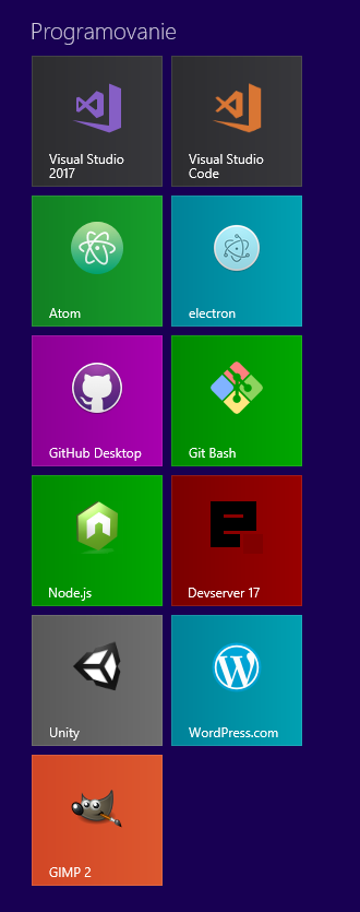
My current Dock:

 offbeatful
commented
6 years ago
offbeatful
commented
6 years ago Can we have new 1.17 release with old color (blue) icon? New one is just awful.
 wmakley
commented
6 years ago
wmakley
commented
6 years ago Man orange is such an ugly color, and the shapes are over-complicated. I liked the old icon just fine (on OS X). Seriously, now my devtools dock area looks awful:

 bithooked
commented
6 years ago
bithooked
commented
6 years ago The prior icon was so distinctive and recognizable, while still extremely clean. The icon made me want to click on it. This one, which showed up on my desktop today, is just so muddy that it all-but disappears on my ribbon.
 miladghiravani
commented
6 years ago
miladghiravani
commented
6 years ago New logo is very ugly!!!
I love previous logo: (blue have powerful)

please change new logo! This affects productivity.
 tahnik
commented
6 years ago
tahnik
commented
6 years ago I almost thought my new icon pack made the VSCode icon crappy. If you guys keep this I swear I will switch to....I will switch to...ummm...
Please don't do this to us. VSCode is the best text editor right now and that icon is just horrible.
 salmansamie
commented
6 years ago
salmansamie
commented
6 years ago Personally, I love the new logo. It's distinct and elegant.
 lipstick-turtleback
commented
6 years ago
lipstick-turtleback
commented
6 years ago New VS Code icon is really bad :( Please return the previous one.
 volllly
commented
6 years ago
volllly
commented
6 years ago please go back to the old icon.
 linfn
commented
6 years ago
linfn
commented
6 years ago the color should be blue
 iblh
commented
6 years ago
iblh
commented
6 years ago It's totally not cool! Weird color & design.
 faraazahmad
commented
6 years ago
faraazahmad
commented
6 years ago Please bring back the blue logo
 iamchathu
commented
6 years ago
iamchathu
commented
6 years ago Bring back the old one.
 saiyaff
commented
6 years ago
saiyaff
commented
6 years ago Please bring back the old logo.
Even the files look uglier and I don't tend to open them.

 Rhodenspire
commented
6 years ago
Rhodenspire
commented
6 years ago I'm glad that they're trying new things with the icon, but the dark orange color doesn't give the feeling that this is a modern tool for programming, and the choice to snip off the leftmost edge is unnecessary and destructive to the iconic loop icon that visual studio is known for. It'd be just fine if It were back to being some variation of blue and had it's left-most side back.
 kaiyuanl
commented
6 years ago
kaiyuanl
commented
6 years ago New logo looks bad.
 Ituury
commented
6 years ago
Ituury
commented
6 years ago I think also that the icon color looks bad. But the icon shape looks great. In #35674 the user had an interesting suggestion. I would like to see the green color instead of the orange, so that the insider version is orange and the stable is green. Like he said "I think color shade in yellow to red feel like a warning. ". And I agree completely.
 jrysig
commented
6 years ago
jrysig
commented
6 years ago It is difficult to distinguish VSCode icon on Linux Mint task bar. A few dark orange pixels on dark background:

 technoiswatchingyou
commented
6 years ago
technoiswatchingyou
commented
6 years ago I'm sorry, but...

GuyHarwood
commented
6 years ago Workaround for macOS....
Steps to Reproduce: new logo put into the start menu is ugly!