 mixxxbot
commented
2 years ago
mixxxbot
commented
2 years ago Commented by: daschuer Date: 2012-04-21T22:49:57Z
Open mixxxbot opened 2 years ago
mixxxbot
commented
2 years ago Commented by: daschuer Date: 2012-04-21T22:56:16Z Attachments: three-column-layout-mock-up.png
mixxxbot
commented
2 years ago Commented by: daschuer Date: 2012-05-18T10:10:29Z Attachments: mixxx-newLibraryWidget-2.pdf
Based on the discussion on [mixxx-devel]
 http://<email address hidden>/msg03974.html
here new mock-ups for reference.
Many thanks to Max, who has started with this mock-up!
mixxxbot
commented
2 years ago Commented by: daschuer Date: 2012-05-18T10:12:22Z Attachments: mixxx-newLibraryWidget-3.pdf
And here an advanced version:
mixxxbot
commented
2 years ago Commented by: kain88-de Date: 2012-05-19T11:03:05Z Attachments: mixxx-newLibraryWidget.pdf
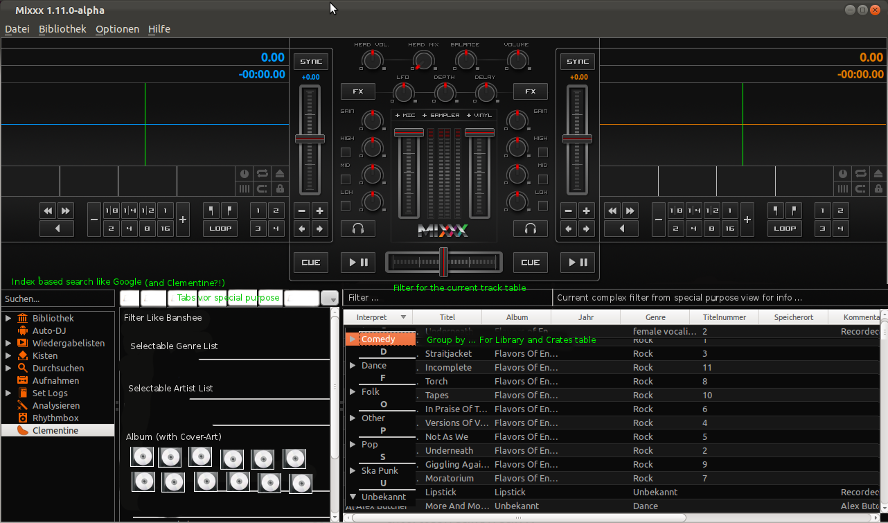
I like the popUp for the Library Tab and the idea place a playlist table and the library table next to each other. But some of the stuff is unclear to me.
In your Info Tab, which Table is shown there? What is shown in the More Tab, this makes no sense to me without some explanation. Where are the results of a search in the "Search all (FTS index based)" field shown? What does FTS stand for?
I've worked on a update of my design over this week and added some of Daniels stuff.
Library Tab
Crates Tab
Artist/Track Info
More
Coverflow
mixxxbot
commented
2 years ago Commented by: daschuer Date: 2012-05-20T19:30:17Z
Hi Max
Thank you!! I think our design is slowly getting complete, super :-)
First let me explain my mock-up from #4. (I thought it was self explaining, surely only for me ...)
The Idea was to have some main tabs which are always visible and a "more" button for the rest of tabs which are less important. "More" should behave like the Eclipse ">> 90" button right of the editor tabs. The selected tab from the more pop-up should become a real tab and a less recent used tab is moved to the more pop-up. This should keep the GUI clear, but extensible.
FTS = Full Text search:
I like to have a search which is not a Filter for a single table but a Goggle like search in all track sources. (Bug #689291)
I am still not sure if it is a good Idea to give the user many different search boxes like clementine does.
Auto DJ: I am not happy with our current ideas of positioning auto DJ controls. They do not fit well to the library. Maybe it is better to put them in the main GUI in combination with the software mixer slider. The Auto DJ Tab is a candidate for the more pop-up, because not any DJ will use it.
Genre tree: I do not like the genre tree as it is in Clementine. We can easily achieve the same if we allow grouping by any column in the library track table. This will give the convenience of a tree with all information in the other columns of a table in a single view. I realy like the way how to filter the library in Banshee. This is included in my mock-up from #4 as "Point and Click Filter".
Artist info tab/button: I think its better to have this as a normal tab on the left for a cleaner layout, otherwise we mix two concepts of controlling stacked wigets .
Grit view for crates is a very good idea. Maybe we allow to switch between tree view and grit view in the library/crates tab.
Maybe we can join the library and the crates tab because Library is like a all crates crate.
Cheers,
Daniel
mixxxbot
commented
2 years ago Commented by: kain88-de Date: 2012-05-26T13:09:34Z Attachments: mixxx-newLibraryWidget-7.svg
I've been doing some work with Daniel and we agreed on this design
In this mock-up we have a static line at the top containing the search,previewdeck and a statusdisplay (this could show the status of a library rescan). Also new here is the idea that we have a gridview to display the library, I imagine this to be similar to a filebrowser. I've added some comments to the mock-up in blue
What do you think of this design?
mixxxbot
commented
2 years ago Commented by: daschuer Date: 2012-05-29T18:06:00Z Attachments: mixxx-newLibraryWidget-step1.svg
The design from #7 is our target goal and it is surley a little to advanced for the next version of Mixxx. I have attached a draft for the first step. It does only include the preview player, has room for extensions and it is on the track to the goal.
I have also included an alternative for the vertical tabs, which were disliked on mix-devel.
mixxxbot
commented
2 years ago Commented by: b-lecam Date: 2013-04-19T02:02:46Z Attachments: music_explorer.pdf
I read all the previous comments, but I love simplicity so I kept it really simple. I drew 2 sheets of paper to show you my first ideas so here is my first one, it is the library gui layout for the music explorer. I plan to apply on this idea for the GSOC 2013, so your feedback would be welcome.
mixxxbot
commented
2 years ago Commented by: b-lecam Date: 2013-04-19T02:03:41Z Attachments: dragdrop.pdf
Here is an explanation on how the drag and drop could be implemented.
mixxxbot
commented
2 years ago Commented by: daschuer Date: 2013-04-19T06:59:51Z
Thank you for your draft! I love simplicity and your drafts are looking nice.
Do you plan to use pop up windows? That might not a good idea since this should be able to control by DJ controllers using arrow keys and jog wheels.
I think the difficulty of this project is focus on the daily DJ Us cases, but allow also crazy new features, without clutter the GUI. Maybe you should tell the story how the GUI will be used.
Btw: We did our drafts with Inkscape.
mixxxbot
commented
2 years ago Commented by: kain88-de Date: 2013-04-19T09:49:16Z
I agree with Daniel your first drafts look nice.
Drag and drop adding to playlists is ok though. That one is hard to achieve with a controller anyway.
Some hints for further designs
mixxxbot
commented
2 years ago Commented by: b-lecam Date: 2013-04-22T20:33:43Z Attachments: mockup_music_explorer.jpg
Hi, Thanks for the feedback. As Daniel said, the difficulty for me is to understand how a Dj can use the music explorer only with a Dj Controller, if you guys would have a video showing how it works using Mixxx and a controller that would be great. I was also wondering if analyze should really be into the music explorer, what I mean is that it is more a tool for the music rather than a way to find music so maybe it should be a option in the menu "Library", for example: "Analyze selected songs", "Analyze all my library".
-Split view has been added to my new mock up, I believe the split view can either be only text and line or it can also be icons of albums and artists. -The left column as icons is a great idea, but I don't know about the Dj Controller still, it gives much more space and make it clearer. -I did not really understand this point
So to explain my mock up, on the left you'll find the icons(red dots) of the Library, AutoDj, Playlists, Crates, Browse, Analyze, iTunes. When clicked on Playlists, Crates, Analyze or iTunes it shows a new panel on the right of the left column(the blue area). If it is analyze it displays the option and tools to analyze. In case it is Playlists, Crates, or iTunes it shows what currently shows when you click on the arrow in the current version. In the music view, on top there is a "navigation bar", the views available: -List View: classic table view as today(with improved header and selected color at least) -Grid View: allows to visualize album or artists by cover, a great example of what I'd like to do is Musique(http://flavio.tordini.org/musique), when this view is selected, "Artists" and "Albums" appear on the right in order to chose what to display. -Split View: either a list view like you can see on most systems or a more extended split views with covers.
Then comes the search box. Something else that could be added in order to support the metadata tags would be a panel that shows on the right to edit informations. This could be done by adding a button Edit or adding the option "Edit" when right-click. I also thought that there would be a need on mac to get rid of the focus blue rectangles around the list view, the search box view, but also of the headers and chance the selection color of the table view to have a design that goes along with the upper part. I thought that instead of using orange color, red should be used. All the controls are red on the upper part and so that would make a consistent UI.
Finally, concerning use case, I believe that when dropping a song to a playlist, a crate or AutoDJ, the selection color should appear in order for the user to make sure he dropped its song in the good place. Let's imagine I want to add a song to a playlist and the playlist panel is not open, I drag the song to the playlist icon, the playlist panel pop up and then I can drop my song in whatever playlist I want. Same with Crate.
If you have any questions or case you would like me to think about, I'd be really willing to do so.
mixxxbot
commented
2 years ago Commented by: daschuer Date: 2013-04-23T12:20:36Z
Nice mockup :-)
For example my RMX2 controller has four arrow keys and two "load to deck" keys. You can test it with your keyboard if you define similar hockeys. Currently Mixxx supports these controls: http://www.mixxx.org/wiki/doku.php/mixxxcontrols.
Edit search box: nice!
How do you control, what will be displayed in the split view? What will happens with the second view if you change the view by the red icons? Maybe your split view is to much bound with the current view, think of it like Midnight Commander.
This project will likely fill three or more GSoC projects, but we really need it in trunk after this one. Do you have an idea for committable step, just in case?
mixxxbot
commented
2 years ago Commented by: b-lecam Date: 2013-04-23T22:49:35Z
What do you mean by how to control what will be displayed in the split view? I believe that what happens is that everything start with Artist, then you can either click on a artist to show all its albums or click on "All artists" to see all albums. Then we can display songs in a simple way like Musique with more information customizable by the dj. The second view follows the red icons states, if you are in playlists and go to crates, the music list(third view) won't change, but the second panel will.
I believe a committable step would be to either say: I will work on the views part, that implies the right side, right to the blue thing or the other option would be to describe the project as just building a easy to add new stuff sidebar. Do that sounds like something correct and doable? I hope to be able to describe a first draft of my application by next week-end.
mixxxbot
commented
2 years ago Commented by: markdanson Date: 2014-07-09T15:19:27Z Attachments: [2 column layout](https://bugs.launchpad.net/mixxx/+bug/986704/+attachment/4148861/+files/2 column layout)
Just run into this, trying to catch up - so apologies if I've missed anything.
Everyone has a lot of great suggestions, so I thought I'd throw mine in - a bit different from what's here so far, but I worry that as there are lots of variations between screens, it could seem inconsistent when navigating around (and therefore quite hard to understand). Adding another window is definitely a great idea though.
So my proposal is to have simple, independent 'columns', which would each have their own separate content navigation. Users could then have several of their most common things open at the same time.
For example: a navigation tree could be displayed at the top of each column, and would open into the column space below. I've attached a mockup of a two-column layout using a dropdown for the link tree to show what I mean. Basically like side-by-side copies of the simple library in mixxx 1.6.
Details:
Comments, suggestions or general insults welcome! I'm a frontend web / usability guy by trade, so whilst I cant help out with any C coding, Im happy to help out wherever possible for the javascript & theming stuff.
Mark
mixxxbot
commented
2 years ago Commented by: daschuer Date: 2014-07-09T22:01:43Z
Hi Mark,
Thank you for warming up this thread.
I like your ideas and mock-up. It is really good looking.
Somehow like two smart phones side by side ;-)
The approach to make it accessible from skins seams to be working this way as well.
There is one thing I am worrying about: usability. Can we add a way to change the view by one click. Maybe we still need a fixed Bar with some controls or infos or drop targets. any ideas
I wish I had unlimited time to start working on this. Do you have fun learning C++ :-)
Kind regards,
Daniel
mixxxbot
commented
2 years ago Commented by: markdanson Date: 2014-07-10T09:19:32Z
Thanks Daniel.
I agree with your usability concerns - the main problem as far as I see it is that because of Mixxx users' varied requirements (e.g. users requiring external controller compatibiblity, or those who just want auto dj alongside the library), one fixed navigation format is always likely to be problematic for some people.
The benefit of allowing skin designers to choose from a variety of navigation 'widget' formats would be that users could then pick a skin which best fits their requirements - some skins could have one-click access via fixed tabs, or a tree on the side, or some could use combobox dropdowns, etc.
I'm still trying to grasp how the program is put together, so please correct me if I'm wrong with any of this, but I suppose the question whether it is actually possible to swap between navigation widgets. Can we use all of the standard QT widgets in the interface? ...and if so, would the tree view widget's data work with the other widgets? it looks possible from this page: http://qt-project.org/doc/qt-5/modelview.html
It sounds like when 1.12 is released there will be more support for the combobox (http://www.mixxx.org/forums/viewtopic.php?f=8&t=6018 ). but I can't see anything for tabs. I also can't see whether it will be possible to 'swap' the tree for the combobox.
Before all that though, a first step might be to just try and get two table views (with two separate trees) side by side and see how well that works.
sorry for the brain dump :-/
mixxxbot
commented
2 years ago Commented by: daschuer Date: 2014-07-10T09:54:53Z
sorry for the brain dump :-/
Thank you for this, we need more of this to bring Mixxx to the max. ;-) The benefit of allowing skin designers to choose from a variety of navigation 'widget' formats would be that users could then pick a skin which best fits their requirements - some skins could have one-click access via fixed tabs, or a tree on the side, or some could use combobox dropdowns, etc.
Good approach, but not that easy, because currently all Library widgets are tight connected and not able to live without each others. But we should work towards changing this. A toolbox of independent Library widgets would be really great.
is actually possible to swap between navigation widgets.
Yes, we use the Qt MVC pattern, for the tree view and the Library, so it "should be" possible. But I am afraid that we have broken the pure MVC approach in some places, so that it is not working just as it is.
Can we use all of the standard QT widgets in the interface?
Yes! The new combo box widget is intended to be used in the Skin above the library. It can be connected to the Mixxx Control Objects, (the Mixxx remote interface) The library is build without these Control Objects. So you have full power of QT on one hand but not full power of the Mixxx Skin engine.
But it seams to be a good Idea to move more parts of the library to the skin engine.
Before all that though, a first step might be to just try and get two table views (with two separate trees) side by side and see how well that works.
This sounds not that hard and will work from the Qt point of view. The only problem is, that there are some places in code that assumes that there is only one view of the data and only one Table is displayed. The hard part is to find and eliminate these places.
mixxxbot
commented
2 years ago Commented by: markdanson Date: 2014-07-10T14:04:45Z
all Library widgets are tight connected and not able to live without each other I've seen a screenshot from 1.6 where the library links were in a combobox - any idea whether there was there a lot of work to switch it over to the tree from that? I'm looking through /src/library/ to see if there's anything obvious which explains how things fit together (and were changed to the tree), but basically don't know where to start.
I suppose the interface widget could be loaded in based on a config key - e.g. <attribute config_key="[Library],nav_widget">ComboBox</attribute> (or 'Sidebar' or 'TabBar')? Though this does assume that all the library widgets would all be the same - e.g. you couldnt have one tab bar and one dropdown. It definitely seems like there's two tasks involved here though - 1) allowing for multiple libraries, and 2) allowing the library nav widget to be changed. Personally, I feel that having multiple libraries is the bigger functionality boost - the widgets would just help usability when there are multiple libraries.
Is there anything I can do to help move that along? e.g. help finding the references to a fixed, singular table?
mixxxbot
commented
2 years ago Commented by: daschuer Date: 2014-07-10T14:44:10Z
Maybe this explains. But it was done before I started to developing on Mixxx. http://mixxxblog.blogspot.de/2008/12/rewriting-library.html
I do not understand this:
> I suppose the interface widget could be loaded in based on a config key - e.g. <attribute config_key="[Library],nav_widget">ComboBox</attribute> (or 'Sidebar' or 'TabBar')? Though this does assume that all the library widgets would all be the same - e.g. you couldnt have one tab bar and one dropdown.But never mind, your analysis looks good.
It seams to be sensible to just double Library and fix all issues that are coming along.
Currently the skin supports
<LibrarySidebar></LibrarySidebar>
and
<Library></Libraryr>
What will happen if we have them twice? What we need to allow this?
If you are ready to make your hand dirty and dig though the Mixxx library code, you are very welcome. You will receive all support you need on the Mailing List and IRC.
But first, you should setup a powerful development environment and check it by fixing an "easy" tagged bug. This is a good start: http://www.mixxx.org/wiki/doku.php/bugfix_workflow
Thank you very much in advance!
mixxxbot
commented
2 years ago Commented by: markdanson Date: 2014-07-10T16:10:18Z
you should setup a powerful development environment and check it by fixing an "easy" tagged bug.
Hmm. Just looked through the 'easy' bugs and my brain is already turning to mush. I'll start by simply trying to install all the requirements to fork / compile 1.12...!
mixxxbot
commented
2 years ago Commented by: jmigual Date: 2016-04-04T16:12:46Z Attachments: Layout.svg
Hi I've been reading this post for a while and I've tried to synthesize everything you said. I've added my own proposal for doing it in Google Summer of Code. This will add the following changes and will be developed in different releases.
Library tab redesign: remove the current Qt Treeview and add instead small buttons (allowing more space) optionally (as Daniel suggested) we can add the option to make the Qt Treeview collapsible allowing the user (or skin designer) to choose from on to the other.
Library view: add a Qt Treeview similar to the one in Clementine but with the playlists and crates at the same tree (as Max suggested in #7 ).
Browse PC view: this adds the option to search songs directly in the computer folders allowing users to make their own organization.
All the info is at my GSoC proposal: https://docs.google.com/document/d/1HaZ5s7PKmE73LacEGbxRJy9LIKi0ZFbZ-emdSQ1m68o/edit?usp=sharing
mixxxbot
commented
2 years ago Commented by: jmigual Date: 2016-04-04T16:25:36Z
Also we should allow the skin designer more freedom. Currently the the skin.xml file supports supports the tags for the LibrarySidebar, the SearchBox, the CoverArt, and the Library itself. When doing this change the State / Progress / Controls widget can also be sepparated (in a LibraryControlls tag for example).
To allow the skin designer to play with this we can separate the LibrarySidebar tag in different tags: LibrarySidebarButtons and LibrarySidebarMenu, the first one will contain the main buttons (Library, Notes, AutoDJ) and the second one will contain the sub-menus for every item (Library Tree (legacy), Crates, Playlists for the Library item).
Reported by: daschuer Date: 2012-04-21T22:49:57Z Status: Confirmed Importance: Wishlist Launchpad Issue: lp986704 Attachments: three-column-layout-mock-up.png, mixxx-newLibraryWidget-2.pdf, mixxx-newLibraryWidget-3.pdf, mixxx-newLibraryWidget.pdf, mixxx-newLibraryWidget-7.svg, mixxx-newLibraryWidget-step1.svg, music_explorer.pdf, dragdrop.pdf, mockup_music_explorer.jpg, [2 column layout](https://bugs.launchpad.net/bugs/986704/+attachment/4148861/+files/2 column layout), Layout.svg
For the upcoming new features the current library layout is to static. We should start a discussion what is the right sustainable library layout that is able to be extended by the new features.
Attached you find a mock-up as first draft. Features:
Here is a list of possible tabs: