Open Tcali opened 
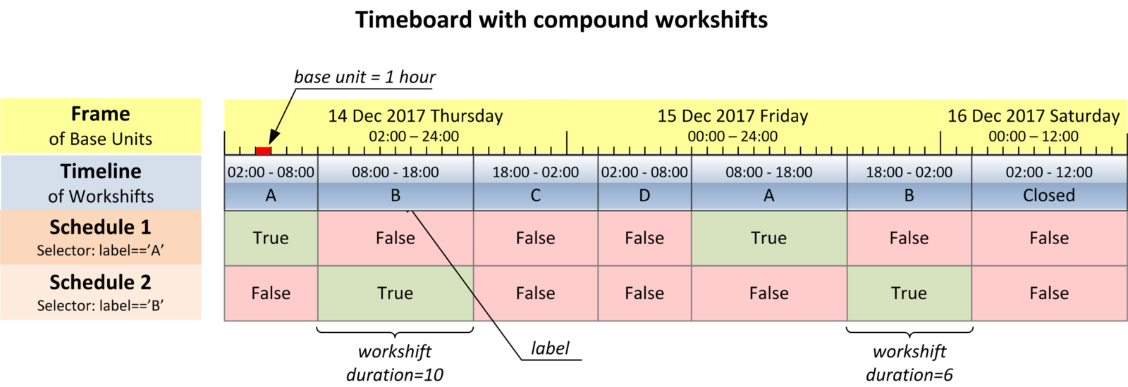
5 years ago
The pictures in the article were not generated by a code but drawn manually. Meaning, I don't have a tool for vizualization of timeboards. This is an interesting feature request. Hopefully, in some way it can be done with matplotlib but so far I haven't had time to think about it properly.
You could use plotly Gantt charts for interactive visualization:
import timeboard as tb
import pandas as pd
import plotly.figure_factory as ff
clnd = tb.Timeboard(base_unit_freq='8H',
start='01 Oct 2017 02:00', end='05 Oct 2017 01:59',
layout=['A', 'B', 'C', 'D'])
ivl = clnd(('2017-10-02', '2017-10-04')) # interval
task = [ws.label for ws in ivl.workshifts()]
start = [ws.start_time for ws in ivl.workshifts()]
finish = [ws.end_time for ws in ivl.workshifts()]
df = pd.DataFrame(list(zip(task, start, finish)),
columns =['Task', 'Start', 'Finish'])
fig = ff.create_gantt(df,
group_tasks=True,
index_col='Task',
showgrid_x = True,
showgrid_y = True,
show_colorbar = True)
x_dtick_hours = 4
fig.update_xaxes(tick0 = start[0],
dtick = x_dtick_hours * 60 * 60 * 1000, # hours to milliseconds
)
fig.show()
Hello, thank you for sharing this. This is great. Was wondering if there is a way to visualize a timeboard like how you do have in the article on free code camp. If so, could you please share how we would visualize the schedule/time board of one of the generic calenders? Thank you