 vomikan
commented
6 years ago
vomikan
commented
6 years ago Your icons looks good. IMHO they a bit complex (the logo contains too many elements. Could you try to create something like this:
It may be more wide stripe with some element in the middle looks like X.
 slodki
 Tobaloidee
 alensiljak
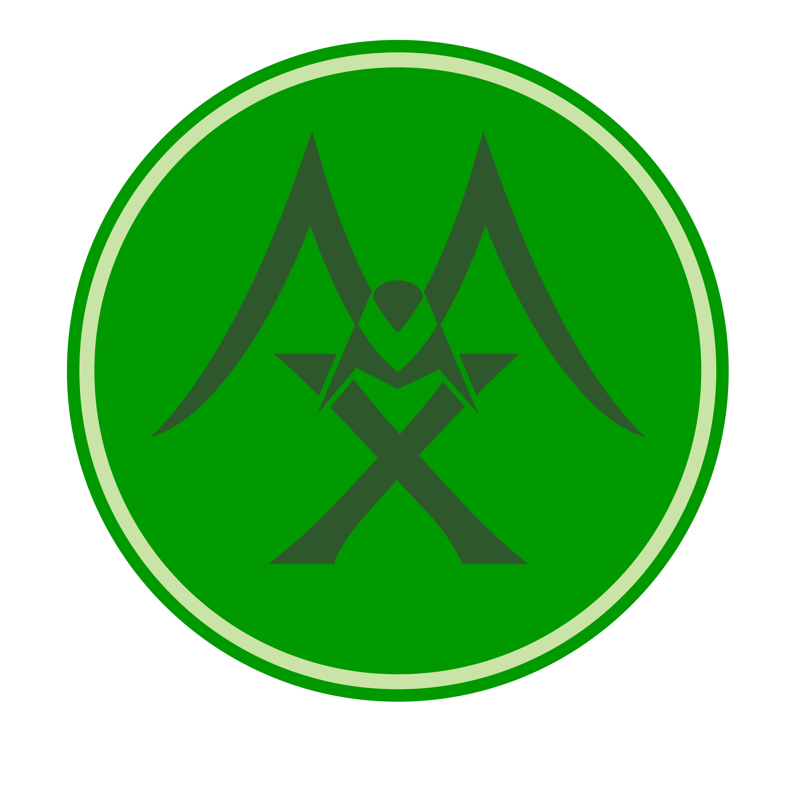


 at first glance
:-1:
at first glance
:-1: 


 (your favourite, @slodki )
with the star outer circle like above, for example, and the logo suggested earlier being in the inner circle.
(your favourite, @slodki )
with the star outer circle like above, for example, and the logo suggested earlier being in the inner circle.
 andrepg


 But basically your call.


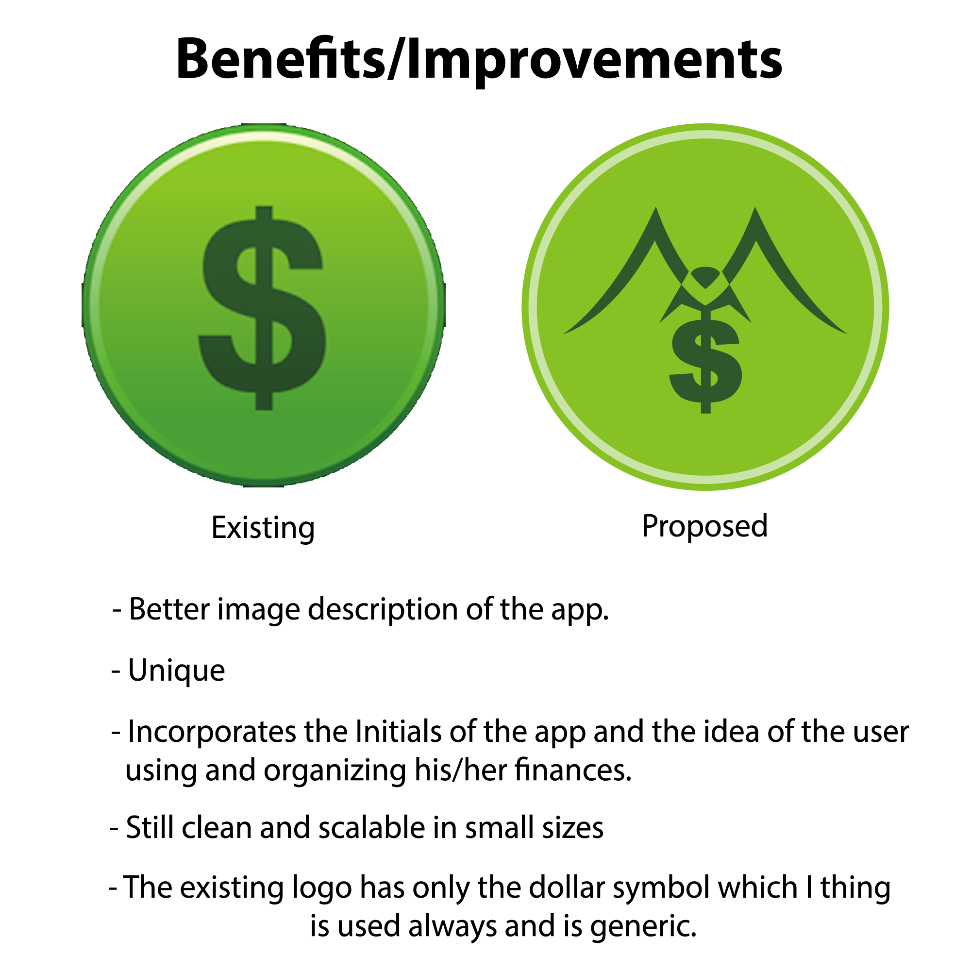
Hi again Sirs, here are the links of the edited icon design..I made 2 versions and made the adjustments as suggested. Thanks a lot!
-made the M more vertical, toned down the green background and replaced the dollar symbol with X http://res.cloudinary.com/tobaloidee/image/upload/v1521738443/editeD-01_ni5sjk.png
-replaced the dollar with coinX http://res.cloudinary.com/tobaloidee/image/upload/v1521738444/editeD-02_c9hsvw.png
Tobaloidee