 armenzg
commented
8 years ago
armenzg
commented
8 years ago Hi @parag9d thanks for being willing to help! I've also opened this up to the rest of the community if they're willing to make proposals: http://armenzg.blogspot.ca/2016/05/open-platform-operations-logo-design.html
Let's see who else will apply for it.
Good luck! Armen
 eliperelman
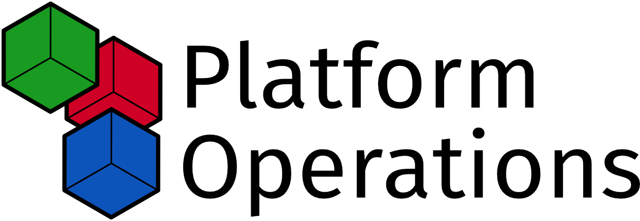
 parag9d
 djmitche
 klibby

 catlee
 lmandel
 lundjordan

 whimboo
 Ryuno-Ki
 catcarbonell

 elioqoshi
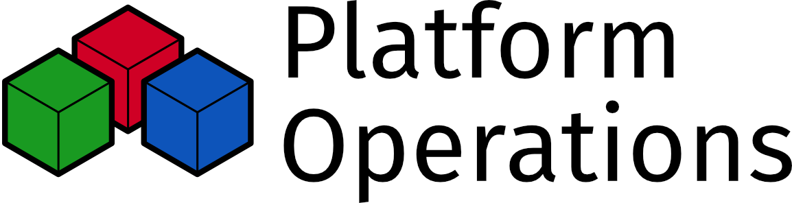
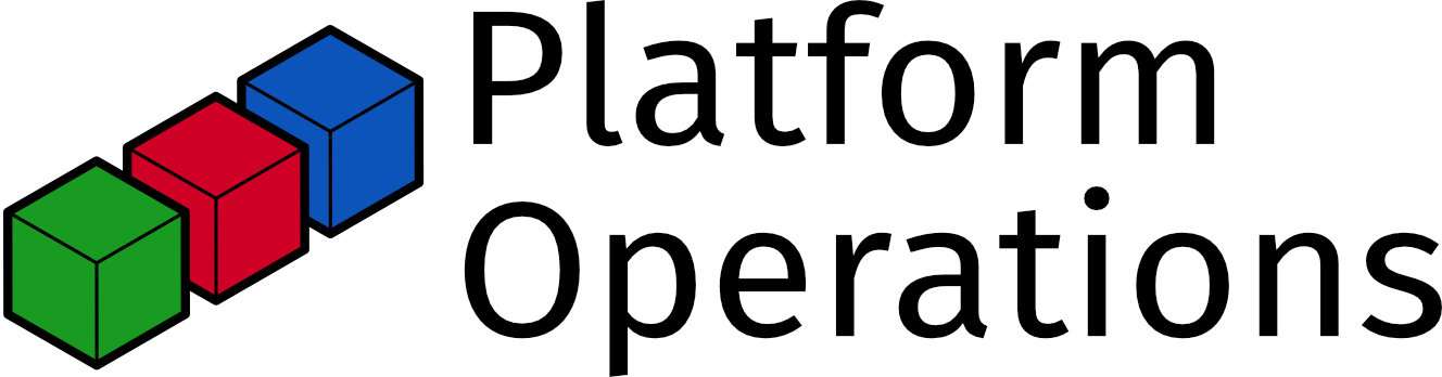
Goal:
We would like to have a logo for Mozilla's Platform Operations division. Platform ops takes care of most services and tooling that enables engineers from the main Firefox products to have an effective development process plus provide the release pipeline. Platform ops is composed of various teams: https://wiki.mozilla.org/Platform_Operations and here's the mission of one of the teams that can (to some extent) be applied to the whole org: https://wiki.mozilla.org/EngineeringProductivity#Our_Mission
Info:
We would like to use this logo to create gear, for our various websites and presentations.
Style Information:
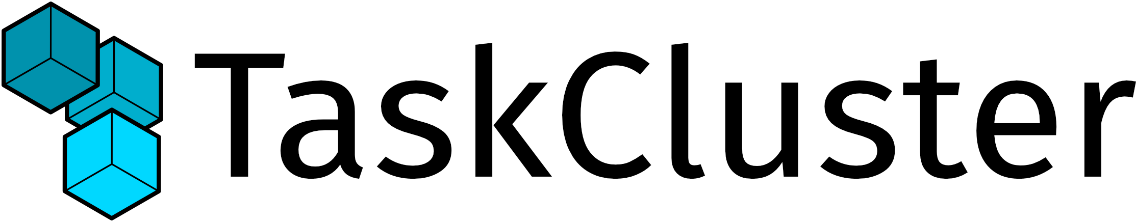
Here are the logos from some of the teams: https://people.mozilla.org/~catlee/releng-banner.svg https://tools.taskcluster.net/lib/assets/taskcluster.svg https://wiki.mozilla.org/images/1/13/Ateam.png
There's a sense of empowering others behind this org.
Deadline:
2nd week of May.
Tag:
[Design Needed, Staff Support Needed]