mui / material-ui

Material UI: Comprehensive React component library that implements Google's Material Design. Free forever.
https://mui.com/material-ui/
MIT License
93.28k stars 32.12k forks source link

Provide helper (or an example in docs) of interactive Card component #10944

Closed yuchi closed 6 years ago

yuchi commented 6 years ago

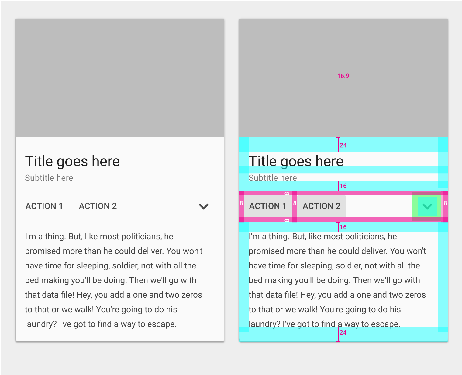
Material Design defines that card can be interactable (button like). This is how the first example of MCW Card component behaves.

This is currently perfectly do-able with ButtonBase, as I answered in this SO question.

I also updated the CodeSandbox example with a new one to include overflow:hidden on the Card so that the button top corners are rounded. In the library this shouldn’t happen since that will cause breaking clipping issues, so this is something to solve somehow.

My proposal is to either

Having even just an example would help, but it requires some styles to be applied to the card and this looks like a common enough case to be covered by the APIs.

Sorry if I removed the rest of the parts of the issue template, they didn’t apply here since it is more of a feature request.

mbrookes commented 6 years ago

@yuchi Good shout, that seem s like a fundamental feature that we're currently missing.

Do you want to work on it?

I think a separate component may be better to save importing ButtonBase when it isn't used (although I appreciate there's a 99.999% chance it will be used elsewhere in a Button!), but also so it can be applied to, for example, CardMedia. Perhaps called CardAction, or CardActionArea? Hard to find something that is less easily confused with CardActions. @oliviertassinari?

yuchi commented 6 years ago

Hard to find something that is less easily confused with CardActions. @oliviertassinari?

Exactly the reason I stopped working on a PR. Waiting on consensus on naming and APIs and then I’ll gladly work on it.

yuchi commented 6 years ago

Also I fear we’ll be somewhat forced to have overflow:hidden on the Card.

Se Action area 3 here:

Example of lateral action area

And Action area 4 here:

Example of full width actions

It would be very hard to have overflow:hidden on the new componet while retaining the right corner radiuses. Asking the developer to specify in which side of the card the component is placed can be tedious and difficult (we can’t use left/right for RTL/LTR issues).

yuchi commented 6 years ago

Yuck! MCW rounds al corners and then un-rounds them using positional pseudo classes.

In fact their demo does not show the real media player component presented in the guidelines.

yuchi commented 6 years ago

Also in the current docs, in the Media demo the Lizard image overflows the top rounded corners.

schermata 2018-04-06 alle 14 34 08
mbrookes commented 6 years ago

In fact their demo does not show the real media player component presented in the guidelines.

Strangely they're also using cards for something the guidelines say specifically not to (their headlines example) vs: "A quickly scannable list, instead of cards, is an appropriate way to represent homogeneous content that doesn't have many actions." from the spec.

the Lizard image overflows the top rounded corners

Good catch. Amazed that bug survived this far! It also affects the UI controls example.

I had a small PR to fix the aspect ratio of the Media example, so I'll add overflow: 'hidden' to the Card while I'm at it.

yuchi commented 6 years ago

Strangely they're also using cards for something the guidelines say specifically not to […]

Probably what happened is that they misread exactly how I did. If you look closely the second image I posted from the guidelines is actually about a list of supplemental actions (CardActions in mui speak) and not two big buttons!!

yuchi commented 6 years ago

Their example is also a little bit broken. (Look at the corners)

schermata 2018-04-06 alle 19 34 05

Zoom:

schermata 2018-04-06 alle 19 35 48
mbrookes commented 6 years ago

Whoops. Oh well, we can't exactly talk, given the corners on the Cards with CardMedia.

Could you take a look at #10946 while we're waiting to agree on a component name?

mbrookes commented 6 years ago

If you look closely the second image I posted from the guidelines is actually about a list of supplemental actions

Yeah, but it still looks like stacked FlatButtons, in two CardActions, which seems a bit odd.

oliviertassinari commented 6 years ago

@mbrookes Interesting thread. I'm also in favor of a separate component, like CardInteractive.

yuchi commented 6 years ago

Proposal: CardAction is going to be the new component, CardActions will be renamed CardSupplementalActions.

function MyCard(props) {
  return (
    <Card>
      <CardAction onClick={props.onClick}>
        <CardMedia … />
        <CardContent … />
      </CardAction>
      <CardSupplementalActions>
        <Button size="small" color="primary">…</Button>
      </CardSupplementalActions>
    </Card>
  );
}
yuchi commented 6 years ago

Also in the PR I will fix the supplemental actions inline-sides (right, left) padding which should be 8px but we set to 12px.

schermata 2018-04-12 alle 14 34 37
yuchi commented 6 years ago

I fear the whole Card component is off the spec. For example CardContent has inline-sides padding of 3 units (≈24px) while this nowhere to be found in the spec.

Edit: Sorry, I missed the discussion in #10044. I still believe CardContent/Action components shouldn’t have variable gutters. They always are 16px in the .ai templates they provide.

yuchi commented 6 years ago

Did we reach consensum on the names? I proposed CardAction and CardSupplementalActions.

yuchi commented 6 years ago

Now that I re-read the thread I’m totally into CardActionArea and CardActions.

mbrookes commented 6 years ago

That name looked good to me, but then I reread the thread and saw I suggested it, so I guess it ought to! 🤣

@oliviertassinari any objection? (And @yuchi thanks for circling back on this issue.)

oliviertassinari commented 6 years ago

Now that I re-read the thread I’m totally into CardActionArea and CardActions.

@yuchi The naming sounds great 👍.

Edit: Sorry, I missed the discussion in #10044. I still believe CardContent/Action components shouldn’t have variable gutters. They always are 16px in the .ai templates they provide.

It seems that the Material team hasn't made up their mind on the topic. The resources they are providing aren't consistent. We can fill the gap by being opinionated. @sergeyfedotov feedback on such change would be appreciated :).

sergeyfedotov commented 6 years ago

I still think that gutters should have variable size. With 16px paddings cards and lists look inconsistent with other components. And I don't see an example of tablet/desktop card with 16px paddings in the specs. @yuchi can you provide one?

yuchi commented 6 years ago

Good news

The implementation is terribly simple, it’s just a (very) thin wrapper over ButtonBase with a forced display: block.

Bad news

Positional pseudo classes used in CardContent added in 3c3acc1b3bddbb651b7ce550e78f4027934453b8 (initial implementation) don‘t have a real meaning now. Specifically a CardContent will tipically be a :last-child of a CardActionArea even when there are other components in the card, but it will actually never be a :last-child since ButtonBase adds a last element for the ripple.

The best approach would be to remove the additional padding in CardContent, and transform it in two different props: additionalGutterTop and additionalGutterBottom this way we’ll be able to perfectly mimic this example:

Look at how «Title goes here» follows a 24dp space.

Top/bottom gutters example and spec

But I’d like to point you to another problem: if you look at that example you’ll see that the final gutter must be 24dp starting from the baseline of text not from the bounding box of the paragraph.

(To show such spacers in the spec is clearly an error: there’s no way a developer is able to define boundaries that way IMHO.)

To reach exactly that spacing we’d need a padding-bottom of 19px (⚠️), see for your self:

card-spacing
yuchi commented 6 years ago

@sergeyfedotov it took me an awful lot to understand what was happening. In the .ai files I was looking I misinterpreted the grid lists as a grid of cards.

mbrookes commented 6 years ago

from the baseline of text not from the bounding box of the paragraph.

We've discussed that before - if you look at various components, it's completely inconsistent. One issue with trying to adjust the padding is that the height of the descender is going to vary depending on font-size. In the end we decided to stick with the padding from the box across all components until the Material Designers get their story straight.

We have tried asking on GitHub, Twitter, even Google+ (remember that? 😆 ), about these sorts of inconsistencies, but they neither answer the question, nor seem inclined to fix them.

oliviertassinari commented 6 years ago

In this context, what about aim for the simplest implementation? I believe that using multipliers of 8px is simpler.