 Skaronator
commented
5 years ago
Skaronator
commented
5 years ago Label seems to be a little bit off-center.

Closed enagy27 closed 5 years ago
Skaronator
commented
5 years ago Label seems to be a little bit off-center.
 enagy27
commented
5 years ago
enagy27
commented
5 years ago @Skaronator The image you provided is from Google's implementation of material-components-web. By this do you mean that my implementation isn't quite right because it is not matching the off-center styling?
Skaronator
commented
5 years ago Oh I'm a idiot. Yes I was looking on the material-components-web link and not on your implementation.
enagy27
commented
5 years ago @Skaronator haha no worries, I appreciate the attention to detail!
 mbrookes
commented
5 years ago
mbrookes
commented
5 years ago @enagy27 This is a great start. 👍
From an aesthetic perspective:
I haven't dug into the code yet.
enagy27
commented
5 years ago @mbrookes Thanks for the feedback, I'll get to work on that!
Also I have some implementation questions. Namely- because of the need for refs to InputLabel, FormHelperText, and Select, would it make more sense to revert those stateless functional components back to components with full lifecycles? Or instead to attach RootRef to their roots?
The default value issue you're referring to is because now that these elements are no longer the immediate children of FormControl, the isFilled(obj) and isAdornedStart(obj) methods are no longer working properly. I could instead write those functions to look for the input recursively, or to provide the refs back to FormControl via context, but I think that's starting to look like a pretty hairy anti-pattern. I'm beginning to wonder if in the future FormControl should take these items as dependency injected items, render props, to dictate this structure.
I'm in favor of changing them to proper components to avoid a number of broken tests in each of those implementations, but if RootRef is the right way to go, I can dig into that a bit further.
enagy27
commented
5 years ago Here's the addition needed on FormControl so far:
const selectElements = ['Select', 'NativeSelect'];
const inputElements = ['Input', ...selectElements];
const whitelistedParents = [RootRef];

const isMuiInput = element => isMuiElement(element, inputElements);
const isMuiSelect = element => isMuiElement(element, selectElements);
const isInputParent = element => whitelistedParents.includes(element.type);

const getInputChild = children => {
  let toCheck = React.Children.toArray(children);
  while (toCheck.length) {
    const child = toCheck.shift();

    if (isInputParent(child)) {
      const grandChildren = React.Children.toArray(child.props.children);
      toCheck = toCheck.concat(grandChildren);
    } else if (isMuiInput(child)) {
      return isMuiSelect(child) ? child.props.input : child;
    }
  }

  return null;
};
and in the constructor:
constructor(props) {
    super(props);

    // We need to iterate through the children and find the Input in order
    // to fully support server side rendering.
    const { children } = this.props;
    const inputChild = children && getInputChild(children);
    if (inputChild) {
      this.state.filled = Boolean(isFilled(inputChild.props, true));
      this.state.adornedStart = Boolean(isAdornedStart(inputChild.props));
    }
}@enagy27 I'm with you here. RootRef is great for users getting a ref to a published component, or for a MUI component getting a ref for a user supplied child, but not where we have the option to do it "properly".
enagy27
commented
5 years ago @mbrookes awesome, it's looking much cleaner now.
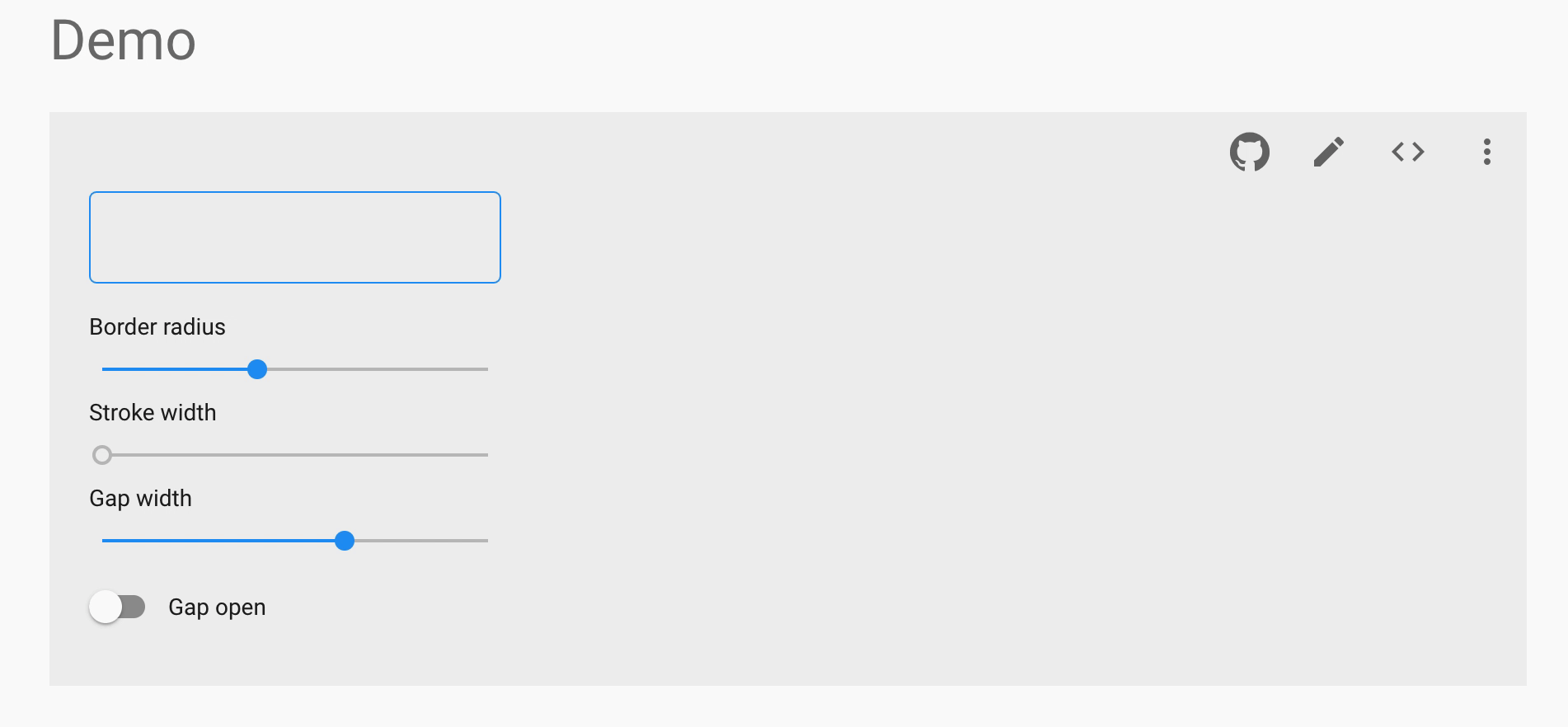
I must admit I'm a bit stumped on the styling and animations, however. Looks like the folks working on material-components-web say up-front not to use full width when styling an outlined text field, likely because of the need to recalculate the size. I'm curious to see if we can achieve this. Currently the field is cut off and I'm looking for solutions.
I'm also unsure of how to attain hover context from the notched outline, and I'm considering pointer events passed down from the form control, though this seems like a dangerous option. Looks like I can write a selector for an svg path inside the FormControl, but I'm still digging into how to do this.
Any pointers would be appreciated! 😄
mbrookes
commented
5 years ago @enagy27 It sounds like you're discovering some of the same challenges I had. 😄
FWIW, here was my first attempt at an Outline component: https://github.com/mbrookes/material-ui/blob/outline-component/packages/material-ui/src/Outline/Outline.js
As you say, the size has to account for the stroke-width. You might be able to use something from here.
I had a (very) work-in-progress integration with TextField, but it isn't worth sharing in its current state.
I hadn't solved the hover state yet, but would probably have started down the mouse-event route. I'm curious - what do you consider wrong with that?
enagy27
commented
5 years ago Thanks for that! Your text field is looking sharp!
That's a really good question, and I'm not sure it's not the right approach. I had a couple reservations about that- primarily that it may yield more coupling between the FormControl and its children. This isn't too big of an issue, but then I also got a bit discouraged when reading about the React16.4` pointer events API and its requirement for a polyfill.
After spending some time digging through MCW, I'm wondering how to achieve this restyling without broader implications for the existing text fields. It seems that the component hierarchy and styling choices made in Material-UI are ever so slightly different from MCW, and a more holistic realignment with their structural choices could help to simplify a push towards Material 2.0.
One key difference for the outlined text field is that in their implementation the <input /> field grows to fill the entire space, which is something my current implementation is not doing. If I can get that working, we could instead trigger a :hover on the input that correspondingly restyles the svg path.
Here's what the scope of work may include:
input to fill the container:hover selector the input (slight caveat that)svg sizing in place currently in favor of a design that follows the input field directly (my existing calculations are pretty tricky and seem unstable in the mid to long run)And, if it's not too much of a change:
div around InputLabel and InputThis last part seems to be a tall order, and possibly out of scope. Would love to get your thoughts on this plan, and if you think this is worthwhile or just scope creep. Thanks again for your help, I really appreciate it!
mbrookes
commented
5 years ago primarily that it may yield more coupling between the FormControl and its children.
Putting it on context with the others states is a loose coupling that will be ignored components other than NotchedOutline, so I don't think it's a big issue.
I also got a bit discouraged when reading about the React16.4` pointer events API and its requirement for a polyfill.
Do we actually need pointer events? (We don't use them anywhere else.) Wouldn't onMouseEnter / Leave be sufficient?
I have the input matching the size of the text field in mine, but for a different (and not entirely necessary) reason. I don't quite follow how that helps set the hover style for the SVG though?
I would leave the existing text field as is, matching the v1 MD spec. The v2 filled and outlined variants can be the v2 height.
What would the extra div be for?
enagy27
commented
5 years ago Right, I think that makes the most sense. I was thinking of the coupling that would be required by FormControl looking at its respective input, but I don't think that's necessary here, as the hover state could come from the top-level FormControl.
I think I'm overcomplicating the issue a bit here. I think there are a number of benefits that could be provided in providing that hover context to other descendants of the FormControl. I'll experiment a little with this implementation and see what I can come up with.
enagy27
commented
5 years ago @mbrookes Worked like a charm! Just added hover to the context as you suggested and started adding outline/multiline styles as conditional changes to avoid deviating from the M1 specification.
Currently working through getting multiline inputs to work, which looks pretty tough. And you were absolutely right on the div and events, and the rest- I'd gotten turned around a bit on this and was off in the weeds 😅
enagy27
commented
5 years ago Quick catalog of outstanding issues:
Select text is raised erroneouslyAlso in my last commit I missed the transition on the textarea border. This has since been fixed
mbrookes
commented
5 years ago Background color is required on multiline to show label properly
How come?
Did you find the example you mentioned being in the spec of no notch in a multiline outlined text field? I can only find a multiline filled which is not very helpfu. Outlined single and multiline should look the same (other than height) IMHO.
MCWs Textarea is a different (non-spec) component AFAICT.
Dynamically resized multiline text fields are not yet supported
"dynamically sized"?
enagy27
commented
5 years ago @mbrookes
For the background label, when the content of the input is filled and the content begins to move up and the scrollbar appears, it overruns the input label without zIndex: 1, backgroundColor: 'white'. Of course the alternative to this would be limiting the size of the input, but then the top of the input box would no longer be clickable in order to begin typing.
Sure thing! The link up top is what I'm referencing there. I've been following that.
In that case would you like me to omit multiline outlined text fields? They appear to be a sizable item, so perhaps it'd be best to leave this for another PR.
Oh, right, by dynamic I mean text fields where <TextArea /> is used (rows not specified, but rowsMax is set).
mbrookes
commented
5 years ago Ah, now I understand. Well, if the label was in the notch, it wouldn't be a problem. 😄Damned if you do, damned if you don't. 😖
The link up top
Ah, that isn't the spec - that's MCW, and while it's useful as a benchmark to see what others are doing, they sometimes go off-piste, like that Textarea component.
We prefer to follow the actual spec where possible. In this case, Multiline text field is discussed in the spec, but only a filled example is shown. To me that says the outlined multiline follows the outlined spec (other than number of lines of text, obviously 😄)
would you like me to omit multiline outlined text fields?
If we can make it work, then it would be good to finish up - it can be difficult for someone else to pick up all the context that you have in your head right now! If it proves too challenging, or will bloat the code, then yes, let's leave it.
enagy27
commented
5 years ago Gotcha! I wonder if google's designers working on material-components-web aren't contributing this back to the spec. Regardless, after seeing how tricky this is to implement, I think it'd be best to use a filled variant instead 😅
Hmm, that would be very tricky, but I admire your consistency. I was originally a little unnerved by the different look and feel of the multiline. You're suggesting moving over to notched on the outlined text field? I think that's unfortunately a very tall order, for the same reason that full width presents challenges. The major pitfall is in resizing the svg, but if we can find a way to do that, it would improve the implementation of fullWidth as well, which is also not implemented by material-components-web.
I think there's a solution in using the EventListener onResize, but I'm not sure it will be triggered. This might require ResizeObserver and a corresponding polyfill
enagy27
commented
5 years ago @mbrookes That did it! Now the multiline and full width fields are responsive! As long as that polyfill is alright with you, it seems that just the Select and <TextArea /> need some love
enagy27
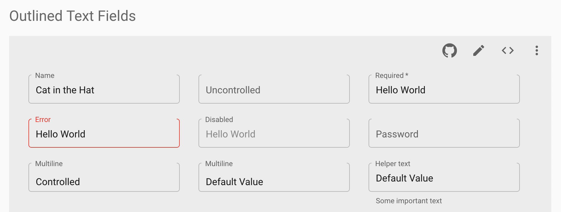
commented
5 years ago @mbrookes I think I've got everything in order and it's ready for another look! Quick question: how can I add the updated argos captures for the new text fields? Also, is the react-bootstrap example deviation acceptable?
mbrookes
commented
5 years ago @enagy27 The issue with the bootstrap example is that it points to a breaking change. If it breaks this example, it could break users customisations. CSS changes should be isolated to outlined styles.
Other than that, a few cosmetic things:
resize: none (no resize handle).error prop.enagy27
commented
5 years ago Awesome! I had not originally planned on animating the notch, but it's worth a shot- I'll take another look at your example and try to replicate.
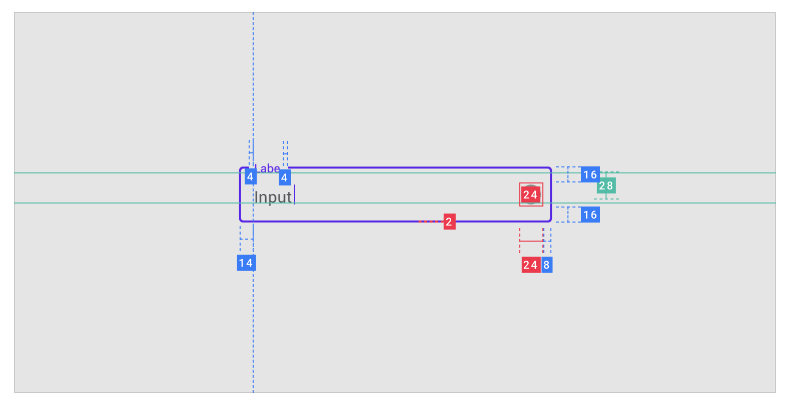
Quick question on your second point. In the spec I'm seeing an offset of the input from the helper text at the bottom, but an alignment with the label up top. The dimensions would correspond to 12px padding for helper text and 14px for the label and the input. Am I reading into this wrong?

mbrookes
commented
5 years ago No, you're right. Seems I misread the spec. I wonder why they don't have the Helper-text line up?
enagy27
commented
5 years ago @mbrookes I'm not quite sure 🤔
I'm having some trouble with your request on the focus state. I've switched over to something closer to your outline implementation, but this causes the svg to immediately re-render on focus, which creates a jump as the box renders from 1px to 2px, and the svg is animating around the center-line of the path. I don't believe there's any way to get the stroke-width property to animate in a given direction, from what I'm reading on StackOverflow.
The best solution then, I believe, would be to animate an inset svg in from opacity: 0. This seems like an inelegant solution, and I'm not sure the animation would look polished. The key issues here would be that it wouldn't properly illustrate the box growing, and also with the box growing inward-only, it would offset the position of the label.
I also spent a little bit of time studying how it's done in MCW hoping for some inspiration, and it looks like there they use a specially sized div that, when focused, fades out. The path then switches from transparent to opaque gradually as the div fades out to make it almost look like an inward fade. All of this seems to snap the corners pretty quickly and leaves the top notch grey until the very end of the transition.
Alternatively, I can accommodate the width of the svg more generally and account for its width by insetting the path according to the focused width, in which case both strokeWidth and focusedStrokeWidth would be properties to the element. That said, I wonder if keeping these details internal and not allowing for them to be changed is appropriate, given that insetting the svg too far would mean the label would be positioned incorrectly.
Taking all of this into account, I feel that it makes sense to keep the current implementation. I'm curious to know your thoughts and if you know of any workarounds to these hurdles?
mbrookes
commented
5 years ago I've switched over to something closer to your outline implementation, but this causes the svg to immediately re-render on focus, which creates a jump as the box renders from 1px to 2px, and the svg is animating around the center-line of the path.
I believe it's about the best compromise that can be achieved; unless you're zoomed in, the illusion is that the border grows inwards (click for full size):
(Ignore the missing top.)
I don't believe there's any way to get the stroke-width property to animate in a given direction
No, there isn't.
The notch animation is looking good. 👍
 ghost
commented
5 years ago
ghost
commented
5 years ago @mbrookes Oh, that looks great! Thanks for sharing that demo. I've made the appropriate changes to keep the svg drawing inside the lines 😃
ghost
commented
5 years ago @mbrookes All set for review :smile: I believe I've addressed all the outstanding issues, though selects may be a separate question. I've carried over the focused styling from the underlined field, but I'm unsure of how this component fits into the spec
 mudrila
commented
5 years ago
mudrila
commented
5 years ago @enagy-earnup Awesome job! Can't wait when I will be able to use it in my project :)
mbrookes
commented
5 years ago @enagy27 What do you think about having the default dimensions for Outlined match the spec? (280w * 56h)
ghost
commented
5 years ago @mbrookes sounds good! I've made those changes
ghost
commented
5 years ago @mbrookes Thanks for your review! I've addressed each of the items and reverted those components in question back to stateless functional components as their refs are no longer needed
mbrookes
commented
5 years ago @enagy27 Nice! Just one minor comment on the svg code, otherwise:
@oliviertassinari, our work is done here. 😄
ghost
commented
5 years ago @oliviertassinari could you take a look? I’m excited to get this out there 🙂
 oliviertassinari
commented
5 years ago
oliviertassinari
commented
5 years ago @enagy-earnup Definitely! I will find sometime before the end of the week :)
ghost
commented
5 years ago @mbrookes this might be worth another look. Since your approval I've fixed some issues with start and end adornments, and with autofill restyling which was overrunning the label and outline
mbrookes
commented
5 years ago LGTM. 👍 @oliviertassinari ?
enagy27
commented
5 years ago @oliviertassinari any recommendation on how to move forward?
enagy27
commented
5 years ago Implementation Notes:
strokeDashoffset cannot be negative. I've made changes accordingly and tested on Chrome and Safari iOSzIndex: 1, now this will only be done for a shrunken labelenagy27
commented
5 years ago @mbrookes any thoughts on caret color? It's not explicitly called out in the design specification, and its use is inconsistent in the docs. Each animated use of the filled and outlined variants use a regular caret, but the static images all use a caret color that reflects the current outline color
mbrookes
commented
5 years ago No strong preference, but I"d lean towards regular rather than outline color. It seems more natural for a cursor.
enagy27
commented
5 years ago @oliviertassinari trying to shepherd this through. Is there anything I can do to help you in your review?
oliviertassinari
commented
5 years ago @enagy27 I need to find some time between this pull request and the others to review it. Given it's a profound change with a lot of implications for an important component, it's typically something I want to do a deep dive into, probably this weekend.
 maulerjan
commented
5 years ago
maulerjan
commented
5 years ago Definitely a breaking change, I'm looking forward to use it in my projects right when available. Thanks for your good work!
mbrookes
commented
5 years ago @maulerjan, could you be more soecific regarding the breaking change?
 TheRusskiy
commented
5 years ago
TheRusskiy
commented
5 years ago @mbrookes may be he meant it in a good way
maulerjan
commented
5 years ago So far I had no other option than to use the MDC library from google as the outlined textfields are required at where I work. The problem is that the MDC library is terrible to work with (and use it within React). So this is a breaking change, at least for me. In a good way. Sorry if it came out wrong. :)
mbrookes
commented
5 years ago Ah, okay, @TheRusskiy was right then. 😄
A "breaking change" is normally something that when released requires changes on the user side for it to continue to work as before, for example a change in behavior, API or appearance.
Under SemVer, those are tied to a major release.
enagy27
commented
5 years ago @mbrookes I gave it a go. I'm pretty happy with the results 😄 please let me know what you think!
@oliviertassinari with the OutlinedTextField as a separate component in this manner, the resize-observer-polyfill will only be used for new consumers of the OutlinedTextField component, meaning that this would not impact existing TextField users. Is this an acceptable compromise?
One further step could be removing the observer from the OutlinedTextField and only setting its initial size, then exposing these props via OutlineProps for dynamic scenarios. Still brainstorming a more agreeable way to do this, as this probably wouldn't be a great developer experience.
Given how long this has been out, in may be best to save the majority of the resize work for a later date, and to listen for window resize in the meantime 🤔
enagy27
commented
5 years ago @oliviertassinari I've taken out the polyfill in favor of using <EventListener target="window" ... /> to save 2-3kB 😄 💪
Closes #11962