 eps1lon
commented
4 years ago
eps1lon
commented
4 years ago That looks fine to me. It's more of an issue with how overloaded the TextField is. It currently includes the Select component which requires the Popover, Modal, List etc.
Tree-shaking is working or otherwise you'd see a lot more components. You can verify this by just importing the Button.
 oliviertassinari
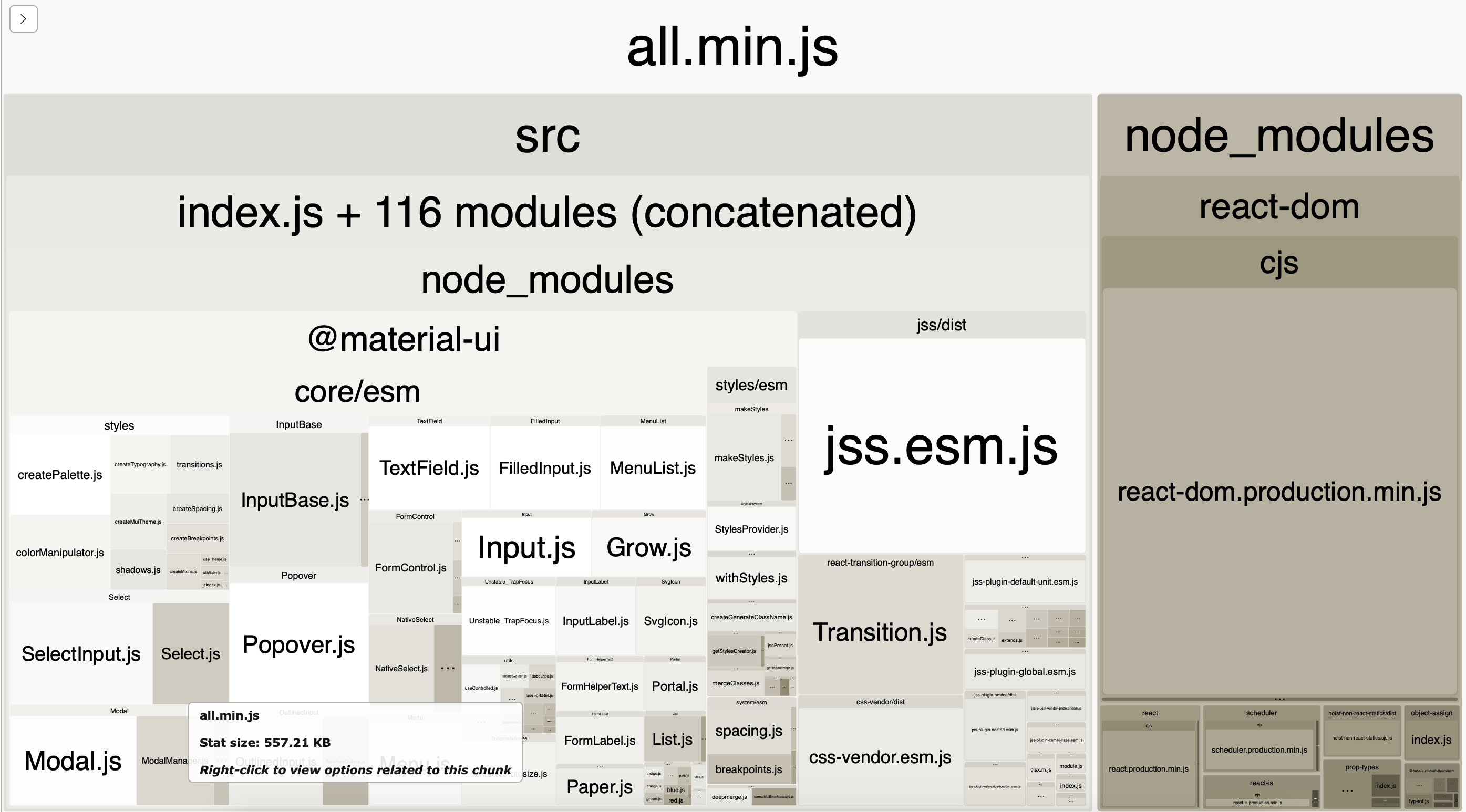
 lovelle-cardoso
 mj12albert
Minimum example of React Material-UI with the only TextField component imported - result bundle size is 250Kb!
https://github.com/pqr/react-mui-treeshake-does-not-work
webpack-bundle-analyzer shows everything is imported, nothing is tree shaked.
According to documentation https://material-ui.com/guides/minimizing-bundle-size/ tree-shaking should work, quote:
But as shown in this minimum example it does not work out of the box. I did several experiments, read through issues and StackOverflow and failed to find a solution.
Current Behavior 😯
Bundle size of minimum app with the only TextField imported is about 250Kb, everything is included into bundle (analized with webpack-bundle-analyzer
Expected Behavior 🤔
Bundle should not contain any code not related to the only imported TextField, tree shake to be working
Steps to Reproduce 🕹
Your Environment 🌎