What is the issue?
Open ghost opened 4 years ago
What is the issue?
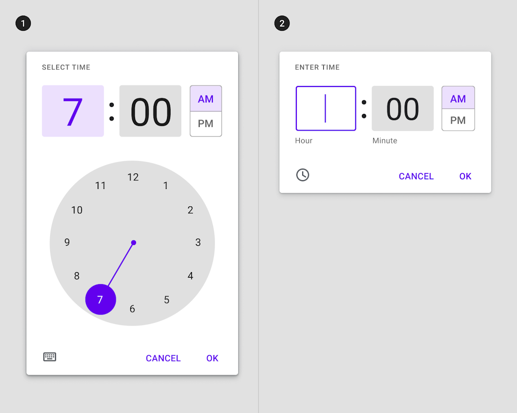
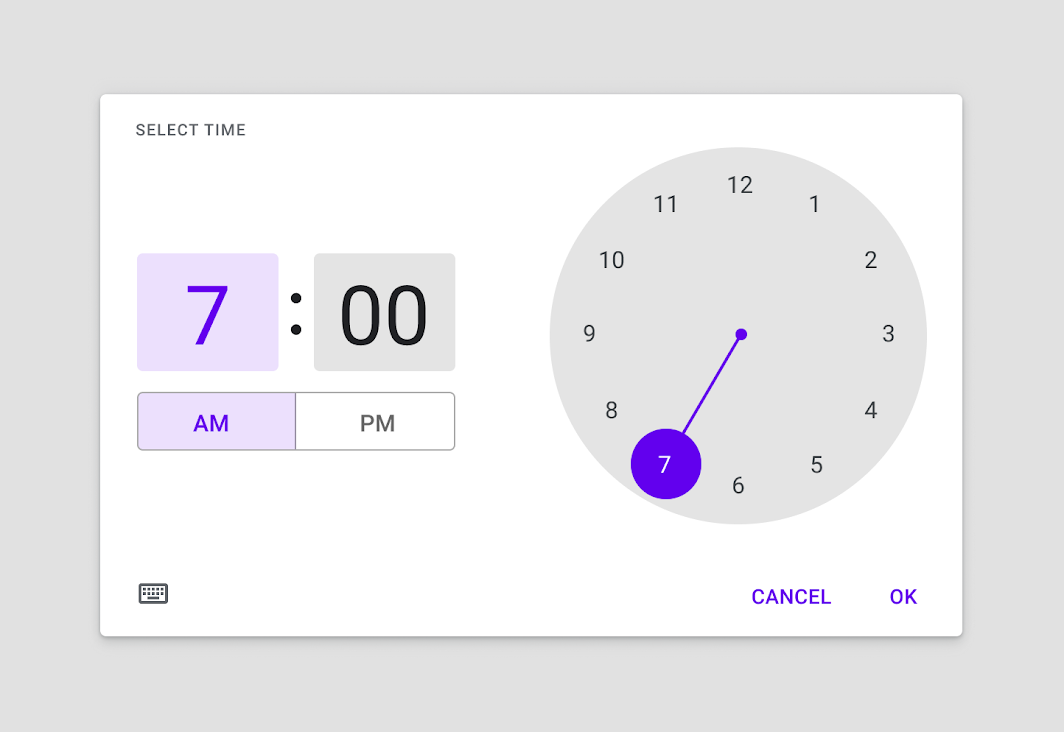
This issue is about the updated material design spec for time picker. Current implementation of time picker in material-ui is not updated to it.
It seems like they totally let the (design) Chaos Monkeys loose on this update 🤕
Agree, it looks ugly 🙈🤮 (at least with the palette color choices they have used for the demo). It's worrying.
Linking https://github.com/mui-org/material-ui-pickers/issues/1860. I feel that for a year or so material.io pushed some changes that are used in none of Google's products. In the case of the mobile time picker. We can wait for what they do with Android 12. Until then, I think that we should stick to Android 11 design.
I'll second the issue. Our users on desktop hate the sun dial design. They want a way to input time simpler, easier. The sundial method feels very much like its only meant for touch screens
I'm bumping this issue back as the new specs are implemented in Google Keep and Assistant Reminders (I can confirm from my Android phone even though it's only at Android 9). It seems going to be eventually rolled out across all apps then.
Ref: https://9to5google.com/2021/08/09/new-android-material-time-picker/
Current one
New Material Design Spec:
Two modes -
select&enterPotrait mode:
Landscape mode:
More info: https://material.io/components/time-pickers