mwaskom / seaborn

Statistical data visualization in Python
https://seaborn.pydata.org
BSD 3-Clause "New" or "Revised" License
12.57k stars 1.92k forks source link

Add percentages instead of counts to countplot #1027

Closed hnykda closed 8 years ago

hnykda commented 8 years ago

Hello,

I would like to make a proposal - could we add an option to a countplot which would allow to instead displaying counts display percentages/frequencies? Thanks

mwaskom commented 8 years ago

As of v0.13, normalization is built directly into countplot:

sns.countplot(diamonds, x="cut", stat="percent")  # or "proportion"

The recommendation is otherwise to use histplot, which has a flexible interface for normalizing the counts (see the stat parameter, along with common_norm), although its defaults are not identical to countplot so you'll need to be mindful of that. Here's an example:

sns.histplot(tips, x="day", hue="sex", stat="percent", multiple="dodge", shrink=.8)

Original answer (context for the rest of the thread):

This is already pretty easy to do with barplot, e.g.

import numpy as np
import pandas as pd
import seaborn as sns

df = pd.DataFrame(dict(x=np.random.poisson(4, 500)))
ax = sns.barplot(x="x", y="x", data=df, estimator=lambda x: len(x) / len(df) * 100)
ax.set(ylabel="Percent")
hnykda commented 8 years ago

Oh! y="x" was that missing piece! :D

IMHO it would worth to add this example somewhere in the docs.

Thanks

napsternxg commented 8 years ago

Unfortunately, this doesn't work if both x and y are non_numeric. I get the following error:

sns.__version__
'0.7.0'
ax = sns.barplot(x="name", y="name",
                 estimator=lambda x: len(x),
                 data=df, color="grey")
/PATHTO/anaconda2/lib/python2.7/site-packages/seaborn/categorical.pyc in infer_orient(self, x, y, orient)
    343         elif is_not_numeric(y):
    344             if is_not_numeric(x):
--> 345                 raise ValueError(no_numeric)
    346             else:
    347                 return "h"

ValueError: Neither the `x` nor `y` variable appears to be numeric.
mwaskom commented 8 years ago

Pass orient="v" to avoid the attempt to avoid inferring the orientation, or pass any numerical column to y (it doesn't have to be the same as the x variable).

hnykda commented 8 years ago

Sorry for opening this again, but it seems that the provided solutions doesn't work with hue parameter. Is there some other tweak fixing this?

mwaskom commented 8 years ago

Can you be specific about what "didn't work"? If you look at the code, you'll see that all countplot is doing is making a barplot with a len estimator and the same variable used for x and y, so it's not obvious to me what your problem might be.

hnykda commented 8 years ago

I should have been more specific, sorry for my stupidity... I currently can't replicate the problem, so never mind.

beniz commented 7 years ago

The example above does not work for me, somehow it plots a flat distribution whereas df is correctly populated with the Poisson samples. Using 0.7.1 from pip.

gandhis1 commented 7 years ago

I do agree this would be a great example for docs.

beniz commented 7 years ago

To be very honest, more than that, having a percentage option right within countplot would clear this issue once and for all, and given the number of entries on stackoverflow, it'd be great :)

As an OSS project maintainer myself, I definitely know how annoying these requests can be. @mwaskom if I were able to fix this myself in decent time, I would PR, but I can't event get it to work ^^.

mwaskom commented 7 years ago

It is not so obvious because different people will want different behaviors in the context of hue nesting and faceting. However it should always be possible for people to make the plot they want by defining the heights and using barplot. I would be happy to advise but as stated above, it is impossible to know what your problem is from saying "it does not work for me".

rselover commented 7 years ago

I'm having trouble reproducing @mwaskom's original response with my own dataset.

A big part is I don't understand the logic of y="x" and am also confused by the use of x in the lambda function vs x="x". Can you elaborate?

Furthermore, I'm having trouble porting this to a Facetgrid (which works great with countplot, just don't have proportions).

Here's an example of what works -

g = sns.FacetGrid(df, col="Cluster_3_0") g.map(sns.countplot,x=df['zone_number'],

y=df['zone_number'],

  #estimator=(lambda x: len(x) / len(df) * 100),
  order=([1,2,3,4,5,6,7,8,9,10,11,12,13,14,15,16]))

When I uncomment y & estimator, (or even just y), the kernel crashes after several non-responsive minutes.

mwaskom commented 7 years ago

In my original response, I used barplot, not countplot.

rselover commented 7 years ago

Right, sorry for the confusion - like the OP, I want a "countplot" with percentages rather than raw counts. I'm trying to access this functionality through barplot as you recommended, but as described, I have a few fundamental questions about the workflow.

mwaskom commented 7 years ago

The example code you posted used countplot. I can't help you any more than that without an example I can reproduce.

rselover commented 7 years ago

Can you explain from your original example -

ax = sns.barplot(x="x", y="x", data=df, estimator=lambda x: len(x) / len(df) * 100)

  1. Why is y="x"?

  2. estimator=lambda x: len(x) / len(df) * 100 - OK x has been used a few times here, in your example it makes sense, but are we talking about the same x as x="x" and y="x"?

If I understood the answers to these two questions, I could move forward solving this on my own.

Thanks so much for your time and attention.

mwaskom commented 7 years ago

y can be anything since you're not using the values, you're just counting how many there are. As stated above, the actual code for countplot is short and instructive as to what's going on. For your second question, no, the name used for the function parameter is arbitrary (as is always the case).

joakimlustig commented 7 years ago

I have a similar problem. I want to create a plot like below but with percentage levels for each year instead of counts:

sns.countplot(x="year", hue="method_pred_level", data=df) plot

I have tried the barplot approach suggested to no success, probably since I'm using hue. How can I achieve this with seaborn? Seems like a normalize-parameter for the countplot would have been great in this use case.

neutralrobot commented 6 years ago

Honestly, I think some way to handle percentages well would be an excellent quality of life addition. The proposed trivial solution, when "hue" is added, does not perform as I would naturally hope: image turns into: image I compare this to ggplot in R:

p5 <- ggplot(all[!is.na(all$Survived),], aes(x = Pclass, fill = Survived)) + geom_bar(stat='count', position='stack') + labs(x = 'Training data only', y= "Count") + facet_grid(.~Sex) + theme(legend.position="none") p6 <- ggplot(all[!is.na(all$Survived),], aes(x = Pclass, fill = Survived)) + geom_bar(stat='count', position='fill') + labs(x = 'Training data only', y= "Percent") + facet_grid(.~Sex) + theme(legend.position="none") plot_grid(p5, p6, ncol=2)

In its context this yields: image

The stacked bars might be overkill, but the general point remains that seeing these makes it easier to evaluate percentages between categories at a glance. The first set of images was from my efforts to divide the ages up into discrete categories based on their different survival rates in Kaggle's Titanic dataset. I based this off of observations with distplot, but there was a little bit of guesswork in the exact cutoff lines and when I looked at various graphs using countplot, it would have been really convenient to be able to stretch them into normalized values as the R output does above, without having to figure out the best way to do it myself from the bottom up.

I'd like to propose the possibility that the most headache-free way to do this might be:

  1. Pass a value into countplot, something like, 'percent=True'
  2. If hue is not specified, then the y axis is labeled as percent (as if sns.barplot(x="x", y="x", data=df, estimator=lambda x: len(x) / len(df) * 100) had been called)
  3. If hue is specified, then all of the hue values are scaled according to percentages of the x-axis category they belong to, as in the graph on the right from R, above.

Does this make sense?

mwaskom commented 6 years ago

That's certainly one way to do it. But it is by no means the only way to do it. What if someone wants to have both x and hue but normalize so all bars add up to 1? Or what if they want to use facets? The challenge, which might not always appreciated by a userswho is focused on their particular use-case, is coming up with a suitably general API.

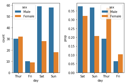
That said, I think people are somewhat forgetting that, while it can be convenient to be able to pass a full dataset to a plotting function and get a figure in one step, pandas is quite useful. It's really not very difficult to generate the plot you want, exactly the way you want it, with just one more step external to seaborn:

df = sns.load_dataset("tips")
x, y, hue = "day", "prop", "sex"
hue_order = ["Male", "Female"]

f, axes = plt.subplots(1, 2)
sns.countplot(x=x, hue=hue, data=df, ax=axes[0])

prop_df = (df[x]
           .groupby(df[hue])
           .value_counts(normalize=True)
           .rename(y)
           .reset_index())

sns.barplot(x=x, y=y, hue=hue, data=prop_df, ax=axes[1])

image

You can even do this in one method chain, saving a temporary variable name, if that's your preferred style:

(df[x]
 .groupby(df[hue])
 .value_counts(normalize=True)
 .rename(y)
 .reset_index()
 .pipe((sns.barplot, "data"), x=x, y=y, hue=hue))
neutralrobot commented 6 years ago

I appreciate the response. And naturally it's not the only way to do it. And I can also appreciate the difficulty in finding where to draw the line for a suitably general API. Had I not seen the R snippet above and also stumbled across this discussion thread, I would probably not have bothered to say anything. But It looks to me like having some kind of normalized rendition could be a pretty generalized need. (I notice that ggplot outputs these values with

y="Percent"

but still gives normalized values on the graph. I doubt it throws anyone for too big of a loop. Or am I misunderstanding how you propose that normalized values are obtained?)

I may be completely wrong in my idea that this is a reasonably generalized desire, and I'm not sure if there's a good way to find out, though this thread and stackexchange are suggestive at least. I posted because the ggplot inclusion of this functionality was also suggestive to me that it is of general use. My inexperience with ggplot may mean that there's something important I'm missing.

I can also appreciate the argument that this can be done in basically a one-liner in pandas. But I find this line of reasoning a little strange, because of the inclusion of countplot in the first place. I've only had a glance at the code for countplot and haven't fully wrapped my head around it, but am I right in my understanding that countplot is basically a special case function implementing the same underlying plotting functionality as barplot? This is what confuses me: surely it would be even more trivial to pass counts into barplot than it is to pass percentages or normalized values. So why include countplot? This is part of what I really like about seaborn.

Anyway, It's possible that this "quality of life" handling of percentages out of the box is not worth the effort. Honestly, I don't know. Would it be worth including the code snippet above as an example in countplot? I guess I might just write some wrapper function that performs as desired, but I have to think that something like this would interest more people than just me.

Edit: Another idea might be to include something like 'scaling' as a passed parameter in countplot and factorplot. It would take a function, similar to the 'estimator' parameter in barplot, and scale the counts according to that function. Maybe this would be generalized enough while also being convenient enough. I guess things like gaussian distributions would be trivial to do then also, for example?

emigre459 commented 6 years ago

I was able to get the early barplot code from @mwaskom to work for visualizing the distribution of a categorical variable with a small DataFrame, but when working with a DataFrame that has millions of rows my kernel seems to freeze up.

What's odd is that countplot has no issue and runs in under 2 seconds for the same dataset. Any ideas why that might be the case?

mwaskom commented 6 years ago

You probably want ci=None.

emigre459 commented 6 years ago

That did it, thanks for the tip!

ishant21 commented 6 years ago

You can use a=((df_ffr.name.value_counts()/df_ffr.name.count())*100)) then print 'a'

here 'name' is name of column of data frame 'df_ffr'

danielkurniadi commented 5 years ago

@mwaskom You're a Goddamn hero! The percentage bar plot is what I need...

amueller commented 5 years ago

Not sure if this was answered earlier, but @neutralrobot's plot can be generated with

df = sns.load_dataset("tips")
props = df.groupby("day")['sex'].value_counts(normalize=True).unstack()
props.plot(kind='bar', stacked='True')

image

gupta-rajat7 commented 5 years ago

@amueller is there any easy way that allows adding lables of count values for each of the bars in the plot listed above? I have a requirement where chart should be plotted using % axis, similar to above but it should also include count labels. Thanks for your response.

Divjyot commented 4 years ago

Maybe this would help anyone : I have been trying to add label percentages and totals to count plot and here is how I have done:

def get_totals_dictionary(ax):
    labels = ax.get_xticklabels() # get x labels

    heights = [(x.get_x(), x.get_height()) for x in ax.patches]
    print('heights s1', heights[::len(labels)])
    print('heights s2', heights[1::len(labels)])
    response = dict()
    for x, y in zip(list(heights)[::len(labels)], list(heights)[1::len(labels)]):
        print(x, '-', y)
        response[x[0]] = x[1] + y[1]
        response[y[0]] = response[x[0]]

    print(response) 
    return response
def countplot(x_, hue_, data_, figsize_):
    plt.subplots(figsize=figsize_)

    if hue_ is None:
        ax = sns.countplot(x=x_, data = data_)
    else:
        ax = sns.countplot(x=x_, hue=hue_, data = data_)        

    labels = ax.get_xticklabels() # get x labels
    patch_totals = get_totals_dictionary(ax)
    patch_i = 0
    for p in ax.patches:
        ax.annotate('{:.2f}% ({})'.format(p.get_height()*100/patch_totals[p.get_x()], p.get_height()),
                    (p.get_x() + p.get_width()/4, p.get_height()+2))
        ax.set_xticklabels(labels, rotation=0) # set new labels
        patch_i +=1

I have been in middle of doing this can saw this post (the code have some prints-ignore them). Anyhow, this is what I have got titanic dataset from Kaggle...


Male_Female_Survival

PClass_Survival

Important lesson learnt! Male 577 : 468 + 109 Contrary to my intuition that the patches are sorted as seen in chart, they are NOT. Infact the patches are sorted as category wise i.e. if there are two categories (or classes in this case M and F) then patches list is [patch_1_cat_1, patch_2_cat_1, patch_3_cat_2, patch_4_cat_2] but we see them as [patch_1_cat_1, patch_2_cat_2, patch_3_cat_1, patch_4_cat_2]

You can look at my notebook here for more details.

I hope this helps anyone in need.

mwaskom commented 4 years ago

With https://github.com/mwaskom/seaborn/pull/2125:

tips = sns.load_dataset("tips")
sns.histplot(tips, x="day", stat="probability")

image

tips = sns.load_dataset("tips")
sns.histplot(tips, x="day", hue="sex", stat="probability", multiple="dodge")

image

tips = sns.load_dataset("tips")
sns.histplot(tips, x="day", hue="sex", stat="probability", multiple="fill", shrink=.8)

image