napari / napari

napari: a fast, interactive, multi-dimensional image viewer for python
https://napari.org
BSD 3-Clause "New" or "Revised" License
2.06k stars 406 forks source link

GUI element to set layer transforms (scale/ translate) #3975

Open sofroniewn opened 2 years ago

sofroniewn commented 2 years ago

🚀 Feature

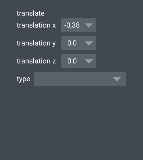
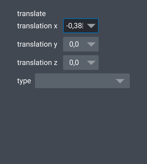
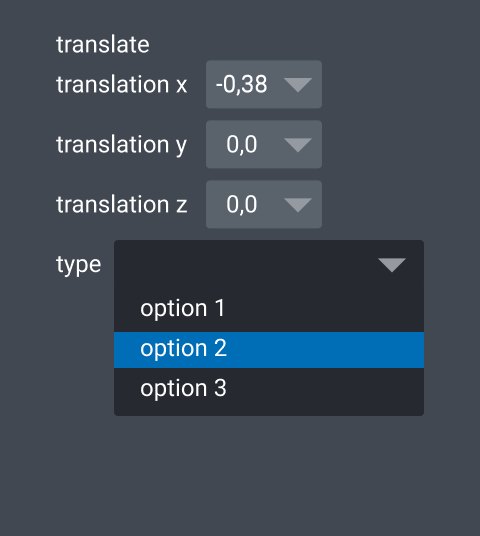
Layer transforms - in particular scale and translate should be settable via GUI elements

Motivation

GUI users want to be able to set layer scale and translate too.

Pitch

There should be some dialog, combobox/ textbox? that allows the properties of the layer transforms to be set. these include scale and translate, but could also include rotation, shear, or a full affine

Alternatives

These are only settable via the API, which limits GUI users

Additional context

Curious which layer transform properties need to be exposed? Is it just scale/ translate - or also rotation, shear, affine etc. What do @jni @andy-sweet @JoOkuma and others think?

Maybe this is something @isabela-pf can begin some design work for and then @ppwadhwa could implement when we have a design

sofroniewn commented 2 years ago

from @tlambert03 in zulip

my first thought of a place for it is: 1) a new item in the layerlist context menu. right-click and it brings up a widget to modify the affine info 2) an as-of-yet-uncreated Layer menu, that would provide similar access to all of the stuff in the context menu. (let's start with the context menu maybe, will be easy to add there later)

JoOkuma commented 2 years ago

I'm in favor of exposing only scale, translation, and maybe rotation. From my experience shear and affine are more complex and are usually computed programmatically.

sofroniewn commented 2 years ago

Yeah, I'll flag I think the most challenging aspect of this design will be how to handle the "nD" data case. Do we want one combobox per axis? Can we use a simple QForm? Does the ideal solution for dim < 5 look different then ideal dim >= 5 (h/t @tlambert03). Just some questions that aren't clear to me

isabela-pf commented 2 years ago

Thanks for the @! I'm totally unfamiliar with this part of napari, so I've been reading the docs to get a better sense of layers and these transformations. I first have some questions to make sure I'm working in the right direction.

  1. In the pitch, @sofroniewn mentioned that

    There should be some dialog, combobox/ textbox?

Is there a reason this needs to be outside of the layer controls (maybe the "nD" case you mentioned above where it could make the layer controls very long)? My early thoughts are that a combobox in the layer controls might be a good fit.

  1. Do these parameters exist with some kind of null value before a user decides to transform it, or does the parameter get added to a layer once a user chooses so? I think this might determine whether this UI is persistent or if it only appears once it belongs to the layer?
  2. Scale and rotate seem to have operations per dimension of the image. Does translation operate the same? (If so, it isn't mentioned in the layers API reference.)
  3. Translated layers are translated relative to other layers (as mentioned in the image layer tutorial). Is there a unit that's important to these relative distances?

P.S. if anyone wants to show off their super cool layer transformations or something I'd be happy to schedule time to watch how people use this in the wild.

andy-sweet commented 2 years ago

2. Do these parameters exist with some kind of null value before a user decides to transform it, or does the parameter get added to a layer once a user chooses so?

They get default identity-like values if they are not specified. E.g. image = Image(np.ones((64, 128)) will create a 2D image layer where image.translate == [0, 0] and image.scale == [1, 1].

3. Scale and rotate seem to have operations per dimension of the image. Does translation operate the same?

Yes, there's a translation value per dimension.

4. Translated layers are translated relative to other layers (as mentioned in the image layer tutorial). Is there a unit that's important to these relative distances?

No units (yet). The translations are actually relative to a fixed origin that all layers share - each layer's translation values kind of specifies an origin for that layer. But you can set those values to describe relative translations between layers.

@isabela-pf : I also highly recommend running napari examples/interaction_box_image.py, which should give a familiar graphical interaction scheme (e.g. powerpoint) for translating, scaling, and rotating a layer (in this case an image layer).

sofroniewn commented 2 years ago

Is there a reason this needs to be outside of the layer controls (maybe the "nD" case you mentioned above where it could make the layer controls very long)? My early thoughts are that a combobox in the layer controls might be a good fit.

Yeah my fear here is that the layer controls will just get too long and crowded. This is also functionality that will work with all of our layer types. We might need a new "transform widget"

sofroniewn commented 2 years ago

@MBPhys has done some cool work on cropping/ adjusting scales/ translates here https://www.napari-hub.org/plugins/napari-nd-cropper we should maybe think about folding this into core or make people aware of this. See the widget on the right. It scales to nD too I think - @MBPhys let me know what you think

Screen Shot 2022-02-02 at 9 10 29 AM
isabela-pf commented 2 years ago

In this comment, I have two things I’m proposing UI for:

  1. the new UI needed for translate and scale specifically
  2. an updated UI for layer controls (to better accommodate an increasing number of layer controls appearing in the viewer)

1. translate and scale UI

Full disclosure, this is the part I’m least confident in. I’ve read what I think are the attributes of each on the API reference. I also referenced the screenshot of @MBPhys’ plugin posted above for translate.

I expect I’ve missed (or misunderstood) something along the way, though, so please let me know what else I should be accounting for.

translate

As far as I can tell, this has two properties (is there a more accurate word for this?) to account for.

First, a translation value per image dimension (three shown here) as a drop down combo box. This means users may manually type in a value, or select from standard values. I felt like this allowed for the same amount of control as the sliders pictured above, but would also show a range of valid values without needing to move a slider to both extremes.

Translate Translate-1 Translate-2

Second is type. Type is a standard drop down. I do not know what options go in here at all; I chose a drop down because the options sounded discrete.

Translate-3

scale

The only value I found for scale was the scale factor. I matched this pattern to an existing UI I found in the default labels layer controls. Like its inspiration, numbers can be typed in manually as well as manipulated to whole numbers with the plus and minus buttons.

Scale Scale-1 Scale-2

2. layer controls more broadly

Quick notes that apply to all layer controls mockups:

Tabs

Perhaps the most familiar option, this adds a list of layer controls as icons to a sidebar. I do expect we’d need some kind of overflow section for this long term. All layer controls available for that layer could appear by default.

https://user-images.githubusercontent.com/50221806/152449354-c941e5cb-51a0-427f-8c0e-8d4445d63cae.mov

Drop down

Instead of making space on the UI for the many layer controls I expect will eventually become available in the viewer, you could switch controls via a drop down. This is similar to the Adobe workspace switcher we discussed at one of the community meetings (example shown from InDesign):

unnamed

Screen Shot 2022-02-03 at 3 33 41 PM

This might scale better in terms of UI real estate since drop downs often have a scroll, or even a search to accommodate long lists.

https://user-images.githubusercontent.com/50221806/152449371-578dcdaf-43ec-4240-85a9-2ff91b24396f.mov

“Add layer control”

This version is a list of layer controls that can be expanded/collapsed. The key change is that not all layer controls are visible in the list by default. Users add layer controls they want to see for that layer by searching and selecting in the top input box.

https://user-images.githubusercontent.com/50221806/152449464-8ccc26f8-4680-41d7-baa0-7b56ff3e345b.mov

This behavior was inspired by Adobe AfterEffects, where all components on screen have a set of (very many) default properties that do not appear on screen until the user chooses to either expand that component or edit that property any way. I think this can reduce the cognitive load of having so many options on a screen by default by prioritizing what the user is actually working with.

Screen Shot 2022-02-03 at 1 45 12 PM Screen Shot 2022-02-03 at 1 48 15 PM

All layer controls would still be discoverable because they appear in the input box list.

To avoid users having to add a control one-by-one, we may want to have an add all layer controls option (or something similar).

isabela-pf commented 2 years ago

I got feedback on the above proposal at one of the community meetings. Here's a summary:

Decisions made

Next steps

MBPhys commented 2 years ago

@sofroniewn

Thanks. This would be cool in core:) Just for clarification There a two plugins:

  1. nd-cropper with four modes seeing the attached video

https://user-images.githubusercontent.com/83079938/152886129-6f1e942b-4cca-4ed4-82d3-a6464ffa6ad5.mp4

This works in nd for all modes except the interaction box. Perhaps, we can update this into the nd-space in the future. The nd-cropper works in data-space, but take into account the world representation.

  1. Partial-Aligner This plugin is created in order to affine transform images and parts of images just in 2D and 3D. This enables affine registration of images and deformable registration via selecting just parts of images (look at the Readme and the attached videos) For 2D, we have also a Drag&Drop solution seeing attached video Furthermore there are two modes, too: 1. With Slider, 2. Absolute values (Spinbox) and we record the values for each layer. The user can switch between the two modes very intuitively. We added this, because we noticed and got feedback that a slider itself is too difficult to control for only very small translations/scales/... for instance

https://user-images.githubusercontent.com/83079938/152887745-edbe4db6-3aab-4108-b875-0257fe4e1c3b.mp4

https://user-images.githubusercontent.com/83079938/152887750-3dedbc65-1607-43a1-bf9e-cd892bea6902.mp4

All this happens in the world space. In order to convert the world to the data space, I wrote the World2Data plugin.

I think napari makes it very good to push unique the data representation with the metadata to a world space (where image registrations lives, too) and separate the underlying data into a data space. Nonetheless my expression was in the past that many peoples ( in particular GUI users), who are not so familiar with this concept, are very confused unfortunately... Therefore I think, it is a very good idea @sofroniewn to make people aware of this and show the people the advantages of this. Do I understand this here correctly @sofroniewn?

Altogether this means just to notice that the Partial-Aligner do not fit to the nd-space, since shear/rotations will be very complex in nd and was not necessary for our and other real-life applications.

However I think that there are no problems to just extend the translation/scale to nd. In my opinion, there should be two modes for the users (SpinBox and Sliders) selecting by own preferences and their related tasks

@isabela-pf I love your solution and layout :smiley: Very beautiful. To add a mode with a slider should not be very complicated, or? What do you think about? Is this an opportunity?

isabela-pf commented 2 years ago

To add a mode with a slider should not be very complicated, or?

I think a slider works fine. I think you'd know better than I what the most useful interaction is, so I'll defer to your advice. Thanks for asking @MBPhys!

What I showed was me thinking that sliders seem like they don't allow for quite the degree of fine-tuning that some of the other options have, but based on how many are currently in napari viewer and your plugin, I think it's the best option here.

ppwadhwa commented 2 years ago

Hi! From what I see above, it looks like we want tabs in place on the layer control panel, so I was going to start getting those in place with the translate and scale options added. If anyone has any objections to that, please let me know! thanks. :)

isabela-pf commented 2 years ago

@ppwadhwa that sounds correct to me! I have some time freed up from bundled app issues, so I will put it on my list to make some more relevant mockups incorporating the latest feedback. I think this will make will make it clear how we want scale and transform to be represented specifically.

dalthviz commented 5 months ago

Hi there, I gave this a check and started exploring adding a slider/spinbox per value in the scale attribute over the layer controls. The controls could look something like the following:

![scale](https://github.com/napari/napari/assets/16781833/a8763949-4340-4773-a325-bd1687906651)
![scale_2](https://github.com/napari/napari/assets/16781833/ddfecc93-4f63-4564-9605-2467e708d91c)

Where the label before the spinbox/slider widget marks the dimension the slider/spinbox affects.

Also, my guess is that a similar approach can be used to create controls for the translate property?

Edit - Implementing a popup widget for the scale following the contrast limits control functionality could look something like this:

![scale_popup](https://github.com/napari/napari/assets/16781833/25927355-0220-4dfa-b7c0-e119ba7d3678)

Edit 2: A branch with the described controls (using sliders) - https://github.com/napari/napari/compare/main...dalthviz:napari:scale_controls

dalthviz commented 1 month ago

Hi there, thinking again about this, maybe adding a button for the Transform mode could help too? I think the mode is already accesible via keybindings so maybe having it as an actual button could be useful? For example, with an image layer which transform mode is activated pressing 2, you could have something like:

transform_mode

Czaki commented 1 month ago

Using API you could easily reset view. Interface should also allow reset transforms.

psobolewskiPhD commented 1 month ago

I like the idea of a way to activate transform mode from the GUI--I bet a lot of people don't know it exists. Not sure every layer needs its own button vs. a viewer button at the bottom? 🤔 Not sure there's room really. But maybe in the layer controls is better, since most of the other layers already have the double-arrow for Pan/Zoom...

dalthviz commented 1 month ago

Using API you could easily reset view. Interface should also allow reset transforms.

Maybe having then the button but also a control? So, using as an example the scale attribute from the affine transform:

transform_mode_scale_controls

Not sure every layer needs its own button vs. a viewer button at the bottom? 🤔

Since the button activates a mode and also the given shortcut is the last number in the sequence from the modes a layer offers, probably makes sense to put it over the layer controls around the buttons for changing modes. For example, over a Shapes layer (where the transform mode is activated with 7 via keyboard) you could see something like:

transform_mode_scale_controls_shapes

Also, seems like the transform mode uses the layer affine attribute (physical2world transform) while the individual layer attributes like scale, translate, etc use the data2physical transform. I don't really know the difference between using one or the other 😅 but probably something to check

psobolewskiPhD commented 1 month ago

Yeah, thinking further it's per layer so the layer controls makes the most sense.

I can't say I love the scale sliders in the layer controls -- feel like something that should be in its own widget and more thought as to how to expose? I think the first step would be a button to activate the transform mode. And then some way to reset the transforms -- maybe Alt-click the butto -- with a confirmation dialog? 😬

dalthviz commented 1 month ago

I can't say I love the scale sliders in the layer controls -- feel like something that should be in its own widget and more thought as to how to expose?

Something to further think about for sure :+1:

I think the first step would be a button to activate the transform mode.

Makes sense to me :+1:

And then some way to reset the transforms -- maybe Alt-click the butto -- with a confirmation dialog? 😬

I thought about a similar idea, although more like a right-click or something that shows the pop up with the reset option. So something like:

scale_reset_popup

Will try to explore the alt-click idea too :+1:

andy-sweet commented 1 month ago

Also, seems like the transform mode uses the layer affine attribute (physical2world transform) while the individual layer attributes like scale, translate, etc use the data2physical transform. I don't really know the difference between using one or the other 😅 but probably something to check

The intent was to separate out the transforms associated with the pixel/sample space (data2physical, similar to ITK's spacing) and then a transform applied on top of that (physical2world) which might align on image with another.

In the long term, I think napari could benefit from a more flexible approach allowing any chain of transforms (including 0 or 1 transforms), but that asks more complicated design questions too.

jni commented 1 month ago

yeah, one thing I will say is that these shouldn't be "always on" in the layer controls, because e.g. you could have a 5D image so that's a lot of vertical space when you account for scale, translate, and rotate.

This could be something that uses @andy-sweet's metadata plugin and is included in builtins, perhaps — that is, it opens in a new side panel rather than be part of the standard controls. Either that or it's a collapsible section, I guess. Either way, it's going to be tricky to make the layout look good and be flexible for any number of dimensions...

dalthviz commented 1 month ago

Just in case, some further exploration of the transform mode button idea using an alt-click/right-click to show a way to reset the transform. Checked with a popup and a dialog showing both a similar set of reset buttons (for scale, rotate and translate properties as well as a full reset):

scale_reset_popup

scale_reset_dialog

psobolewskiPhD commented 1 month ago

I like the contextual style menu a lot better than the floating dialog. I think that looks pretty good. I think if it's to make a menu, it should be a right-click. This is just the most intuitive thing for a contextual menu. The other option is a simple option-click the button to reset everything -- boom!

Either way I think the first pass should be to expose the layer transform mode in the layer tools (analogous to the keybinds being in each layer) and then we can think about enabling more granular widgets that let you use a slider or such to control the rotation, vs. just rotating stuff.

I do think this is pretty high value stuff for people working with multiple modalities of the same "stuff".

dalthviz commented 1 month ago

The other option is a simple option-click the button to reset everything -- boom!

Oh I think I now understand the dialog idea you had! So showing after and alt-click something like:

scale_reset_dialog_confirm

right?

Either way I think the first pass should be to expose the layer transform mode in the layer tools (analogous to the keybinds being in each layer) and then we can think about enabling more granular widgets that let you use a slider or such to control the rotation, vs. just rotating stuff.

I do think this is pretty high value stuff for people working with multiple modalities of the same "stuff".

Will try opening a PR adding the transform mode button then :+1: Not totally sure if there are any other ideas for the reset behavior besides the alt-click with dialog confirmation or righ-click popup with reset buttons or option-click full reset (and probably worthy to note that it's possible to have all of those alternatives at the same time too) so maybe doing some more exploration over that could be worthy

jni commented 1 month ago

Just to clarify, the pan-zoom icon is not the proposed final icon for transform? I find it too overloaded. Having said that I'm not finding a great one. swap? rotate? expand? rotate inside an expand?

psobolewskiPhD commented 1 month ago

Yeah, that's basically it @dalthviz as a simpler alternative. And 💯 with @jni that there needs to be a good icon for transform mode. Here's a couple I saw: https://fontawesome.com/icons/group-arrows-rotate?f=classic&s=solid (and related) the pivot table ones (lol) kinda look like resize and rotate: https://fontawesome.com/icons/table-pivot?f=classic&s=duotone

dalthviz commented 1 month ago

Regarding the icon, I put the current one shown in the previews as a place holder using the available icons and following the names for icons available (so putting for the pan-zoom button the pan_zoom name which make available the pan name), but I think too that a better icon should be defined. Maybe @isabela-pf could suggest icon alternatives and in general give some feedback/new ideas about what has been discussed

isabela-pf commented 1 month ago

Hi there! The most common icon I have seen used for transform features is similar to the one we currently use for adding a rectangle on a shape layer (rectangle with vertices marked). Keeping something that references the handles in the transform controls would be my recommendation, but I think it will be a balance to differentiate it from the existing rectangle icon.

My first proposal is branching from the previously mentioned expand icon, adding the handles back in for transforms, and turning it on its side to reference the rotation element.

And here it is in @dalthviz’s image from above (thank you for that!) to see it in context.

Let me know if this seems like the right idea or not. I’ll export it as a proper SVG when we make a decision.

psobolewskiPhD commented 1 month ago

I like that, it's simple. Being a diamond evokes rotation to me.

isabela-pf commented 4 weeks ago

I got some feedback off the issue and want to throw another potential icon into the ring. This one is built from existing iconography, but it distinguishes itself from the add rectangle by including the cursor. If matching the existing icons is the greatest priority, I'd recommend this version.

And here it is in @dalthviz’s image again to see it in context.

psobolewskiPhD commented 3 weeks ago

Ooo! I like that one too, the cursor indicates interaction!

dalthviz commented 3 weeks ago

Thanks @isabela-pf for bring up more options! From my side both icons look nice but indeed the second one kind resembles more how other icons available look (in fact I would say it reminds me the buttons in the Shapes layer) :thinking:

Just in case, here a preview to contrast icons when you have a Shapes layer:

Option Preview
imagen
imagen

Maybe we should link this over Zulip or some other place to get more feedback?

psobolewskiPhD commented 3 weeks ago

More feedback is definitely a good idea. I do love the 2nd icon, but it strikes me now that the other icons with the arrow affect individual shapes, while the new one affects the layer. So it's a bit tricky. I wonder if we should give those layer-mode icons a different tint or something?

dalthviz commented 3 weeks ago

More feedback is definitely a good idea.

:+1:

I do love the 2nd icon, but it strikes me now that the other icons with the arrow affect individual shapes, while the new one affects the layer. So it's a bit tricky. I wonder if we should give those layer-mode icons a different tint or something?

That's a good point, kind of tricky indeed 🤔 Maybe the tint you mention could be linked with the highlight color? The modes available that affect individual shapes use the highlight color while the transform mode doesn't (and the box to do the transformation differs also using squares instead of circles for the handles):

imagenimagen

Also, after thinking for a while what about merging the two icons? So something like:

mix

Maybe in that way the button can differenciate enough to not give a wrong idea (like the button affects a single shape/item) and still preserve some level of match with current icons available?

psobolewskiPhD commented 3 weeks ago

I like that! It makes it looks like like the pointer is over a shape. What if we kept the diamond orientation? 🤔

dalthviz commented 3 weeks ago

What if we kept the diamond orientation? 🤔

Maybe something like one of these?:

mix_1mix_2mix_3

I'm not totally sure how to handle the lines superposition 😅

psobolewskiPhD commented 3 weeks ago

1 or 2 for me, maybe small preference to 2?

dalthviz commented 3 weeks ago

What do you think @isabela-pf ? Maybe there is a better way to handle lines superposition for a merge between the two initial icons suggested (the diamond shape one + a pointer)?

Also, just in case, a summary of the options that have been created until now:

1 2 3 4 5 6
option_1 option_2 mix mix_1 mix_2 mix_3

Seeing all options shared up to this moment, I would say I lean towards (5):

mix_2

psobolewskiPhD commented 3 weeks ago

I'd vote 5 as well. 2 looks too much like shape manipulation, rather than layer manipulation. Ironically it's more evocative than the existing shape selection tool icon...

isabela-pf commented 2 weeks ago

Thanks for spelling this out so clearly, @dalthviz! I think I'd vote for 3 or 5 based on what you have above. I still like those the best and do think they have enough difference in design as well as having different tool tips.


If we are still worried about the square shape looking too close to the Add Rectangle and the rotated square looking too close to Add Ellipses, we can also squash the layer to get a different shape and imply it's on the layer level since this is not used elsewhere. It would look like the following.

I do want to reiterate I think 3 and 5 are still good options.

jni commented 2 weeks ago

I like 5 the best. I appreciate the suggestion @isabela-pf but to me the squished shape looks like it's a bug in the rendering, ie it was square and it's gotten squished on its way to the UI. 😂

DragaDoncila commented 2 weeks ago

Just a quick +1 here for number 5.

psobolewskiPhD commented 2 weeks ago

But it's supposed to be squished because in transform mode you can squish your layers!!

(I like the new squished version 😭 )

jni commented 2 weeks ago

@psobolewskiPhD that transformation is actually an axis-aligned scaling plus a shear — can the transform interaction box actually do shear? I see no indication of that in the above. In which case, it's actually misleading. 😉

I don't think you need to encode all possible transforms in the logo, only the possibility of a transform.

dalthviz commented 2 weeks ago

Although option 5 seems like the prefered one, as a summary of the comments above, I would say these are now the possible options:

3 5 7
mix mix_2 squished_option

Also, thinking about the new squished version suggested by @isabela-pf (thanks for that!), we could potencially have an icon per state of the button. So, for example, one icon when is unchecked and another icon when is checked. As an illustration, without using the actual icons but to give an idea of the behavior:

icon_states

Maybe we could use for the unchecked state option 5 and for the checked state option 7 (the squished version), or maybe some other combination? Not sure if that could add some unnecesary complexity and we just should go ahead and use option 5 but sharing the idea just in case :)

isabela-pf commented 1 week ago

Maybe we could use for the unchecked state option 5 and for the checked state option 7 (the squished version),

This is a good idea to point out! While this is something that some interfaces definitely do, off the top of my head I can't think of precedent for this in the viewer. Because of this, I still think I'd recommend picking one. These icons will stay on this issue if we change out mind later. I'm good with 5!

jni commented 1 week ago

The icon switch is cute but for now confusing. In fact we do have one more icon that does this, the ndisplay (2D or 3D) button in the viewer — and I find it confusing as heck. 😂 Because the button shows what you would change to if you clicked it, rather than the current state. I'm thinking maybe we should change that to a toggle, with the square/cube icons on either side.

But, that's beside the point — point is, let's not do dynamic icons for now, but thanks for the idea! It could be part of a bigger overhaul in the future.

dalthviz commented 1 week ago

Thanks for all the feedback! Then I think option 5 it is :) will check with @isabela-pf the SVG file for the icon so we can add it to #6794

isabela-pf commented 1 week ago

I've cleaned up option 5 and made it to size of the other SVG napari icons. Let me know if there's any issues or changes needed. Thank you all for you feedback!

transform

(Yes, it looks like it was made for ants when previewed. 😆)