Team's Response
There is nothing wrong exactly, The use case line is much longer than the MSS and Extension, visually it is very obvious. It is down to a matter of personal preference for those distinctions.
Items for the Tester to Verify
:question: Issue response
Team chose [response.Rejected]
- [x] I disagree
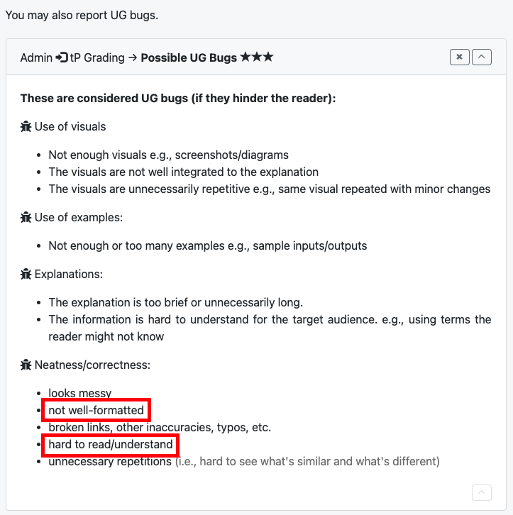
Reason for disagreement: While I understand that this may be nothing exactly "wrong", we were asked to find possible UG bugs, as seen from the CS2103 website. In this case, I found that your UG was not well-formatted enough for a reader (myself) to be able to easily differentiate the different use cases, regardless of the fact that the length of the use case title being longer than the other titles. Something that I would've really appreciated may have been the use of different font size and/or colour.
I have attached a screenshot of the part from the CS2103 website which I'm referring to. I do, however, feel that this is a bug of very low severity.

:question: Issue severity
Team chose [severity.VeryLow]
Originally [severity.Low]
- [ ] I disagree
Reason for disagreement: [replace this with your explanation]
There is insufficient formatting on the headers listed in the Use Cases section of the DG.
When scrolling, I am unable to differentiate Use Cases from each other as all headers of "Use Case: UC", "MSS" and "Extensions" are of the same size.
See attached screenshots below.