Open naz019 opened 2 years ago
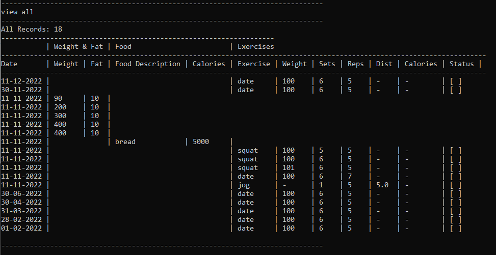
The purpose of view all is to enable the users to view all the daily records sorted according to date (i.e. all records are grouped together by the date), splitting them will defeat the purpose of this feature. Additionally, as the display values are all aligned with the header (through the padding), we believe it allows the user to correctly interpret their records without much hindrance. As such, the severity should be 'Low' as it only causes some minor inconvenience for certain users who prefer a different format (which could be achieved through typing in all other subcommands for 'view').
Team chose [response.Rejected
]
Reason for disagreement: The main issue that is not addressed is that the padding and blank spaces force the user's eyes to dart around the screen to digest their summary list. This is bad UX as the user has to spend more time reading the different entries and can get confused more easily, which defeats the purpose of optimising the app for fast-typers.
When using a 'view all' command, perhaps users should be given a subcommand to display all subcommand outputs at once i.e. display all categories like exercises, food etc. separately and sorted individually by date. With this additional option, the current version's feature flaw can be alleviated by users being able to use their preferred interface.
Team chose [severity.Low
]
Originally [severity.Medium
]
Reason for disagreement: Users that find the current interface confusing and time-wasting experience inconvenience when using this common command.
When different kinds of categories are present e.g. exercise, weight, food etc., the list gets very confusing to read since the entries are mixed into one list and there are a lot of empty gaps. This may slow down even fast typers form properly using this app. Consider splitting the overall list even with 'view all' without the user having to type in the view command for each category.