 hadinon
commented
8 years ago
hadinon
commented
8 years ago Here's my attempt to reduce text to bullet points:
Structure tab
- Tools broken into 4 categories related to major stand considerations: environment, stand establishment, management, and both market and non-market production
- Subcategories under each of the four categories, e.g. Environment includes Temperature, Precipitation, and Drought
- Clicking a subcategory, e.g. Temperature, reveals tools related to that topic
- Note: DSS works best with current version of any major browser in full-screen mode
Climate Data tab
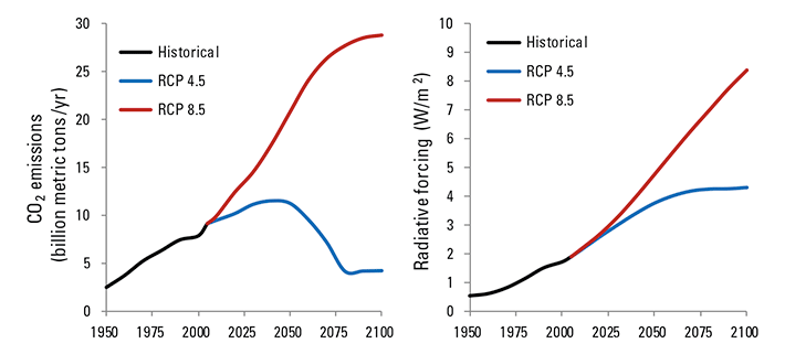
- Climate dataset used: University of Idaho's Multivariate Adaptive Constructed Analogs (MACA)
- MACA aims to simulate physics / chemistry of our atmosphere / oceans to paint a picture of climate at a local scale over several decades or longer
- Two different scenarios and spread of future outcomes shown, not just a single average future climate state
[[note: I would link the word MACA to their website: http://maca.northwestknowledge.net/ and maybe add "2 future emission scenarios" as a bullet on the image? Add another bullet point that says, "time period (out to 2099)". Also, statistically speaking it would be more appropriate to replace all DSS instances of (on this page and in tooltips, legends, etc.) the word "range" with "spread" (see example in third bullet above).]]
Three-Map Layout tab
- Center map: mean of all 20 global climate models
- Left map: 2.5th percentile of all 20 global climate models
- Right map: 97.5th percentile of all 20 global climate models
- Map Features: click map to select your location, double-click to zoom, click and drag to pan, click side map titles to enlarge that map
Time Series tab
- summarizes the historical average and future projections for your location
- each future bar shows the mean and spread of all 20 global climate models
- note: the model error is not shown yet
 daviswx
On each tab, reduce text using bullet points and bold when applicable Add this to the Three-Map Layout tab: “click the map to select your location” *Add this to Climate Data tab: "time period (til 2099)" (HIGH PRIORITY)