 nus-pe-bot
commented
2 years ago
nus-pe-bot
commented
2 years ago Team's Response
Thanks for your response :) This is a duplicate issue
The 'Original' Bug
[The team marked this bug as a duplicate of the following bug]
Hard to read labels due to color contrast
Note from the teaching team: This bug was reported during the Part II (Evaluating Documents) stage of the PE. You may reject this bug if it is not related to the quality of documentation.
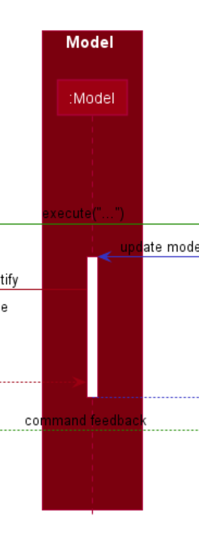
It can be difficult to see the black labels when put against the dark red background in the diagram, especially since the font size is not big if reader do not zoom in.Cosmetic bug.
[original: nus-cs2103-AY2122S1/pe-interim#4755] [original labels: severity.VeryLow type.DocumentationBug]
Their Response to the 'Original' Bug
[This is the team's response to the above 'original' bug]
Thank you for the response :) Some of diagrams are created in red-green colour blind colour scheme (which might differ from the normal one). Therefore, we are really sorry that some of them are hard to see. In fact, these diagrams allow 2 of our teammates who are red-green colourblind to be able to see the diagrams well. Not only that, the rest of our teammates, are able to read the words just fine, so we find that this colour is acceptable. Please forgive us.
Items for the Tester to Verify
:question: Issue duplicate status
Team chose to mark this issue as a duplicate of another issue (as explained in the Team's response above)
- [ ] I disagree
Reason for disagreement: [replace this with your explanation]
:question: Issue response
Team chose [response.Rejected]
- [x] I disagree
Reason for disagreement: It is quite clear at a glance of the diagram that once the arrows/text cross the Model section, everything becomes much harder to see and the text blends in with the background colour. In fact, the text, lifeline and arrowheads are nearly not visible. Hence, I would still classify this as a cosmetic issue that actually causes inconvenience to the reader.
Not sure if this is only on my computer, but the dark, red-brown colour of Model makes it quite difficult to see the black text.