 georgehrke
commented
6 years ago
georgehrke
commented
6 years ago I'm actually not sure about this, most other calendar applications just do a proper ellipsis:

Displaying very big / multi-line summaries in the calendar-grid will take up a lot of space.
 florom

 jancborchardt


 AlexandreBonneau
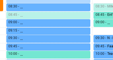 .
.
ping @georgehrke
Overview picture/ Actual behaviour:
Marking Error in Acutal behaviour:
As illustrated the event text is cut off at the end of the column, which depends on monitor/window size. A small window means almost nothing to see.
Better behaviour:
As seen new lines for the event text are created. Column width still fixed, row height gets larger compared to other rows.
Using: nextcloud 12.0.3/calendar 1.5.5/php7.0/firefox 55.0.3 64 bit