Team's Response
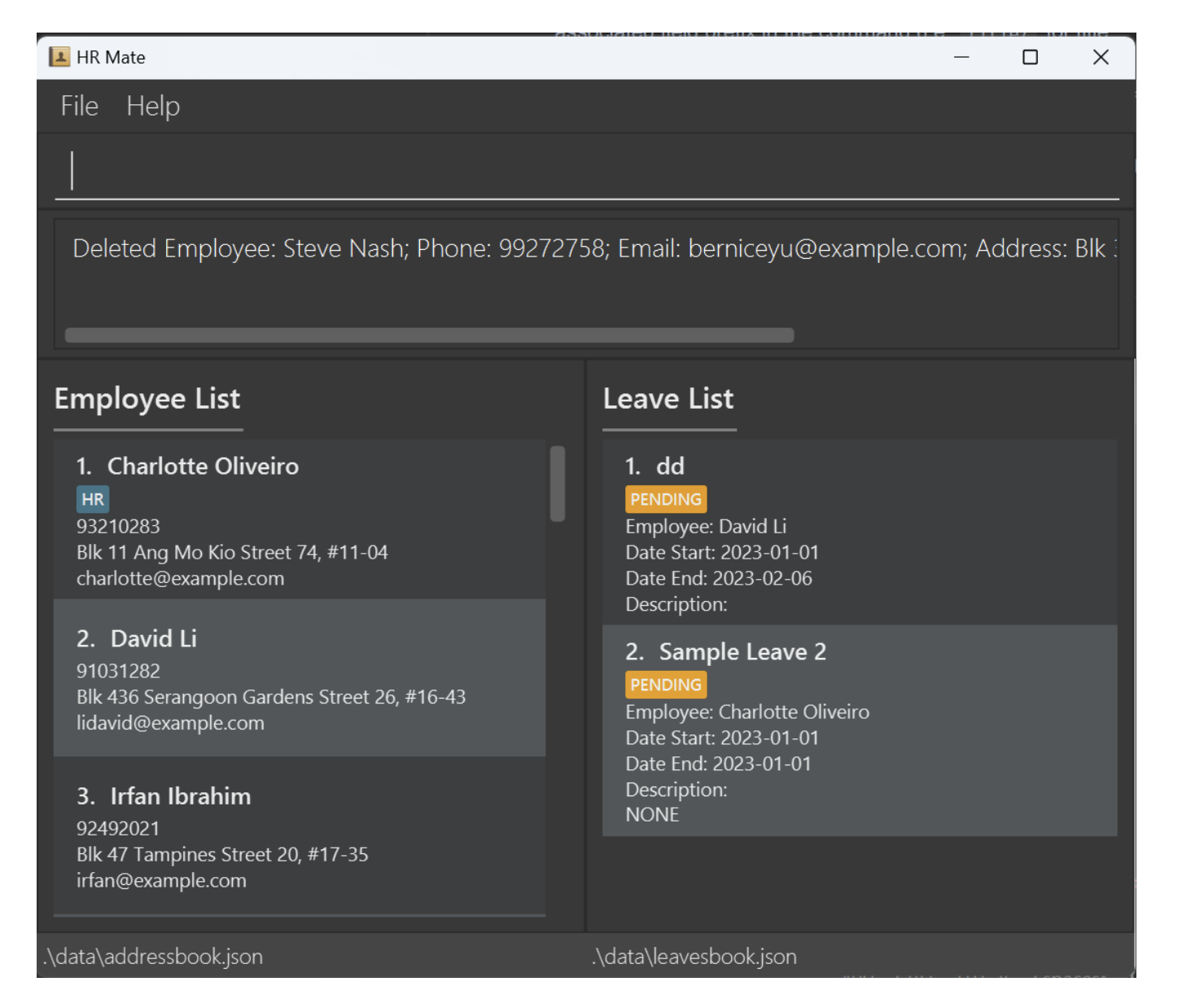
Similarly, we believe that we have provided sufficient instructions in our User Guide, and deliberately chose to limit and avoid having too many visuals in our UG, choosing to show success output GUI screenshots for selected commands, eg: delete and find-leave

Therefore, we do not believe that it affects understanding of current user guide.
The 'Original' Bug
[The team marked this bug as a duplicate of the following bug]
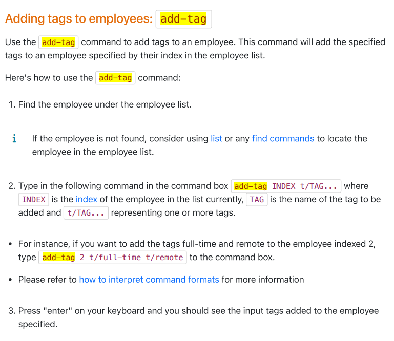
No screenshot for
add-tagcommandNote from the teaching team: This bug was reported during the Part II (Evaluating Documents) stage of the PE. You may reject this bug if it is not related to the quality of documentation.
No screenshots are provided for theadd-tagcommand. A screenshot of what tags added to employees should look like would help users know whether they are on the right track. This is especially because the third step mentions "you should see the input tags...". If users are not sure what to look out for, they will not know whether their command execution has been successful.
[original: nus-cs2103-AY2324S1/pe-interim#3184] [original labels: type.DocumentationBug severity.VeryLow]
Their Response to the 'Original' Bug
[This is the team's response to the above 'original' bug]
This was done in deliberate consideration to not add too many screenshots to our user guide. Given that a labelled diagram is already shown at the QuickStart section, we anticipate that users would already be familiar with the overlay of our application and can view the changes accordingly.
Furthermore, we believe that the examples that we provide already serve the same purpose as the visuals.
Items for the Tester to Verify
:question: Issue duplicate status
Team chose to mark this issue as a duplicate of another issue (as explained in the Team's response above)
- [ ] I disagree
Reason for disagreement: [replace this with your explanation]
## :question: Issue response Team chose [`response.Rejected`] - [x] I disagree **Reason for disagreement:** I believe that the UG was too wordy for readers and with only specific commands like delete-leave, find-leave and delete having a screenshot, readers had to read large chunks of words to find the meaning of their output from the UG. I do understand you did not want to use excessive screenshots but I think considering you have so many different type of commands eg list related commands, edit related commands, you could have added at least 1 screenshot for a type of command and explain that the GUI output of the others is of a similar nature. In this case I think it hinders the reader. Going back to the quickstart section each time to understand is an inconvenience.
## :question: Issue severity Team chose [`severity.VeryLow`] Originally [`severity.Low`] - [x] I disagree **Reason for disagreement:** To me, I felt like the lack of visuals really hindered the reader, as it took a lot of effort to check for each command by reading large chunks of text.  I felt like it affected the readability and thus usage of the UG and ultimately the usage of many functions of the product (hence I did not think it is a cosmetic issue), though I understand it being of severity.VeryLow as well as it does not directly affect the product's functionality, just dependant on the interpretation of below: 

There are no screenshots that show the successful output GUI etc. Makes it very hard to use as I have to read everything rather than look at an image