 simon-davis-nhs
commented
5 years ago
simon-davis-nhs
commented
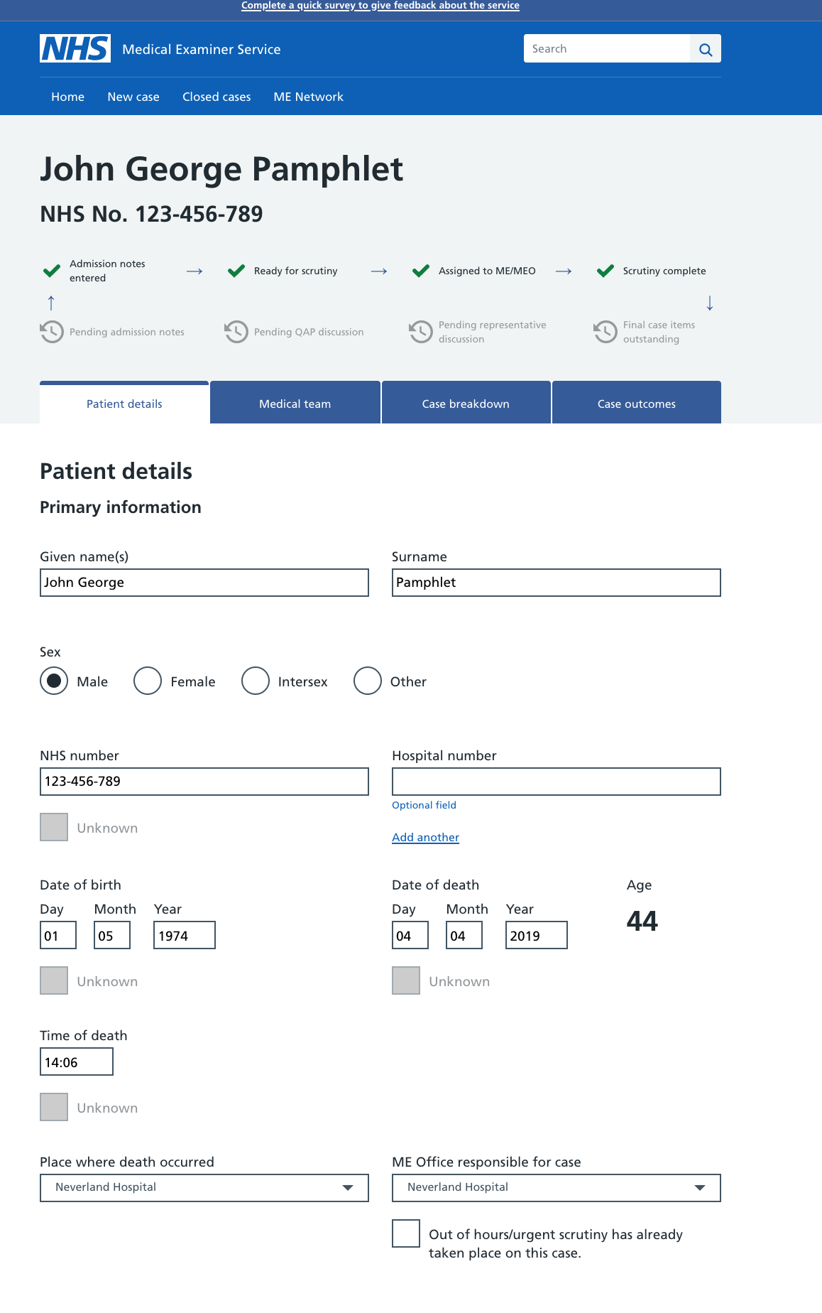
5 years ago Research update: This component was tested with a mix of clinical and admin professional users. This was split across both primary and secondary care settings. Research was conducted both face to face and via remote moderated usability sessions. Feedback was very positive and users were correctly able to identify what each part of the header would do. Users described it as providing clarity and being a familiar pattern. Users correctly identified that clicking the patient's name in the header would display more information about the patient, for example, address and contact details.
 davidhunter08
 devansXD
 danjohnstonUX


 alison-warren
 TJFDM
TJFDM mikebainbridge
 sarawilcox
 jwfone

 thomashallam

 mattedgar
 payneandy
What
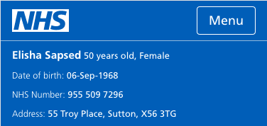
Patient header; a proposed addition to compliment the header component. This proposal is to create a version containing patient information for admin and GP users.
Contains briefly:
Once logged in, patient details appear below the main header bar containing:
Example
Why
Current implementation on e-Referral service contains usability and accessibility flaws, as fed back through user research, and also when comparing to WCAG 2.1 color contrast ratios. Readability is key to understanding the correct patient details are being surfaced and to match this with patient referrals. Summary Care Record also require this component for their own service.
Research
We have tested this component with a number of clinical professionals in medical care settings. Feedback is very positive, and task completion for retrieving the information in the header is high. I have also used primary colours from the NHS service manual for accessibility: https://service-manual.nhs.uk/design-system/styles/colour
I'll be attaching the previous research to this when I have it.
Anything else