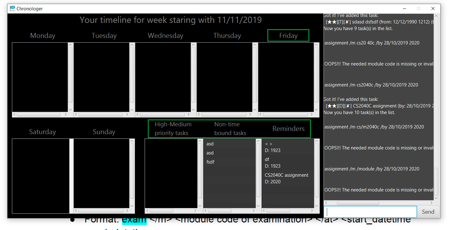
 UI is poor, there is no space to see the output fully. Need to scroll. Extremely inconvenient and difficult to use and test.
Open nimiew opened 5 years ago
 UI is poor, there is no space to see the output fully. Need to scroll. Extremely inconvenient and difficult to use and test.
After testing on other dimensions, this was the only size that could work on other computer screens. It used to be much bigger to prevent unneccessary scrolling but have to take into account users with smallers screens. On a side note please do try to be professional when commenting on others' work and realize that there may have been other considerations.
Do note there are other time-consuming solutions like making the GUI resizable but since the GUI is apparently not even being looked at, time was spent doing up the features that are actually considered instead.
Team chose [response.Rejected]
Reason for disagreement: Even if feature is not considered, this is still a pain point for users and really quite frustrating.