Closed jpwesselink closed 
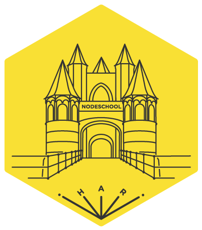
8 years ago
Why there is a "path" label in the middle?
2016-02-20 13:58 GMT+01:00 JP Wesselink notifications@github.com:
I'm hacking on a new logo, let me know what you think.
[image: screen shot 2016-02-20 at 13 57 41] https://cloud.githubusercontent.com/assets/1814479/13196820/027bfe6c-d7da-11e5-9a7c-a251fdd131a1.png
— Reply to this email directly or view it on GitHub https://github.com/nodeschool/haarlem/issues/4.
Shouldn’t there, it’s a screen shot : )
On 20 Feb 2016, at 21:13, Davide Fiorello notifications@github.com wrote:
Why there is a "path" label in the middle?
2016-02-20 13:58 GMT+01:00 JP Wesselink notifications@github.com:
I'm hacking on a new logo, let me know what you think.
[image: screen shot 2016-02-20 at 13 57 41] https://cloud.githubusercontent.com/assets/1814479/13196820/027bfe6c-d7da-11e5-9a7c-a251fdd131a1.png
— Reply to this email directly or view it on GitHub https://github.com/nodeschool/haarlem/issues/4.
— Reply to this email directly or view it on GitHub https://github.com/nodeschool/haarlem/issues/4#issuecomment-186675556.
I like a lot. Maybe the building could be a little bit bigger as to fill out the space at the top of the octagon, i.e., the tips of the towers having the same space between the border as at the bottom? Could also make it feel too cramped or tight, but I dunno…
Btw, are we gonna run with the abbreviation "HLM"? If so, I need to change our Twitter handle.
'HLM'... Well. Preferably it would say Haarlem
since that would make more sense than using a nomenclature the Dutch are not familiar with. I've been playing around with spelling out the full word. I'll show that in the next iteration.
I tried spelling out Haarlem in full, but that yielded only tears and ugliness. s/HLM/HAR/ like it used to be.
I like this iteration a lot! Kudos!
Another take on the hex logo, this time in familiar yellow.
I like this one!! the yellow.
2016-02-22 8:34 GMT+01:00 JP Wesselink notifications@github.com:
Another take on the hex logo, this time in familiar yellow. [image: screen shot 2016-02-22 at 08 32 31] https://cloud.githubusercontent.com/assets/1814479/13212141/0006045a-d93f-11e5-8d98-67389b7e3b49.png
— Reply to this email directly or view it on GitHub https://github.com/nodeschool/haarlem/issues/4#issuecomment-187054973.
Thanks :) It needs clouds I think
I tried clouds, but that did not add anything substantially. I applied the logo.js colors. AFAIC this can be final.
@jpwesselink I'd respectfully like to reopen the issue: the nodeschool
-text seems to be a different color / hardness
that makes it stand out from the rest of the image.
(should be clearly visible here : https://raw.githubusercontent.com/nodeschool/haarlem/master/resources/nodeschool-haarlem.png)
Thanks!
Thanks for pointing it out, will fix asap! On vr 11 mrt. 2016 at 08:59 Robin Speekenbrink notifications@github.com wrote:
@jpwesselink https://github.com/jpwesselink I'd respectfully like to reopen the issue: the nodeschool-text seems to be a different color / hardness that makes it stand out from the rest of the image. (should be clearly visible here : https://raw.githubusercontent.com/nodeschool/haarlem/master/resources/nodeschool-haarlem.png )
Thanks!
— Reply to this email directly or view it on GitHub https://github.com/nodeschool/haarlem/issues/4#issuecomment-195242497.
Sjeez you're quick ;)
I'm hacking on a new logo, let me know what you think.