 zeffii
commented
6 years ago
zeffii
commented
6 years ago nothing official, i've been thinking about making a proposal.
Closed robinrosenstock closed 6 years ago
zeffii
commented
6 years ago nothing official, i've been thinking about making a proposal.
 robinrosenstock
commented
6 years ago
robinrosenstock
commented
6 years ago  portnov
commented
6 years ago
portnov
commented
6 years ago G+ group has a good logo (low-poly cricket). But, i don't think it is suitable as an icon: too much details.
 enzyme69
commented
6 years ago
enzyme69
commented
6 years ago By now, somebody should have done a 3D model of cricket using Sverchok alone. It becomes primitive 3D model: https://github.com/nortikin/sverchok/issues/616
I like the "origami" looking of the look.
@zeffii made that a while ago.
robinrosenstock
commented
6 years ago thanks @enzyme69, I've overlooked #616. @zeffii: so, what is the status of the logo? Will the 3d cricket make it as an logo? Why do I not see it on the website and on the github readme and everywhere?
zeffii
commented
6 years ago @geniusupgrader i've been preoccupied, and don't have final say in this matter. Best i can do is give opinion. The cricket model turned out to be more suitable as a mascot.
for a logo we have options like
or more abstract sketches.. done with the dotgrid program made for designing single colour avatars or logos..

 !
!
robinrosenstock
commented
6 years ago yeah correct, maybe a 3d model is not right as a logo. Personally I don't really like abstract logos, at least it should resemble some sort of cricket.. What is a "RNA logo"?
zeffii
commented
6 years ago RNA icon =

zeffii
commented
6 years ago 
enzyme69
commented
6 years ago For me Sverchok is a bit like this:

But simple is better.

It can morph and reimagined.
I like Zeffii approach. It reminds me of this:

A bit alien, a bit architecture like...
enzyme69
commented
6 years ago 

zeffii
commented
6 years ago the best icons are simple and scale well to small sizes.
 vicdoval
commented
6 years ago
vicdoval
commented
6 years ago Proposal 1

Mixing the concept of the RNA with something architectural, a building or an helicoidal ramp.
Proposal 2:

The S mixed with the RNA...
Any of them would need some refinement... if selected. They where both made in Sverchok :)
zeffii
commented
6 years ago @vicdoval i'd go for something in-between my utterly simple RNA and your more detailed one.. but leaning towards less details.
vicdoval
commented
6 years ago @zeffii I agree with you. I'll try to find that middle point
zeffii
commented
6 years ago enzyme69
commented
6 years ago @zeffii nice one, maybe the twisting can sort of multiple twists like rope toward one end.
vicdoval
commented
6 years ago 
The Rna and the S with even a little diagonal (of the V), also looks like some kind of connector in a ultra minimal style
Also created in Sverchok :)
zeffii
commented
6 years ago to me it seems still a bit dense / busy.
vicdoval
commented
6 years ago  It could be thinner

zeffii
commented
6 years ago this is the quick sketch i did a while back

vicdoval
commented
6 years ago  :)
:)
zeffii
commented
6 years ago i'm not feeling the two horizontal lines
vicdoval
commented
6 years ago  :)
:)
enzyme69
commented
6 years ago Getting there, now just add vertical lines also on the SV --
vicdoval
commented
6 years ago @enzyme69 I don't understand what you mean
enzyme69
commented
6 years ago 
I actually don't mind the line, just adding dots to make it balanced.
zeffii
commented
6 years ago "less is more" .
i understand where the nodules come from, and perhaps they would make sense for a scenario where the logo is animated/ident .. but not needed for the logo ( at least.. not all of it )

enzyme69
commented
6 years ago I actually quite like these. There is totally something here. The color and dots and snakey lines. The very bottom one is clever, Zeff.. actually you guys might have something. It feels quite modern with slightly retro feel.
robinrosenstock
commented
6 years ago Maybe put the circles behind the lines like this:

or a bit smaller:

portnov
commented
6 years ago Good icon should be scalable down. Scale last icons down to 16x16. :/
portnov
commented
6 years ago 
vicdoval
commented
6 years ago Incorporating some of ideas said here.
All the proposal are greyscale as is has to work also on one color, later or a color version can be made
I agree with @portnov , but i think a "pixelart style" transformation should be done for the small icons, is not the same as reducing the size
Proposal A.0
 Proposal A.1
 Proposal A.2
 Proposal A.3
(for small sizes would be the best one)
Proposal A.3
(for small sizes would be the best one)

All created in Sverchok
zeffii
commented
6 years ago 
enzyme69
commented
6 years ago Very interesting Zeffii.
vicdoval
commented
6 years ago 

 nortikin
commented
6 years ago
nortikin
commented
6 years ago i cannot choose, it is hard. Victor and Dealga and Ilya made cool variants
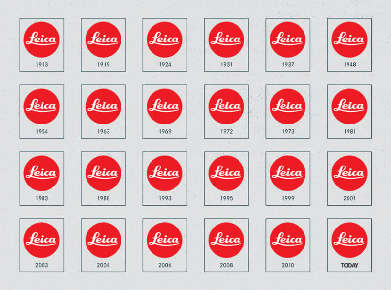
zeffii
commented
6 years ago I also like @vicdoval latest. but don't like the overwhelming orange.. and would prefer to see quite a few more ideas. You adopt a logo for extended periods, good logos for life. (Leica)
https://petapixel.com/assets/uploads/2017/08/howleicalogochanged-800x594.jpg
 THJG
commented
6 years ago
THJG
commented
6 years ago Really like ideas of @zeffii and @vicdoval but what if take an one more step and add third dimension?

zeffii
commented
6 years ago 
nortikin
commented
6 years ago светофор теперь. more like case of } symbol, mind no limits, no borders anyway.
vicdoval
commented
6 years ago 
The first with coorporative colors,
The second on the black
And the third with a proposed alternative color


zeffii
commented
6 years ago i am not a fan of that olive green, but i like the simplicity.
vicdoval
commented
6 years ago  Alternative colors :)
 Durman
commented
6 years ago
Durman
commented
6 years ago 
portnov
commented
6 years ago I like yellowish and reddish variants. Also, I have an idea of the same geometry, but to colorize lines (or maybe "dots" at sides) instead of background.
nortikin
commented
6 years ago maybe to center? in blender sockets connect from top to bottom as a case
nortikin
commented
6 years ago i don't like circles are in focus anyway. Victor made superminimal design https://github.com/nortikin/sverchok/issues/1834#issuecomment-351024649 that i like most. what do you think? and this is much like https://github.com/nortikin/sverchok/issues/1834#issuecomment-350870129
nortikin
commented
6 years ago 


Has sverchok some type of quadratic Icon or symbol? Something that can stand for sverchok?
I want to promote Sverchok on alternativeto.net, but without an Icon this looks dumb.