 ItsDuke
commented
10 years ago
ItsDuke
commented
10 years ago Do you mean an icon in the contact list with the person you are currently in a call with, or an icon in your contact list showing that a person is initiating a call?
Open tsudoko opened 10 years ago
ItsDuke
commented
10 years ago Do you mean an icon in the contact list with the person you are currently in a call with, or an icon in your contact list showing that a person is initiating a call?
 tsudoko
commented
10 years ago
tsudoko
commented
10 years ago An icon in the contact list with the person you are currently in a call with.
ItsDuke
commented
10 years ago Is this for a situation when a person starts a call, goes to chat with someone else, and then forgets who they were on a call with? I don't mean to sound rude, I'm just curious.
 DanTheBritish
commented
10 years ago
DanTheBritish
commented
10 years ago Sort of, but it's a basic feature of any communication software. It's just for completeness, I guess.
Why would you need the contact your're on a call with displayed on your phone? Same goes for Skype too, but they both do it.
tsudoko
commented
10 years ago Is this for a situation when a person starts a call, goes to chat with someone else, and then forgets who they were on a call with? I don't mean to sound rude, I'm just curious.
That's exactly why I wanted to have it implemented, I completely forgot I was in a call with audiobotze and suddenly heard some music, not nice.
ItsDuke
commented
10 years ago Wow, I guess I had no idea that could even occur, though I've never been in a call long enough to forget it was happening. How would you feel about something like this?

ItsDuke
commented
10 years ago Or a video icon, depending on the situation.
tsudoko
commented
10 years ago Doesn't seem bad, but the contact could be put on top of the list for extra visibility. Also, what if the person I'm in a call with sends me a text message? I think surrounding the phone/video icon with an outline in a way similar to normal messages wouldn't look very nice, but maybe that's just me.
ItsDuke
commented
10 years ago I can understand that. Though would people be willing to sacrifice some horizontal space to show both icons?
ItsDuke
commented
10 years ago Or perhaps even just overlay the icon on top of the user's avatar.
DanTheBritish
commented
10 years ago What about automatically moving the active call to the top of the contacts list? Also I would maybe suggest the red hang-up button next to there,so you don't need to stop what you're doing to hang up. Changing the background of the contact doesn't sound like a bad idea either.
ItsDuke
commented
10 years ago I don't have a problem with moving a contact to the top of the contact list when you're on a call with them. Though changing the background has the potential to break the "contact selected = white bg" rule that helps the contact list and chat side fit together so nicely.
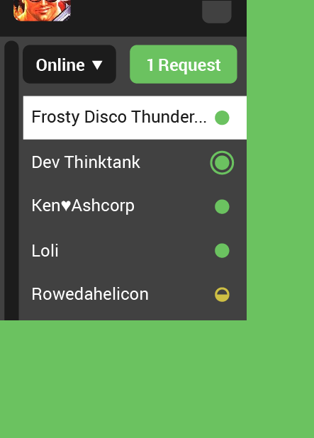
How does this feel? It fades the avatar a bit, and overlays the avatar with a call icon (or video icon, depending on your current type of communication). If you are chatting with someone else, or are simply too lazy to move your mouse all the way over to the "end call" button, the icon would rotate and turn red to show that with a click you can end the call. This also frees up the status dot to show it's notifications as usual.


tsudoko
commented
10 years ago Looks good to me.
DanTheBritish
commented
10 years ago :+1: Looks great to me also
 AlexDaniel
commented
10 years ago
AlexDaniel
commented
10 years ago Oh! That's a great use for these useless avatars!
ItsDuke
commented
10 years ago useless
u wot m8
AlexDaniel
commented
10 years ago @ItsDuke Yes. I don't know who had such a great idea to make the contact list so huge.
Just compare it:
42.5% of the area saved. YAY!
Okay, prepare for the rant now!
I don't want to see avatars all the time. I already see it TWICE for the selected contact. If you think that avatars make it easier to navigate then you're wrong. We have plenty of software that have buttons without any icons (like Blender), it works fine. If you want some visual aid to differentiate between the contacts - great! Just generate a random color based on the tox id and colorize that person in the contact list. If two contacts have similar colors, that's fine! You will face same empty avatars much more frequently.
If you think that by making the buttons smaller there will be a higher chance to misclick, you're wrong again. Each contact on my screenshot is thicker than the "Online" button, which means that you're almost saying that it will be a very common situation to click on the first contact when trying to click "Online" button.
If we need such ridiculous interface in order for tox to become popular - FINE, but otherwise that's bullshit. Perhaps you open IM windows maximized on your huge screens? I don't. And I think that there are many people out there using tiling window managers, and a lot of people with small screens on netbooks and just small PCs.
What is a real disaster is that these mockups define many ways to waste space, but they don't suggest anything useful to counter it. For example, where is the handle to change the width of the contact list? Where is the handle to change the size of the message box? How to hide the top bar?
Some clients invent these features on their own. But I would highly prefer if all clients invented bullshit features on their own, so that these stupid decisions were not present in all of the clients.
Who had such a great idea to make contact list black while the rest is white? That's a huge fuck you to people who set their gtk themes to something they want. Ok, now I have a dark gtk theme and white tox window shining like a fucking light bulb, AMAZING. Even if we don't count the theme problem, this black-white contrast is just pure stupidity.
So please, developers, just forget these mockups. Use what works best. Default system colors are the way to go if not specified otherwise (or if running on windows...). Don't implement silly eye-candies (don't waste your time). Don't use too much empty space between the elements. Use common sense.
Also, what the fucking communism is this? Just let UIs evolve independently, over time we will see what works best.
Besides that, tox is a great! Thanks :)
DanTheBritish
commented
10 years ago If you think that avatars make it easier to navigate then you're wrong.
Yeah. No (That almost came off as a little hostile to me, but maybe I'm a little over-sensitive). That's your personal opinion (Which is fine) but people like me who doesn't identify people by their name very well prefer to use their avatar.
If you think that by making the buttons smaller there will be a higher chance to misclick, you're wrong again
Smaller buttons make for a smaller area of intent. People who use touch-based input on their device (Surface Pro 3 as a prime example) can't get as precise movements as people with mice. But then, not all people are as good with mice as others, people with bad hand-eye coordination would have more trouble hitting the button they want.
The mockups allow developers to work on objects without worrying too much about how they look - not all developers are designers or UX experts, they sometimes just want to implement a feature without worrying about how big the button should be, or what colour to make a selected contact.
So please, developers, just forget these mockups. Use what works best.
I can't agree with you more about using what works best. However, since uTox and other clients are in early alphas, I think it's perfectly acceptable to use this as a 'placeholder' ui, to make them more usable and pretty for user acceptance testing. When they have all the features they need to function as a skype replacement, then we can worry about looking like one.
Thanks for your comment, it is definitely a valid point; by having multiple clients, we hope at least one will suit all types of users and their design and style preferences.
AlexDaniel
commented
10 years ago People who use touch-based input on their device (Surface Pro 3 as a prime example) can't get as precise movements as people with mice.
That makes sense, but you're missing one thing. If I was using a tablet, I would open utox settings and set the dpi option to something higher. It will make buttons and text a little bit bigger, which probably solves all of your mentioned problems, right? But it does not work in the other direction. If I want it to use less space, I can't just change the dpi setting because it will make text ridiculously small.
...sometimes just want to implement a feature without worrying about how big the button should be...
Perhaps. It would be great to get some feedback from the developers on this question. I have a feeling that they waste too much time trying to get it to look like the suggested mockup instead of making things just work.
tsudoko
commented
10 years ago Eh, just make an option to hide them, I've even suggested that before.
AlexDaniel
commented
10 years ago @tsudoko it is a bit complicated. What if ItsDuke's suggestion gets implemented, how would it indicate ongoing calls for those who have hidden avatars?
DanTheBritish
commented
10 years ago @AlexDaniel Then we can use his first suggested implementation, with the icon to the right.
AlexDaniel
commented
10 years ago @LapFox correct. We have just doubled the effort to get this feature done :(
ItsDuke
commented
10 years ago I don't want to see avatars all the time. I already see it TWICE for the selected contact. If you think that avatars make it easier to navigate then you're wrong. We have plenty of software that have buttons without any icons (like Blender), it works fine. If you want some visual aid to differentiate between the contacts - great! Just generate a random color based on the tox id and colorize that person in the contact list. If two contacts have similar colors, that's fine! You will face same empty avatars much more frequently.
No one is forcing you to see avatars all the time. Many threads have talked about a reduced size contact list, whether it be avatar-only, name-only, or simply smaller avatars + shortened names. I appreciate you having an opinion, that's what helps make Tox and the Tox UIs better. But we must balance the foaming-at-the-mouth loud-as-can-be minority with those who remain quiet yet actually like the default UI and the way it works. As such, we'll have options to please both parties.
If you think that by making the buttons smaller there will be a higher chance to misclick, you're wrong again. Each contact on my screenshot is thicker than the "Online" button, which means that you're almost saying that it will be a very common situation to click on the first contact when trying to click "Online" button.
I'm not sure how you inferred that I would immediately jump to the "higher chance to misclick" argument, but the fact that you jumped there for me means it does deserve merit. I'm not saying we should keep everything Windows 8 Metro Huge, but trying to cram as much information on the screen simply for the sake of saving space at the sacrifice of UX is not the direction we should be heading in. But again, I have no doubt there will be options to make all avatars nonexistent and all usernames 7px height.
If we need such ridiculous interface in order for tox to become popular - FINE, but otherwise that's bullshit. Perhaps you open IM windows maximized on your huge screens? I don't. And I think that there are many people out there using tiling window managers, and a lot of people with small screens on netbooks and just small PCs.
In my nearly 2 decades of UX and UI work, I've learned to not take comments like these personally. I always find it odd though when clients go out of their way to lambaste something that clearly works for 99% of cases. I'm not implying that you don't understand how it works, but calling it ridiculous doesn't really give me a lot of room to work when when trying to understand your point of view. What on earth gave you the idea that this UI is designed to be full-screened? Obviously it will support that, but as it stands now, I'm currently designing around a 764x642 layout. According to W3Schools.com: as of today, 99% of your visitors have a screen resolution of 1024x768 pixels or higher. These mockups are being designed for the smallest 1% of the computer-using population. So if you see any mockups from me that are larger than that, it's because I blew them up when exporting to show detail. It's also why all my UI files get exported at a 2x size as well, so our dev friends can code for normal or HiDPI resolutions. So forgive me if I have to call bullshit on this, but I think we're being as inclusive as possible when it comes to size of the UI.
What is a real disaster is that these mockups define many ways to waste space, but they don't suggest anything useful to counter it. For example, where is the handle to change the width of the contact list? Where is the handle to change the size of the message box? How to hide the top bar?
Really? Disaster? Instead of jumping to conclusions, you could have simply asked me what my thoughts were on changing the sizes of various things. I bet you didn't know that these mockups (which started over a year ago) originally had a handle for the contact list. It was quickly trashed, though, because it got in the way of the chat text, and was just all around unnecessary. The current way to do it would be to just hover over the vertical line between the chat and the contact list, and watch your cursor turn into the little <--> symbol, and drag to your heart's content. Ditto for the size of the chat window, though it would be at the corners of the windows. Currently there is no hiding of the top bar in the chat. I'm not against making it available to hide, it could definitely go in the little options arrow popout that's next to the current contact, or in the general options.
Some clients invent these features on their own. But I would highly prefer if all clients invented bullshit features on their own, so that these stupid decisions were not present in all of the clients.
So because you are upset, suddenly the mockups that everyone has had over a year of input on through countless threads are full of stupid decisions? I see.
Who had such a great idea to make contact list black while the rest is white? That's a huge fuck you to people who set their gtk themes to something they want. Ok, now I have a dark gtk theme and white tox window shining like a fucking light bulb, AMAZING. Even if we don't count the theme problem, this black-white contrast is just pure stupidity.
Whose idea was it? People who genuinely cared about how Tox works. We have been slowly refining how Tox looks with these UI mockups for over a year, so I guess if anyone is at fault, it's anyone who voiced their opinion to help make the Tox UI grow. Wow, what shitty people they must be :smile:
As far as I know, nothing is stopping the developers from allowing user-defined themes to override the Tox color scheme. In fact, I'm sure many people would enjoy that. You included. Though to be fair, devs have been trying to make all OS versions of this app look similar, so no matter what machine you used it on, it would be familiar to you. I also love how you venture into the realm of hyperbole by saying a Tox window would shine like a lightbulb. Maybe turn on some lights down there in your basement and it won't be a problem. Seriously though, this is another case where you could have asked instead of assuming. Jumping to conclusions makes you look ignorant, and I'm sure you're not.
So please, developers, just forget these mockups. Use what works best. Default system colors are the way to go if not specified otherwise (or if running on windows...). Don't implement silly eye-candies (don't waste your time). Don't use too much empty space between the elements. Use common sense.
I agree with you here. I think if developers want to roll their own version of Tox that they think will suit them, then they have every right and I wish them all of the best. I actually think you might be happier if you do that as well. You won't be bogged down with things like visual hierarchy, color theory, proper alignment/spacing, or anything else that makes good UI/UX that you so simply cast off as "eye-candies". That stuff just gets in the way, doesn't it? Let's forget how humans use computers and just "use common sense" :smile:
Also, what the fucking communism is this? Just let UIs evolve independently, over time we will see what works best.
Again, that's what they have been doing. For over a year. As I have stated over and over in previous threads, emails, and github conversations, I am not some gatekeeper of this UI. Granted, I have many years of experience to pull from, so I can lend a helping hand or a trained eye, but ultimately the direction of Tox and it's UI rests with those who use it. I merely collect all the agreed-upon suggestions and conglomerate them into my current UI mockups and guidelines. Every devloper is free to pick and choose from it what they will. This is no communist system, this is democracy and peer review. And luckily, the loudest are not the ones with final say.
Besides that, tox is a great! Thanks :)
Tox is wonderful, I agree. Thanks for your insight, and good luck!
 CowInAPie
commented
10 years ago
CowInAPie
commented
10 years ago @AlexDaniel
I had already made a pull request for hidden avatars - located here https://github.com/notsecure/uTox/pull/384. Let me know what you think. Please check the pulls for features you're requesting, and make suggestions there for improvements. If it doesn't exist, then make a topic on it under issues.
AlexDaniel
commented
10 years ago @ItsDuke, Thanks for your comment! Please do not take my words too close to your heart.
First of all, let me point out that authority and history is not a good argument in such discussions (ranting is not as well, but at least it is a good way to start the conversation, right?)
In my nearly 2 decades of UX and UI work ... ... everyone has had over a year of input ... ... for over a year ... For over a year. I have many years of experience to pull from
Ok ok! I get it. But it doesn't mean that the decisions are right. We can always look at some popular commercial products and say "hey, it has been there for so many years and so many people have worked on it", but it does not mean a thing.
As far as I know, nothing is stopping the developers... I think if developers want to roll their own version of Tox Every devloper is free to pick and choose from it what they will.
OK!! But it seems like this is your typical answer in such discussions. Yes, sure, but why don't we provide an adequate goal for them? Otherwise, maybe we shouldn't give any goal at all? We have so many clients out there, yet none of them has a separate window for contacts. And I don't know any client that allows you to hide the contact list or resize it to 0 pixels. Fuck.
So if you see any mockups from me that are larger than that, it's because I blew them up when exporting to show detail
Sure, I understand. Probably that's why I didn't resize my image, right?
What on earth gave you the idea that this UI is designed to be full-screened?
Hmmm, maybe the fact that you are providing stats for maximized windows? Look:
I'm currently designing around a 764x642 layout. According to W3Schools.com: as of today, 99% of your visitors have a screen resolution of 1024x768 pixels or higher.
These stats obviously refer to maximized (or kind of maximized) windows.
You see, when tiling, one of the most obvious approaches is to split your screen in half vertically (because most screens are wider horizontally). Divide 1024 by two and you get 512, which is 250 pixels less than your goal. And you think that I want some instant messenger to take a whole half of my screen? No, probably I have some other "main" window on the screen and I want tox to be on the side (which is what some tiling WMs do by default. Instead of dividing everything in half, they do it in 2/3 + 1/3 proportions or something like that). I think that this is important (even Weandows 7 is capable of splitting in half) and it will become even more important when Weandows 10 comes out (because it provides even more functionality for kinda-tiling).
Let's forget how humans use computers and just "use common sense" :smile:
Let's ignore common sense and build UIs based on some counterproductive principles. :smile:
but trying to cram as much information on the screen simply for the sake of saving space at the sacrifice of UX is not the direction we should be heading in.
Actually, I agree now. If you think that the height for contacts should be like that - ok, it's not so bad to me. If I see twice less contacts in the list, I can live with that. But horizontal space is still important, and that's where avatars are making a problem.
We have two elements besides the nickname: avatar and status icon. So, if we want to kinda keep both, then here are some choices:
Or just combine any of these. I hope you will not say that out of all solutions current one is the best (because it was based on one year of experience and some magical UX principles), although I am prepared for that.
But we must balance the foaming-at-the-mouth loud-as-can-be minority with those who remain quiet yet actually like the default UI and the way it works.
What kind of fucking balance are you talking about? On one side we have people like me, who sometimes want to resize their tox window to something ridiculously small and still want it to be useful. Because we want to get our job done without switching between the windows like faggots. On another side we have people who don't fucking care because they always maximize their windows and they have never tried placing two windows side by side. So are you saying that these mockups represent a compromise between the two?
I also love how you venture into the realm of hyperbole by saying a Tox window would shine like a lightbulb. Maybe turn on some lights down there in your basement and it won't be a problem.
"Would"? It already does.
I don't mind if Tox clients supported custom themes, but it seems like it is not going to happen any time soon. Also, look: https://github.com/naxuroqa/Venom/issues/40 https://github.com/naxuroqa/Venom/pull/232 https://github.com/naxuroqa/Venom/issues/233 https://github.com/naxuroqa/Venom/issues/219
These are some problems caused by the developers who are trying to get it to look like these mockups. And here is someone asking for the inverted theme to work at night: https://github.com/notsecure/uTox/issues/21 But what would it mean to have a "dark option"? It doesn't mean that the chat box should be black while the contact list is white, right? It means that the background must be black or gray. All of the background. Consistently dark. If you have a reason for having the contact list dark while the rest is light, then please tell it. Or, if you explained it earlier elsewhere, please link to it.
Currently I don't see how these mockups are helping. Maybe it would be better if we created a list of must-have UI things. Like "it must be possible to resize this and that", "it should be possible to hide contact list" and stuff like that. This would be a great guide for developers and all of the users would benefit from it. Also, such things are usually client-independent. It will not push developers to create cool-looking user interfaces but focus on the features and usability instead.
Sure, I can always create my own client... but we already have too many and none of them is good enough. What is the point of having several clients that look exactly the same anyway? Unless they all look amazingly productive, which is not the case.
@CowInAPie Thanks! Unfortunately, I didn't manage to compile it today. Maybe later. I have no idea why your pull request is not accepted yet, but it seems like now it will create another problem with this issue (no active call indication when avatars are hidden).
CowInAPie
commented
10 years ago @AlexDaniel Alex, previously you stated "I don't want to see avatars all the time.", and I had already given a pull request with a solution, which I linked to you. Now you advocate that this will cause problems with a call feature that requires avatars. Which path do you support? You also stated that developing both call indicators would take double the effort (Something you seemed to not desire). I'm curious to know what path you specifically would desire and appreciate, and then posting your suggestion for others to critique themselves, or just code it for your own personal use.
ItsDuke
commented
10 years ago Thanks for your comment! Please do not take my words too close to your heart.
Never have, never will.
First of all, let me point out that authority and history is not a good argument in such discussions (ranting is not as well, but at least it is a good way to start the conversation, right?)
I'm unfortunately inclined to disagree. Authority and history are great places to speak from. This is not to say that fresh new ideas (or people) are bad, but inherently dismissing a point of view simply because it comes from a place of seniority and professional background is a poor idea at it's very base.
Ok ok! I get it. But it doesn't mean that the decisions are right. We can always look at some popular commercial products and say "hey, it has been there for so many years and so many people have worked on it", but it does not mean a thing.
At this, I am inclined to agree and disagree with you. If something is a commercial success, and has been worked on by loads of people, does that make it bad? I can somewhat see where you're coming from, but at the same time, you're trying to argue simply that "popular things are bad simply because they are popular", and that is not the proper stance to take.
OK!! But it seems like this is your typical answer in such discussions.
Yes, because it's apt.
Yes, sure, but why don't we provide an adequate goal for them? Otherwise, maybe we shouldn't give any goal at all?
The goal is to provide a clean working interface that can be used as a simple guideline. It is not a mandate or a dangling carrot. Folks are free to deviate in any or every way based on personal preferences or feedback.
We have so many clients out there, yet none of them has a separate window for contacts. And I don't know any client that allows you to hide the contact list or resize it to 0 pixels.
It sounds like you're in the minority on this issue. Not that you're wrong, but you're maybe the third person I've heard who has asked for a separate contact list. It would be my advice to pick your dev/interface of choice and work with them on making a version that suits your needs. The purpose of the UI that I'm helping mockup is not to make everyone happy, because that will never happen. It's aim is to be clear, concise, and implement the majority or requested features.
Sure, I understand. Probably that's why I didn't resize my image, right?
Not sure what you're referring to.
Hmmm, maybe the fact that you are providing stats for maximized windows? Look:
I'm currently designing around a 764x642 layout. According to W3Schools.com: as of today, 99% of your visitors have a screen resolution of 1024x768 pixels or higher. These stats obviously refer to maximized (or kind of maximized) windows.
Incorrect. That is the size of the normal window. this is not a window-maximized version. This is not a kind-of maximized version. When a user installs this program for the first time, this is the default size and layout the user will be presented with. It will not be maximized in any way. Obviously the user can maximize it, and they can also make it smaller as well. All of my mockups are based on normal sized defaults.
You see, when tiling [...] more functionality for kinda-tiling).
I understand how tiling works, thanks. Tox will not stop you from splitting your windows to be side-by-side. You will be differing from the default layout a bit, so your Tox window will (obviously) not look like the standard window. This is normal. And obviously there are people, like @CowInAPie already trying to work on a version that will be avatar-free so that will take up less of your horizontal space when tiling.
Let's ignore common sense and build UIs based on some counterproductive principles. :smile:
So far you've given 0 (zero) productive opinions, so I fail to see how anything Tox is doing thus far is counterproductive, but oh well.
Actually, I agree now. If you think that the height for contacts should be like that - ok, it's not so bad to me. If I see twice less contacts in the list, I can live with that. But horizontal space is still important, and that's where avatars are making a problem.
See above where I address your comments on tiling.
We have two elements besides the nickname: avatar and status icon. So, if we want to kinda keep both, then here are some choices: Get rid of the status icon. [...](because it was based on one year of experience and some magical UX principles), although I am prepared for that.
The status dots serve their purpose admirably. Just giving the avatars a colored border is a poor idea. The reasons the status dots have different shapes is to accommodate folks with visual impairments, or those using high-contrast/low-color monitor options. And no, it was not based on one year of feedback for Tox, it was based on my nearly 2 decades of UX and UI work. As much as you'd like to blame "magical UX principles", the reality is that we're trying to be decent and inclusive people, especially in regards to the visually-impaired. Sorry if that answer disappoints you.
What kind of fucking balance are you talking about? [...] are you saying that these mockups represent a compromise between the two?
Pretty much. There are meant to be options within Tox that will allow for some flexibility in regards to sizes and such, but if your needs fall far outside of the accommodations that the Tox options gives you, then you are free to mod it until you see fit, or simply create your own.
"Would"? It already does. Sorry ;)
I don't mind if Tox clients supported custom themes [...] these are some problems caused by the developers who are trying to get it to look like these mockups.
Showing that devs are working on making their UIs consistent with the sample UI is not indicative of anything. They are simply working.
And here is someone asking for the inverted theme to work at night [...] Or, if you explained it earlier elsewhere, please link to it.
As I've stated before, if devs want to deviate, they are perfectly within their rights to. Nothing is stopping them. For reason why it is the way it is, I've explained this in countless threads previously, and a few git issues, most recently this (and #511 in utox).
Currently I don't see how these mockups are helping. Maybe it would be better if we created a list of must-have UI things. Like "it must be possible to resize this and that", "it should be possible to hide contact list" and stuff like that. This would be a great guide for developers and all of the users would benefit from it. Also, such things are usually client-independent. It will not push developers to create cool-looking user interfaces but focus on the features and usability instead.
Again, there is nothing stopping ANYONE from completely ignoring the mockups I've helped make. If you want to completely ignore any and all user interface best practices, then that is surely your prerogative!
Sure, I can always create my own client... but we already have too many and none of them is good enough.
By your standards, perhaps.
What is the point of having several clients that look exactly the same anyway?
See above. They don't have to look the same. Competition breeds ingenuity.
Unless they all look amazingly productive, which is not the case.
Again, by your standards. For nearly everyone Tox will be a delight to use. Unfortunately we can't design for every basement-dweller alive :)
AlexDaniel
commented
10 years ago So I asked you not to throw your "years of experience" shit at us and you simply replied that it is justified and that you will keep doing that. Great. This discussion is not going to get anywhere this way, so I will keep this answer as short as possible.
Incorrect. That is the size of the normal window. this is not a window-maximized version.
But do you understand that it does not leave any space for other windows?
For reason why it is the way it is, I've explained this in countless threads previously, and a few git issues, most recently this (and #511 in utox).
Thanks, this broken link really helps. Searching for your name in the issue list didn't give much results either. No, you didn't explain a thing. All your explanations in this thread were about years of experience and other bullshit. Yes, we all know that we can simply ignore your mockups, there is no need to repeat that. However, if you insist on actually doing that, I'm all for it.
The status dots serve their purpose admirably. Just giving the avatars a colored border is a poor idea. The reasons the status dots have different shapes is to accommodate folks with visual impairments, or those using high-contrast/low-color monitor options.
Yay! Great, finally we have some explanation from you. I can't even express how happy I am. Ok, so why can't we use dashed borders for this? :)
Sure, I can always create my own client... but we already have too many and none of them is good enough.
By your standards, perhaps.
No, according to this table: https://wiki.tox.im/Clients
It sounds like you're in the minority on this issue. Not that you're wrong, but you're maybe the third person I've heard who has asked for a separate contact list.
Not only I want a separate (or at least hidable) contact list, but I also want to have several windows for different contacts. This way it will be possible to see more than one chat window at the same time (possibly side by side), also it would allow me to group contacts on different workspaces (remember, workspaces is another feature in the upcoming microsoft product). This could be done in utox by allowing people to open more than one window (sounds easy, but most likely it is a PITA to implement). Of course, this is totally offtopic, I am just saying that a lot of people who have to get stuff done daily will appreciate such features. It is not about three "basement-dwellers".
@CowInAPie I fully support your pull request, and I will appreciate if avatars are gone completely or optionally. But I had to point out that your pull request will make THIS issue a little bit worse.
tsudoko
commented
10 years ago But I had to point out that your pull request will make THIS issue a little bit worse.
There could be some empty space on the left (yay, wasting space) that could be used to show a call icon.
AlexDaniel
commented
10 years ago @tsudoko :laughing: Actually, it could show that icon or even re-enable the avatar for that particular contact when there is an active call. That's okay.
ItsDuke
commented
10 years ago So I asked you not to throw your "years of experience" shit at us and you simply replied that it is justified and that you will keep doing that. Great. This discussion is not going to get anywhere this way, so I will keep this answer as short as possible.
It's not going to get anywhere anyway. You're simply being contrarian for the sake of wanting to get your extremely specific set of rules set in place as a default.
But do you understand that it does not leave any space for other windows?
Incorrect.
Thanks, this broken link really helps. Searching for your name in the issue list didn't give much results either. No, you didn't explain a thing. All your explanations in this thread were about years of experience and other bullshit. Yes, we all know that we can simply ignore your mockups, there is no need to repeat that. However, if you insist on actually doing that, I'm all for it.
Not sure why you can't view it. Oh well :) I also love how you just dismiss experience as if it's detrimental. But we already know this back-and-forth with you is going nowhere.
Yay! Great, finally we have some explanation from you. I can't even express how happy I am. Ok, so why can't we use dashed borders for this? :)
Subtlety sure isn't your strong suit. But we already knew that. Dashed borders on the avatars, you mean? Why dashed?
No, according to this table: https://wiki.tox.im/Clients
I see lots of promising-looking projects being worked on. Not sure what the problem is. Just because they're not "good enough" for you is irrelevant.
Not only I want a separate (or at least hidable) contact list, but I also want to have several windows for different contacts. This way it will be possible to see more than one chat window at the same time (possibly side by side), also it would allow me to group contacts on different workspaces (remember, workspaces is another feature in the upcoming microsoft product). This could be done in utox by allowing people to open more than one window (sounds easy, but most likely it is a PITA to implement). Of course, this is totally offtopic, I am just saying that a lot of people who have to get stuff done daily will appreciate such features. It is not about three "basement-dwellers".
The mockup I've helped create does not hinder having separate windows at all. Not sure why you even brought this up.
Until next time :)
Maybe add some icon to the contact the call is with or highlight it