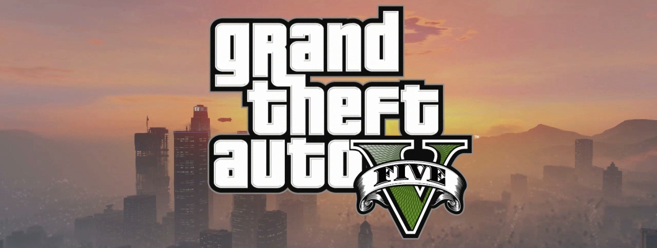
I'm not sure about the black background. Is there any characteristic GTA V colour? Or maybe it's the white part of the letter which could be bright or dark green with little saturation.
Closed BlueManCZ closed 4 years ago
I'm not sure about the black background. Is there any characteristic GTA V colour? Or maybe it's the white part of the letter which could be bright or dark green with little saturation.
I don't know. Does this look better?


Sorry for the back and forth, could we please try dark brown for the white part and a bright baseplate?
Something like this?

I don't know, in my opinion it lacks that GTA5 vibes.
The thing is, the original icon has white and black outlines. I'm not sure, mayve be it's is the perpective of the outline. Maybe it should be isometric.
Could you please try the previous draft (dark baseplate) with a little more brightness+saturation in the baseplate and the V serifs increased to a height of 3 px like this?


The V is still a strange mix of 2D and 3D but an isometric outline doesn't look that nice or does it?

Any ideas, @Foggalong @creepertron95 @mrmeszaros ? Otherwise I'd say let's go with what's pushed.
If I recall correctly, the banner of GTA games looks usually like this:
 You could try to incorporate the comic book panel style into the base plate - without much detail to look numixy.
Maybe just pastel colored panels separated by black beams (low contrast) and the "V" in the foreground. The banner has blue, green, yellow and purple - and in GTA3 they were the colors of the objectives / cash in game. The white border should provide enough contrast to separate it from the background.
This is risky, and might turn out bad, but might be worth a try.
@BlueManCZ I like the colours in the pushed version, thanks for bearing with while we workshopped that!
@palob agreed, I hadn't noticed it until you mentioned it but yeah it looks so much better when that 3D element is taken out.
@mrmeszaros Nay on the comic book panel; we're trying to avoid creating new icons which use the full baseplate now, and at some point those that already do will be reviewed.
Well, maybe the comic thing as a rectangle instead of full baseplate with a simple V on it.
| I made some drafts as @palob suggested. Maybe you will like something, maybe not. We can always change colours, it's just to give you an idea. | A | B | C | D | E |
|---|---|---|---|---|---|
 |
 |
 |
 |
 |
If I can express my subjective opinion, I agree with @palob
an isometric outline doesn't look that nice
especially in the small resolutions. Maybe with the thicker outline, it could be fine.
And to this comic style rectangle, I had to shrink the V letter to fit inside. With a smaller resolution, it becomes harder to recognize.


There is also possible extreme like this.


@BlueManCZ From the ones I like B most, but @Foggalong is right - these do not look numixy to me either.


Closes: https://github.com/numixproject/numix-core/issues/5420
https://steamdb.info/app/271590/