Team's Response
We believe that this is extreme user behaviour.
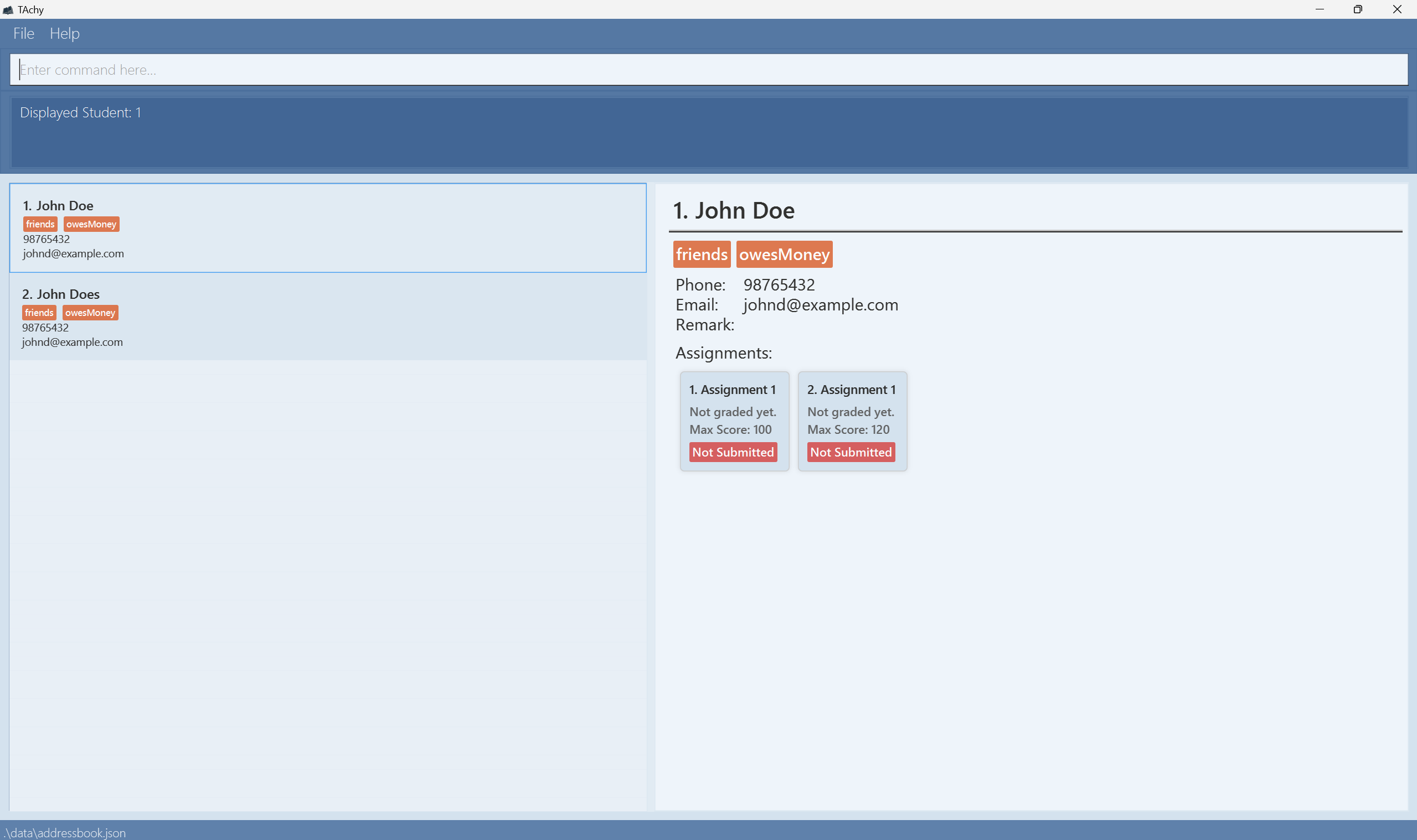
By default, when you launch the app, the size of the left and right panels are of equal size. When the user resizes the entire app window horizontally, both panels resize accordingly and still take up half of the entire app window. We have already taken steps to set a minimum app window size such that no information is cut off in this minimum window size when the user horizontally resizes the entire app window.
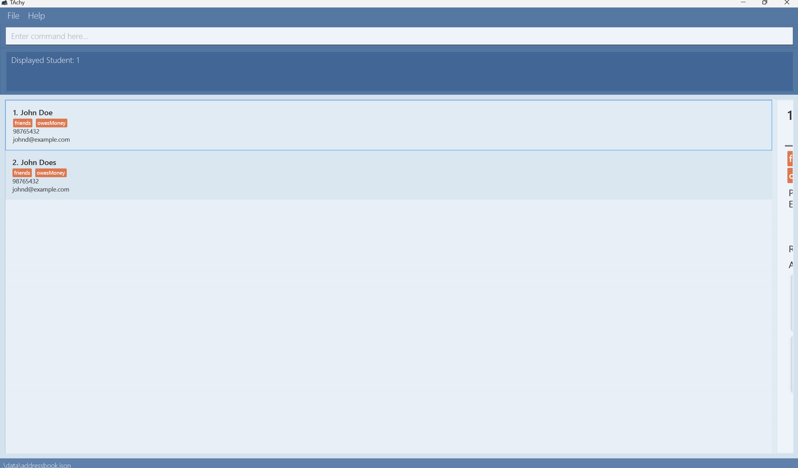
The only way the user will see student details being cut off is if he purposefully resizes the panels using the centre bar, which we have allowed for user flexibility while using our app. There has to be an intentional resizing of the panels by the user.
Furthermore, if the user has an issue with viewing the student details after he has intentionally resized the panels, the user would inherently know that the size can be readjusted back to normal.
A demo of our explanation is linked here
Since this issue is purely cosmetic, the severity has also been revised down to VeryLow.
Duplicate status (if any):
--
Default:
After adjusting the size:
There is no minimum size to view the students' details and student list which leads to the information for either students details and student list being covered (Not wrap).
The way to get this: Adjust the horizontal size of the student details.
[original: nus-cs2103-AY2425S1/pe-interim#2310] [original labels: type.FeatureFlaw severity.Low]