 octalmage
commented
9 years ago
octalmage
commented
9 years ago Yeah go for it! We still need the back and forward buttons. See #3.
Open mjchamplin opened 9 years ago
octalmage
commented
9 years ago Yeah go for it! We still need the back and forward buttons. See #3.
octalmage
commented
9 years ago I think I want to have the top visited websites on the info screen, something like this:

Idk, we have a bunch of real estate here:
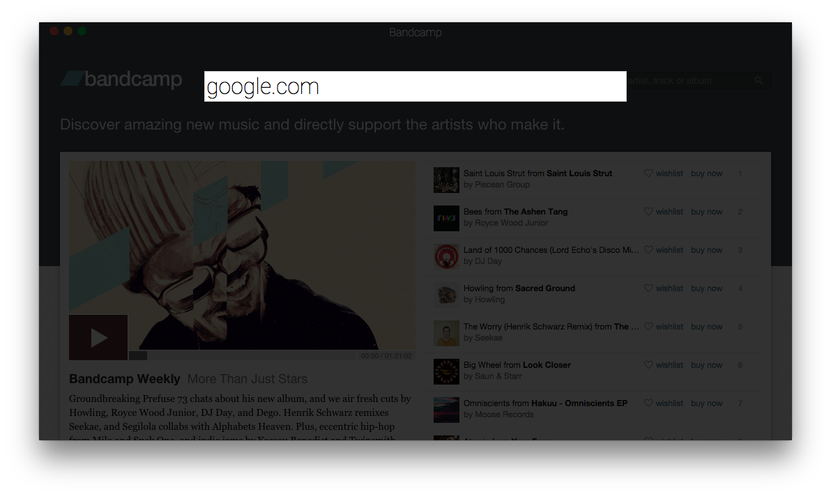
I'm open to ideas!
 mjchamplin
commented
6 years ago
mjchamplin
commented
6 years ago I still think it would be cool to tweak the UI a bit. A few initial thoughts, three years later:
background-color it's defaulting to grayYou know, if you're interested. ;)
octalmage
commented
6 years ago Of course I'm interested! Got #3 for the back and forward buttons, not sure what to do there. Title bar font is easy, I'll make that happen. For the background color do you mean the title bar? The title bar is complicated, it captures the screen then attempts to grab the pixel color at the top of the screen and uses that. I've seen this not always work though. I have it set to read the pixel color on dom-ready for now, which means it might not always catch everything if things are loaded after dom-ready.
octalmage
commented
6 years ago And I love that icon! Still one of the best icons I've seen. I think it looks really nice in the dock.

mjchamplin
commented
6 years ago Thank you for your kind words re: the icon!
The title bar is great. I think I'll open a separate issue for the page-wide BG thing I'm seeing (with screenshots), since it's not really a UI issue.
I'll think on the < > issue and follow up on #3 if I think of anything.
octalmage
commented
6 years ago Badass!
I'm loving the minimal design of the app, and I'd love to refine the typography a bit and whatnot. Want me to work something up in Sketch?