 sandrina-p
commented
6 years ago
sandrina-p
commented
6 years ago Could you listen what are the requirements for this feature so we can improve the ux/ui part ?
Closed taoeffect closed 5 years ago
sandrina-p
commented
6 years ago Could you listen what are the requirements for this feature so we can improve the ux/ui part ?
 hubudibu
commented
6 years ago
hubudibu
commented
6 years ago I will give these requirements a try as I already started work on this issue, @taoeffect add your thoughts if I missed something!
Proposals are the only way to change group properties. On the UI side, the two parts of the proposal system are
there are change links on the group dashboard for each property above. (actually, the remove member option is still missing, but the rest are there on the design attached.) clicking those links should show a form with fields to change said property. I would suggest reusing the steps of group creation for these forms to keep consistency. one thing that already exists and works is member invitation. the rest is not yet implemented.

all ongoing proposals that need the logged in user's vote are displayed on top of the group dashboard, as seen on the design above.
apart from that, submitting a proposal sends a special, vote type message to all affected members where they can cast their vote for or against said proposal. this part is already implemented and can be tried out with creating an invitation proposal. clicking the message in the inbox leads to the following voting view. this could also use some UI improvement, eg. to be consistent with the voting panel on the group dashboard.
 sandrina-p
commented
6 years ago
sandrina-p
commented
6 years ago Thank you @hubudibu for the explanation!
Clicking those links should show a form with fields to change said property. I would suggest reusing the steps of group creation for these forms to keep consistency.
I believe our main priority right now is having a functional prototype, so reusing the steps of group creation seems the fastest way. Since Proposal Creation flow can (and should) be very similar to "Review & Finish" step from "Create Group", let me point some personal notes on that part:
Could you tell me what was the reason behind to divide that flow into individual steps / pages?
Generally speaking, that design pattern is used when a user has a lot of questions to answer (+10), so it gets divided into different "grouped" steps of related questions, so the user understands the context. (A great example of that pattern is adding a new place on Airbnb). Since "Create a Group" flow is simple, I think the current "step-flow" UX can be simplified.
Right now the User Experience might not be flawless, and the implementation has additional logic to handle (more room for bugs). Since this is a main task (aka important!) with few inputs to fill I would suggest to group them all fixing the above issues and:
Just this "Create Group" flow could be discussed in another issue, since it's not the focus of this one. Sorry for running away of voting / proposals system 😶, so let's get back to the point.
Well, after what I said that's something you guys decide: Would it be easier to reuse the current incomplete logic or redo the UX part with a a simple form? Just to get an idea of UX, it could be something like this Dribble example). Using the form flow, when clicking in any of the "Propose changes" links it would open the form with the proper input focused.
one thing that already exists and works is member invitation. the rest is not yet implemented. Curious because even that I couldn't make work. User A invites B, when I go to B account I have no notification of the invitation. 😞
this part is already implemented and can be tried out with creating an invitation proposal. clicking the message in the inbox leads to the following voting view.
I can't reproduce that flow neither. Maybe I am missing something on the process 😞
This could also use some UI improvement, eg. to be consistent with the voting panel on the group dashboard.
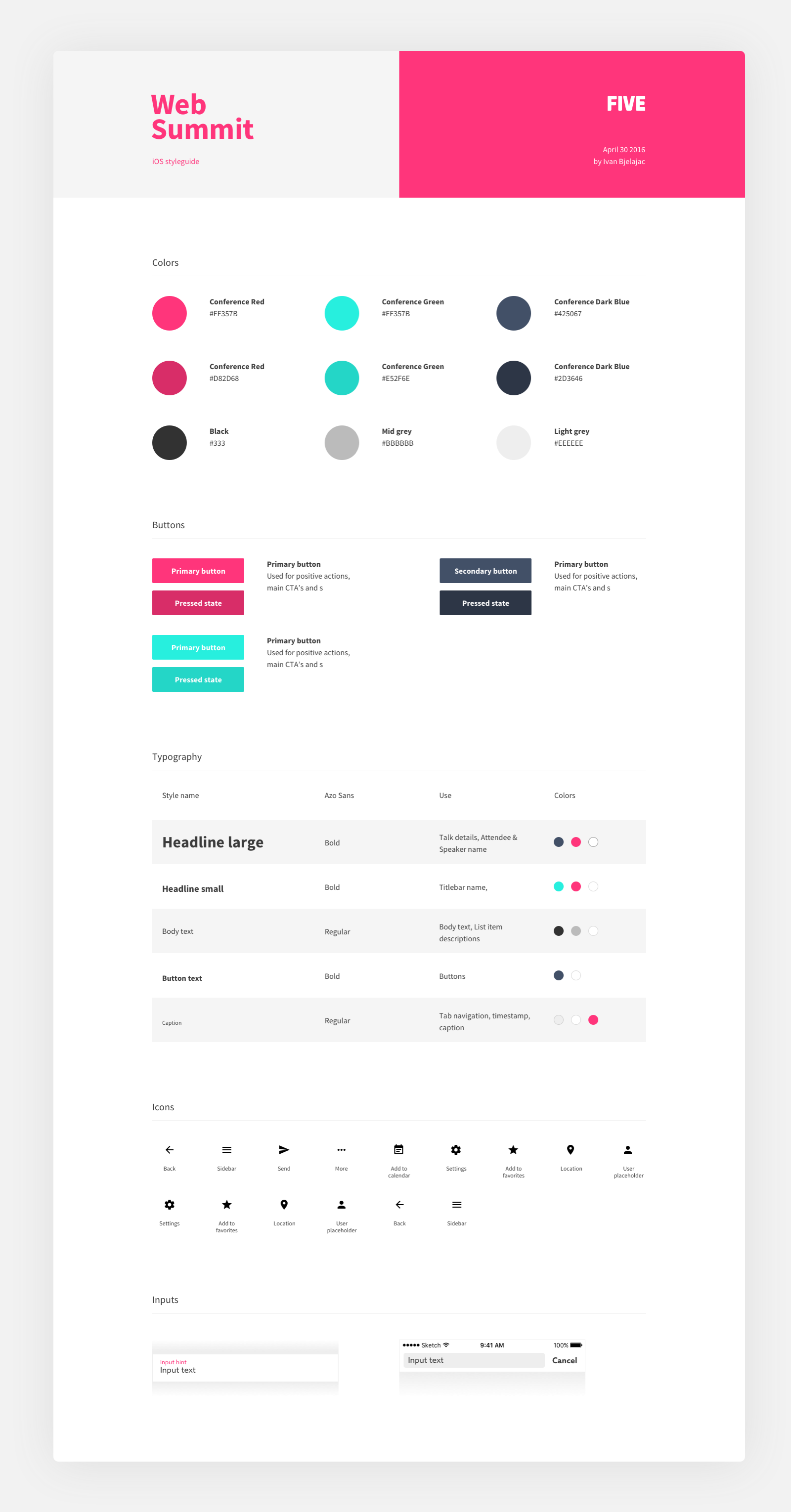
Completely agree. You guys are always trying to make things more consistent joining the similar "blocks", that's cool, but even doing that, at the final of the day things seems lost. That's because it's missing a Design Style Guide. That's useful to start creating our product identity. It can be as simple as only showcase our colors and typography to be more complete with iconography, components (button), etc...
That's one of the cons of using frameworks like Bootstrap or Bluma. It provides a full-kit-of-everything, so we use all. At the end of the day things don't look right because the truth is we don't need it all. That's where a Design Style Guide can helps us too.
For you to get an idea of what a Style Guide looks like, here's an example of very simple Web Summit Style Guide. In our case we could create a new page /design-style-guide with that documentation.
 taoeffect
commented
6 years ago
taoeffect
commented
6 years ago Could you tell me what was the reason behind to divide that flow into individual steps / pages?
This is a great question, and I honestly don't remember the answer, but if I had to guess, it's something like:
If you can make a better one while respect all of the above concerns by all means feel free.
Also, I want to point out that this step-by-step sequence is created using a component/mixin that @hubudibu designed, so it's flexible. If you're concerned that the number of steps (and current progress through the assistant) isn't visible, then it's fairly trivial to edit that step-assistant to add those as features one can enable.
In other words, we have a generic way of creating step-by-step setup assistant-style sequences, which is a flexible UI-pattern that I've used quite a lot in my work.
I think the current "step-flow" UX can be simplified.
Simplifying is always good. It's what we strive for — maximum simplicity. But it's also easier said than done. So if you think you can really simplify the existing flow, by all means go for it. Just don't end up accidentally over complicating it! 😄
Bonus: The implementation logic is much simpler.
Right now we've done a pretty great job of making a generic setup assistant that already has very simple logic. So all that really is relevant is the number of steps. The logic itself doesn't need much modification, as it can accommodate any number of steps.
Just to get an idea of UX, it could be something like this Dribble example).
That is a big question-mark. I am uncertain. There is quite a lot potentially that would be in that form, and it must look good on all screen sizes, including modal.
Our current UI, although it involves slightly more clicks (you are correct), does work great on all screen sizes.
If you try to stuff it all into a single form I suspect we'll fun into problems on mobile, and it might get too cluttered / confusing to the user.
Remember also that right now what is most important is not redoing the group creation, but simply creating the Dashboard markup.
That is what we need most for you to focus and work on. Ignore everything else. You can always return to it later after the dashboard is ready. :)
sandrina-p
commented
6 years ago I agree with all of that you've said and your concerns.
Remember also that right now what is most important is not redoing the group creation, but simply creating the Dashboard markup. That is what we need most for you to focus and work on. Ignore everything else. You can always return to it later after the dashboard is ready. :)
I could swear I did end my previous comment saying exactly that, maybe I've forgot to write it down and only thought about it 😕 All my questions/suggestions aren't important compared to our current goal - finish the prototype.
So let's just focuson what's missing in this issue polish generic voting / proposals and in another issue we can discuss more how to improve Create Group userflow.
[ ] Develop "Propose Changes" feature: On link click opens a modal within the respective step reusing our current step-flow system.
[ ] Redesign "new member approval" to be be similar to "mincome system panel"
sandrina-p
commented
6 years ago As discussed on last call, my focus this week is this issue. I've started by refining the existing Voting Panel on Dashboard.
First things first, besides a kindergarten-professional theme, it's also important to have a intuitive interface for the user. Since all the voting system will be the first thing of the dashboard right on the top, I believe that yellow / danger background might be too strong for the purpose, so I've followed a cleaner interface.
So these are the designs I've came up so far. OFC these designs are not finished and anything can be changed and iterated. Also, those were not implemented, I want to hear your opinion first!

As said on #285, a important part of the profile is the picture, so I thought showing the user avatar would be a great improve when the proposal is to invite / remove members. Also the user name's could be clickable to view the profile. Are the user profiles public?
The CTA copy for and against can be being more specific for each voting case. For example on a inviting proposal, instead of for, it could say Yes, invite and on removal it says Yes, remove. That micro words show an actual action for each scenario instead of a generic word that can suit any case, improving the cognitive process when taking the decision, so the UX is improved.

An alternative version for the accept button is using solid instead of outlined. What do you prefer?
If multiple proposals are on going, it can be displayed a button that shows all proposals in list sorted by type of proposal (or date?)

During this process I took some notes/doubts:
Does a Voting Proposal has a time deadline or is it timeless?
Is there a view to show the history of all proposals/votes?
Can the user propose a new change based on the current proposal?
When a member A invites member B to the group, member B only receives the notification after the proposal is approved by the group, correct?
Can we have multiple equal proposals at the same time from different members? (ex: Kat proposed 200$ and Sam proposed 150$ for mincome)? Maybe not as MVP... to simplify the logic of handling different proposal / voting rules. If we disallow that, the "Propose Change" link related to the active propose (in this example, the Min income) should be hidden while the proposal is opened. This rule wouldn't apply to "Add member", unless 2 members invite the same member. We need to be careful on our App logic here, I'm starting to see the logic increasing here with a lot of if and but.
When a proposal is finished, how are the members notified with the result? An inbox message? A notification on the Dashboard on the same place of Voting?
On Voting Settings, show 80% of the members need to approve it, what exactly does that mean? It's not intuitive enough. What about add an explanation to that number somewhere? If a group has 7 members, 80% means “6 of 7 members". I've added that info to the voting view.
Regarding the message in the inbox with a different view, could be exactly the same as on Dashboard for consistence purposes.
I'll keep working on this view and try different approaches. So far, what do you think guys? @taoeffect @hubudibu
So, I've polished even more the UI, now with a left alignment and without those grey divider lines, following the rest of the dashboard's vibe. I thing this approach is much better because it's so more readable. The user can have a better bigger picture of all proposals and their process, since everything related is aligned and on its place.


Notice that it also shows the proposal started by the user and those that he already voted. Some more notes:
Can the user cancel a proposal after created (and still in voting)?
Can the user change its vote?
Should the user be able to see "3 of 7 votes received" before voting? Does that might influence the user decision in any way? I don't believe so, so I've removed it and show it only after voting (having in mind that the user can't change the vote).

sandrina-p
commented
6 years ago @hubudibu
apart from that, submitting a proposal sends a special, vote type message to all affected members where they can cast their vote for or against said proposal. this part is already implemented and can be tried out with creating an invitation proposal. clicking the message in the inbox leads to the following voting view (this). this could also use some UI improvement, eg. to be consistent with the voting panel on the group dashboard.
I've tried to reproduce this and couldn't see any message on the inbox. Is this part still working? These are the steps I've did:
What did I miss? 🤔
hubudibu
commented
6 years ago My part of the answers:
- An alternative version for the accept button is using solid instead of outlined. What do you prefer?
I would prefer the outlined version, as that is closer to the ‘against’ option. the solid one feels more like that is the “right” option that should be clicked. a bit too suggestive for my taste in a question we don’t want to interfere with
- When a member A invites member B to the group, member B only receives the notification after the proposal is approved by the group, correct?
Yes, the invitation is only sent once the invite has been voted for.
- Can we have multiple equal proposals at the same time from different members?
I would go for disabling that option while a vote is in progress, making it possible to withdraw a proposal, and limiting the time available for casting votes on a proposal. I assume this would simplify decisionmaking, but would also allow for some flexibility to replace the proposal if the discussions move towards a better idea
- When a proposal is finished, how are the members notified with the result? An inbox message? A notification on the Dashboard on the same place of Voting?
I would go for the latter, plus maybe later a “new” badge on the new value/member for a while?
- On Voting Settings, show 80% of the members need to approve it, what exactly does that mean? It's not intuitive enough. What about add an explanation to that number somewhere? If a group has 7 members, 80% means “6 of 7 members". I've added that info to the voting view.
I love the “6 of 7 members" wording 👍
- Can the user change its vote?
I imagine a long discussion going on about each proposed change, people voicing opinions for and against, and people changing their opinion based on those. I don’t see a problem with changing votes.
- Should the user be able to see "3 of 7 votes received" before voting?
pro: Seeing that many people already voted could be a good motivation for the user to cast their vote finally. con: Based on the number you see and the fact that the proposal is still open could make the user think about who could have voted for what, instead of focusing on their own opinion and intention
I love the left aligned layout, it’s clean and can display multiple proposals nicely. I love what you did with the wording and displaying the selected vote 👍
About testing the proposal message: you need at least 3 people in a group to be able to make a proposal, add one more and you’re good! (I don’t know the reasoning behind this, and can totally remove this part if you think it’s unnecessary:)
isProposal () {
  return this.memberCount() >= 3
}Since all the voting system will be the first thing of the dashboard right on the top
This may be a questionable assumption, as I suspect the usual case will be that there won't be any proposal at all near the top, so something else might have to fill some of that space when there are no proposals. That's something worth mocking up and thinking about as well — what the dashboard looks like when there are no proposals.
As said on #285, a important part of the profile is the picture, so I thought showing the user avatar would be a great improve when the proposal is to invite / remove members. Also the user name's could be clickable to view the profile. Are the user profiles public?
Yes, I like the idea of showing the profile picture of who's being invited. :+1:
Re profiles being public... yes, part of them is. There is a public profile, which includes their profile picture, and there's a group profile that's associated with their public profile once they join. The information stored in the group profile is not public, it is visible only to the group.
That micro words show an actual action for each scenario instead of a generic word that can suit any case, improving the cognitive process when taking the decision, so the UX is improved.
Little details like that are brilliant. :+1:
An alternative version for the accept button is using solid instead of outlined. What do you prefer?
The two buttons should have the same general look and feel except for the color, so either both are solid or both are outlined. We don't want to unintentionally trigger some sort of weird unconscious voting bias based on how users are already mentally conditioned to click call-to-action buttons.
If multiple proposals are on going, it can be displayed a button that shows all proposals in list sorted by type of proposal (or date?)
Yes, I think the list mockup that you came up with at the very bottom is good.
Also, I do still think the proposals should stand out somewhat, and that keeping them "bare white" might not be a good idea. We do want them to sort-of visually nag users to deal with them and not ignore them.
Does a Voting Proposal has a time deadline or is it timeless?
It probably depends on the proposal. I am guessing most proposals will have a time deadline (that can vary based on the proposal), and that most will default to keeping the status quo unless the threshold is met by the deadline.
Is there a view to show the history of all proposals/votes?
There should be, but that's something that can be added later. Low priority for the prototype.
Can the user propose a new change based on the current proposal?
Proposals for proposals? I don't think so. At least I have not heard of a compelling argument for such a feature (yet).
When a member A invites member B to the group, member B only receives the notification after the proposal is approved by the group, correct?
Correct. Effectively, the proposal is whether or not to send the invite.
Can we have multiple equal proposals at the same time from different members? (ex: Kat proposed 200$ and Sam proposed 150$ for mincome)? Maybe not as MVP... to simplify the logic of handling different proposal / voting rules. If we disallow that, the "Propose Change" link related to the active propose (in this example, the Min income) should be hidden while the proposal is opened.
Indeed, that seems like a good way to handle it for the MVP.
When a proposal is finished, how are the members notified with the result? An inbox message? A notification on the Dashboard on the same place of Voting?
Good question. The Dashboard should only show things relevant to a specific group that you're already a part of. So I'm leaning to Inbox message for this.
On Voting Settings, show 80% of the members need to approve it, what exactly does that mean? It's not intuitive enough. What about add an explanation to that number somewhere? If a group has 7 members, 80% means “6 of 7 members". I've added that info to the voting view.
An tiny explanation below is a great idea. You added it tastefully in greyscale.
Can the user cancel a proposal after created (and still in voting)?
Yes.
Can the user change its vote?
Yes.
Should the user be able to see "3 of 7 votes received" before voting?
Yes.
sandrina-p
commented
6 years ago Thank you guys, you've answered everything! The summary so far:
I still have some questions:
It probably depends on the proposal. I am guessing most proposals will have a time deadline (that can vary based on the proposal), and that most will default to keeping the status quo unless the threshold is met by the deadline.
Should be the user or the system to automatically setup the proposal deadline? Maybe as an MVP we can set a deadline of 1 week and when it's left ~48h we remind the user about his missing vote?
taoeffect
commented
6 years ago Note that even using red / green where can lead to an unconscious voting bias. Should we really use them or try a total neutral approach where the only difference is the buttons text?
I think the outline colors are fine, I can't think of what bias might come into play except for cultural bias which we might need to account for via i18n (e.g. in some cultures green and red might be swapped or they might use different colors for "go" and "stop").
So it's fine to use those colors IMO, and when we need to customize them for i18n we can get to that later. You might want to account for that early on though by making $go-color or $success-color variables and using them early on for stuff like this.
Should be the user or the system to automatically setup the proposal deadline? Maybe as an MVP we can set a deadline of 1 week and when it's left ~48h we remind the user about his missing vote?
Let's worry about that later? For now we'll define some default times, and that's probably something that we can add as settings to the group's constitution later.
sandrina-p
commented
6 years ago Designs updated now with new font Source Sans Pro!


If the user declines the the invite, we could stay visibile for, let's say, 24 hours, before complete disappearing with an UX similar to "Cancel Proposal". That interval might give time to the Group Founder (that received a notification saying "Katty declined joining to your group" to chat with her and clarify things before creating another proposal. Or do you think it should be instantly without countdowns, and this logic is unnecessary?
On the current "tabled view" it also shows "Open to new members" and "contribution transparency". @taoeffect could you explain me better what are these options? Where can I, as a member, edit those settings, so I can better understand how to place them on the Interface.
Some more doubts/notes I had during the process:
@taoeffect: (...) I suspect the usual case will be that there won't be any proposal at all near the top, so something else might have to fill some of that space when there are no proposals.
IMO the Dashboard can just show directly the next widget ("Members") after the Header and the "Proposals" are visible only when any is active. Do you have anything else in mind? 🤔
Regarding how to let the user know about "a recent closed proposal", I'll keep study that part, I'm exploring @hubudibu suggestion of using "badges".
I'm also studying how to improve the Proposals visibility without users ignoring it. Any idea that doesn't include a strong colorful background it's welcomed 😄 (Joking, any idea is very welcomed!)
taoeffect
commented
6 years ago I thought instead of our current complex tabled layout with a whole different design, we can take advantage of the actual Dashboard and adjust it from a "member view" to a "guest view".
Personally, I would still like to preserve some of the original design for this view, for two reasons:
MembersCircle.vue looks pretty good, and definitely can add a "fun" element to the UIThose are my thoughts on that, I'll leave the final decision on this up to you though.
On the current "tabled view" it also shows "Open to new members" and "contribution transparency". @taoeffect could you explain me better what are these options? Where can I, as a member, edit those settings, so I can better understand how to place them on the Interface.
I think the thinking was that "Open to new members" might be something like open groups where outside users can apply to join. That's not something we'll have in the MVP, or maybe ever.
The "contribution transparency" setting was about how to handle whether or not to show who is paying how much in the group. This might not be a setting we have in the MVP either. Either way, it will likely need another round of discussion and brainstorming to figure out.
So... don't worry about them for now. ^_^
If they were implemented, they would be part of the group's constitution / settings.
What exactly is the "profile" when I click on some member link? What information are displayed for each case and what are the different cases? Image? username? user email? bio? what else?
A person has a public profile, and the info displayed there will be whatever info they want to be publicly known. So it might just be a username, and that's it. Or it could include other info.
Can I interact with him? Send a message? invite directly to the group? block? Send friend request? Does Group Income has the concept of "friends" ?
Err... unknown for now. You'll probably be able to send them messages (since we have an inbox). But for now just don't worry too much about this since we honestly haven't thought this far ahead and it's not super important for the MVP.
Great work! 👍
sandrina-p
commented
6 years ago Oh I'm sorry, but actually I was talking about this tabled layout, not the one from Aaron! I'll have Aaron's design in mind on further iterations, it won't be forgotten! 😉
Thanks for the clarification regarding the Profile, that will help me to decide what's the best UX/UI to explore and propose at the moment :)
taoeffect
commented
6 years ago Oh I'm sorry, but actually I was talking about this tabled layout, not the one from Aaron! I'll have Aaron's design in mind on further iterations, it won't be forgotten! 😉
I know, that's the one I was talking about too. :)
And I'm saying I think that's a good place to put the MembersCircle.vue
sandrina-p
commented
6 years ago So, after a quick call with @taoeffect I've worked on Group Invitation view based on the original design and I came up with this solution:
That graphic summarises the last 6 months. I've removed the verbose "Jan, Fev, etc.." and % values because I think it's was just noise for the case. IMO a simple graph with a copy explains well the group performance. I've also removed min income, but I believe we might want to keep that informartion, correct?

Similar to the previous one but the summary is built by shades. I know that @taoeffect prefer a red/green approach, but I've tried it here just to compare. :D
Note that I've removed the colorful borders around each member

When hover on a member, its picture border gets highlighted and the summary graphic is replaced by an the essential member information.

I've tried this view with different themes and all of them worked great, so I think it can adapt well to any theme!

What do you think?
taoeffect
commented
6 years ago @sandrina-p These look great! 👍 💯
I've also removed min income, but I believe we might want to keep that informartion, correct?
Yes, the mincome is probably something that should be displayed as it's pretty vital/relevant information.
sandrina-p
commented
6 years ago @taoeffect min income added to invitation view


What can be available:
Suggestions are welcome!
sandrina-p
commented
6 years ago I've explored a little the "badge" solution proposed by @hubudibu, but I'm afraid this can't suit every case.

To let the user know of a recent closed proposal, there are several points we need to have in consideration:
Will the user know "5 of 7 members voted" or just the final result? (If all votes are for and the threshold is 70%, 5 votes are enough to close a proposal).
On "min income" there's blue dot with some kind of blinking animation, to notify the new value $200, but... what was the previous value? How many users voted for? When will this dot notification disappear? Not sure if it's intuitive enough.
The "new member" badge is cool, but the user will have the similar questions.
On "Current Settings" the user would need to scroll down to view the changes (if any).
If the proposal was rejected, the user won't know it with "badges".
I will continue exploring this part of the UX, and come up with other solutions. Any suggestion is welcome!
taoeffect
commented
6 years ago Will the user know "5 of 7 members voted" or just the final result? (If all votes are for and the threshold is 70%, 5 votes are enough to close a proposal).
I believe that's an important thing to know to keep the group information _transparent.
I agree. :)
On "min income" there's blue dot with some kind of blinking animation, to notify the new value $200, but... what was the previous value? How many users voted for? When will this dot notification disappear? Not sure if it's intuitive enough.
I don't think the dot is helpful as it's not clear to me what it means.
Let's have a "news feed" of recent proposals, their outcomes, etc. All recent changes and the results can go there. This can even be a "widget"/section in the dashboard.
The "new member" badge is cool, but the user will have the similar questions.
Not sure what you mean by "but the user will have the similar questions."
I've remembered another peculiar scenario: If a setting value is 10% and the group has 10 members, does that mean the group doesn't need to have a "voting system", since 1 vote it's enough to be approved. Correct?
Err, that's a corner case @hubudibu and I will have to look into later. Feel free to open an issue for that, we can discuss what to do in there.
If the proposal was rejected, the user won't know it with "badges".
Not sure what you mean here either.
I will continue exploring this part of the UX, and come up with other solutions. Any suggestion is welcome!
The recent badges underneath member names could look better. I think their width should be the same, for example.
I also think you're ready at this point to start implementing this in .vue files. :)
sandrina-p
commented
6 years ago I don't think the dot is helpful as it's not clear to me what it means.
I agree. That's why I believe using only "badges" it's not enough to let the user know of a recent proposal.
Let's have a "news feed" of recent proposals, their outcomes, etc. All recent changes and the results can go there. This can even be a "widget"/section in the dashboard.
That's almost like a "Proposals History" view! 😄
The "new member" badge is cool, but the user will have the similar questions. (How many users voted for? When will this badge disappear?)
If the proposal was rejected, (example a new member was rejected) the "badges" approach wouldn't work out for that scenario.
The recent badges underneath member names could look better. I think their width should be the same, for example.
The initial design had the same width. To try different I've removed it. But I can add it again :)
I also think you're ready at this point to start implementing this in .vue files. :)
I agree, I'll be on that during the next sprint!
taoeffect
commented
6 years ago That's almost like a "Proposals History" view! 😄
Yes, and in this case other group news in addition to proposals can go there too. :)
The "new member" badge is cool, but the user will have the similar questions. (How many users voted for?
So that would go into the news feed where the results of proposals are sent.
When will this badge disappear?
Dunno, let's ask those sorts of detailed questions once we actually have this implemented or are working on the feature itself.
If the proposal was rejected, (example a new member was rejected) the "badges" approach wouldn't work out for that scenario.
What won't work out? The result of the proposal goes to the recent news feed where everyone can see it.
I agree, I'll be on that during the next sprint!
😄 👍
sandrina-p
commented
6 years ago What won't work out? The result of the proposal goes to the recent news feed where everyone can see it.
Yes, a recent news feed can solve it all as a generic solution!
taoeffect
commented
6 years ago Note that I cannot fully test #407 until voting on whether to add members actually works (as currently clicking "For" does nothing).
sandrina-p
commented
6 years ago So here's a design for the starting point to propose a change: A modal as we had talked before.
The actual content of the modal is very similar to the correspondent step on CreateGroup flow. Here the focus was not just to "to make it work", but to also keep it consistent with what we already have. Make it good, then make it better. Later we can iterate on this again ;)


I'm aware of #409 , and that should be solved on its own task. That's why I've kept a similar UI. I've added the "Help text" to better explain what's the meaning of 78% on this Group context, was we discussed before too.


On "Add/Remove Member" I've tweaked the Design because I think the current huge card is... too huge. Still, I believe this is away from a final solution since I have some questions about how search works:
So, guys, what's your thoughts?
hubudibu
commented
6 years ago they are nice and simple 👍 I love the simplification with the add member design! and 👍 👍 for reusing the create steps
about the search there: I think the intention here was not to be able to search among existing users, but just to add users whose identifier(name) the proposing user already knows. @taoeffect can probably tell you more about the reasoning behind this, and the security/privacy aspects of this question.
the only reason why we had a separate input field and found user list here is for the ability to add multiple people at once when inviting or proposing new members. I'm sure invite works with multiple people now, but I'm not sure if the propsal does/should?
taoeffect
commented
6 years ago about the search there: I think the intention here was not to be able to search among existing users, but just to add users whose identifier(name) the proposing user already knows. @taoeffect can probably tell you more about the reasoning behind this, and the security/privacy aspects of this question.
Yeah, a big reason is simply that the user registration / namespace stuff is something that is really hard to get right, and so we're putting all of that off until after the prototype to figure out. We can discuss this over a call if either of you are interested, although I think we've discussed some of this stuff before.
I'm sure invite works with multiple people now, but I'm not sure if the propsal does/should?
The generic proposal system should be able to handle complicated proposals like that once it's built out. For now though let's just focus on getting it working with one person at a time.
So, guys, what's your thoughts?
I think these designs look great! 😄
sandrina-p
commented
6 years ago Thank you guys for the search clarification! After we close the current #415 PR, I'll start implementing this one, it that's okay for you ;)
 mmbotelho
commented
5 years ago
mmbotelho
commented
5 years ago Hello! Since the modals to propose changes were not yet implemented, I decided to tackle them. What I designed is very similar to what @sandrina-p started, but with a few tweaks:


Because members will be added one by one (thread above), I removed the "add" button, so that we don't give the user the false expectation that they can add more than one at a time.

I took the chance and made some changes to the rules component (see issue #409 ). I will post a comment in that thread with further information.
What do you think?
sandrina-p
commented
5 years ago Thanks for improving the original designs @mmbotelho! Just a few quick design notes: (@taoeffect can better clarify the other doubts)
50 instead 50%, so that should be reflects on the border-bottom) Also I find the up/down icon extra noise that might not be needed. One last thing that I already commented in the past somewhere else (couldn't find the link): We should better explain "50%" means in a group context. Imagine a group with 15 members: It could have a text somewhere saying "Now at least 8 of 15 members must agree when a proposal is created." And when the user changes to 80%, it updates the text "Now at least 12 of 15 members must agree when a proposal is created." taoeffect
commented
5 years ago I made the modal a bit wider;
👍
I've seen a few different terms for minimum income (minimum income, mincome, min income). Which is your preferred term? We should take that and use always the same everywhere.
While I agree that 3 ways of writing it are too much, I'm not sure having only one way of writing it is the best plan. Having "minimum income" and "mincome" allows us flexibility in the UI where space is limited.
So perhaps on the dashboard we can use "mincome" if it looks better, and in the proposal title we can spell it out as "minimum income". I haven't seen where we use "min income", but if we do that anywhere it should be rewritten as one of the other two.
I am assuming that once the currency is selected for the first time, the platform assumes that this is the currency for the group. Is this correct? If yes, maybe this can also be a group setting.
Correct, there is an official "group currency" that the mincome is measured in. Payments can be sent in other currencies, but everything is based on the exchange rate to the group currency setting (which can be changed, but when it's changed it's changed for all group members).
Because members will be added one by one (thread above), I removed the "add" button, so that we don't give the user the false expectation that they can add more than one at a time.
OK, but keep in mind we need some way for this to work on iPhones and iPads, so something to press is needed, just to be clear, because the "Enter" key may not be obvious to everyone.
OK cool I'll post any responses in #409.
You can see the mockups for this directly on Figma
Ok but currently I don't see a mockup for removing the member?
 dotmacro
commented
5 years ago
dotmacro
commented
5 years ago 1. Change minimum income:
I've seen a few different terms for minimum income (minimum income, mincome, min income). Which is your preferred term? We should take that and use always the same everywhere.
Having "minimum income" and "mincome" allows us flexibility in the UI where space is limited. So perhaps on the dashboard we can use "mincome" if it looks better, and in the proposal title we can spell it out as "minimum income".
What if we were to use "mincome" everywhere except explanatory text and FAQ?
2. Add new members
Because members will be added one by one (thread above), I removed the "add" button, so that we don't give the user the false expectation that they can add more than one at a time.
👍
With the earlier mockup (with "add" button), I could imagine the process of adding a member -- type name, and click "add" button when box shows correct user or email address, then click "open proposal".
I like the new mockup. Can you clarify the flow? How would the user select the correct "Sam" from a suggestion list, or propose a completely new "Sam" instead?
OK, but keep in mind we need some way for this to work on iPhones and iPads, so something to press is needed, just to be clear, because the "Enter" key may not be obvious to everyone.
Also, many laptop/desktop users still use their mouse to click/select instead of typing "Enter".
mmbotelho
commented
5 years ago Hello!
Make clear that's the wider modal is just for desktop - aka on mobile we keep the original ones. (smaller)
Correct, I changed the desktop width to 640px, but other media queries should have the same width they have today.
To Add a new member, how is it the layout after the user types a username? What happens if it finds the username (or not)? I believe we should reflect that on the layout.
From reading the conversation in this thread, I got the impression that searching for usernames was not possible. I got this impression from the comments below:
about the search there: I think the intention here was not to be able to search among existing users, but just to add users whose identifier(name) the proposing user already knows. @taoeffect can probably tell you more about the reasoning behind this, and the security/privacy aspects of this question.
Yeah, a big reason is simply that the user registration / namespace stuff is something that is really hard to get right, and so we're putting all of that off until after the prototype to figure out. We can discuss this over a call if either of you are interested, although I think we've discussed some of this stuff before.
I assumed that the only possible outcomes are "the user exists" or "the user does not exist". Is this the case?
Note that the user can just write 50 instead 50%, so that should be reflects on the border-bottom
Correct! Can we make the field only accept numbers and a percentage sign, and if the user does not add it (the percentage sign), we add it automatically after they have unfocused the field? I saw this example on Codepen that does something similar, but with a phone number.
We should better explain "50%" means in a group context. Imagine a group with 15 members: It could have a text somewhere saying "Now at least 8 of 15 members must agree when a proposal is created." And when the user changes to 80%, it updates the text "Now at least 12 of 15 members must agree when a proposal is created."
Agreed, but keep in mind that this works when you are trying to change voting rules, but not when you are creating the group itself (because there's no one in the group yet). Here's the updated version:

Also I find the up/down icon extra noise that might not be needed
I left the arrows to keep it consistent with the other number inputs in the platform:

OK, but keep in mind we need some way for this to work on iPhones and iPads, so something to press is needed, just to be clear, because the "Enter" key may not be obvious to everyone.
I agree. As I mentioned above when replying to Sandrina, I'm not sure what is possible to do with the search username functionality at the moment, can you explain a bit further?
Ok but currently I don't see a mockup for removing the member?
Correct. I didn't design it because at the moment this functionality does not exist in the platform. I was thinking that it would be best to design that first (probably when designing the dashboard) and then decide what should be in the modal.
What if we were to use "mincome" everywhere except explanatory text and FAQ? This could work well. We could also explain it when we first use the word - for example, when creating the group, we can say something like "mincome (minimum income)" and use mincome from then on.
As for the "add a member" modal, I'm waiting for more information so I can improve it :)
Thank you for the great feedback everyone!
sandrina-p
commented
5 years ago I left the arrows to keep it consistent with the other number inputs in the platform:
Oh, but the mockup you made has custom arrows, the arrow from the pledge input is native.
mmbotelho
commented
5 years ago You are absolutely right @sandrina-p , no need to customize the arrows:

I have update the rest of the screens on Figma so it's clearer :)
Also I believe number inputs don't accept the "%" symbol, so this will probably need to be a regular field, right?
sandrina-p
commented
5 years ago No, it doesnt accept % character. If we make it a text (regular) field, we'll lose the accessibility of it: The arrows wont be there and on mobile it will show a numeric keypad instead of the alphabetical keypad.
My suggestion is to have the % character after the arrow (aka outside the input). That way it's always there visually, the user doesn't need to worry about it and we don't need to have JS logic to add a "miss-deleted" %. And last but not least we'll still be A11Y friendly :D.
mmbotelho
commented
5 years ago Even simpler and 100% accessible, awesome!

This is a number input that should accept integers from 1 to 100. Updated on Figma
Problem
Need to make a generic system for submitting proposals to the group to be voted on, for various actions like adding/removing members, changing the mincome, etc.
A lot of this has been implemented but much of it isn't polished and much of it isn't hooked up to the UI.
Also keep in mind issue #192 is related to this!
Solution
While keeping in mind related issues like #192, #300, and #312, fix the problem above.
EDIT: make sure to check Voting.vue for improper
v-htmlusage