Team's Response
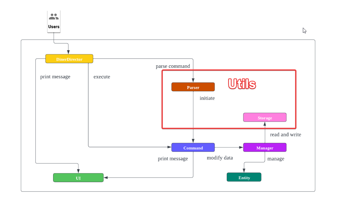
We agree that it would be better if the Utils component is labeled in the Architecture diagram. In our code, the Utils component consist of the Storage and Parser class. Hence, perhaps if we use a box to put those 2 components together as shown in the image below, it would be much clearer.
However, we feel that this can be reduced to a low severity because this misunderstanding can be fixed by highlighting which class consist of the Utils portion in our Architecture diagram.

Items for the Tester to Verify
:question: Issue severity
Team chose [severity.Low]
Originally [severity.Medium]
- [x] I disagree
Reason for disagreement: I want to link these to other parts of the bug report because the developers responses seem to somewhat be inconsistent with each other.
Based on the position of your Utils component and these sections, "Utils" seem to form a very big part of the project. Hence severity is a medium. And this is a real feedback from someone that took time to read it multiple times before getting it: You cannot assume readers understand that your Utils component would encompass these sections. Furthermore your storage section is included in another (manager) component. and your utils component does not include a storage component but it does include DinerDirector (as shown in my original screenshot in the argument above).
So either I am confused in this interpretation after many read throughs or you the responder are. Either way it proves my point that these assumptions and orientation of the DG is too confusing, especially for a new reader.
Second of all, it is a severity.Medium as this confusion:
- cuts across multiple main sections of the Architecture explanation (DinerDirector, Storage, Parser)
- Architecture part IS the (or one of the most important) core part of this DG
- ^this is because most devs can work solely with the Architecture if they can get the terms used and the connectivity of the design of the Architecture. I.e. a High Level understanding. And your architecture section not only does not do that but gives more confusion.
Where is the Utils component and what is the main purpose of it? This is not tagged to any part of the larger architecture