 slowe
commented
1 year ago
slowe
commented
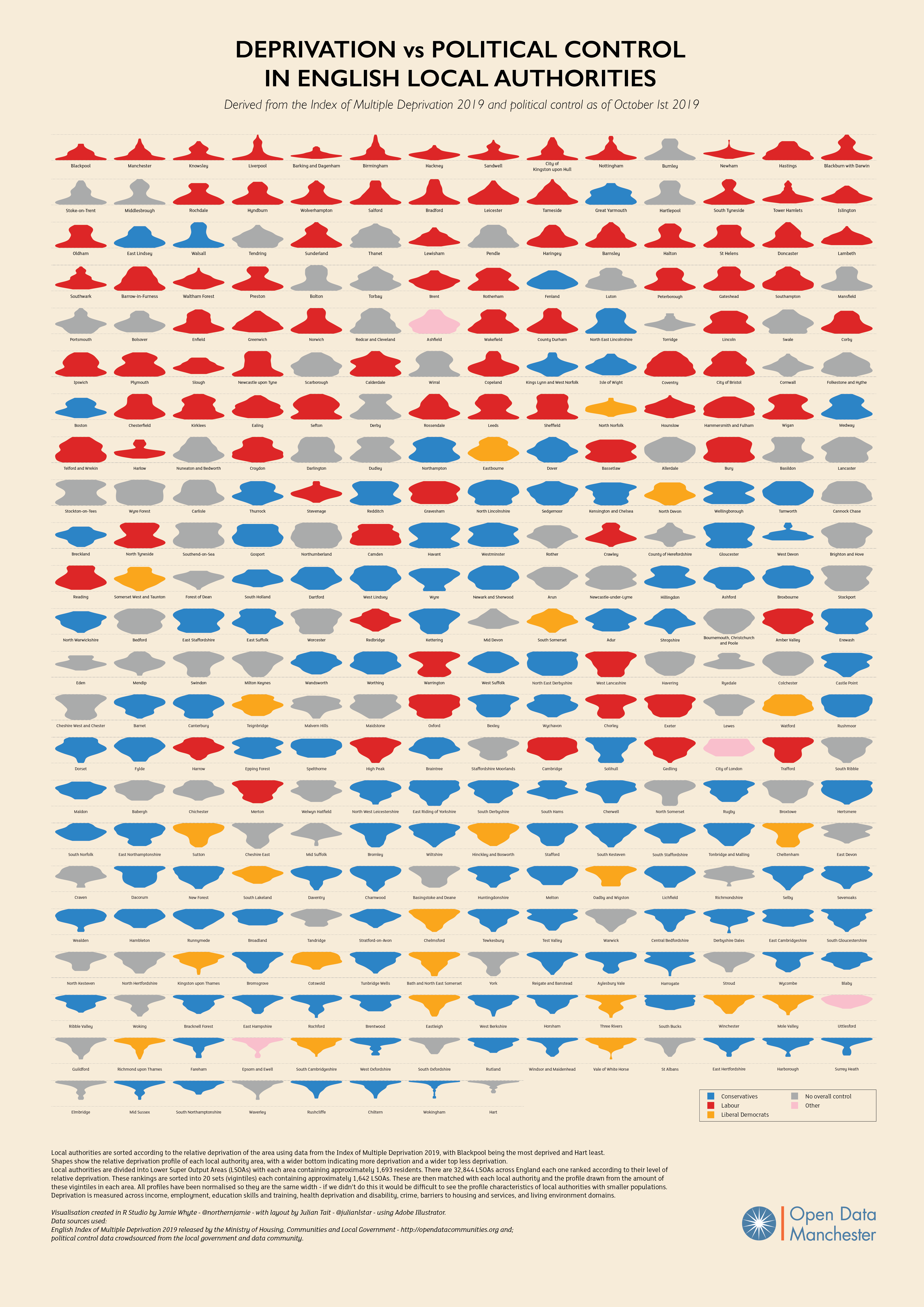
1 year ago Related would be the single series "lava lamp" plots such as these by Open Data Manchester. https://raw.githubusercontent.com/OpenDataManchester/indices-of-deprivation/master/imd19/lava-lamp-plots/IMD19%20A2%20FINAL.png Both plots shift the starting point. The population pyramids invert the sign of the first series and put it back-to-back with the second. The lava lamp plot shifts the series start to minus half its value.
It may be useful to have a "population pyramid" style chart e.g. these from ONS . It is basically a double-sided bar chart that can be useful to compare two (and only two) series.