 iandees
commented
7 years ago
iandees
commented
7 years ago Open migurski opened 8 years ago
iandees
commented
7 years ago  migurski
commented
7 years ago
migurski
commented
7 years ago That Mapbox map is in dire need of visual design help.
migurski
commented
7 years ago Making some progress on this in openaddresses/population repo, starting with per-country area and population estimates and writing to a useful database that can drive a coverage page:
iandees
commented
7 years ago I <3 those colors.
 nvkelso
commented
7 years ago
nvkelso
commented
7 years ago Cool! Reminds me about those funky Natural Earth concordances I need to fix.
On Mar 8, 2017, at 16:58, Ian Dees notifications@github.com wrote:
I <3 those colors.
― You are receiving this because you are subscribed to this thread. Reply to this email directly, view it on GitHub, or mute the thread.
migurski
commented
7 years ago I have a temporary representation of this data here: http://ec2-54-89-13-7.compute-1.amazonaws.com
Feedback at this stage would be really helpful!
nvkelso
commented
7 years ago Nice! I like the addition of the population map at the bottom.
I continue to think the break from substantial and minimal should be somewhere in the 10% to 20% range.
On Tue, Mar 14, 2017 at 12:56 PM, Michal Migurski notifications@github.com wrote:
I have a temporary representation of this data here: http://ec2-54-89-13-7.compute-1.amazonaws.com
Feedback at this stage would be really helpful!
— You are receiving this because you are subscribed to this thread. Reply to this email directly, view it on GitHub https://github.com/openaddresses/openaddresses-ops/issues/14#issuecomment-286540961, or mute the thread https://github.com/notifications/unsubscribe-auth/AA0EO3E692s3IwRv1j1B4V3WUPjfMsvCks5rlvEIgaJpZM4IXoCU .
nvkelso
commented
7 years ago The text in the intro helps explain the 3 parts of the table, but if you breeze over that it's not clear why the table parts are grouped that way. Might also add a column for the overall coverage grade (full, substantial, minimal)? This would allow future sorting of the table, too.
migurski
commented
7 years ago Good ideas, I incorporated them all.
iandees
commented
7 years ago This looks great, thanks for putting it together! The columns are a tiny bit confusing, though. maybe the "population in land area" column should be "population covered" or "estimated population covered"?
migurski
commented
7 years ago Okay, made that change. I experimented with splitting up the columns a bit, curious if this makes sense.
Old:

New:
 nvkelso
commented
7 years ago
nvkelso
commented
7 years ago Is there special HTML formatting that would allow these to copy into OpenOffice as a table? Right now I'd need to do processing to get it into a full table (as Land Area Covered, Population Covered, and Address Density all have sub cells that copy into 1 generic OpenOffice cell):

So instead A-G it'd be 3 more for A-J.
migurski
commented
7 years ago I was thinking of this with the "new" variant from the comment above, with separate columns for the parenthesized parts. I'll push it live; tell me if it works for you.
migurski
commented
7 years ago Results when pasting into Numbers:
 nvkelso
commented
7 years ago
nvkelso
commented
7 years ago YES!
 migurski
commented
7 years ago
migurski
commented
7 years ago ✨ Spreadsheets! ✨
nvkelso
commented
7 years ago Now add a save as DBF option ;) JK!
On Mar 14, 2017, at 15:22, Michal Migurski notifications@github.com wrote:
✨ Spreadsheets! ✨
— You are receiving this because you are subscribed to this thread. Reply to this email directly, view it on GitHub, or mute the thread.
nvkelso
commented
7 years ago The paragraphs at the top serve as legend, but are missing two items:
 migurski
commented
7 years ago
migurski
commented
7 years ago After some good brainstorming with @sbma44 and Michael Steffen, I’m going to dumb down the address density number a little. It’s currently the average of densities (with standard deviation) and I’m going to simplify it to the average density so the arithmetic is easier to understand.
 michaelsteffen
commented
7 years ago
michaelsteffen
commented
7 years ago @migurski you can call me by my github name, it's OK :).
👋 @iandees @nvkelso
 NelsonMinar
commented
7 years ago
NelsonMinar
commented
7 years ago Loving this work. My requests:
migurski
commented
7 years ago Good suggestions, @NelsonMinar. I’ve applied them all except the font thing. Can you tell what font is actually being rendered on Windows? It’s not Palatino, which looks like this for me:
 NelsonMinar
commented
7 years ago
NelsonMinar
commented
7 years ago You're right, I think it's actually Georgia that my sample is showing (second option in the CSS for body). My Windows 10 system doesn't have a font named "Palatino", but it does have "Palatino Linotype" which seems to work in the CSS and looks OK.
migurski
commented
7 years ago This is real now: http://results.openaddresses.io/coverage
nvkelso
commented
7 years ago Congrats, great new feature :)
On Wed, Mar 22, 2017 at 2:43 PM, Michal Migurski notifications@github.com wrote:
This is real now: http://results.openaddresses.io/coverage
— You are receiving this because you were mentioned. Reply to this email directly, view it on GitHub https://github.com/openaddresses/openaddresses-ops/issues/14#issuecomment-288549322, or mute the thread https://github.com/notifications/unsubscribe-auth/AA0EO5M3qQxAZtc813osFrWJTQfDaLfpks5roZX4gaJpZM4IXoCU .
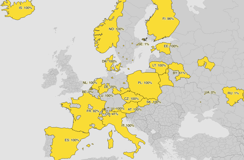
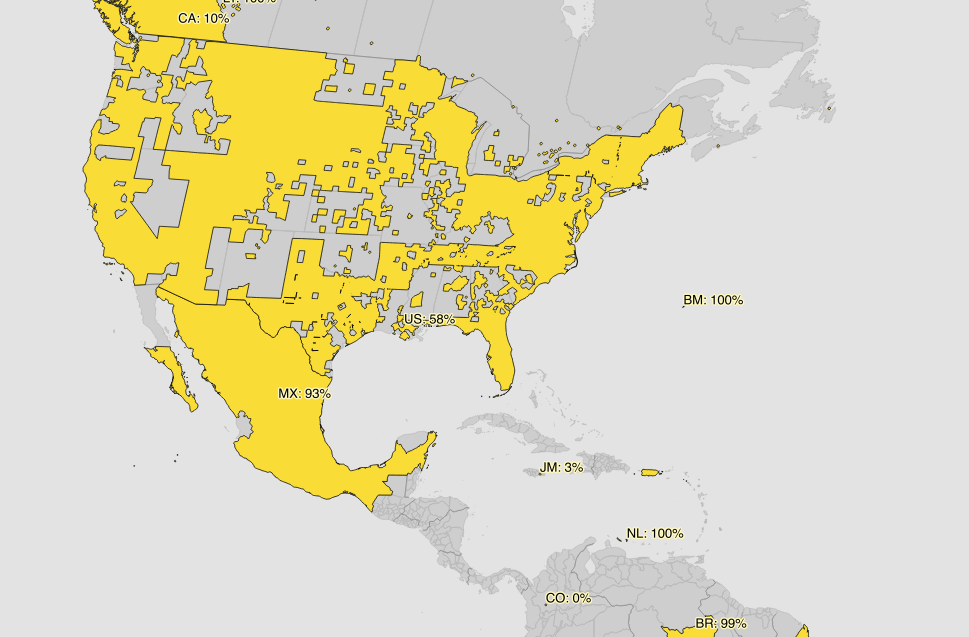
iandees
commented
7 years ago 👏 This is really excellent. I tweeted about it here: https://twitter.com/openaddr/status/844666719209750528
Can we add a map like the green/red one on https://results.openaddresses.io/ but coloring countries based on population coverage percentage?
migurski
commented
7 years ago Yes, absolutely! I probably shouldn't use the same colors for this.
 jharpster
commented
7 years ago
jharpster
commented
7 years ago These coverage metrics are the best thing ever. Also wondering if raw counts of addresses by country are maintained some place or if that would be useful to anyone besides me.
migurski
commented
7 years ago That sounds pretty useful. Maybe a thing to put on a linked page for each country, as @michaelsteffen has suggested.
Companies like Google and HERE produce coverage summaries of their data:
We’ve got a visual version of this in the maps at https://results.openaddresses.io, but a tabular form might be useful as well.