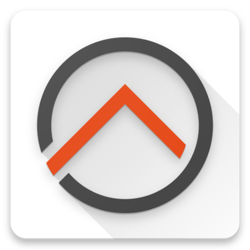
7 looks awesome :-) Long shadows FTW
Closed mueller-ma closed 7 years ago
7 looks awesome :-) Long shadows FTW
My favorites are 3 and 5
Mine is 3 - I think we should go for a round one as this is hip these days for Android apps :-)
Nice! lets do 3
Not a big fan of this new logo… Thinking that this logo will be used on mobile apps, at first sight I cannot recognize what this app really does… this will lead to one usability problem... but is just my opinion...
My vote 3 or 7
I'm surprised by this issue. Wasn't the idea to have one designer provide all needed icons and then stick with those to establish a consistent styling throughout all openHAB parts? If we start to create our own variations now, disaster is inevitable... For example: The main design consists of a gray circle and the orange triangle. Designs 6 to 10 break with that and the shadow introduced (as nice as it might look) is not part of the original design.
@mueller-ma apart from that I like your designs and would be fine with one of 1-4.
@jmvaz almost every icon is highly abstract and doesn't identify the function of the app. See the facebook f or any other icon on your homescreen. Associated meaning is generated in our minds from memory and you'll very soon get used to it.
@ThomDietrich I agree with you and that's why I voted for 3 as this is what came out from the logo design - the logo on a white circular background. Android and iOS have some specifics on the exact shape, resolution and use of shadows, though, which isn't yet created - this is something I am handing over to @digitaldan as he planned to do new app releases soon.
I think @mueller-ma suggestions are great as it gives an idea about the options. 6-10 is in the style that our current app icon is, so it is fair of him to list those as well. But I think we all agree that we should go back to the "normal" app icon now. So Android should be (3), while iOS uses the shape of (1). @mueller-ma I suggest you leave the update to @digitaldan as he also has access to the appstores and can update all required data there at the same time.
One question to all app experts though: From what I see from other apps, putting a shadow behind the logo is not very common - so shouldn't it rather be completely flat without any shadow?
@mueller-ma I suggest you leave the update to @digitaldan as he also has access to the appstores and can update all required data there at the same time.
It doesn't really matter if @digitaldan or me makes the PR, that changes the icon. It will only be visible to the user, when Dan uploads a new version.
No shaddow at all:
 "Elevate" shaddow:

Thanks - we should go for no shadows as this is how we use the logo at all other places as well.
Ok, I will update the pr.
Since we're updating the icon, should we also consider supporting the adaptive icons that Google introduced with API 26? https://developer.android.com/guide/practices/ui_guidelines/icon_design_adaptive.html
Some work need to be done, when we target 26. I heard, that it is possible to compile with 26, but still target 25. Someone with an android 8 device needs to test it.
With the dark themes the circle is hardly visible. Maybe we should use the icon with the white background everywhere in the app?

OH has a new icon: https://community.openhab.org/t/new-logo-for-openhab/35140
I have made some icons for the android app. Since the icon itself it round, we might want to use round icons for all android versions.
1: 2:
2:
 3:
3:
 4:
4:
 5:
5:
 6:
6:
 7:
7:
 8:
8:
 9:
9:
 10:
10:
