openpaperwork / paperwork

Personal document manager (Linux/Windows) -- Moved to Gnome's Gitlab
https://gitlab.gnome.org/World/OpenPaperwork/paperwork
2.43k stars 149 forks source link

Paperwork 0.2 UX issues #356

Closed mjourdan closed 8 years ago

mjourdan commented 9 years ago

Hi,

While I had to scan about a dozen of documents, I gave a try to Paperwork and would like to share some thoughts on it's user experience. You'll find in a separate post some ideas to fix the issues listed below.

Ux review

First things first, everytime I launch Paperwork, I'm delighted by it's logo and think "straight and fast, this will light me of a burden". However, Paperwork is not as close to the "scan and forget" philosophy as I hoped, because reaching the scan step requires too much effort and time (see how lazy I am).

In my opinion, controls make user think too much :

  1. huge number of buttons make feel every actions are equally important. This should be "scan and forget", but it more looks like "scan or modify or print or move or zoom or open a dir and forget"
  2. document controls (new, edit, delete) are separated from the document list (by a too wide searchbar)
  3. useless quit button
  4. the app menu contains actions specific to the current window
  5. Settings icon and Preferences in the app menu do exactly the same thing but appear twice and under different names

I also think the actual content is drawn in a far too complex layout:

  1. tabs to switch between labels and pages make think labels are as important as pages
  2. at a time, the document list shows no more than 2 documents (on a 15" screen)
  3. 3 columns layout for two kinds of items (documents and pages), so a single page may appear three times at a time (two times as thumbnails in document list and pages list, plus the page itself)
  4. some empty space at the bottom of the screen look very weird
  5. huge amount of vertical space lost (up to 7 lines of controls + windows decoration on the labels tabs)

Once she have figured out how the ui works, user will need to find out how to get this stupid scanner working:

  1. scanner detection requires an extra step on every launch (Hint: open preferences, wait a couple of seconds until a scanner is found, then close the preferences)

Finally, it's pretty easy to get rid of a maximum of paper in a minimum of time. Being able to move pages across documents and marking documents with labels are great features, for example to avoid bothering with scaning the right pages in the right order. Nonetheless, there is plenty of room for improvement.

Regards

mjourdan commented 9 years ago

On 13/02/2015 10:30, tYYGH wrote:

jflesch, mjourdan, I’m impressed with the mockups, the quick adoption, and real improvements this brings!

Thanks!

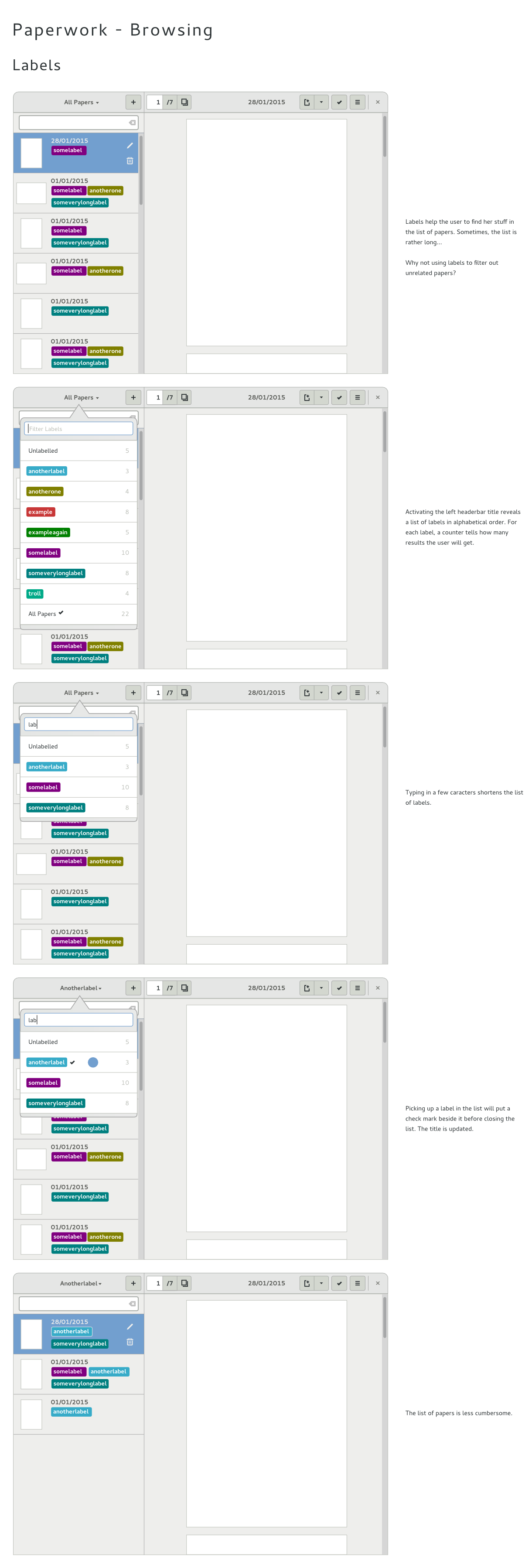
I post this only to comment about tags. While I agree with most of mjourdan’s improvements, he/she seems to relegate tags to second-class objects in Paperwork, which may explain the focus on titles… Of course, each person may use the software in a slightly different way, but IMHO tags are important, much like they can be on a blog or an email client software. (BTW, +1 for #362!)

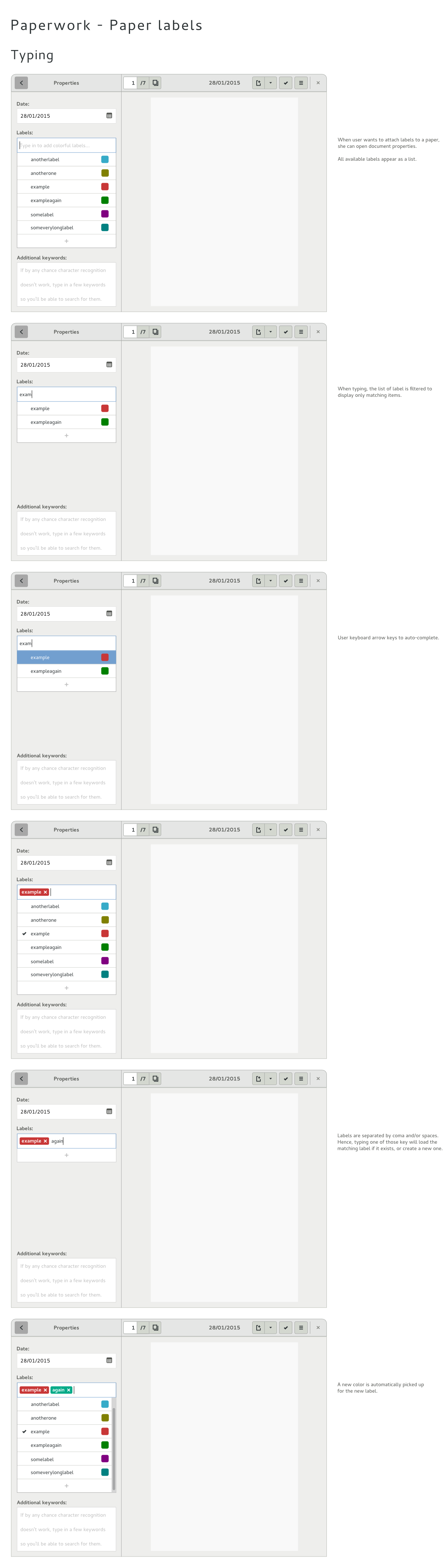
I like a lot the idea to start typing a tag and have it auto-completed and changed into an on-screen label with a delete-button.

I think there is a little misunderstanding here. When you talk about second-class objects, I guess you refer to this where user types in two labels. As the wires cover the very first paper digitalization, there are absolutely no existing label to be shown. Is this your concern?

So, when jflesch wrote "- disadvantage : users have to remember which tags exist and which don't", this is true only on first start.

However this gives me an idea. To invite people to use labels, and make the properties dialog less surprising, we could apply a dummy label for the very first document. Would it help?

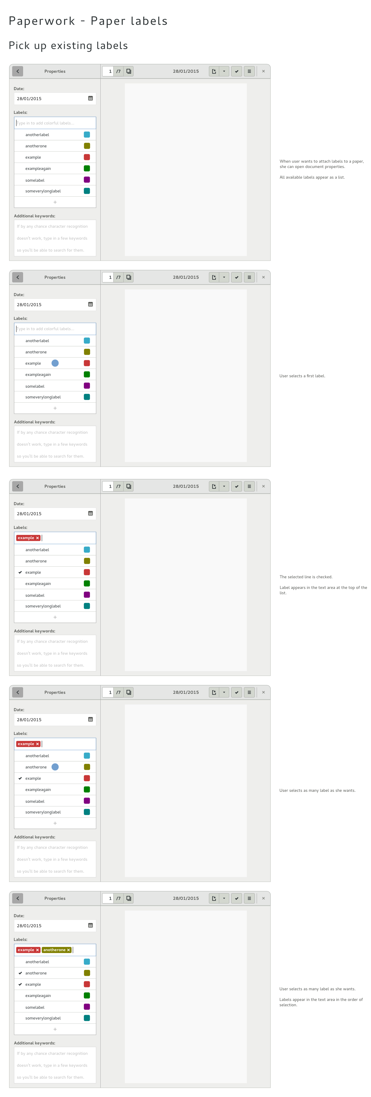
I would also like to point this mockup out.

I have a question: what happens when several tags start the same? For instance, since one may not remember the exact spelling of a tag, it would be nice to have a list open just like in the web browser’s search bar, with all tags matching “typed text”, case-insensitive and disregarding diacritics.

Well, this is indeed the intended behavior, I think I sketched that on paper but I didn't go further with inskcape.

Regards


Reply to this email directly or view it on GitHub: https://github.com/jflesch/paperwork/issues/356#issuecomment-74226874

mjourdan commented 9 years ago

Here are some wires covering move, edit and delete onto multiple pages (see #132).

jflesch commented 9 years ago

Hm, looks good, but I have some questions :

FYI, for now, when opening a document, if it has only one page, the page list mode is used by default. If it has many pages, the page grid mode is used. A single click on a page allows to switch from grid mode to list mode.

Also, just a quick note regarding cropping : It can only be done on one page at a time. Also, it requires precision, so I don't think it makes sense to do it from page grid mode.

jflesch commented 9 years ago

So, when jflesch wrote "- disadvantage : users have to remember which tags exist and which don't", this is true only on first start.

Ok, I think I misread your wires. But does typing a label name allow to create a new label, or does it allow to filter the label list ?

mjourdan commented 9 years ago

Do you think multiple selection is really useful ?

Yep. See the use case described here and there, plus the one below.

In the edition buttons, you suggest a button to mirror the page. Is there a use case for it ?

Yeah, actually page orientation detection never worked well for me, and usually give me bad results (while OCR does work well). As it is very long to proceed, I disabled it to save time. But my scanner has a lid and I never remember where I should put the top of the page. In both cases, I end up with pages upside-down, far most frequently than I get portrait position instead of landscape.

I don't get how the user is supposed to switch from the page list mode to the page grid + multiple selection mode ?

Yeah, sorry, I did'nt show that. It's by activating the check mark button. You may want to take a look at the gnome hig to decide if it is appropriate for Paperwork or not.

mjourdan commented 9 years ago

Ok, I think I misread your wires. But does typing a label name allow to create a new label, or does it allow to filter the label list ?

Both. It allows to keep only matching labels from the list, and create a new one (with a pre-filled color) when there is no match. I hope to make more detailed wires tomorrow.

jflesch commented 9 years ago

Yeah, actually page orientation detection never worked well for me, and usually give me bad results (while OCR does work well). As it is very long to proceed, I disabled it to save time. But my scanner has a lid and I never remember where I should put the top of the page. In both cases, I end up with pages upside-down, far most frequently than I get portrait position instead of landscape.

With Paperwork <= 0.2.2, make sure you have the correct dictionary installed (if you're French, aspell-fr for instance, but it should also work with myspell-fr and ispell-fr I think). It's required to get correct results. With Paperwork which is currently in the unstable branch, Tesseract orientation detection will be used. It gives much much better results :)

Anyway, if I understand correctly, this icon is supposed to mean "rotation of 180 degrees", right ? Because as-is, I understand it as "vertical mirroring", which is not the same thing.

Yeah, sorry, I did'nt show that. It's by activating the check mark button. You may want to take a look at the gnome hig to decide if it is appropriate for Paperwork or not.

I didn't realized it is a mode disabled by default. OK for me (... and more work for me ...)

mjourdan commented 9 years ago

Also, just a quick note regarding cropping : It can only be done on one page at a time. Also, it requires precision, so I don't think it makes sense to do it from page grid mode.

Use case: I forgot to calibrate my scanner (actually I didn't understand what "calibrate meant" when I saw it in the preferences window), so every page should be equally cropped. On the other hand, your are right about precision.

With Paperwork <= 0.2.2, make sure you have the correct dictionary installed (if you're French, aspell-fr for instance, but it should also work with myspell-fr and ispell-fr I think). It's required to get correct results. With Paperwork which is currently in the unstable branch, Tesseract orientation detection will be used. It gives much much better results :)

I got aspell-fr and myspell-fr-gut installed among others. I'll probably wait 0.3 is ready before I enable this again, then.

Anyway, if I understand correctly, this icon is supposed to mean "rotation of 180 degrees", right ? Because as-is, I understand it as "vertical mirroring", which is not the same thing.

Ah. It is meant as a 180° rotation, as in gnome display settings. Indeed this icon is also used by inkscape for instance as vertical mirroring. Don't know if we could find a less confusing icon.

I didn't realized it is a mode disabled by default. OK for me (... and more work for me ...)

And less work for users \o/

jflesch commented 9 years ago

Ah. It is meant as a 180° rotation, as in gnome display settings. Indeed this icon is also used by inkscape for instance as vertical mirroring. Don't know if we could find a less confusing icon.

I think with Tesseract's orientation detection, there will be much less need for page rotation. Also, clicking instead 2 times on "rotate right" (or left) isn't a problem. So I think we can safely get ride of this button.

mjourdan commented 9 years ago

This evening I started working on wires for browsing by labels, so I didn't have time to make wires for labels creation / edition. Sorry.

jflesch commented 9 years ago

Wouldn't make it more sense to attach the popover to the search field instead of the header bar ?

On an unrelated note, I'll be working on another personnal project for the next few months. I'll keep replying here, but I don't think I'll have much time to code on Paperwork :/

mjourdan commented 9 years ago

Wouldn't make it more sense to attach the popover to the search field instead of the header bar ?

I don't know if it would make more sense. What I mocked up was "browse every papers that belong to this label (and eventually later search for papers inside this restricted set)". If we attach the popover to the search field, we would have "search only for papers that belong to all selected labels (but do search or the list won't be filtered out)".

On an unrelated note, I'll be working on another personnal project for the next few months. I'll keep replying here, but I don't think I'll have much time to code on Paperwork :/

Ok, thanks.

mjourdan commented 9 years ago

Hey,

Here are some more wires to attach labels to a paper:

mjourdan commented 9 years ago

Here is a review of what I found in the repository. I hope to send some patches, at least for the easy items.

WIP Review

Paper view:

Properties:

Label Editor:

Preferences:

Help:

Annoying bugs

jflesch commented 9 years ago

install fails with "error: package directory 'src/paperwork/frontend/doceditdialog' does not exist"

This is a work in progress, do not install it ! :) You can run it from the repository by running 'src/launcher.py'.

with the first paper opened in grid view, clicking in an empty zone switches the view to a zoom on the second paper

Funny, I didn't see this bug. It's actually even weirder for me, because when I test it, it switches to another document.

mjourdan commented 9 years ago

This is a work in progress, do not install it ! :) You can run it from the repository by running 'src/launcher.py'.

Stupid me!

Funny, I didn't see this bug. It's actually even weirder for me, because when I test it, it switches to another document.

Yeah, by paper I meant document, not page.

jflesch commented 8 years ago

Ok, it's working good-enough for the unstable branch so I merged it and destroyed the branch 'wip-ui-redesign'.

WIP Review

Paper view:

Properties:

Label Editor:

Preferences:

Help:

Annoying bugs

jflesch commented 8 years ago

It has been a very long time since there was a major Paperwork release, and this GUI is already looking really great compared to 0.2.x :) --> I would like to ship a 0.3.0 asap. We can still fix minor issues later in the next minors releases (0.3.x).

Anyway, I have a few questions for you:

quick scanner setup for first page scan (needs design)

What do you mean exactly ?

sometimes no paper is shown because none is selected in doclist

Well .. it makes sense I guess, no ? :) I assume you mean when we start Paperwork or when we click "New document" ? We could:

But is it blocking for 0.3.0 ?

the additional keywords text area has no border

I didn't notice it as being a problem. Maybe it could be a problem based on the Gtk theme used. But then again, is it a Paperwork problem ?

help is not available without network connection (Jflesch> Won't do for 0.3.x)

This one will require some work, and I'm fairly sure that current users of Paperwork all have an Internet connection :). However, I must admit it's a problem because it makes Paperwork dependent on GitHub, and pages can't be translated. Still, I think it would be best to keep this change for 0.4.0.

in paper list, controls (edit and delete) sometimes disappear

Do you have any reproduction scenario ? I can't find any anymore :(

with the first paper opened in grid view, clicking in an empty zone switches the view to a zoom on the second paper

Can't reproduce. However, I did a lot of changes, so I may have fixed it by accident :-). Can you have a look please ?

So, what do you think ?

tiramiseb commented 8 years ago

Hello,

I'm currently trying this new UI. Some comments:

jflesch commented 8 years ago

multiple pages preview is a great idea but not very effective as-is: pages previews are generated given a size (and I can change this size, great), but I would prefer setting a "number of pages on a single row", pages size would change when resizing the window

I understand your idea, but I'm not sure how it can be presented without making the GUI complex to use. This isn't a common approach (see for instance Evince, when it's freshly started and display the last documents used ; or any file browser)

margin between pages is way too large

In which view ? Grid, list, or both ?

I would prefer having three buttons instead of a dropdown menu on the "scan" button. maybe a dropdown on the side as in Simple Scan...

Hm, good point

tiramiseb commented 8 years ago

I'm not sure how it can be presented without making the GUI complex to use

By default, multi-page documents would display 3 pages per row, no matter the size of the page. The same slider than now would be used to set the number of documents per row. But instead of setting the size of a single document, it would set the number of documents per row (with gaps between two steps on the slider ; eg. settings for number of cpus or number of screens in virtualbox).

Problem with fixed thumbnails sizes is that if the window is 1 pixel narrower than a number of thumbnails, the last thumbnail goes on the next line and there is a wide empty space.

see for instance Evince, when it's freshly started and display the last documents used ; or any file browser

Displaying pages in a document and files in a directory is not the same thing. content vs icons.

In which view ? Grid, list, or both ?

grid. the space between thumbs in the grid (which can be pretty small) is the same as the space between pages in the list (which is usually large, 100% width zoom by default ?).

BTW, in all situations Ctrl + mouse wheel should changes pages size, on-the-fly (Ctrl + "+" and Ctrl + "-" too).

jflesch commented 8 years ago

By default, multi-page documents would display 3 pages per row, no matter the size of the page.

Why 3 ? :) Also, a problem with that is that pages can have various width. You can have portrait pages on the first line, and only landscape pages on the second line. The zoom level couldn't be the same for both lines.

So I just implemented something a little bit different : Paperwork checks if it can fits all the pages in one line without making the previews too small. If it can, it does, if not, it fall back to the previous grid layout. It doesn't really solve the problem for big documents, but it does for small ones.

Please tell me what you think of it ?

grid. the space between thumbs in the grid

I reduced the margin. Again, please tell me if it is ok for you.

in all situations Ctrl + mouse wheel should changes pages size, on-the-fly (Ctrl + "+" and Ctrl + "-" too).

Good point. I'll see what I can do

jflesch commented 8 years ago

Hm actually, maybe you're right. In grid mode, the slider could be the number of pages par line In page mode, the slider could be the level of zoom (as of now)

I can give it a try this evening

tiramiseb commented 8 years ago

Paperwork checks if it can fits all the pages in one line without making the previews too small. If it can, it does, if not, it fall back to the previous grid layout

I really didn't notice that at first. It's not clear, but it is a pretty great idea.

I reduced the margin

It's better

Hm actually, maybe you're right.

Yes I am ! I am always right !!! :smiley:

However, when there are less pages than the number of pages configures, they could be larger than the selected value...


After playing more with that, I realized something : the current slider is in a drop-down menu, displaying with an annoying animation. It makes me feel like it is a long-term setting which should not be used ofter. But in fact it is only a zoom level slider. A zoom level slider should either be always or never visible. Example for "always" : LibreOffice, low-right corner Example for "never": Evince, textual percent drop-down / edit box

The same applies to switching between "page" and "grid" views. Buttons on a popup doesn't feel right. 2 buttons on the bar would be better.

Moreover, the "highlight words" is more like a long-term setting and should not be placed with zoom parameters.

jflesch commented 8 years ago

While I agree that the slider could control the number of pages per line, I disagree with moving the settings.

The current logic is the same for the zoom level, the grid/list layout buttons and the "highlight words" switch :

The zoom level is always annoying to set correctly (LibreOffice and Evince actually give good examples: if often end up being trial-and-errors) The layout : If there is only one page, the layout 'grid' is useless anyway. If there are more, you start with the grid, and then look at one or two pages specifically. I'm not sure there are so many cases where you have to switch back to the grid layout (I'm not saying it doesn't happen, I'm saying it happens rarely). "Highlight words" : That's more a debug feature than a really useful one. I guess it helps people relax by making sure the OCR worked (I know it does for me ;) ).

So in the end, if the UI is done right, you shouldn't have to use them really often.

Also, I think moving them out of this dialog would clutter the main window.

tiramiseb commented 8 years ago

Understood. In this case, I think this behaviour is a step towards a UI done right / a perfect world. It should be used by as many people as possible to check which improvements could be done. I will use it and see if it fits my usage of Paperwork.

jflesch commented 8 years ago

Note to myself: I must also re-add support for drag'n'drop also (the API tends to be really painful to use ; I did some crappy work in the previous UI :/)

tiramiseb commented 8 years ago

I don't know if I should open a new issue for the following thought...

Clicking on "New document" on the documents list displays an empty document (zero page) Clicking on "+" makes the documents list jump to "New document", displaying zero page Clicking on "Scan" gives a list of options for importing documents (scan or pdf import). Even if a document is displayed, the scan (or import) is done in a new document.

My idea:

I think "Scan" has nothing to do with the current document, nothing to do on the right panel.

jflesch commented 8 years ago

"New document" and "+" are useless

How would you start making a new document then ? oO

I think "Scan" has nothing to do with the current document, nothing to do on the right panel.

"Scan" add a scanned page to the current document. Always. ("scan single page" anyway)

tYYGH commented 8 years ago

Maybe scan and import just shouldn't stay together: import would go to the left, and scan would remain to the right.

tYYGH commented 8 years ago

Unless of course you intend to allow importing additional PDF content to an existing document…

jflesch commented 8 years ago

I don't.

But as of now, "import" can import PDF as a document, or images as extra pages to the current document :/

tiramiseb commented 8 years ago

Wrong memory on my side, sorry, you are of course right. Recently I have only imported PDF documents :)

However the behaviour of the "Scan" button is not consistent, as you have said.

Another suggestion:

mjourdan commented 8 years ago

I don't know if I should open a new issue for the following thought...

Seems to me you're far from being off topic.

Let me rephrase you're idea to get this straight. What you are saying, tiramiseb, is it is nonsense to create document of 0 page, therefore documents should always be created either from file or scanner. Then it is allowed to add pages when a document has been created from scanner, when you imported an image file. However, if you imported a pdf, it is not allowed, because a pdf is considered to be a whole document. Am I right?

Let say a user does create a document using some .jpg file. Would her be able to add pages from her scanning device, and why?

tiramiseb commented 8 years ago

Regarding behaviour when it is a scanned document or a PDF file or an image import, I'm keeping the existing behaviour.

Globally, my idea is to totally remove the "document of 0 page" and to be able to:

However, the current behaviour being "a PDF-based document cannot be modified", the "scan [...]" on the right panel would only be available for scanned docs or images.

mjourdan commented 8 years ago

Le 07/10/2015 11:57, Jerome Flesch a écrit :

It has been a very long time since there was a major Paperwork release, and this GUI is starting to look really great :) --> I would like to ship a 0.3.0 asap. We can still fix minor issues later in the next minors releases (0.3.x).

Anyway, I have a few questions for you:

quick scanner setup for first page scan (needs design)

What do you mean exactly ?

I launch Paperwork, start my scanner, and try to scan a document. Nothing happens, and I have to open the Preferences so that my device is detected. This happens every time I launch Paperwork, and is uncomfortable, as my device is the same for years now. At least, that was true by the time I wrote this.

sometimes no paper is shown because none is selected in doclist

Well .. it makes sense I guess, no ? :) I guess we could display the last used documents instead of nothing. But is it blocking for 0.3.0 ?

Yeah, my point was we should always have a document selected, so that we have something to show, whether it is the last used, or a new empty doc (in which case we would have a nice message saying "this doc is empty, you can add pages blah blah"). While it is confusing, I wouldn't say it's a blocking issue.

the additional keywords text area has no border

I didn't notice it as being a problem. Maybe it could be a problem based on the Gtk theme used. But then again, is it a Paperwork problem ?

I took a look at a couple of apps (polari, boxes...) and I couldn't figure out how it happens I can't set a stupid border on this particular widget. But really it's just about polish.

help is not available without network connection (Jflesch> Won't do for 0.3.x)

This one will require some work, and I'm fairly sure that current users of Paperwork all have an Internet connection :). However, I must admit it's a problem because it makes Paperwork dependent on GitHub, and pages can't be translated. Still, I think it would be best to keep this change for 0.4.0.

Seems wise to me.

in paper list, controls (edit and delete) sometimes disappear

Do you have any reproduction scenario ? I can't find any anymore :(

As far as I remember, I couldn't identify a pattern to reproduce, but this definetely happened multiple times!

with the first paper opened in grid view, clicking in an empty zone switches the view to a zoom on the second paper

Can't reproduce. However, I did a lot of changes, so I may have fixed it by accident :-). Can you have a look please ?

So, what do you think ?

I'll test a bit and give some feedback soon.


Reply to this email directly or view it on GitHub: https://github.com/jflesch/paperwork/issues/356#issuecomment-146136521

mjourdan commented 8 years ago

Globally, my idea is to totally remove the "document of 0 page"

This could be a good thing indeed!

  • "scan or import a new document" on the left panel
  • "scan or import into the current document" on the right panel

I'm not sure about this. This means user would have to chose the source in two different places instead of one, which would result imho in a more complex experience.

jflesch commented 8 years ago

I launch Paperwork, start my scanner, and try to scan a document. Nothing happens, and I have to open the Preferences so that my device is detected. This happens every time I launch Paperwork, and is uncomfortable, as my device is the same for years now. At least, that was true by the time I wrote this.

I think this one is a bug unrelated to the UI changes. The expected behavior, even in stable:

You can open a ticket if you want. If you do, please have a look in your paperwork.conf after each session / reboot. Maybe your scanner ID changes when you reboot, which could partially explain this bug.

Yeah, my point was we should always have a document selected, so that we have something to show, whether it is the last used, or a new empty doc (in which case we would have a nice message saying "this doc is empty, you can add pages blah blah"). While it is confusing, I wouldn't say it's a blocking issue.

Noted, but for 0.3.x

As far as I remember, I couldn't identify a pattern to reproduce, but this definetely happened multiple times!

Actually, in the meantime, I reproduced it and fixed it :) (please tell me if you see it again)

I'm not sure about this. This means user would have to chose the source in two different places instead of one, which would result imho in a more complex experience.

I agree. The current way is messy and unperfect, but I think most users (if not all) found their way. I doubt we will find a perfect solution anyway. So I think we will just let it as it is for 0.3.0.

I'll just split the "scan" button in two --> "scan" button + a button to have the sub-menu, as done before in 0.2.x

tYYGH commented 8 years ago

About the scanner and the preferences:

I launch Paperwork, start my scanner, and try to scan a document. Nothing happens, and I have to open the Preferences so that my device is detected. This happens every time I launch Paperwork, and is uncomfortable, as my device is the same for years now. At least, that was true by the time I wrote this.

Same for me. Probably because it is an USB scanner, that I plug only when I need it, and it would get a different system ID each time…

jflesch commented 8 years ago

My scanner is also a usb one (HP), but I never unplug it. Anyway, it's still a bug in that case : if the scanner id cannot be found, it should either display a popup saying "scanner not found" or open the settings window.

tYYGH commented 8 years ago

About the “empty document” thing:

Yeah, my point was we should always have a document selected, so that we have something to show, whether it is the last used, or a new empty doc (in which case we would have a nice message saying "this doc is empty, you can add pages blah blah"). While it is confusing, I wouldn't say it's a blocking issue.

I don’t agree. I find nothing either unnatural or confusing about seeing an empty document. In the real world, there are empty folders; there are empty pages; there are empty notebooks… However, it is a really good idea to have a message like “This is a new, empty, document. You can import or scan new pages inside.”

As for always having a document selected, I even more don’t agree. When I start Paperwork, it is: — either because I will scan/imports new documents, in which case being on a new, empty, document is just perfect; — or because I have a search to do, and then I don’t care at all what document was selected last time.

Cheers,

tYYGH commented 8 years ago

rel. scanner: I do have a “scanner not found” message. Maybe some heuristics using the scanner name instead of its ID if the ID is not found would solve the issue?

jflesch commented 8 years ago

Hm, I prefer not using heuristics when possible. They tend to be hard to debug (for instance, I'm fairly certain the label guessing has some bugs).

Here, I guess it can be done by simply looking how many scanners are connected. If there is only one ... well it must be this one. I will just have to ignore camera devices. Since their IDs are prefixed with "v4l:", it should be easy.

Added: #403

jflesch commented 8 years ago

Implemented:

5dd34ed562206783c906d3b9350f210d1712daee 54710c354d37b0a190e15a5fb9719241f155c010 1f5012d1bb26b6682ada5c088c71ad439169baf2 7225381c25889765c405972d0f20343b1c28e5b2

jflesch commented 8 years ago

Most of the GUI changes for 0.3.0 have been implemented (in the branch 'unstable'). I'm going to close this meta ticket. Please feel free to open a new ticket for each issue you (still) see.