openpaperwork / paperwork

Personal document manager (Linux/Windows) -- Moved to Gnome's Gitlab
https://gitlab.gnome.org/World/OpenPaperwork/paperwork
2.43k stars 149 forks source link

UI Idea : Need a general/index/summary view #548

Open jerrydiff opened 7 years ago

jerrydiff commented 7 years ago

Let me start from the begining, when you enter paperwork, you are directely in the action, you arrive in the middle of your last documents, and .. thats it. I've seen poeple start paperwork and dont understand it was a document archive tool, because it mostly looks like an explorer windows with a research function. For some poeple, its an interface for scanning that lets you see the last document you have scanned.

It feels to me that it lacks what could be named a summary, or an index, a view that would provide with a glance what actually is in store, that provide a classification and reassure the user that his documents are indeed well organised, well classified, accounted for.

Here are a few starting ideas for this view, it should help reply to this question : how much documents are in each category, what are the main categories, how much documents have failed the automatic tagging (and if there's none, say it !), how many electric bills do i have stored, how many documents are in a single / multiple categories and so on

Users are very used to being abused by softwares, silent errors, lost datas without warning, etc. they need some kind of metric and feedback to be assured it is actually working. Sometimes, a stupid green indicator saying all stuff are ok since last time goes a long way. I must say paperwork works honnestly quite well, I know it, but it does not advertise in anyway during the time you interract with it. A summary would help in that regard, it gives the feeling that everything is well organized

tYYGH commented 
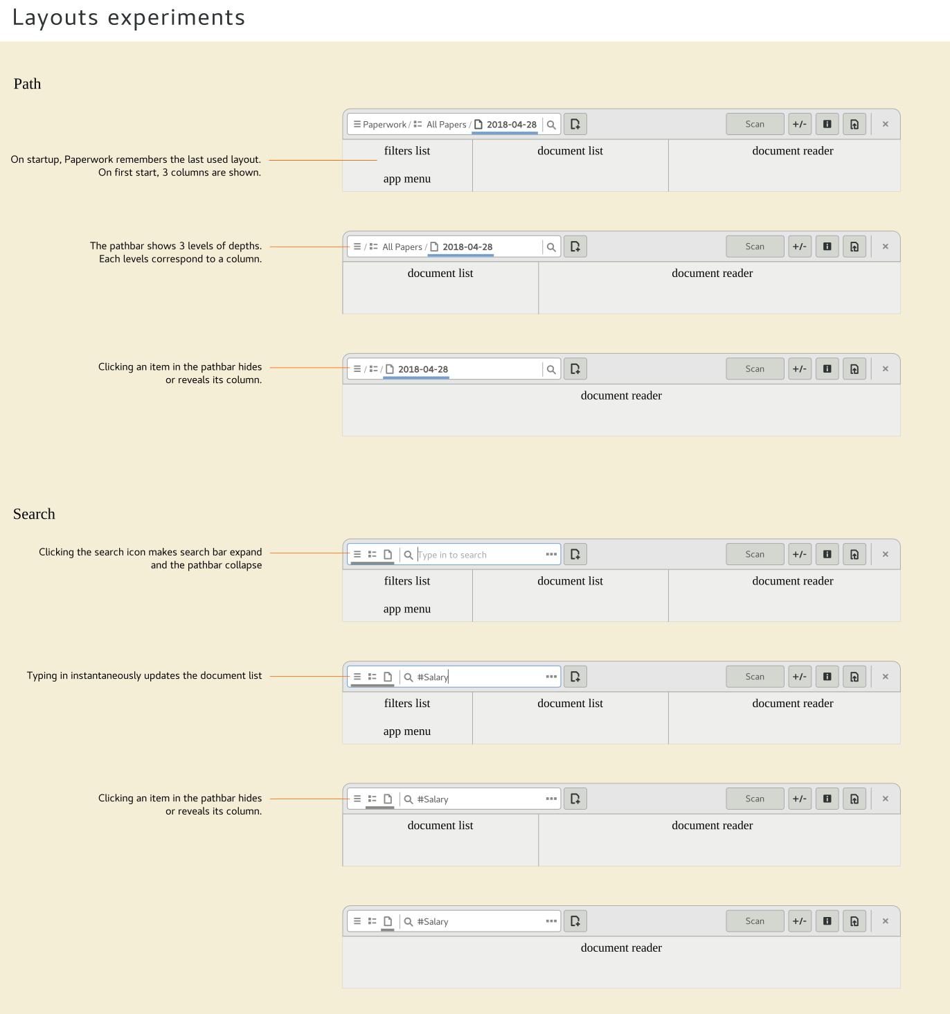
6 years ago

As I see things, this new panel is interesting, but it is not part of a “left-to-right” relationship, if you see what I mean. For example, the “right” document panel is linked to the “middle” one: the page displayed on the right is part of the document that is selected in the list; but the “middle” list is not linked to the “left” (new) panel: there is no concept of current element in the new “left” pane. In my eye, this rules out variants 1 to 3.

Although I do not like variant 4 much, for the reasons given by @mjourdan, it does have some merit: the current state of the “left” panel becomes implicit in the fact that we kind-of entered an item in that panel, much like we enter a directory in Nautilus. This is symbolized by the left-pointing arrow at the corner of the window, which indicates that the displayed list is in accordance to the item that was selected on the parent pane (although there is no indication of which that is), much like the details of a document, in the details panel, are in accordance to the document that was clicked on, on the previous panel (the list). In short, it is at least somewhat consistent.

This leaves variants 5 to 7, which I like better. However, variants 6 and 7 seem to imply the kind of relationship already found in variants 1 to 3, which is IMHO non-existent.

My all-favourite is thus variant 5.

From my point of view, this new pane is nothing more than a “new-age” menu. Sure, it is dynamic, but that is nothing new (numerous software give access to the list of recent documents, for example). For this reason, I would ask one question (all the more since there are actual menu items in this panel): why not make this panel the Gnome menu?

jflesch commented 6 years ago

Actually, when I think of it, I'm not sure I see a real difference between #4 and #7 ? oO

tiramiseb commented 6 years ago

I prefer #5 too. Maybe #7, but there is no advantage in pushing the document list behind the document reader...

Regarding making it "the" Gnome menu, I'm not sure I understand which menu you are talking about. If you are talking about the menu displayed when you click on the window name in the topbar, I'm against it.

It could definitely be a regular menu, with dynamic entries (but I don't know if we can put label icons, colors, etc, in a menu...)

tiramiseb commented 6 years ago

jflesh: are you talking about #5 vs #7, or really #4 vs #7 ? Because the difference between #4 and #7 is obvious to me... The difference between #5 and #7 is just about the behaviour of the document list.

tYYGH commented 6 years ago

@tiramiseb Yes, that’s the menu I was referring to: the unigue application menu in the black Gnome3 top-bar. (btw, may I know why you’re against it?)

tiramiseb commented 6 years ago

As I understand it, this menu is for occasional actions (parameters, etc), not for day-to-day use.

jflesch commented 6 years ago

Well, I'm obviously missing something here, because I don't see the difference between #4 and #7 ? Is it that in #7, the overview doesn't push entirely the document list ? (If so, that will be a pain to implement :/)

tYYGH commented 6 years ago

@jflesch : 4: the new panel and the current left panel alternate: it is one or the other, at the exact same location. 7: the new panel is hidden on the left, and slides out from the left, pushing the current left panel 2/3 of its width to the right, where it slides under the right panel… more or less…

I don’t remember the current transition from list to document details (this is the same kind of transition), but if it is a sliding thing, then your comment is right: it just slides 100% instead of 66%.

jflesch commented 6 years ago

Ok, because if I have to implement #4, there would still be sliding/pushing (as currently in 1.2.4). So with #7, the difference is actually that it would stop at 2/3 or 3/4 of the way, right ?

I wasn't sure if the mockups show things in-motion or once they are at the end of each motion :/

mjourdan commented 6 years ago

Thanks all for your comments! Below answers to specific points.

but the “middle” list is not linked to the “left” (new) panel: there is no concept of current element in the new “left” pane.

There is, actually, that's why there is a light blue bar and small police changes (the very same treatment used between documents list and document reader). On startup it always shows "all papers", but it is intended to apply filters as well.

why not make this panel the Gnome menu?

That's precisely what I did with all variants except number 4!? This could not be done on number 4 because the app menu has to be behind an always visible button showing the app icon (so we can't use the back button for that). Or did I miss your point?

Maybe #7, but there is no advantage in pushing the document list behind the document reader...

I think there is, as it shows thumbnails of recent documents on startup, and thumbnails of the documents matching the selected filter. Variant number 5 though shows a bit of the document list, but an absolutely useless part of it.

I wasn't sure if the mockups show things in-motion or once they are at the end of each motion :/

@tYYGH explained well. Mockups do not show transitions and show the end of each motion!

As it appears that the mockups are not as obvious as I thought (shame on me!), I turned them into wireframes to demonstrate the same scenario: Start Paperwork -> Apply a filter -> hide the overview column.

Feel free to comment again or suggest totally different approaches if you like.

jflesch commented 6 years ago

Ok, I eventually got the difference between 4 and 7 .... :)

jflesch commented 6 years ago

I like 7 better. But for any of the variants, there are some things I would like to discuss first:

My questions:

mjourdan commented 6 years ago

In the current implementation, the assumption is that the users more often use the last documents scanned than the other. This is why the default is the whole document list, ordered by reversed date.

That would stay true.

When the user will start Paperwork for the first time(s), the overview will be almost empty. Is that what we want to show as soon as it start ?

So would be the document list. The list of tags may even increase faster than the document list, for users who set a couple of labels per document.

Do we need the overview immediately when we start ? Wouldn't it be better to just display it when the user request it (application menu for instance) ?

I think showing it on startup would better answer the different problems reported by @jerrydiff (see the list here).

Do we need a 2/3 split ? The animation should show clearly enough what happens, and entirely replacing the left pane (as currently for the doc proprerties) would give more room for the overview, no ?

The overview would not be complete if the list of labels and the list of the most recent matching documents were not shown at the same time. So, the 2/3 thing is an idea to show a complete enough overview while keeping the document reader unchanged. This is intended mainly for small screens, as an alternative to the push effect shown in variants 3 and 9 (which I prefer).

Adding a new pane provides useful info and allows for quicker navigation, but is shows only labels and counters, so it needs less space than the document list which shows thumbnails too (and in the mockups, they also show excerpt). This is quite a common pattern nowadays, not really on GNOME but there are several examples (e-mail clients, note-taking apps like ulysses, bear, boostnote, notes-up…)

jflesch commented 6 years ago

It makes sense. However, in all the example apps you shown, what we call the overview cannot be hidden. I guess nowadays on 16/9 screens it makes sense. Maybe as a first step, we should forget about small screens ? I'm starting to think it's making things really much more complicated and I'm not sure it would not be that useful ?

tYYGH commented 6 years ago

I wish to defend the “small screen” camp! I use quotes because in truth, I’m not that much interested in small screens, but…

I very often need to have Paperwork opened next to another window (email, web, accounting…), because these documents are not an end in themselves; they are documents related to:

It is thus very important to me, that Paperwork works in a width equal to between ½ and ¾ of the screen width, ie. roughly 800 pixels or more.

jflesch commented 6 years ago

@mjourdan : A while ago you mentioned a lib for various GTK animations. I can't find it back. Can you remind me what it was please ?

mjourdan commented 6 years ago

However, in all the example apps you shown, what we call the overview cannot be hidden.

Probably screenshots can't show such things but yes:

I very often need to have Paperwork opened next to another window

Yeah, for that reason, or to better focus on the content, I am thinking also about hidding the document list too. I made a wireframe with a popover to switch between layouts, but I worry the extra popover would be a bit cumbersome.

A while ago you mentioned a lib for various GTK animations.

That was libdazzle. GNOME Builder uses this for its panels, if you wanna have a clue of how it feels.

tYYGH commented 6 years ago

Yeah, for that reason, or to better focus on the content, I am thinking also about hidding the document list too. I made a wireframe with a popover to switch between layouts, but I worry the extra popover would be a bit cumbersome.

I like it, with a preference for the first popup, and with a condition: Paperwork would have to remember the layout between restarts (much like a mail client remembers your preference between 2-pane or 3-pane, and vertical or horizontal).

Your UI idea gave me another idea, without a pop-up, although I do not remember having seen such a thing… What about an “horizontal accordion button/switch”? It would be located where you put your own button, and would behave as a mix between this: https://www.pegasusautoracing.com/images/M/1068-105.JPG and this: https://www.storepascher.com/317-large_default/store-bateau-tamisant-taffetas.jpg

And it would reflect in real-time the panes being shown…

mjourdan commented 6 years ago

I like it, with a preference for the first popup, and with a condition: Paperwork would have to remember the layout between restarts

Yeah, sure!

What about an “horizontal accordion button/switch”?

I'm not sure I understand. Basically, you mean something like a view switcher with icons in it showing either 3, 2 or 1 pane?

tYYGH commented 6 years ago

@mjourdan , not quite… It sure is not easy to describe, but it would IMHO be easy to understand. Let me explain differently. You see, those rolled rulers several meters long? eg: https://i2.cdscdn.com/pdt2/2/1/4/1/700x700/46214/rw/metre-ruban-3-m-x-16-mm.jpg

When only 1cm is out, you only see the 1st cm. If you pull 1 more cm, you see the 1st cm, and the 2nd cm. If you pull 1 more cm, you see the 1st cm, and the 2nd cm, and the 3rd cm.

Now imagine, when you release the ruler back into its box, the cm do not actually disappear, but instead “fold” like https://www.storepascher.com/317-large_default/store-bateau-tamisant-taffetas.jpg, so that a tiny bit remains visible to remind us of their existence.

Let “¦“ be a vertical separation in the widget, and let “⇂” be a handle for the mouse to drag, and let “|+—” be the window panels’ borders. We would have:

One area visible:

+——————————————————————————————————————————————
| ¦¦¦Page⇂
+——————————————————————————————————————————————
|
|   The Page area
|

Two areas visible:

+——————————————————————————————————————————————
| ¦¦List¦Page⇂
+———————————————+——————————————————————————————
|               |
| The List area | The Page area
|               |

Three areas visible:

+——————————————————————————————————————————————
| ¦Find¦List¦Page⇂
+———————————————+———————————————+——————————————
|               |               |
| The Find area | The List area | The Page area
|               |               |
mjourdan commented 6 years ago

Dragging would probably work on touchscreens but I'm less confident with mouse/touchpad. Anyway, I tried to iterate over your accordion idea, and combined this with a pathbar. Here is the thing.

tYYGH commented 6 years ago

Nice! Although this does not exactly correspond to the user experience I was trying to convey in my comment, it is still interesting. Thank you @mjourdan. I would make some changes: