openui / open-ui

Maintain an open standard for UI and promote its adherence and adoption.
https://open-ui.org
Other
3.4k stars 183 forks source link

Panelset & tabs: defining separate goals for each pattern #559

Open smhigley opened 2 years ago

smhigley commented 2 years ago

@bkardell and I went through a number of examples of more traditional application tabs and examples of the proposed panelset pattern, and came up with a proposal to separate them into two different platform-level solutions with discrete purposes and use cases, outlined below.


Through a lot of discussion and looking at examples, as well as based on evidence in existing UI toolkits, we believe that there is a need for two separate solutions for something that many users would just call 'tabs'. In this document we're attempting to explain the differences between them, what their uses are and offer some working terminology.

There may or may not be implementation detail overlap between these ideas, but their basic purpose, limits and likely semantics would differ. They probably benefit from work happening in parallel to coordinate similar APIs in areas like CSS pseudo-selector naming or open/close DOM attributes.

Statement of purpose for each element

A brief description of the basic purpose and functionality of each proposed element.

Application tabs

The primary purpose of application tabs is to allow users to easily switch between multiple possible panes of content that are specifically not intended to be viewed at the same time. As such there are functional differences, covered in more detail in the next section. Possible examples include browser tabs, file tabs in a code editor, multiple views within an app such as map/list, or email/calendar/contacts.

Some implementation challenges that a tabs element could solve for authors include:

Panelsets

The primary purpose of panelsets is to provide a mechanism to reflow multiple sections of content between a tab-like one-at-a-time presentation and a linear, sequential presentation. So in essence, the visual title/content ordering for multiple sections may switch between these two options:

  1. Title 1, Title 2, TItle 3 Content #

  2. Title 1, Content 1 Title 2, Content 2 Title 3, Content 3

Visually, the first option could be presented as tabs, a carousel, or anything with a similar content-switching interface.

The second option could be presented as accordions or simply linear content.

Some implementation challenges this element or elements could solve for authors include:

Differences between Tabs and panelsets

Examples

Application tabs

  1. Code editor: This shows probably the most traditional tabs, together with a currently hard-to-solve author problem, a close button per tab. VS Code file tabs, showing a close button on one hovered file tab

  2. Write vs. preview tabs in a compose box on github: Screenshot of the comment UI on github, showing the open "Write" tab with a textbox titled "leave a comment". The unselected Preview tab is next to the Write tab.

  3. Tabs that progressively collapse behind an overflow menu in github, another current implementation challenge for authors. horizontally oriented tabs in the github UI for a single repository at full desktop screen width, showing all 10 tabs. The first tab is Code, and the last tab is Settings. (shown above uncollapsed) horizontally oriented tabs in github at mobile width, showing three tabs and all other tabs collapsed behind an overflow button with an icon of three dots (shown above collapsed)

  4. Vertical tabs with an overflow menu in google docs vertically oriented icon-only tabs in google calendar showing an overflow button below five icons with the first (calendar) icon selected

  5. Slack: Notable because it's tabs in collapsable sections. Slack channel and message UI of vertical tabs, showing the All unreads first tab selected, the channels section is collapsed, and the Direct messages section is expanded.

Panelsets

  1. Tabs to accordion presentation: Screenshot showing a heading saying "Bookshelf", and a horizontal row of pill-like buttons with every year between 2022 and 2014 that function as tabs. Below the year tabs is a list of books. The same bookshelf UI, except each year is a disclosure button spanning the full screen width, and appearing vertically one after another. 2022 is collapsed, and 2021 is expanded showing books underneath it.

  2. This one switches between presentations in the opposite way to most other examples, with tabs at a small screen, and linear order at a larger screen: Two tabs, free and premium, oriented horizontally and visually styled like traditional folder tabs. The text is in French. The same two sections, free and premium, but at a wider screen width and styled as two adjacent columns both visible side by side

  3. Tabs to accordions: Wolvic.com is a website primarily used by XR devices with mostly fixed width windows, however, the sizes can differ substantially. It should vertical tabs when that is pragmatic, but as a series of collapses when it isn't. Five tabs, experiences, games, painting, videos, and streaming, in a single horizontal row with images underneath. The experiences tab is selected and looks like a traditional file tab, while the other tabs look like pill-shaped buttons. The same five sections at a smaller screen size, but they are styled like accordions that are all collapsed and in a vertical list.

  4. Michigan.gov drivers license renewal shows vertical tabs to the left on a wider screen, but regular "top" tabs on a smaller screen. Several other variants could fit just as well and the 'one-at-a-time' view is secondary. A section with the heading "What do I need to renew my license or ID? (Choose tab below), with a column of four vertical tabs to the left of a section of content. The Online tab is selected. The same license or ID heading with the same four tabs below it, this time formatted as a single horizontal row of tabs with the content beneath

jonathantneal commented 2 years ago

Wow, @smhigley! Thank you for this very helpful classification.

I have a question about what is permitted in a panelset. It has to do with this point:

panelsets would not have built-in dismiss or close functionality

Would open/close statuses still be permitted in an ‘accordion’-like experience, like <details>/<summary>?

I expect ‘open’ and ‘close’ to have different scopes in tabs versus panelsets.

In tabs, I would expect ‘close’ to allow the dismissal of the label itself (the [role="tab"] part).

In panelsets, I might expect ‘close’ to be limited to the content associated with the label.

I thought a better term than ‘close’ would be ‘collapse’, too, but the existing art of <details> would lead me to believe this is still an open/close named thing.

smhigley commented 2 years ago

@jonathantneal yup, you're exactly right in that I intended "built-in dismiss or close functionality" to refer to the "x" button that fully removes a tab, e.g. this:

screenshot of a browser tab with an arrow pointing to the close button icon

Since <details> already uses open/close, maybe the better term would be "dismiss"?

css-meeting-bot commented 2 years ago

The Open UI Community Group just discussed [tabs] Panelset & tabs: defining separate goals for each pattern.

The full IRC log of that discussion <gregwhitworth> Topic: [tabs] Panelset & tabs: defining separate goals for each pattern
<gregwhitworth> github: https://github.com/openui/open-ui/issues/559
<JonathanNeal> bkardell_: we made our proposal, and we were getting ready to move a high-fidelity proposal into OpenUI itself, as a sort of prototype that gets into all of the defined parts and how it should work; and it raised some new discussion.
<JonathanNeal> bkardell_: That discussion was: is it appropriate to use ARIA tabs for all tabs?
<JonathanNeal> bkardell_: sarah_higley and I have looked into this and found there are different kinds of tabs, where a user would refer to the interaction as “tabs” but they may not be the same kind of tabs.
<JonathanNeal> bkardell_: we have identified where we think there are clearly ARIA tabs.
<JonathanNeal> bkardell_: We are not of the opinion that we know exactly what the semantics of the panelset (non-ARIA) tabs should be.
<JonathanNeal> bkardell_: The non-ARIA tabs are all about overflow. We are suggesting that, rather than having one component, we should have two components. They should probably work together. They will probably have a lot of similarities. But they are also probably different.
<JonathanNeal> bkardell_: We should have a “panelset” proposal, to see what its semantics should be.
<JonathanNeal> bkardell_: And we should have an answer to how tabs should wire up.
<gregwhitworth> q?
<gregwhitworth> q+
<JonathanNeal> sarah_higley: we think the main difference between the two are: switching between mutually exclusive content, vs panelset that focuses on content and aiding authors in switching between different kinds of content due to screen size.
<JonathanNeal> bkardell_: there are different user expectations for different aspects of usage.
<JonathanNeal> gregwhitworth: you are putting forward is that there should be an element for panelsets and also tabs?
<JonathanNeal> gregwhitworth: is the group okay with splitting tabs into effectively two elements?
<JonathanNeal> bkardell_: we want to keep the tabs one about ARIA tabs, and then separate its use cases from panelset.
<JonathanNeal> bkardell_: we suggest we should do two elements. we should do a fair amount of working together between the elements. The average author should expect a similar way to control them.
<JonathanNeal> gregwhitworth: if you are able to put forward your proposed resolution, we can move forward.
<vicgutt> q+
<gregwhitworth> ack gregwhitworth
<gregwhitworth> ack vicgutt
<JonathanNeal> vicgutt: this seems similar to dialog and modal. They are similar, but things change a little bit in the behavior. Is that a similar case here for tabs and panelset?
<sarah_higley> q+
<gregwhitworth> ack sarah_higley
<JonathanNeal> sarah_higley: I think a lot of the similarity comes from the fact that the visuals are really similar. It’s when we dive into it a little more we see they are different. In application tabs, they are less about content show/hide. The author concerns would be to open new tabs, close tabs, menus. With panelset, it’s about reorganizing content and how its displayed in different screen sizes.
<hdv> q+
<flackr> q+
<JonathanNeal> sarah_higley: the visuals can definitely look the same, but the purpose behind them can be very different. That’s why we think they should be separate elements.
<JonathanNeal> bkardell_: I agree that it would be intuitive to use one element, and I can empathize with that, but I think they are very different due to the reasons sarah_higley said.
<JonathanNeal> vicgutt: I agree it’s a little nuanced, but if it’s explained well, it makes sense.
<gregwhitworth> ack hdv
<JonathanNeal> hdv: Is it safe to say that panelset is something that has really light semantics, whereas tabs would have very heavy semantics?
<JonathanNeal> hdv: and one would want to use tabs more carefully?
<JonathanNeal> bkardell_: I think it’s difficult to say. We haven’t taken a position. I think we have two implementations and we should test them both, and see. We shouldn’t assume that either one is the ‘right’ answer.
<JonathanNeal> hdv: I agree that having two different ones makes sense.
<gregwhitworth> ack flackr
<JonathanNeal> flackr: I might be missing context, but I think in the cases were panelset degrades into a visually-tab-like experience, there will be use-cases where all of the problems of tabs also apply to panelset. So one is like a superset? Therefore, will there be strong incentive for developers to use one over the other?
<JonathanNeal> bkardell_: I would not say there are supersets.
<JonathanNeal> flackr: you are saying the overflow menu is only something one would want to do with tabs, but I could see where on panelset developers would want to have an overflow menu.
<JonathanNeal> bkardell_: there are definitely cases where reasonable people will disagree on which element is appropriate to use, and I think there are clear cases where one would want to use one or the other.
<gregwhitworth> q?
<gregwhitworth> q+
<scotto_> q+
<JonathanNeal> sarah_higley: for panelset, I haven’t seen an overflow menu. Instead, I am seeing tabs switch into something like accordions.
<JonathanNeal> gregwhitworth: so it’s almost like we are wanting to swap elements
<JonathanNeal> gregwhitworth: we are effectively wanting responsive design element switching
<JonathanNeal> q+
<JonathanNeal> gregwhitworth: is that a solid representation of a description based on what you’ve seen?
<gregwhitworth> ack gregwhitworth
<JonathanNeal> sarah_higley: yes, where users don’t need to move around DOM between screen sizes.
<scotto_> q?
<scotto_> q-
<JonathanNeal> gregwhitworth: so we would have used JS to swap this normally?
<JonathanNeal> bkardell_: you certainly could do that, or you could use shadow DOM and project things into different slots.
<JonathanNeal> bkardell_: it would also require you to answer all the questions we are spending lots of time thinking about and not agreeing upon.
<gregwhitworth> ack scotto_
<JonathanNeal> bkardell_: the likelihood that we’ll build usable things in the wild is pretty low.
<JonathanNeal> scotto_: the benefit of a proposal of going in two different directions would be that tabs would always stay tabs, and it gets around the squishy-ness of how things could change what they would represent.
<bkardell_> q+
<JonathanNeal> scotto_: like when something was sometimes tabs and sometimes sections. Where it could have always been something else.
<JonathanNeal> scotto_: I look forward to being able to just use tabs.
<gregwhitworth> ack JonathanNeal
<gregwhitworth> JonathanNeal: how we would do this otherwise and I feel it's very similar
<gregwhitworth> JonathanNeal: it would be navigation, we don't want to create responsive HTML
<gregwhitworth> JonathanNeal: when we get to a small size and we change the DOM of that navigation based on real estate and adding entire affordances for hamburger menu
<gregwhitworth> JonathanNeal: but that requires markup that wouldn't be there at a different breakpoint and panelset has made it very apparent where we need something more advance
<gregwhitworth> JonathanNeal: it's like nav was the first boss
<gregwhitworth> q?
<gregwhitworth> ack bkardell_
<JonathanNeal> JonathanNeal: and panelset is a harder boss
<bkardell_> Proposed resolution: Split the work currently under "tabs" but proposed as "<oui-panelset>" into two cooperating efforts focused as discussed in the issue
<JonathanNeal> bkardell_: we are hoping that all of this would work without JS, to tantek’s point.
<gregwhitworth> q+
<JonathanNeal> +1 to the splitting the work
<gregwhitworth> q-
<JonathanNeal> bkardell_: we have people who disagree on which semantics should be used when, but we think we have agreement that there are two different elements that should be split
<JonathanNeal> scotto_: are you saying even tabs are agreed upon?
<gregwhitworth> JonathanNeal tantek basically my position on this is that we may want to consider if/else directives that many templating languages have where we want markup to change based on layout
<JonathanNeal> bkardell_: no, just for panelset.
<gregwhitworth> I know the implications of that statement from an impl perspective
<sarah_higley> I take it as a complement you'd mistake me for Melanie 😊
<hdv> +1 to proposed resolution
<sarah_higley> +1
<hdv> +1 to responsive markup being interesting to discuss!
gregwhitworth commented 2 years ago

Minutes got stopped prior to the resolution getting recorded so here it is:

RESOLVED: Split the work currently under "tabs" but proposed as "<oui-panelset>" into two cooperating efforts focused as discussed in the issue

github-actions[bot] commented 1 year ago

There hasn't been any discussion on this issue for a while, so we're marking it as stale. If you choose to kick off the discussion again, we'll remove the 'stale' label.

dbaron commented 1 year ago

I've been thinking about this issue for a while since @bkardell pointed out this discussion to me, and I suppose I'm still feeling unconvinced. Or, to put it another way, I'm not sure that I can correctly classify a particular usage of tabs into one of these two categories, and I'm not sure how we'd tell developers to do that classification if we provided two separate features in the web platform. The choice to display one item exclusively, in a single location, rather than displaying them in different locations (spatially, sequentially, etc.) feels to me like a choice about preferred user interface or presentation. I'm not yet convinced that there's a category of things where the distinction is more fundamental to the content.

When I look at the examples in the "Application tabs" part of https://github.com/openui/open-ui/issues/559#issue-1289757827 , I'm having trouble convincing myself that the "not intended to be displayed at the same time" is something fundamental to the content rather than a matter of UI design. For example, for examples 1 and 5, and to some extent also 3 and 4, I think these uses of tabs could also have been presented in an MDI, or (at least in a native application) presented in separate OS-level windows for the user to arrange as they see fit. For item 2 -- I've definitely used UIs where the preview is visible below the text entry, as you type. Phabricator (a code review system, used by Mozilla among others) is one example (and definitely comparable to github!), but I think I've used others as well. And for item 4, the icons essentially exist to load an additional panel on the side (or have all the panels hidden); it doesn't seem fundamental to the content that only a single side panel be open at once.

Is there some other way to describe the distinction between these categories that would more clearly separate these?

gfellerph commented 1 year ago

The panelset feels like a "tabcordion". There are some examples online:

@dbaron I'm not sure where the term comes from, but maybe it would be easier for developers to distinguish between tabs and tabcordion, even though the term is a bit rowdy.

dbaron commented 1 year ago

@gfellerph I think the discussion here (at least as I understand it) is not about presentational differences between these patterns but about underlying semantic differences between them. The goal of panelset is to be something that can be presented using a number of different mechanisms for displaying sections of content (e.g., tabs, accordions, carousels, consecutive sections), perhaps differently based on conditions (such as conditions expressed in media queries). But the argument here is that some uses of tabs are semantically a different thing that is fundamentally only tabs and doesn't make sense to be any of the other presentations. And that's the argument that I'm not convinced about.

dbaron commented 1 year ago

I just had a video chat with @bkardell and @smhigley to try to understand this a bit better. (We scheduled an off-teleconference chat because it's going to be over a month until both @bkardell and I can both be at the same OpenUI teleconference; it turns out switching the calls to Monday did increase occasional conflicts for both of us.)

I'll try to summarize what I took away from that conversation, which may or may not be what they intended for me to learn... and hopefully they can comment about what they agree with or disagree about.

First, I think the biggest thing I took away from the conversation is the idea that perhaps the core difference between "application tabs" (and the ARIA tab role) versus "panelset tabs" is the complexity of learning/using the widget, as @smhigley described. In other words, while both widgets have the same visual appearance, application tabs have more complicated interactions that both (a) require more effort to learn and (b) are more efficient once they are learned. This means that they are more likely to make sense in the context of an application that the user spends a lot of time in than on a web page that a user only visits once or rarely.

That said, there's the caveat that some users of assistive technology don't consider the ARIA tab interactions to be more complicated and don't mind it being used more widely. But it's not clear how widespread this preference is.

That said, I think one counterpoint to this idea is that one of the goals of building tab widget features into the web platform is that built in platform features can push many of the interactions (whether visual appearance, ARIA, keyboard handling, focus handling) to be more consistent across pages, which should reduce the learning costs.

Another point that @smhigley made is that the choice between two widgets, one with more complex interactions with the other, is fundamentally a UX decision. One of the main criteria for making that decision might be the frequency with which the user uses the UI in question. However, there are some other heuristics that might guide the choice such as:

There are also some other considerations that may be relevant, such as UI consistency (e.g., if there's a strong similarity between an interface that's clearly on one side (say, github's view of a repository, probably application tabs) and another that's maybe weakly on the other side (say, github's view of a pull request, maybe panelset tabs), perhaps they should still be the same and the stronger one should win.

@bkardell also thought it would be useful to study the question of whether it's actually harmful to have non-application-type tabs use the ARIA tabs role and corresponding interactions. I got the impression that there isn't really consensus on whether this is the case.

One thing that I think @bkardell argued is that it's important to build the web features that address both types of tabs at the same time; otherwise the existence of an easy path for one of them would force things that should be the other one to take the wrong path.

That made me wonder whether addressing both usescases with a single proposal that only has a small mechanism for switching between the two types might be a reasonable approach.

That said, @smhigley pointed out that there may be some features that make sense for one of the types of tabs but not the other, and thus their presence might push developers to make the right choice between the two paths. These include:

Another point that came up is that it's common for user interfaces on the web to appear tab-like but in reality be neither of these types of tabs. In particular, it's common to have navigation between pages within a set of pages to have a user-interface that appears tab-like, but in that case the tabs are really links. These are definitely not ARIA tabs. And it's worth noting that use of ARIA tab roles break a bunch of a11y features related to links.

ZoeBijl commented 1 year ago

Oh tabs, what a cruel yet helpful design pattern. @alice pointed me to this discussion after we chatted about it last week. I’ve been following panelsets ever since Brian and Léonie wrote the proposal some years ago.

still collecting some thoughts and (re)reading some articles and threads.

I'm not sure that I can correctly classify a particular usage of tabs into one of these two categories

One possible way that comes to mind is the same classification we use for buttons vs links: if you can link to the section/open in a new tab it should be a panelset.

How I see it application tabs are usually in a section whereas panelsets are the sections. My view stems from tab usage in things like Windows’ and macOS’ settings/file info panels. I’ll add some screenshots when I’m at my computer.

settings pane for Security & Privacy on macOS shows four tabs for General, FileVault, Firewall, and Privacy “Security & Privacy” is the section with the tabs as sub-sections I suppose?

Windows file property window shows various tabs for General, Security, and Details We have the entire file info window as section with the tabs as sub-sections.

note: writing this out now with the screenshots I’m not entirely sure if my earlier distinction holds up but it’s the best I’ve got for now. The link vs button example holds up though, at least on Windows. I wouldn’t expect to be able to link to the “Details” section of the file info window from some other place.

Another way in which I make the distinction is that application tabs should only be used in applications, not websites. I believe this was mentioned before in this thread.

Another identifier for panelsets is that they’re more likely to contain a lot of text rather than a few labelled controls and/or small pieces of info about a certain thing.

Safari settings panel with a row of tabs at the top, the content consists of mostly form controls with some explainer text

Outside of the control explainer text there are no swatches of text to be found here.

This differentiator kinda breaks down when we start to think about browser and IDE tabs. Perhaps those are exceptions to the rule.


My experience is that developers struggle with application tabs due to wanting to add things like overflow menus. I’m not sure if that’s currently part of the APG (I’ll check at home). I believe close buttons are implemented though. Neither the overflow nor the close button is implemented in the APG tabs pattern at this time. I seem to remember @jnurthen and I discussed the close button way back when during an APG call. Unfortunately I don’t remember the implementation details he envisioned at the time.

User research at CrowdStrike found that most customers found application tabs confusing. Though, unfortunately, I have no stats as to how many and whether this includes PWD.

Looking forward to thinking about this more.

bkardell commented 1 year ago

Thanks @ZoeBijl - I think most of your examples, checks are good ones too..

User research at CrowdStrike found that most customers found application tabs confusing.

That's interesting... Could you find out about this research and whether you could share it, or at least a summary? Or even specifically, do you know more about what those users found confusing exactly? Its tempting to assume this is referring to keyboard navigation which is kind of the thing we've heard a few times, but assuming would be bad if we can verify

bkardell commented 1 year ago

That made me wonder whether addressing both usescases with a single proposal that only has a small mechanism for switching between the two types might be a reasonable approach.

I originally suggested this as a possible answer as well, because at least it makes remedy for being told you've chosen the wrong one very easy... But... I think after discussion the answer was "no".

The concerns of applications and documents are just very different in this regard for both authors and users in most cases. The proposed <panelset> element "fits" the regular web of documents - they are just kind of special group markers that contain content that is already meaningful everywhere (search engines, accessibility, etc). They can progressively enhance, there's no information loss for anyone really. Applications generally are not searchable inside with search engines like that. They generally absolutely require JS, etc. So, for authors of applications, the panelset markup would be very unnatural. So from that point of view, I think no.

We could, I suppose, invert that and make only the element(s) that would be natural for applications (there are several possible variants in our research), and make it switchable. However, we explained in our research why we thought that was perhaps less than ideal for documents, and I'm not sure it really changes anything else.

ZoeBijl commented 1 year ago

Could you find out about this research and whether you could share it

I would love to @bkardell but I’m no longer with CrowdStrike and don’t think they’d share it with me now 🫣. But your assumption was right it was about the keyboard controls. As a general note we mostly stayed away from one tab stop widgets. Though we did at one point revamp our “mega menu” to be one tab stop. I don’t know if that persisted in that state after I left.

keithamus commented 8 months ago

I'd like to suggest there's more nuance to the difference between panelsets and application tabs, and I would categorise some of the GitHub UI differently.

For me, the choice to use a panelset comes down to a rubric of a few things:

If the answer of all of these is yes, we most certainly want to use a panelset. If the answers begin to steer towards no then we want application tabs.

Consequently, for GitHub's UI, here is what I see - an example of two panelsets and two application tabs:


a screenshot of the navigation links of a GitHub repository, links include "Code", "Issues", "Pull Request", "Discusions", "Actions", "Projects", "Security", "Insights"

This is a set of application tabs that is a <nav> of <a>s, because we want to make a full server request to get an entirely fresh application context, and the users focus can be reset to the application wide context, where they can be presented with a new page title and start their navigation journey from the top. The tabs are not always consistent, for example a repository can disable the Issues, Discussions, Projects or Wiki tabs (in this instance Wiki has been disabled).


a screenshot of the GitHub comment box

This is a panelset. The two views are of the same content and as such we don't want the user's context to reset, we want them to remain focused to the comment. The two views could be shown side by side (some editors have a live preview, ours doesn't). Switching to Preview may make some database checks but the time to see the content is usually sub 200ms. We are happy for the user to frequently switch back and forth and so want it to be effortless for them to do so, and have shortcut keys to switch between them. The tabs are always shown for consistency, even if you cannot comment on an issue (they're disabled in those instances).


a screenshot of the Issues "Projects" filter dropdown, featuring "Repository" and "Organization" tabs

This is a panelset. The two views are a lens into the same content, but are placed here to reduce the amount of information for users to consume - it's a quick filter over the content. We imagine users will regularly switch between them, and we most certainly don't want users to lose context when they do so. One or both tabs may be empty, but both tabs are always shown for consistency. These could be displayed as a single list, but separating them helps organise the different sets for our users.


a screenshot of a GitHub project board called "@keithamus' work". The board features two tabs one labelled "Board" and another labelled "Table"

These are application tabs predominantly because it would be baffling to display them side by side. They're views of the same data, and so displaying them on the same screen would make no sense - consequently the tabs are a UX affordance to suggest to the user that these are views of the same data (it could just as easily be a navigation list). The list is also not consistent, and every board can have many tabs of varying views, or just one tab.

lukewarlow commented 8 months ago

https://developer.mozilla.org/en-US/docs/Web/Accessibility/ARIA/Roles/tab_role

The above page provides an interesting example of a pattern, multi-selectable tablist. That idea is an interesting one to me for the purposes of distinction. Application tabs (based on Keith's above definition) don't make sense as multi-selectable whereas "panelset" tabs do (even if most of them might not use the pattern you can see how they wouldn't break with it).

bkardell commented 8 months ago

To @lukewarlow's multiselect...

I've said a few times now one of the bigger challenges we face in all of this is that these patterns continue to get stretched, adapt, evolve and change. This was originally because of accordions - the roles we used for those used to be tabs (there are N definitions of accordions and this made sense for 1 of them, which is what led to the originial panelset proposal (note: Not the same proposal here of the same name!). So, you might think the right thing to do is just say "whoops, that's not a thing" but actually people continue to mess with these components / patterns so it's not that simple and ARIA wrestles with it too.

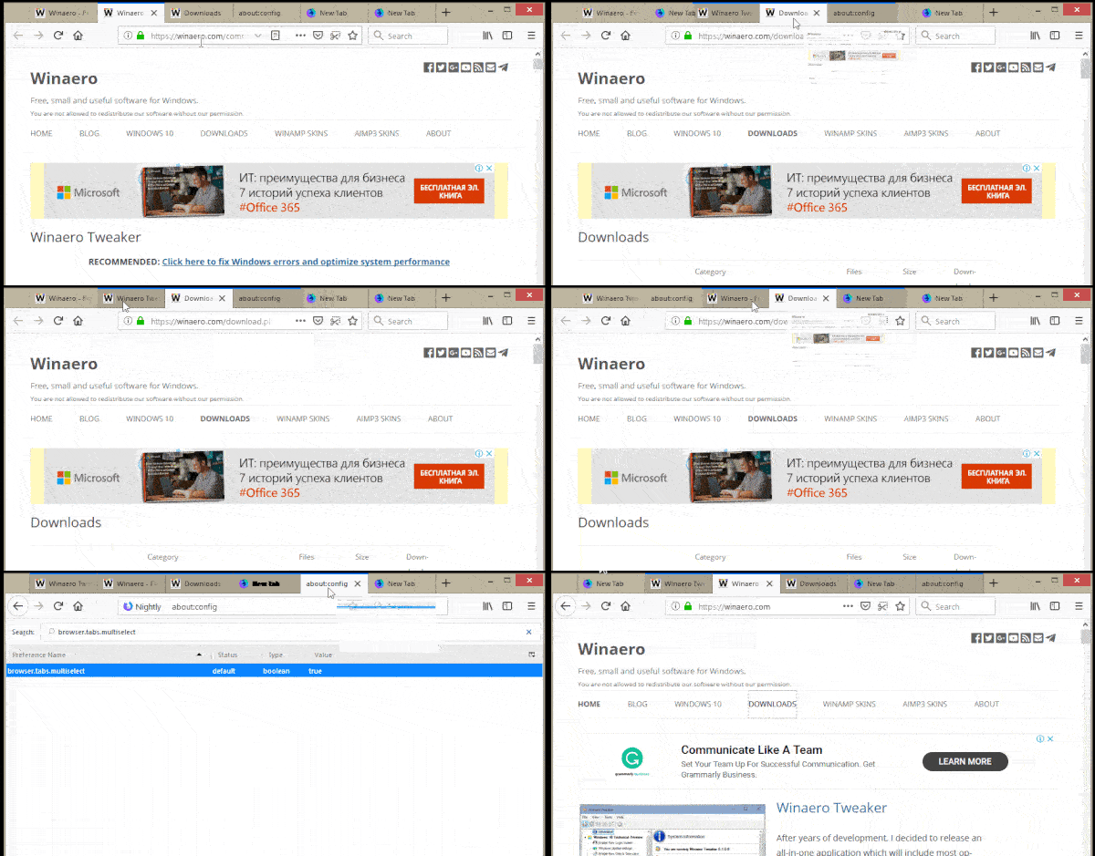
Today, for example, many browsers have ways to "grab" a number of tabs at once and act on them as a unit -- drag them around, say... They aren't all active, but you could say they're all selected, maybe?

Illustrated: dragging multiple tabs in Firefox

But also, as I keep saying "I'm not sure we can always say never" and "application tabs are more of a window manager" and if you think about it like that, there are plenty of cases where it's possible to display more than 1. Many code editors use tabs and you can also do several things with them, including side-by-side

Screenshot 2023-11-04 at 11 20 20 AM

I guess you could think of that also as multiselct? That's what sublime calls it.

Anywho, those are both application tabs for sure and they are some kind of multiselect, but it's totally unclear how that should work imo and should be part of the work of defining application tabs, perhaps. Along with @smhigley's secondary actions. (for extra extra fun, you can multiselect and get a context menu in some apps 😛 ).

lukewarlow commented 8 months ago

I've got a few ideas floating around so at some point soon I'll chuck it down into a document or comment here. The code editor side by side is a good point in my head they were separate windows but they're not actually. One thought I have is how often do people actually want their tabs to morph? As I say I'll try and get my thoughts a bit more concretely together and put a comment here with them.

github-actions[bot] commented 1 month ago

There hasn't been any discussion on this issue for a while, so we're marking it as stale. If you choose to kick off the discussion again, we'll remove the 'stale' label.