 nlf
commented
8 years ago
nlf
commented
8 years ago interesting. let me talk to someone i know :)
Closed hueniverse closed 8 years ago
nlf
commented
8 years ago interesting. let me talk to someone i know :)
 AdriVanHoudt
commented
8 years ago
AdriVanHoudt
commented
8 years ago Just make sure I can get stickers ;)
 devinivy
commented
8 years ago
devinivy
commented
8 years ago 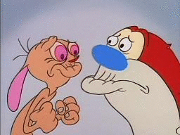
 adityabakle
commented
8 years ago
adityabakle
commented
8 years ago same here :) sticker for me too
 geek
commented
8 years ago
geek
commented
8 years ago We owe it to everyone to keep the logo fun loving.
Should we keep the same orange color we have on the site (#f6941e)? Do we fit the design into a hex?
 kepano
commented
8 years ago
kepano
commented
8 years ago We've enjoyed using hapi for lumi.com – let me know if we can contribute some stickers :)
 davepoon
commented
8 years ago
davepoon
commented
8 years ago A minimalist logo could be a great option, which is easier to get people to remember. A great use of minimalist logo could convey the message of simplicity and reliability from the hapi framework. hapi could even define a new visual language, a brand redesign, not only the logo. Meteor.js is an great example to see the success of the redesign, which increase publicity around the framework. Please let me know if you need any of my design contribution ;)
 jhrobles
commented
8 years ago
jhrobles
commented
8 years ago 
How is this? I wasn't sure if you wanted to pull completely away from the helmet/Ren & Stimpy.
 hueniverse
commented
8 years ago
hueniverse
commented
8 years ago @jhrobles thanks! That's a great option. I'm sure people will have comments. I need to stare at it for a bit :-)
AdriVanHoudt
commented
8 years ago @jhrobles great job, personally I did like the detail of the current one, also it has more colors and the weird angle :P
nlf
commented
8 years ago I definitely like this simpler approach better than the old logo. I asked @jhrobles to come up with a few other non-helmet ideas too :)
AdriVanHoudt
commented
8 years ago I do like the helmet, and not against flat logos, I like the one from eslint a lot
 paulovieira
commented
8 years ago
paulovieira
commented
8 years ago Good work! I like it, but it's a bit too "clean", maybe... One thing I like in the current logo is the childish aspect.
Also, it immediately reminded me of the reddit logo. Anyone else too?

 dylan-cromwell-sociomantic
commented
8 years ago
dylan-cromwell-sociomantic
commented
8 years ago @hueniverse from reading the thread I understood a logo has not yet been chosen. Thus, I let one of our Designers at Sociomantic know about this issue. They are very excited and whipping up a proposal logo for you now. I can't say precisely how long they need, maybe a couple of weeks?
 vctrfrnndz
commented
8 years ago
vctrfrnndz
commented
8 years ago @hueniverse We use HapiJS in our projects at Auth0 and one of our team members told me you were looking for a logo. I tought I might have a go at it, this is my proposal:
 Kept the helmet to some extent, and humanized it a bit. Let me know what you guys think.
hueniverse
commented
8 years ago @vctrfrnndz nice! These are very cool. I am not sure keeping the helmet concept but going in another direction makes sense though. The existing helmet was from Ren and Stimpy Happy Happy Joy Joy song.
@dylan-cromwell-sociomantic would be cool to get more options, thanks!
dylan-cromwell-sociomantic
commented
8 years ago @vctrfrnndz yes those are very cool! Dig the calm, humble style and flat illustrative quality. Nice color schemes too!
@hueniverse yup will post the work from our Designer ASAP once it's ready. Thanks for the opportunity here!
Also, if you have anything specific you'd want me to pass along to the Designers, please let me know. They are very receptive to direction.
 zoe-1
commented
8 years ago
zoe-1
commented
8 years ago 
Got inspired and came up with this today. It goes in a different direction than the helmet etc.
zoe-1
commented
8 years ago  Has space to brand hapijs plugins too.
zoe-1
commented
8 years ago 
Changed the size proportions between the H and the api.
nlf
commented
8 years ago hmm.. i like the style of it, the only issue i take with any of these @zoe-1 is that we've already established that hapi is always all lowercase, so it seems weird to see the H capitalized
zoe-1
commented
8 years ago hmmm.... that is an issue. @nlf Will put more thought into it. The capital H is more proportional so easier to design with.
zoe-1
commented
8 years ago lower case concepts below:

zoe-1
commented
8 years ago 
eyes on angle
zoe-1
commented
8 years ago  eyes straight ahead.
zoe-1
commented
8 years ago 
zoe-1
commented
8 years ago I think lowercase looks better :-)
@nlf what do you think?
 arb
commented
8 years ago
arb
commented
8 years ago I think https://github.com/hapijs/contrib/issues/68#issuecomment-189572206 is my favorite of your recent posts; FWIW.
devinivy
commented
8 years ago @vctrfrnndz https://github.com/hapijs/contrib/issues/68#issuecomment-186426073 looks very nice!
I don't mind the helmet staying around, especially if it has a very different character (as in the logo referenced above). What do we think of the all-caps in that logo? The all-caps don't offend me, but we do typically stylize "hapi" to be entirely lowercase.
AdriVanHoudt
commented
8 years ago I also do like the helmet, and while cool ones by @zoe-1 and find them not too readable, could be me.
 danielb2
commented
8 years ago
danielb2
commented
8 years ago :+1: for jrohbles with https://github.com/hapijs/contrib/issues/68#issuecomment-173352864
Doesn't bring it too far from the original plot, and it's clean
devinivy
commented
8 years ago @vctrfrnndz mind if I play around with altering the type in your logos?
zoe-1
commented
8 years ago 
zoe-1
commented
8 years ago 
zoe-1
commented
8 years ago Previous two logos are an attempt at a clean and pure look. No fuss no confusion.
vctrfrnndz
commented
8 years ago @devinivy Not at all, in fact I'll send over lowercase versions
vctrfrnndz
commented
8 years ago See these alternates, also tested out the concept on your website:


 jamesdixon
commented
8 years ago
jamesdixon
commented
8 years ago @vctrfrnndz that looks mighty slick..well done!
kepano
commented
8 years ago @vctrfrnndz I like it! Can I make a minor suggestion? The logo should be facing right, it is a subtle change but suggests "looking forward" rather than looking back.

AdriVanHoudt
commented
8 years ago Oh wow I like the lowercasing!
 semateos
commented
8 years ago
semateos
commented
8 years ago @vctrfrnndz @kepano I like it - and, yeah, right facing is a big deal, it generally means "good guy" and "progress" - think super mario. Agree that the lowercase is better - a bit more friendly. In the single-color outline versions the variation in line-weight is a little odd-feeling in places - particularly the interaction between the antenna and the outer helmet line - I might play with that a bit. @vctrfrnndz would you post the vector file?
I really like the full color version and I think it could be a lot of fun to see it animated. For example, the helmet could have a visor that starts closed where and you can't see the face, it flips open to revel the face, the person nods or winks, and the antenna shifts up into position. Or, the antenna shifts (like the helmet has turned on) and then the eye goes from sad looking to insanely happy looking. Or something along those lines... any motion graphics people out there?
Anyway, really nice work!
vctrfrnndz
commented
8 years ago @kepano That's a really good point, already flipped the logos.

@semateos Sure, here's an SVG, final vector file may need some more work, but its good enough for a concept.
 woloski
commented
8 years ago
woloski
commented
8 years ago +1 to that logo. Looks beautiful. I want the sticker right now. Great job @vctrfrnndz
hueniverse
commented
8 years ago The problem with the logo from @vctrfrnndz is that while it is very well done,clean, and project the kind of professional image we want, it makes little sense. It took the helmet concept into a direction that just doesn't relate to the framework. The existing logo's helmet is from the happy happy joy joy episode of ren and stimpy. An astronaut helmet just doesn't have a thematic relation to this project.
It is a absolutely great logo. I just don't see how it fits this project.
vctrfrnndz
commented
8 years ago @hueniverse Totally understand, if I find time this week I will make another proposal.
Let me know if you or anybody else here have ideas or concepts for me to work off.
devinivy
commented
8 years ago Here are some core hapi-specific concepts that could have visual counterparts–
AdriVanHoudt
commented
8 years ago @devinivy add predictability to that
zoe-1
commented
8 years ago 
configuration centric hapi face. radial knobs for eyes. slider controller for mouth. Plus, custom hapi name text.
zoe-1
commented
8 years ago 
Same as previous but with different font.
zoe-1
commented
8 years ago 
hapi face to left of name. Positioned for branding at top left of page similar to github's octocat.
I think it's time. We are no longer using the Ren & Stimpy theme so maybe refresh the logo with something cleaner and more up to date?