ownpass / api-server

The OwnPass server application.
https://ownpass.io
7 stars 3 forks source link

Logo Design #2

Open waltertamboer opened 7 years ago

waltertamboer commented 7 years ago

OwnPass requires a logo.

It might help to know where this logo will be usedPlaces where the logo will be used:

Requested formats:

References:

I imagine that all these formats can be exported if the source file is available?

I can setup a repository where all visuals and source files can be stored because I would like to keep these big binaries out of the ownpass/ownpass repository.

myckyc commented 7 years ago

Hey @waltertamboer!

I just design some simple icons based on your description. They are pretty much based on simple objects like key, keyhole, shield, letter O. Which are represents passwords and security. ownpass-logo-work-01

These is just basic visual brainstorm and they should be there is a lot of work to be done if you would choose some of it. But don't be confused by their simplicity. They can turn out pretty good. Here is some quick examples:

ownpass-logo-work-02 ownpass-logo-work-03 ownpass-logo-work-04 ownpass-logo-work-05

kwarkjes commented 7 years ago

@myckyc Woow cool!

waltertamboer commented 7 years ago

Hi @myckyc !

Awesome!! I'll go over them tonight (it's 16:45 in my timezone now) but so far they look awesome and it seems there is plenty to choose from.

waltertamboer commented 7 years ago

ping @jaapio @JustInVTime

myckyc commented 7 years ago

Cool! Guys feel free to comment and decline if you don't like the idea behind. First goal is to make strong foundation. We can decide on tweaks, colors and visual effects just after that.

Forgot to mention that the "star" form comes from asterisk (*) which is common symbol that hides our password from other's eyes.

jaapio commented 7 years ago

I really like the 1.3 version. It looks a bit like a weel of a safe door. You could even use it in the name Ownpass where the O is replaced by the logo. The reference to the asterisk is very nice. The 2 and 3 series make me remind to the old Lastpass logo. We are not connected to the lastpass company in any way. So I would pick those.

Thanks for this very nice effort @myckyc!

waltertamboer commented 7 years ago

So first of all, again, great work! :-)

I recognize four different concepts in your designs:

Serie 1: Asterisk

The asterisk let's me think of passwords. The thing one will be managing. It also reminds of security. This afternoon I was leaning towards 1.1 and 1.2 but a couple of hours later they look a lot like a lightning bulb (not sure if it was intended but that's the feeling I get). That in itself is not bad but I cannot link the relation between a lightning bulb and password management yet. The bulb gives me the feeling of 'ideas' which probably should not be the intention of the logo. 1.3 Really gives me the right feeling.

Serie 2: O-Shape

Really solid logo, an O-shape with an asterisk in it. I think it's a very strong logo. The O-shape reminds me of the O of OwnPass and the asterisk let's me think of passwords. Yet I think it looks too much like LastPass and therefor I don't think it's a good fit.

Serie 3: Shield

Another solid logo which gives me the feeling of security. And that of course is one of key things we are focussing of. Like the O-series this logo also looks a lot like LastPass's logo.

Serie 4: Freestyle

4.1: a keyhole which in a way also looks a bit like a lightning bulb. I don't really get a feeling with this logo. 4.2: a padlock, not getting a really good vibe with this logo either.

Conclusion

I prefer 1.3. It looks the most solid and gives me a great feeling of password management. I also like it's potential, we can use it in a O like @jaapio suggested and we could also use it as a loader-gif where the key would move around (ping @kwarkjes).

When it comes to the text, I might be a bit too impatient but I would reaaallly like to see how it looks with font Impact, a big, fat, shouting font. We should be proud of this product, shout it out :)

kwarkjes commented 7 years ago

Personally I like 4.2 the most, the O as a 'lock symbol'. Very strong and clear. It might need some fine tuning and maybe a better color combination, something with two similar colors. Maybe two tints? A little hole/gap at the bottom side of the lock?

On the other hand, I like serie 1 also. Especially 1.2 it might need some fine tuning as wel, like @waltertamboer already said it's looks like a light bulb.

One more thing: can you try something with the O as a vault or a vault door?

Once again great work, I appreciate it!

waltertamboer commented 7 years ago

@ei8fdb What do you think? :)

myckyc commented 7 years ago

Wow =) That's a lot of structured feedback. Thank you guys. I wasn't familiar with previous LastPass logo before but you right, series 2 and 3 looks close to it. Strike them from the list.

So we're waiting for the feedback from other mates (@ei8fdb and @JustInVTime) and back to work.

Current leader — 1.3. Then goes 1.2, 4.2 and "O as a vault or a vault door" suggested by @kwarkjes

waltertamboer commented 7 years ago

Hi @myckyc

I think we should move forward. I encourage anyone to voice their opinion but we can't wait days and days everytime a decision has to be made.

I'd prefer to keep momentum and your work really helps.

Let me know if you need anything :+1:

ei8fdb commented 7 years ago

Hi all sorry, busy week.

I think @waltertamboer summarised the concepts well above. I think the idea of trying to use the logo in the name (replace the O) also makes sense in some situations - website title, branding etc.

I think for me the concepts that make most sense are those in 1.x, 2.x and 4.x, they are visual, passwords are often hidden behind an asterisk. Just my opinion but I think there is less need to communicate an '*' (as the user will see it when they type a password in...) than a concept like a shield.

A shield can have differetn meanings - yes personal protection, but also "offensive" - like attack, battle, army.

Option 1.3 or 1.2 - I think are fine options. The main different I can see is the angle at which the key is located. I wonder what these options would look like when replacing the O in Ownpass? I wonder could they get mistaken for a P or some other letter?

The use of the key, again, keys used to lock access to an entrance to protect something valuable or restricted.

Option 4.2 - I like the simiplicity of it. it lends itself to representing letter O very well. Its similarity to a padlock is also nice - a padlock is used to "lock" an entrance to something valuable.

It's a difficult decision! If it makes sense, my "non-techy" side is leaning towards 4.2, while my techy side is leaning towards 1.3, 0r 1.2

Let me think a bit about it. I'll try to do some research in work with some people and get input from tech and non-tech people. :)

ei8fdb commented 7 years ago

Hi all,

So instead of speaking to a small number of people, I created a small survey.

From Friday until today we got 35 people to respond. I recruited these people from Twitter, Facebook, and work. They are a cross-section of people: some technical (developers, engineers) some not (artists, translators) and some UX type people (designers, researchers).

Description of survey

2 main tasks:

  1. Write 5 words they associated with logos 4.2 ("LOGO 1" in the survey) and 1.3 ("LOGO 2" in the survey)
  2. compare the 2 logos against the description of the concept of a password manager and decide which they thought represented the description best

Ordering of images

The reason I used option 1.3 as the second image was during the trial with one person they felt image 1.3 biased them towards thinking 4.2 was a lock. So I reversed them.

Question 1

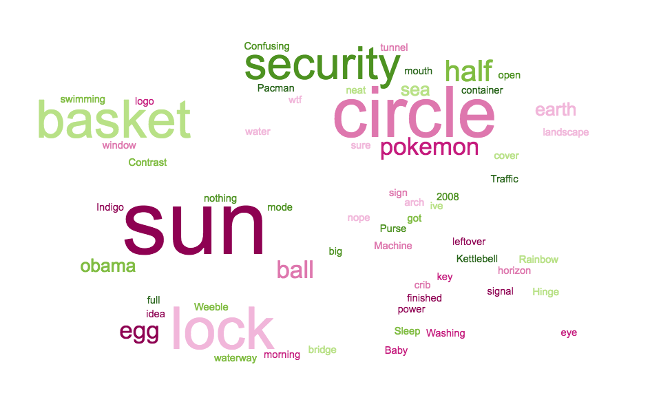
Write 5 words that describe the logo below: Ownpass logo 1 - the abstract padlock

RESULTS: Word cloud post analysis of answers to question 1:

Word cloud post analysis of answers to question 1

Question 2

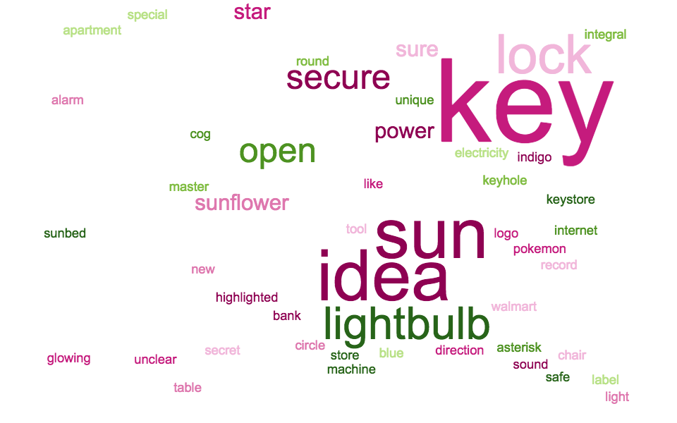
Write 5 words that describe the logo below: Ownpass logo 2 - the key on an asterisk

RESULTS: Word cloud post analysis of answers to question 2:

Word cloud post analysis of answers to question 2

Question 3

The participant was asked to compare logo 1 and logo 2 and choose which they thought was best associated to the software application.

Ot explained the two logos were proposed for a software application called Ownpass, a password manager. The definition of a password manager was given as:

A passport manager is a software programme that helps a user store and organise passwords.

They usually store passwords securely using encryption and require the user to create a "master password" to open it.

The purpose of the "master password" is that only one person knows it.

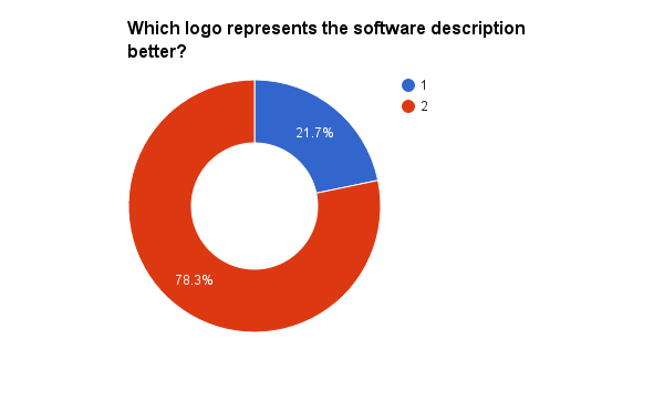
RESULTS: What logo best describes a password manager?

Chart showing results of which logo better describes Ownpass. ANSWER: logo 1 - the key on the asterisk

Some quotes explaining choices

In favour of logo 1

It works in the context as a lock, but if you only show me the logo I wouldn't really think locking, it need to look more like a safe's lock - the second just not good example for logo, too much detail, it would be better just have a key :)

I already associate padlocks with online security moreso that I do keys.

Immediately saw a padlock. Feels more solid and secure than the second.

It's simple and it looks more like an O for Ownpass... the lock symbol is quite subtle but I like it for that reason

(You can see more quotes in the data analysis)

In favour of logo 2

It represents the key to open the program

The first logo means absolutely nothing me.

The first is too ambiguous; it doesn't look enough like a lock.

It has a key which cannot be mistaken for anything else.

Really couldn't make an association with the first one until I read the explanation. A minor preference of 2 over 1.

(You can see more quotes in the data analysis)

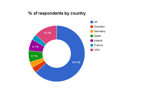
What countries were respondents from?

Below gives the break-down of country where the survey respondents were from Breakdown of country where the survey respondents were from by %

If you're interested in seeing the raw data and the analysis, you can have a look in my Ownpass logo research repo

Conclusion

From the results I think its clear that logo 1.2 (or 1.3) works better in comparison to logo 4.2.

The reason for this, from the data, it seems that option 4.2 was just a bit too abstract, as one participant said

Option 1 is just too abstract/vague. I struggled to derive any association from looking at it. You can get 'single key gives you access to many' quite easily from #2.

Was this helpful? Is there anything other information you'd like to get?

Any questions, or suggestions, let me know.

gillisig commented 7 years ago

So hopefully I'm not complicating things for you but I was in a state of tiredness when things pop into my head and this suddenly did. So I thought I'd just throw it out there at least.

ownpass

gillisig commented 7 years ago

Bonus feature: If you move the middle circle down it turns into a robot!

...yeah I should probably go to sleep now.

waltertamboer commented 7 years ago

Wow @ei8fdb That is just awesome! Great work!! This will definitely help to make the right decision.

If you want we can transfer your repository to the OwnPass organization? I'll add you as the admin so you'll have full control.

waltertamboer commented 7 years ago

@gillisig Looks great, I like how you turned the O into a masked symbol as well :)

The only downside is that it looks very similar to LastPass. The dots remind me of LastPass a lot and we should prevent that association I think.

Nevertheless, I'm very curious what people think, great work, thanks!

ei8fdb commented 7 years ago

@waltertamboer Thanks for the invitation. I've accepted ;)

I'll happily transfer it to the Ownpass org. I wasn't sure about how you wanted to do it so I created my own.

It would be good to have a design and research repo for these kinds of things.

In my head (and how I've worked before) it might b something like this:

Theres a Github issue where some is requested "Can someone help with a logo?" (issue #2), and that gets worked on in a folder inside the design-research repo so all of the iterations are there...it keeps things easy to find...

github.com/ownpass/ownpass-research-design/#2/

and so on.....

Does anyone have any request on where to actually put the repo? As I said to me it makes sense to have it under "/ownpass-research-design/"

so "/ownpass-research-design/#2-ownpass-logo-research" or something like that...

@gillisig what about combining number 1.2 or 1.3 from @myckyc with the O in your ownpass logo? Just something that came to mind now...

waltertamboer commented 7 years ago

ownpass/design-research seems good to me @ei8fdb :+1:

Do I need to take any action or will you manage?

ei8fdb commented 7 years ago

@waltertamboer No need. I can do it now. I just need to remember git syntax..its been a year or so since I've used git in anger. 😬

myckyc commented 7 years ago

Hey guys!

Wow! Cool research! Thanks @ei8fdb

Sorry for this long delays. Still working on logo. And still not happy with current result.

Here is some of screenshots: ownpass-logo-work2-08 ownpass-logo-work2-09

And attempt to apply some style and colors: ownpass-logo-work2-10

And here is my current progress in my working/experimental directory (if you want to see more): https://drive.google.com/open?id=0B8_5BZdVxA1cMVBsZ2xVMkJmQWc

There is ai-file if you want to jump in and experiment with it. It's pretty messy. Sorry for that too.

jaapio commented 7 years ago

Please stop saying sorry :-) You are doing an awesome job. We are all technical people without eye for design. So your help is very appreciated. We are all doing this in the little amount of time we have beside our normal live. You are one of those very little group of people that do contribute :+1:

jaapio commented 7 years ago

A had a look at your logo expiriments, I think I like the sharp key more than the rounded one. Same for the asterix design. For some reason, I can't explain why, I'm more attracted to the asterix with the sharp cornered beams. The rounded corners are giving me a fluffy feeling. I think that is what I liked in your first setup item 1.3.

I like the colors you choose. And I think we could use the logo this way on dark and light background which is always good to have.

waltertamboer commented 7 years ago

I agree with with @jaapio I also like the sharp end more than the rounded version. I also like the color scheme that you used.

Great job @myckyc !

I believe @kwarkjes is eager to start setting up the layout with the right color scheme, is there anything you want to change there?

myckyc commented 7 years ago

Thanks for a feedback @jaapio, @waltertamboer! Working on that sharp cornered version =)

waltertamboer commented 7 years ago

How's it going @myckyc ? @kwarkjes will integrate your WIP logo already in the control panel, that way we can show some progress on the design. Later on we will change the logo to the version you are happy with, no problem :+1: