pajicf / react-native-semi-circle-progress

Lightweight, Animated and Easy to use semi circle progress bar for React Native
MIT License
34 stars 18 forks source link

TypeScript Functional Remake #2

Open Martinocom opened 1 year ago

Martinocom commented 1 year ago

Hello there! I was searching for a SIMPLE and CLEAN solution for a semi-circular progress. I need to make a simple indicator. My React-Native app is on version 0.71.2 and I'm not using class components anymore. With a little refactor I remade all the thing with TypeScript in functional style, and it seems to work properly.

The only "error" showing is in line 89, saying that Type 'AnimatedInterpolation<string | number>' is not assignable to type 'string'., but it seems that it doesn't care.

I also fixed (?) a problem with percentage calculation and throw an error if no percentage nor min/max/current are provided. Surely a better work can be done, but at least it's working again!

Here is the code:

import React, { useEffect, useRef } from 'react';
import { Animated, View, StyleSheet, StyleProp, ViewStyle } from 'react-native';

interface SemiCircleProgressProps {
  percentage?: number;
  progressColor?: string;
  progressShadowColor?: string;
  interiorCircleColor?: string;
  circleRadius?: number;
  progressWidth?: number;
  exteriorCircleStyle?: StyleProp<ViewStyle>;
  interiorCircleStyle?: StyleProp<ViewStyle>;
  animationSpeed?: number;
  initialPercentage?: number;
  minValue?: number;
  maxValue?: number;
  currentValue?: number;
  children?: JSX.Element;
}

const SemiCircleProgress = ({
  percentage,
  progressColor = 'steelblue',
  progressShadowColor = 'silver',
  interiorCircleColor = 'white',
  circleRadius = 100,
  progressWidth = 10,
  exteriorCircleStyle,
  interiorCircleStyle,
  animationSpeed = 2,
  initialPercentage = 0,
  minValue,
  maxValue,
  currentValue,
  children,
}: SemiCircleProgressProps) => {
  const rotationAnimation = useRef(new Animated.Value(initialPercentage)).current;

  useEffect(() => {
    animate();
  }, []);

  useEffect(() => {
    animate();
  }, [percentage, currentValue, minValue, maxValue]);

  const animate = () => {
    const toValue = getPercentage();

    Animated.spring(rotationAnimation, {
      toValue,
      speed: animationSpeed,
      useNativeDriver: true,
    }).start();
  };

  const getPercentage = () => {
    if (percentage !== undefined) {
      return Math.max(Math.min(percentage, 100), 0);
    } else if (currentValue !== undefined && minValue !== undefined && maxValue !== undefined) {
      const newPercent = ((currentValue - minValue) / (maxValue - minValue)) * 100;
      return Math.max(Math.min(newPercent, 100), 0);
    } else {
      throw 'No percentage nor min-max-current value provided';
    }
  };

  const interiorCircleRadius = circleRadius - progressWidth;
  const styles = StyleSheet.create({
    exteriorCircle: {
      width: circleRadius * 2,
      height: circleRadius,
      borderRadius: circleRadius,
      backgroundColor: progressShadowColor,
    },
    rotatingCircleWrap: {
      width: circleRadius * 2,
      height: circleRadius,
      top: circleRadius,
    },
    rotatingCircle: {
      width: circleRadius * 2,
      height: circleRadius,
      borderRadius: circleRadius,
      backgroundColor: progressColor,
      transform: [
        { translateY: -circleRadius / 2 },
        {
          rotate: rotationAnimation.interpolate({
            inputRange: [0, 100],
            outputRange: ['0deg', '180deg'],
          }),
        },
        { translateY: circleRadius / 2 },
      ],
    },
    interiorCircle: {
      width: interiorCircleRadius * 2,
      height: interiorCircleRadius,
      borderRadius: interiorCircleRadius,
      backgroundColor: interiorCircleColor,
      top: progressWidth,
    },
  });

  return (
    <View style={[defaultStyles.exteriorCircle, styles.exteriorCircle, exteriorCircleStyle]}>
      <View style={[defaultStyles.rotatingCircleWrap, styles.rotatingCircleWrap]}>
        <Animated.View style={[defaultStyles.rotatingCircle, styles.rotatingCircle]} />
      </View>
      <View style={[defaultStyles.interiorCircle, styles.interiorCircle, interiorCircleStyle]}>{children}</View>
    </View>
  );
};

const defaultStyles = StyleSheet.create({
  exteriorCircle: {
    borderBottomLeftRadius: 0,
    borderBottomRightRadius: 0,
    alignItems: 'center',
    overflow: 'hidden',
  },
  rotatingCircleWrap: {
    position: 'absolute',
    left: 0,
  },
  rotatingCircle: {
    position: 'absolute',
    top: 0,
    left: 0,
    borderTopLeftRadius: 0,
    borderTopRightRadius: 0,
  },
  interiorCircle: {
    overflow: 'hidden',
    justifyContent: 'flex-end',
    alignItems: 'center',
    borderBottomLeftRadius: 0,
    borderBottomRightRadius: 0,
  },
});

export { SemiCircleProgress };
ChawkiOS commented 1 year ago

@Martinocom Thank you for your implementation.

Here is a solution for this TS problem, you just have to move the transform directly into the style props of your Animated.View
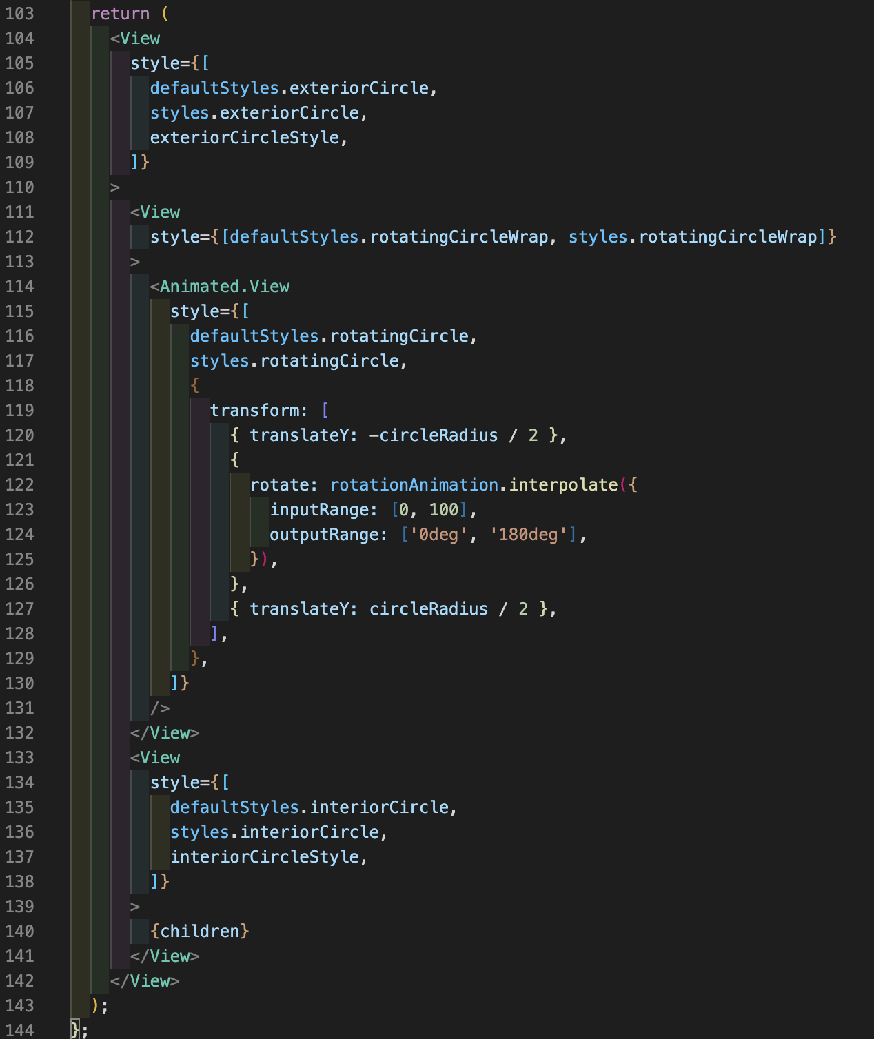
screenshot