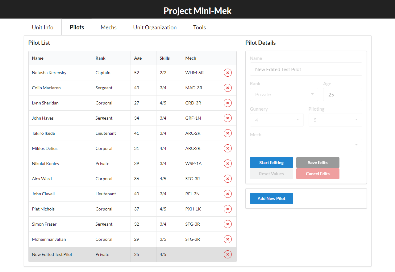
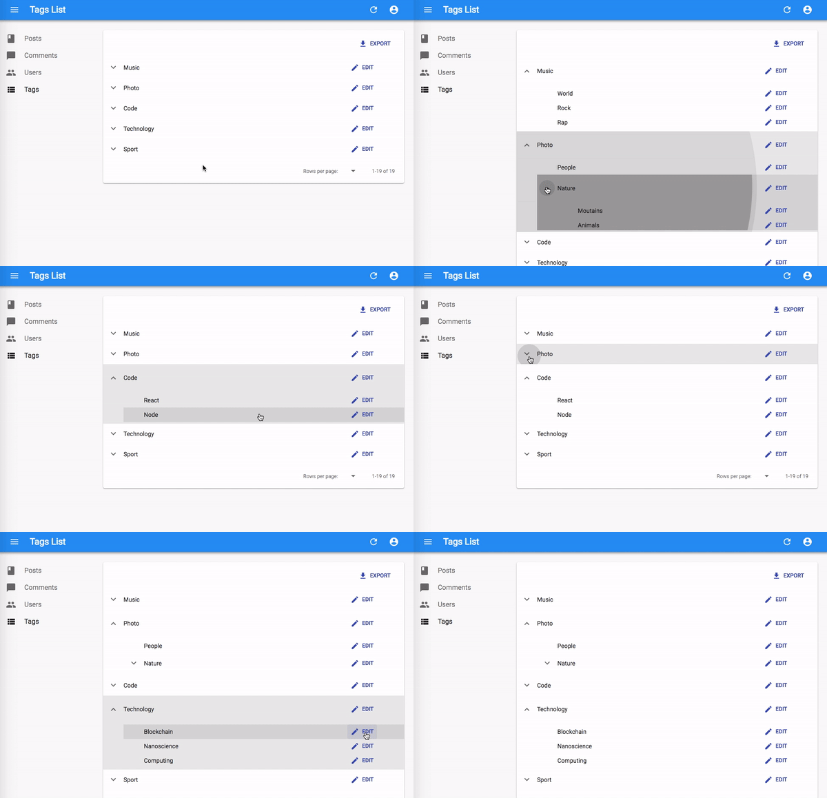
@jbargu I did a small mockup design for this that I believe would work great in term of UX. I think the 2nd option is good but unfortunately it might be hard to go through things or modify. The first one is nice for that but the tab can be annoying
ideally it would be something similar to this :

One left tab to select the chain you are in ( should visually display the chain on the tab bold & selected , and being the title on the right card ). Thinking that it could filter chain using a small search ( no need for BE it can be a simple filter )
A right card that contains all the tracked contracts inline editable with the + sign to add at the top & and some trash icons to either ( delete all if we want ) or delete per row
Let me know what you think, I can dig more and do a better design if you want or if you guys think it's good we can start going this way.

The node connects to different chains and listens for any on-chain events from the contracts listed in
tracked_contracts:The chain can be either EVM or Substrate based. Propose a design for a tab called 'Tracked contracts', which will list chains with the corresponding
tracked_contracts. The chains can be enabled/disabled. The contracts can be added/edited (validation of the addresses depending on the chain type) and deleted. User then clicks 'Save and apply', a response is returned by the backend, which should update the frontend as well as show a message box that the call was a success/an error.Some possible designs:
1) Flat hierarchy, e.g. tabs = chains, contracts are listed below, editing could also be done inline
2) Tree like structure with 2 levels
Personally I would prefer this to be more like 2), on a single screen.