 soc-se-bot
commented
1 year ago
soc-se-bot
commented
1 year ago Team's Response
The images provide step-by-step guidance for a non-technical audience, who may be more comfortable with visual guidance.
Since a video was not permitted in the UG, the next best option was a sequence of images.
We believe that the amount of images is helpful for the beginner, but not too overwhelming for the experienced user.
Items for the Tester to Verify
:question: Issue response
Team chose [response.Rejected]
- [x] I disagree
Reason for disagreement: > The images provide step-by-step guidance for a non-technical audience, who may be more comfortable with visual guidance.
As far as I can tell, this statement is actually incorrect, because the intent of the image is to provide a glimpse of the changes to UI after a successful command execution, but not to guide the user on how to use the command. So there is no step-by-step guidance involved here, unless the intent of this statement was that the images provide a step-by-step guidance on how to use the entire tag feature. If this was the intent, then these images should be in a separate "Demo" or "Tutorial" section with a corresponding explanation that highlights how the different tag commands fit together.
Since a video was not permitted in the UG, the next best option was a sequence of images.
A sequence of images would have been helpful, but they are repetitive. I think the first image is fine, but the subsequent images do not add much value to the UG, because the user already can intuitively expect the UI to be refreshed in a certain manner.
We believe that the amount of images is helpful for the beginner, but not too overwhelming for the experienced user.
I respectfully disagree, as no matter the skill level or experience of the user, the UG is still becoming rather cluttered and hard to read. Users may find it difficult to navigate, and this trade-off on helping beginners versus cluttering the UG is not worth it because the repetition of images does not actually add much value.
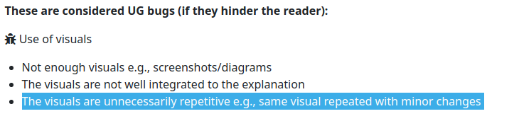
There are too many images in the UG for the
tagcommands. Each message shows a lot of detail about the other clients which is unnecessary and hampers the ability of the reader to scroll quickly in the UG.What can be done better: Each tag command has a different success message - perhaps just this message itself can be replicated in the UG instead of a screenshot of the entire UI.
For commands like
tag remove 3 bff, the UI does get updated in such commands. But as we cannot see the previous UI, showing the updated UI for any comparisons is meaningless. Furthermore, the UI has details of other clients. It's best to just display the success message only in the UG.