 nus-se-script
commented
10 months ago
nus-se-script
commented
10 months ago Team's Response
We believe that our UG is beginner-friendly for the following reasons:
- There is a step-by-step guide to guide first time users from downloading the app, setting up, to typing their first command:
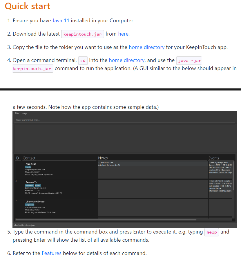
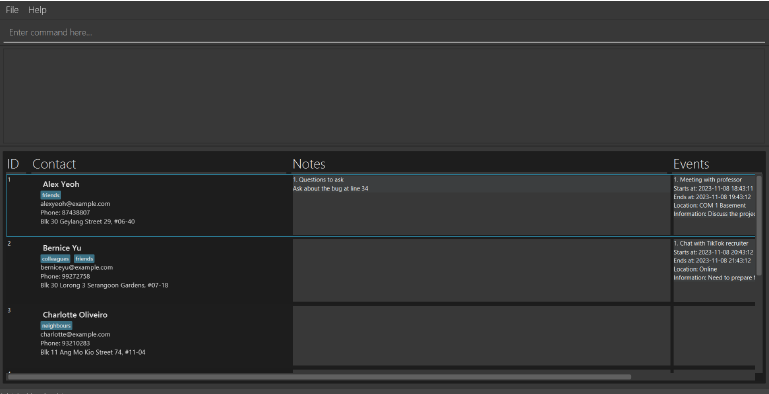
- While there is preloaded data, the presentation of the data in the UI is very intuitive as it is presented in a very standard table format with clearly labelled headings. The information within each contact, such as email, tags, phone and address are also easily understood as they are formatted in the commonly used format.
-
There was not need to introduce other parts of the UI as they are also intuitive enough. The menu option
 is a very standard feature in modern applications, and our does not deviate from the norm. The area to enter your command is clearly indicated in the UI
 . While the feedback box does not have clear indication, but since it empty and is not interact-able when the app first started, it should not be a point of confusion for users. And once the first command is entered, its functionality should be very clear even without explanation.
 -
Terms that might be unfamiliar to new users can be checked in the glossary section. While there may be some terms that we missed, it is already addressed in catcher issue #2014.
-
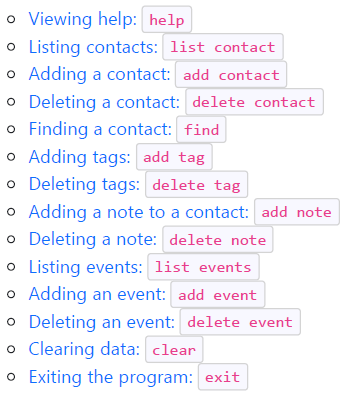
We believe your concerns regarding unfamiliar commands is addressed by the intuitive naming of our commands:
Furthermore, every one of our commands are clearly explained in the feature section with clear instructions on what the command does, how to use them, as well as the expected output.
Items for the Tester to Verify
:question: Issue response
Team chose [response.Rejected]
- [x] I disagree
Reason for disagreement: >There is a step-by-step guide to guide first time users from downloading the app, setting up, to typing their first command:
This 'Quick-Start' does not teach users how to properly use the application, and assumes users already know what to do with the application after opening the app. In their reply, the team had focused a lot on what you can do with the app, however they do not address the underlying issue in which there is little to no explanation on how do beginners use this app for its intended purpose.
intuitive
The team constantly uses the term 'intuitive' in their reply, which indicates an assumption that users would, by default, understand what the application does and the dev team's intention. However, what may seem "intuitive" to the developing team may very much not be to new users, especially given that their target group is simply 'job-seekers', with no pre-requisite on technological knowledge. Operating the commands, navigating the system, steps in order to reach a desired output are not elaborated upon. Intuition should never be assumed, and this issue should not simply be categorised as 'rejected' simply because the team does not agree on the feedback. A lack of proper documentation should not be acceptable behaviour towards a new user
intuitive naming of our commands
The team may wish to consider that while command names may seem to be intuitive (given that they were based on the AB3 format), for a new user they are still not well elaborated especially in their usage.
Example: New user follows the quick start guide and wishes to maintain a full contact book that has all his contacts and events.
-
He downloads the file, opens it, maybe even runs the
helpcommand as given in the example. -
Now the user is confused as to what he can do next. All the commands are, by nature, new to him as a user.
-
Is the user willing to read through the entire user guide to figure out how he can add his contacts, and then add notes, and then add events?
-
All this without any guidance from the developers (lack of tutorials / beginner guide), and no FAQs to help him through it
above example is the actual flow of thoughts that I, from the approach of a new user, went through (even as a fellow developer/tester), as their lack of proper documentation made it difficult for me to use the app, creating a barrier of entry
## :question: Issue severity Team chose [`severity.Low`] Originally [`severity.Medium`] - [x] I disagree **Reason for disagreement:**  As seen from the website, this issue affects the operations of the product as it will occur to all new users of the product, and thus is not in a "very rare situations only" occasion
As a new user, there is data pre-loaded into the application but there is no standard 'guide' to walk new users through the process of using the application itself (i.e. Tutorial / Beginner Guide).
This is overwhelming and non user-friendly as they will have to slowly piece together what they have to do using completely unfamiliar commands and an unfamiliar interface, which severely limits the effectiveness of the application as there is a significant skill floor / commitment level required to before the user is able to use the application.