i like the design of https://github.com/OnionUI/Onion
they use Exo 2 bold 700 italic https://fonts.google.com/specimen/Exo+2
reference:
https://github.com/OnionUI/Onion/wiki/Style-Guide
Open x1y opened 1 year ago
i like the design of https://github.com/OnionUI/Onion
they use Exo 2 bold 700 italic https://fonts.google.com/specimen/Exo+2
reference:
https://github.com/OnionUI/Onion/wiki/Style-Guide
Here is my take at the challenge. I created two different designs.
Not really creative, but I tried to make some minor design changes (typography, slight adjustments to the pine cone shape & colors) to the original design from the blog post.
I really like the draft proposed within the post, but I think these adjustments make it a bit more colorful and also slightly closer to the original logo.
I believe the current pine cone shape is good and it ultimately should have 4 colors. Even if the rule of thumb is to avoid using more than 3 colors, in case of Pine64 logo, there are 4 shades of the same color, not really 4 different colors.
The old colors are grayish, the new are more vibrant. It is rather boring to look at bright colors than to grayish ones. More than that, a gray shade of pine cone indicates it is related to metal, to hardware, not to nature.
However, the font change is welcome. Also I welcome small letters for text instead of capitals. I tend to say the colored text is beautiful even with bright vibrant colors. I really like the different color if dot above "i". Ubuntu font is OK. I personally like the font used in Debian logo.
Not really creative, but I tried to make some minor design changes (typography, slight adjustments to the pine cone shape & colors) to the original design from the blog post.
I really like the draft proposed within the post, but I think these adjustments make it a bit more colorful and also slightly closer to the original logo.
The draft is liked by multiple community people. As enhancement I would recommend changing the color on top of the pinecone to a less greenish color, such as #3ca6ea. The "community" writing is maybe better removed in that version, I'm undecided regarding that.
I believe the current pine cone shape is good and it ultimately should have 4 colors.
I just made it less round in some places, which I'm not sure if it was intentional in the first place, there were no other shape changes.
The "community" writing is maybe better removed in that version, I'm undecided regarding that.
Yes, I'm also not sure about that, but here's a version without it:
Perhaps a pixel art logo 😄
Please add a white background, with a transparent one it's not visible properly in GitHub's dark mode.
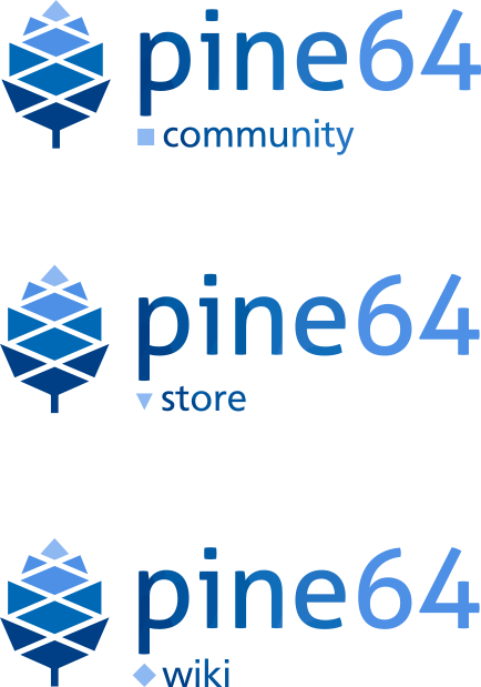
Here's my submission, named "pineflow". it was originally posted on the community Discord, Reddit and forum shortly after the challenge was announced, as a logo and identity rebrand idea.


(repost from the Telegram/Discord chat:)

Hello everyone! Here's my entry for the community logo contest. It's not entirely a logo idea, but rather an identity rebrand concept for the PINE64 community. For now this concept is called "pineflow".
Using a minimal color palette (only +1 from the original 3 blu-ish colors used in the pinecone logo) with white backgrounds, the new logo and the infographic packages aim to deliver a modern, decently vibrant & practical visual style with good readability.
The design is also flexible and could be adapted for various needs (for example, optional shape/color indicators could be included before the logo subtitles or the title text in announcements)

(Sorry for the lack of examples, since PINE64's news announcement is the only use case I could think of for now)

This is a preliminary design, so all suggestions are appreciated!
btw, If this concept is ultimately chosen as the community's new visual identity, I would hand in the infographic template SVG as well as the logo to the community for use in future news/announcements or in other fields.
I would also be glad to work on future updates, improvements and maintenance for this set of graphic packages as a volunteer :)

(sorry if the preview looks blurry; perhaps that's an issue with my HiDPI screen, since I'm using scaled KDE)

---

possible FAQs?
- IMO the original pinecone logo is decent enough, so I focused more on a graphics package rebrand besides doing minor tweaks to the logo itself.
- For the "store" logo suffix: I'm now aware that Pine Store Ltd is a separate entity, so perhaps I'll make a separated one for it in the future.
- No smooth color gradients are used in the text section of the logo; these are discrete color chunks with fairly sharp edges.
My original idea was indeed to use gradients, but that was scrapped since the description of the contest reads "no gradients; a minimal color palette is preferred"). Do we have a winner yet?
Do we have a winner yet?
The challenge was my idea to bring up interaction and ideas, as well as testing the idea with the challenges to use them later for bugs in software of the projects and similar. For the logo challenge, there isn't really a scheduled ending and selection process.
Feel free to post your ideas regarding the logo challenge here!