This is not what it looks like for us/others. Please provide as a minimum:
- screenshot demostrating the above points
- which resolution are you playing at?
Open ElonSatoshi opened 5 years ago
This is not what it looks like for us/others. Please provide as a minimum:
Oh, okay. I will update Pioneer and take some screenshots.


ver 20191116 (7589dfaa8) on: Linux
My operating system: Debian 10 Buster
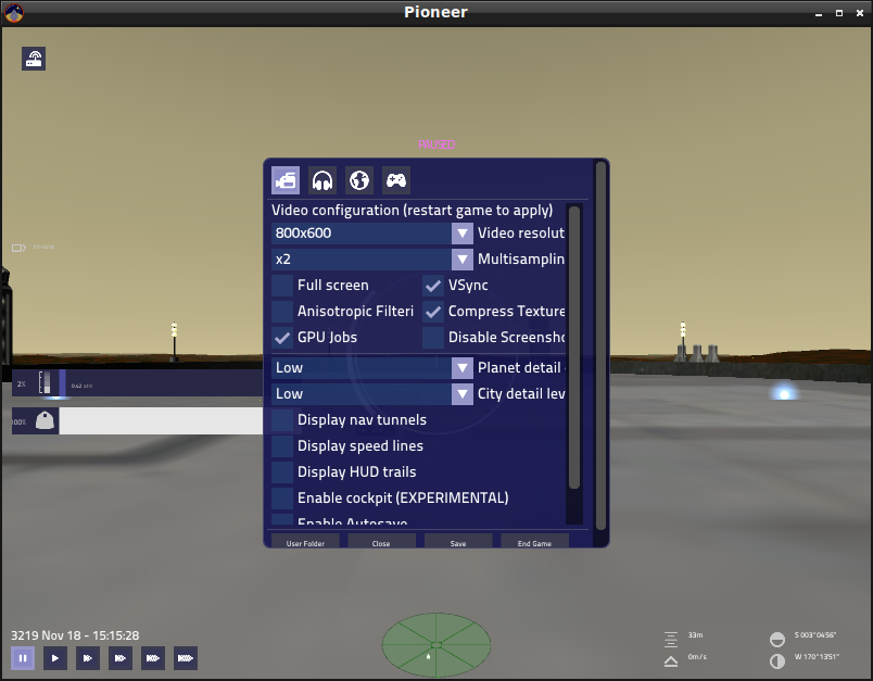
Pioneer resolution: 800x600
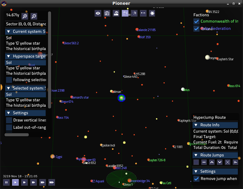
Also, the search list in the sector map is too small to use unless I collapse some of the above menus


Interesting. I just noticed that when I hover over "Enable Autosave", the info text stops when it hits the right side of the window.
It seems that the other options do this too. The ones that go off the side of the screen are Anisotropic Filtering and Compress Textures.


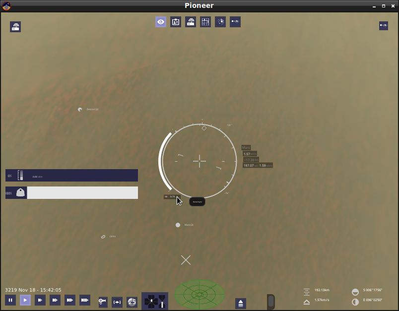
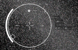
Some screenshots detailing the small text around the reticule


It can be especially hard to read against the stars

You can't even make out the numbers on the bottom left unless you look carefully.
I completely agree about the UI, I think it needs a lot of work.
Are all of you playing at less than 1920x1080 and windowed?
I used to play at 1368x768 fullscreen.
I'll add a +1 to the UI needing a lot of work. The thing is that it's, well... a lot of work. From what I remember talking with @Web-eWorks the idea was to first move everything to pigui, and start improving/fixing it once we're using 1 framework for everything rather than 3.
I think we're almost 100% pigui now. Only F6-F8 map-screens remain, right?
I'm catching up with where we're at right now, but from what I see the station and info views are more or less where I last saw them: about 30-50% done with the ship market, ship repairs, police and bulletin board tabs in the station-view still to be done, and econ, missions, and crew tabs in the info view.
And then we have the map screens.
This is mostly due to the fact that whoever wrote the PiGUI stuff in the first place used hard-coded fixed-size windows for pretty much everything, apeing the oldUI behavior instead of making full use of ImGUI's strengths. Which is okay, but it's something that we're going to have to refactor and clean up.
@vakhoir thank you for all your work on the UI! I'm much happier in the guts of the engine than I am working on the UI, so you're a godsend.
I'm going to improve the C++ to PiGui control flow for the map screens so it's much easier to implement the UI for them and the rest of the game; there's a lot of improvement that could be done in this regard. Before we tackle the map screens I want to bug @nozmajner to go through all of our collected references for orrery / system map / orbital map interfaces and come up with a coherent concept that works for Pioneer... no pressure! :D
In my opinion, I think making it easier to implement the UI, and bug fixing the UI should come before porting the old UI to the new UI. Once the new UI works well, you can port another part of the old UI, but at the same time making sure the freshly ported new UI works well.
It sounds like it might even be productive to focus on improving this control flow thing first, that way it's really easy to improve and maintain the new UI.
Disclaimer: I'm a user, not a programmer. If I don't know what I'm talking about, feel free to disregard my silly opinions. I do a little bit of Bash scripting, though. A little bit. A very little bit. And I know how to exit Vim.
And I know how to exit Vim.
Ah, a power user then ;)
indeed. i use neovim btw
another idea would be to not use the new UI by default and have it available to turn on in the settings, or a compile option, and then hack away at it while letting users still use the old UI
another idea would be to not use the new UI by default
No, we're not putting the old UI back, after +5 of ripping it out. Nor living with even more cludge of code. If someone wants the old UI, the can play an older version of the game.
fair enough, but it might be a good idea to keep old UI after developing a replacement new UI, and only getting rid of that old UI once the new UI has been polished a bit. In the future, I mean.
I think we should embrace imgui, instead of half-assing it by providing it only as an option. We aren't working on commercial software, so there's less pressure for our releases to be bug free. The feedback we can get is much more valueable in my opinion. And I am not only talking about user feedback, but ours as well as we play. I already have quite a few things I would do or try differently on the HUD, not to mention the other parts.
If anybody is up for debugging and polishing what we currently have, I am open to discuss and mock up the design, and I can provide the assets.
In my opinion, I think making it easier to implement the UI, and bug fixing the UI should come before porting the old UI to the new UI. Once the new UI works well, you can port another part of the old UI, but at the same time making sure the freshly ported new UI works well.
The problem with that though, is that having three UI frameworks like we do means that we can't focus on improving just the one. There's always an interop issue just around the corner, or places where you can't improve the UI/UX without having to rewrite one of the older UI systems. Everything being moved to pigui means that we can actually breathe and be able to focus on the one single framework.
In counterpoint, a lot of the issues you're reporting are mostly tied to the inability to test pioneer's UI at multiple resolutions easily. I can't just drag the game window to change the size, instead I've got to completely quit and change the resolution in the config file before restarting. That's something I'm working towards tackling, but it's also a fairly major undertaking and, like mentioned above, the other two UI frameworks are a massive pain in regards to actually accomplishing it.
It sounds like it might even be productive to focus on improving this control flow thing first, that way it's really easy to improve and maintain the new UI.
This is just a quality-of-life improvement so we're not hardcoding which Lua functions C++ needs to call to draw the UIs for different screens. It's not a large undertaking, but it does require a moderate amount of planning so I don't just make a different, equally-worse problem.
... I'm also up to my neck in the scenegraph code right now, so everything seems worse than it actually is :stuck_out_tongue:
@ElonSatoshi if you could be so kind as to open a new issue with your bug images, I'll add it to the UI task so we can get those fixed. It's a little hard to track bugs in the middle of 2-3 pages of discussion; so I'd rather we have this issue for discussion and another with the list of current UI bugs you've found. You should be able to just drag and drop the images into the new issue dialog...
Alright, I will next time I'm at my computer.
Not sure if this warrants a new bug report or belongs here...
Playing at 1600x900, Pioneer git compiled 2020-10-23 (52360f815), on Linux (openSUSE Leap 15.2).
Object info text in the Orbit Map is cut off (see below, red circle).

@clausimu yes, that's a problem, name is too long. When prioritizing, I thought it was more important for the player to see the values, not the keys. The final solution would be to give the ability to resize this window, it is in the plans.
@Gliese852 - got it. I'm already super happy with the new UI. I'll just collect any observations like this for future reference in this thread then.
I had an issue with the UI that rendered the game unplayable for me; upon first boot, I simply went to the options, ticked the Full-screen box, and restarted the game (I think it defaulted to 1600×900; my laptop uses 1920×1080). Since then, the menu wasn't even readable because the text boxes get graphically cut off by the left side of the screen (involving the ship), the mouse cursor didn't synchronize with where its actual click coordinates were, and I couldn't even reach the options to reset the graphics.
I uninstalled the game entirely and tried to reinstall it, but this issue is persisting; it seems to have put some kind of config file somewhere on my PC whose location I have no idea of.
Until this is solved, or maybe regardless, this game could really benefit from some kind of graphical reset button that isn't mouse-dependent (like a brief, 1-second popup saying, "Press A to reset graphics" before reaching the menu), or something like that.
There should be an imgui.ini im Documents/Pioneer, try deleting that. Alternatively: what's your scale setting in the OS? If I recall right, windows likes to set it to 120-150%, and maybe that what's messing with it?
The bugs in Pioneer's GUI make the game impossible to enjoy as much as I'd like to. In Pioneer's default resolution, there are these issues:
These issues, especially text being too small to read/going off screen, make it hard for me to play. I hope that these issues can be resolved soon.