 faissaloo
commented
6 years ago
faissaloo
commented
6 years ago You should specify some dimensions
Closed dansup closed 6 years ago
faissaloo
commented
6 years ago You should specify some dimensions
 hellcp
commented
6 years ago
hellcp
commented
6 years ago @faissaloo considering that it's supposed to be SVG, I would say that dimensions don't matter ;)
 NFGman
commented
6 years ago
NFGman
commented
6 years ago 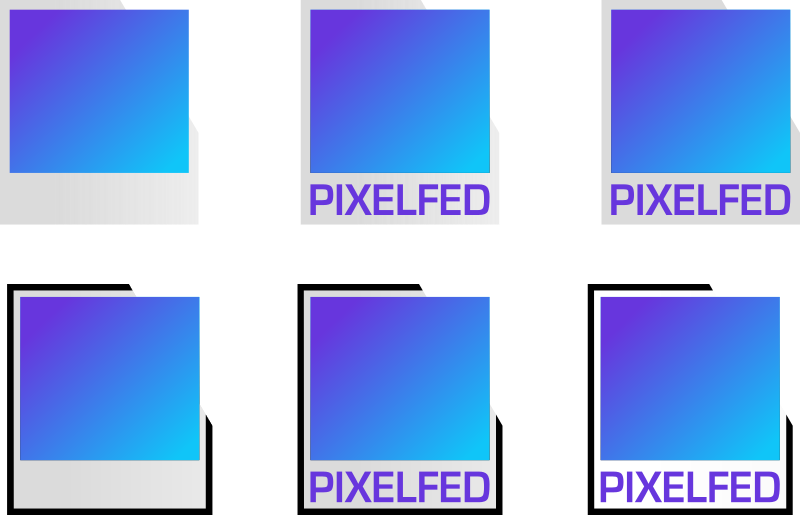
Since the point is photos, I wanted to avoid cameras. What does a camera even look like now that so many of us use our phones? But a Polaroid-alike instant photo is still pretty recognizable. One pixel image, with a gradated tone. The final colour TBD of course, but I went with something that suggests a sky colour, because why have limits? Cut off the corner of the backing, because this pixel is escaping some bounds.
Throw in some variants: with and without gradation in the backing, with and without text, with and without an outline.
hellcp
commented
6 years ago 
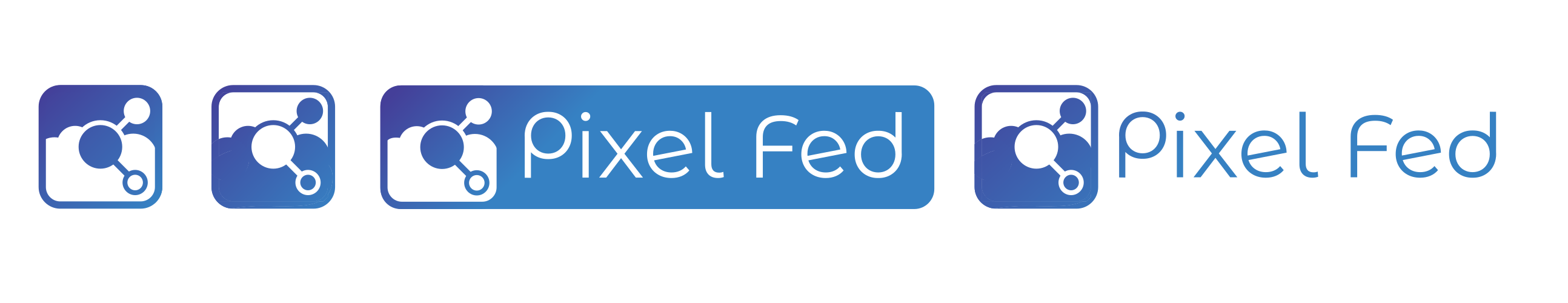
V2:
I wanted to go with something very simple to reflect the fact that the page is supposed to be as unobstructed as possible. It's an image of two hands framing a picture of a single big pixel. I made it so we would have app icon and two logos to chose from (depending on context), as well as logo + text which would be used for header. Font chosen is Open Sans Condensed, which is freely licensed. I chose it to reflect value of freedom and open source in PixelFed.
 noiob
commented
6 years ago
noiob
commented
6 years ago 
I tried to do something that's acutally pixel art, and while playing arount with letters I came up with this simple two-colored camera which incorporates the project's initials. The font is Noto Sans (OFL) but that's really just as an example of how it'd look like with text. The color could also be changed to whatever accent color suits the whole page best. I quite like the gradient though.
 moshpirit
commented
6 years ago
moshpirit
commented
6 years ago OK, so it's basically all from my comment here (I won't copy/paste them so they don't use that much space) (see below) and these designs based on Instagram (this is why I add its icon), just like the Social Network (I try to be as coherent as possible):

And here how would they look like if they have gradients


 razcore-rad
commented
6 years ago
razcore-rad
commented
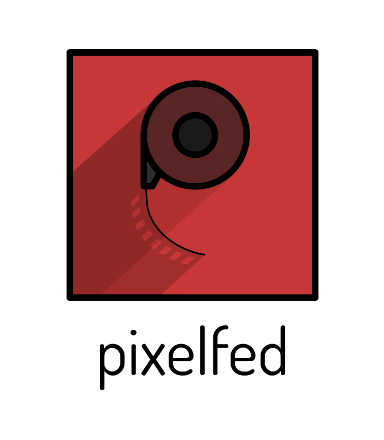
6 years ago Helloo peps, I saw the announcement at mastodon art and altho' I have 0 exp. making logos I decided to give a shot cause you never know what you come up with. So I read on the pixelfed website that the look is modern design with clean UI and that makes me think of material design so with that in mind I came up with these two designs, one more serious, one less so :)
B isn't optimized yet, that's to say, it only works on white background cause I didn't properly cut the shapes, just used white here and there.
@dansup what's the aspect ratio/resolution of the header you're talking about? cause that will influence the composition/graphic. Thanks!
SVG CC BY 4.0

Hope you like em, I'm sure you figured out already that it's a play with the words pixel and fed (as in feeding) and in the first case a camera too? Depends on who's watching :p
edit
I'll just keep on updating this comment with other ideas (not necessarily included in the original SVG, it's just to output more stuff as I think of it).


 ghaor
commented
6 years ago
ghaor
commented
6 years ago y'll got such good ideas, i'm new to this and mine are a mess and i don't got svg files haha, apologies. anyway, here are my ideas, regardless! i did use a lotta cameras, though i als tried using a combination of p and f, but idk how it came out, and i can see some are kinda generic. but whatever, my contribution!

 trwnh
commented
6 years ago
trwnh
commented
6 years ago Too on the nose...? ;)

(jk, I'll be editing later with more ideas)
 ghost
commented
6 years ago
ghost
commented
6 years ago Hey everyone, I tried to keep it very minimalistic, still we can try to read a hidden meaning in these logos:
I used the font Open Sans Bold
Let me know what you think. :)


Just had to include the gif because it's cute ^^
CC-BY-SA-4.0 Cleaned Up Version 1.1 as SVG PNGs as ZIP
Note: Design is never done. As with software you always do iterations, updates and improvements with designs. This is just a first concept and I'd modify it to fit PixelFed's requirements if needed.
ghost
commented
6 years ago Hi folks, there are already so many good designs I kind of feel silly posting mine now, but here it is for the fun of it :)
The idea I have is to have a mascot/icon pretty much like Mastodon, while looking for a candidate (and trying to avoid the most common ones like cats, dogs, frogs, tarsiers, etc.) I came across an old pal of the mastodons (time wise): A Glyptodon, a big armadillo from the ice age :D. I know it makes little sense but I did have the image of the camera aperture structure kind of stuck with an armadillo shell in my head.
Anyway, I'm trying to keep it very simple and abstract, have a few variations of the icon, some which are depicting a letter "P" for Pixelfed. For the header I also went for a "flat" gradation instead of the gradient to match the simplicity of the design, with three samples shown. The font is Noto Sans, I personally prefer lowercase but I sampled both.
Let know your comments/thoughts : )
cc-by-sa-4.0
SVG file
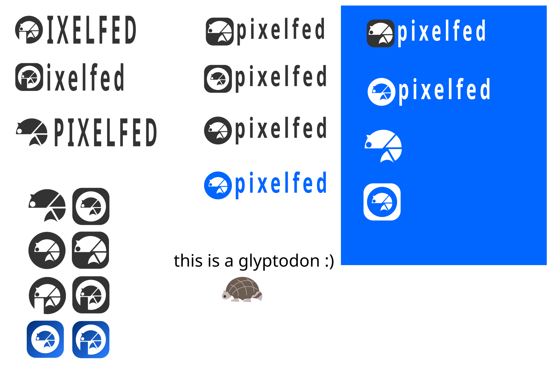

Its nice to see so much good designs around here! :) Also thank you all for the likes, one day someone out there ought to find a home for this little glyptodon, if you do, let me know, will be happy to hear that. And to end with a good note, here are some cleanups of the logo. enjoy! :)


 Vhalesa
commented
6 years ago
Vhalesa
commented
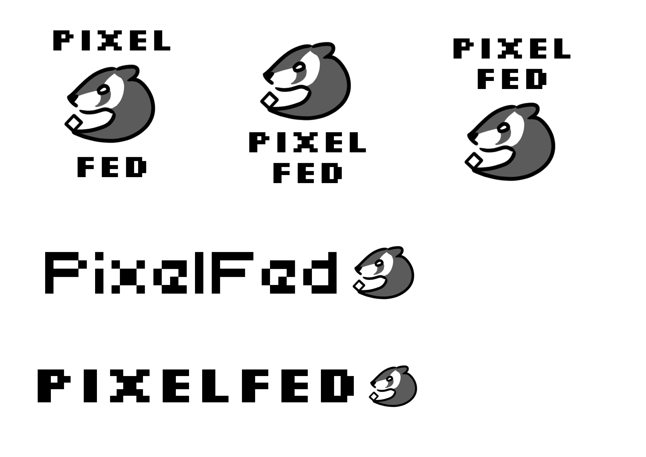
6 years ago I also wanted to make something with the fed pun and and animal. So after several sketches I came to a fe(rre)d ;P
@RJQuiralta Love your Glyptodon btw!
trwnh
commented
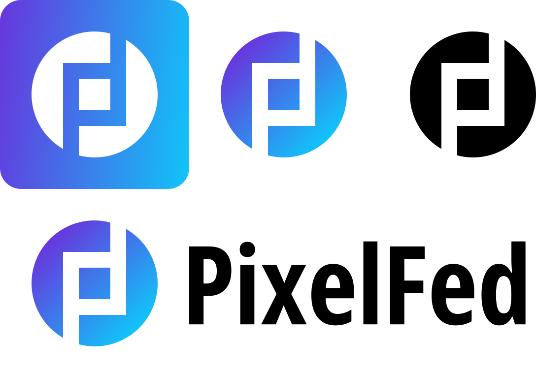
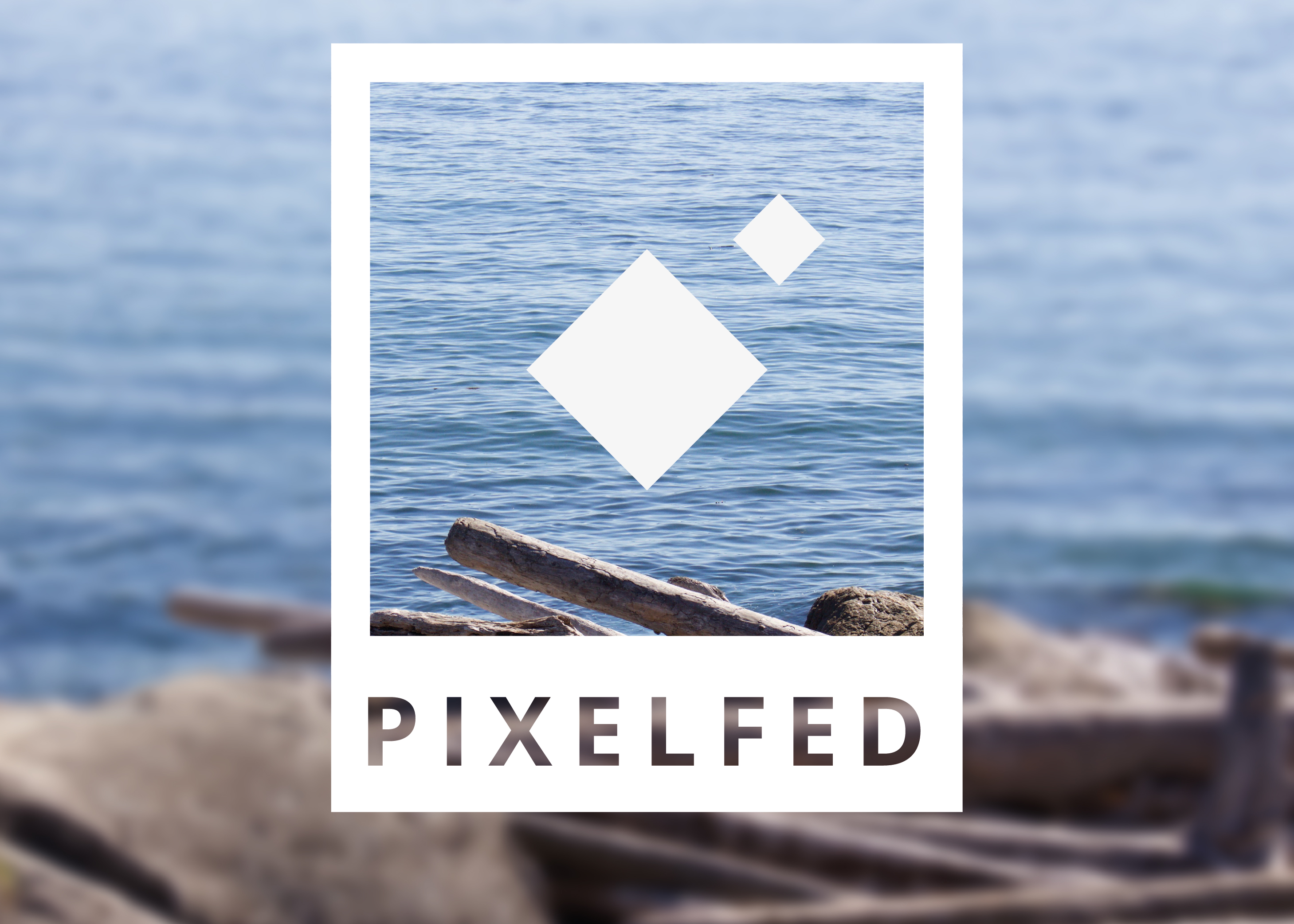
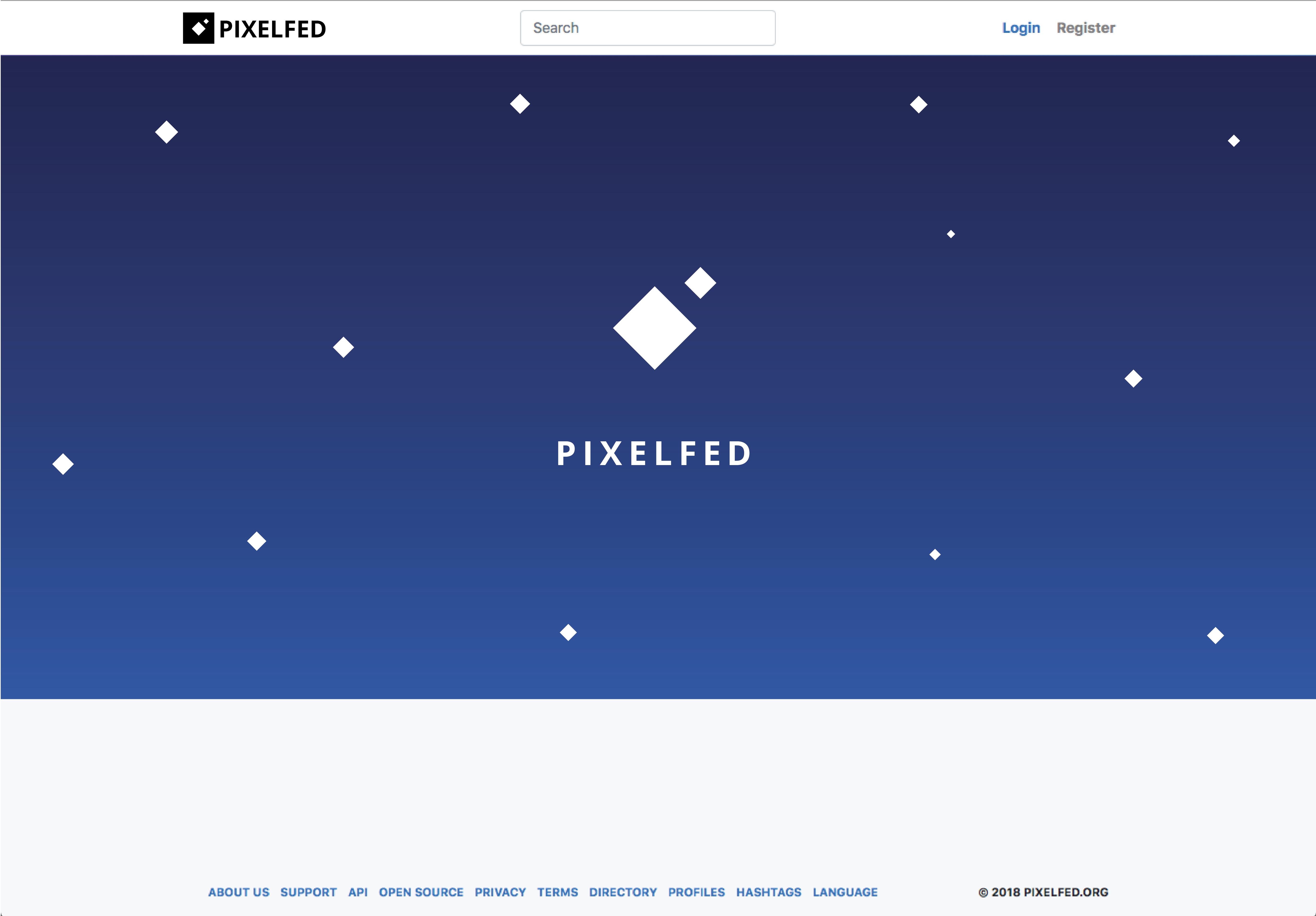
6 years ago OK, serious attempt number one: tried to stick to the idea of pixels and keep it as simple as possible.

Good logos are simple, memorable, recognizable, and look good even at small sizes or in multiple environments. This is hopefully some of those things.
How it looks in context:

Monochrome assets from the basic silhouette also look pretty iconic, imo
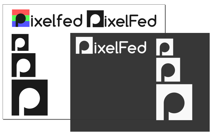
| 16x16 | 24x24 | 32x32 |
|---|---|---|
 |
 |
 |
| 96x24 | 100x24 (capital F) | 192x48 | 256x64 |
|---|---|---|---|
 |
 |
 |
 |
Different color versions with various masking:
| iOS | Android Square | Android Circle | Android TallRect | Android WideRect |
|---|---|---|---|---|
 |
 |
 |
 |
 |
In-context previews:
| Desktop | Mobile |
|---|---|
 |
 |
 uvexz
commented
6 years ago
uvexz
commented
6 years ago 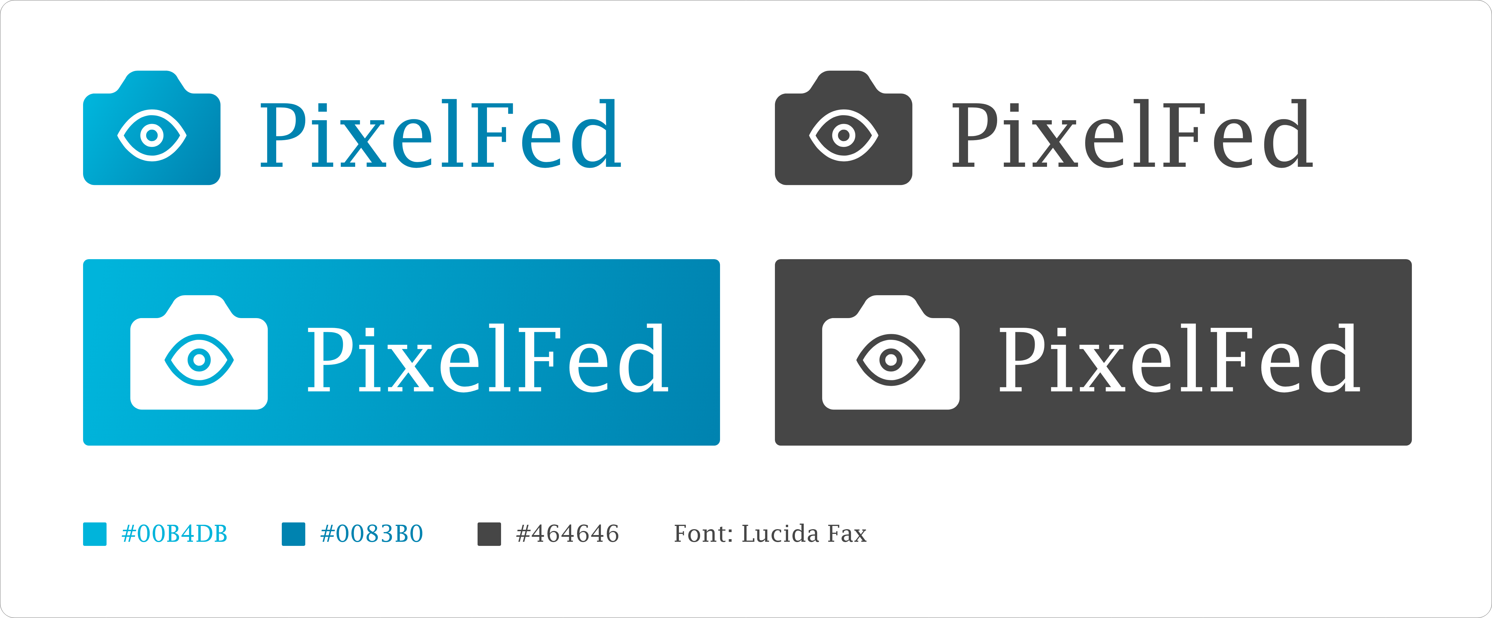
emmm......
 qwazix
commented
6 years ago
qwazix
commented
6 years ago This has gathered a few fav's on masto so I'm putting it here.

 Bugsbane
commented
6 years ago
Bugsbane
commented
6 years ago Please, please just make sure you get input from a professional designer before making the final choice! There are things that need to be considered that people without design experience usually don't consider until running into problems when it's too late to go back. If you have professional design experience, then just ignore this and move along. :)
hellcp
commented
6 years ago @Bugsbane I talked with one, he agreed with my points, conclusion is that this far all logos would need small tweaks at most. So worry not, we got this ;)
qwazix
commented
6 years ago And another, more contemporary approach.
moshpirit
commented
6 years ago
- Provide assets in .png & .svg formats
- Create logo and header/hero image.
About that, I propose to ask for the designers who made the X designs you liked the most (maybe 2, 3, 4, you name it) to make the header/hero after selecting the logo. This would save us all a lot of time and effort. After a couple of days of creating the hero/headers then you can definitely select your best.
Or, if you are pretty sure about what are the one you liked the most, just ask this one person to do it.
For example, if you select Loogah's design (I personally love it, tbh, so congrats) then ask just Loogah to do it.
Why doing so? as I said, is saves a lot of time and work, it's not me being lazy, it's me presenting tons of different designs. So, if I need to include all the headers, that would be horrible for my exams. This said, it would also leave more time to create and think in more logos to add, so you can definitely say: OK, authors, I'd go with logos X, Y and Z, please, @authorOfLogoX, @authorOfLogoY and @authorOfLogoZ, create their headers so I can finally tell the best.
The only counterpart this has, it's a little bit of time (from hours to whatever you want) so the best candidates can do the headers. But it would not affect those who already made them or have the intention to do so before this Sunday.
 Julianoe
commented
6 years ago
Julianoe
commented
6 years ago Some great ideas here ! @ghaor i like yours, the center one with all the colors but you should display it alone, not surrounded/lost among all the other propositions.
 Sylvhem
commented
6 years ago
Sylvhem
commented
6 years ago I am no artist or graphic designer, but since I make a small logo for fun, I thought I could as well share it here.


The circle is meant to be a stylized representation of a camera's lens.
hellcp
commented
6 years ago So I was thinking about a mascot in a case that non-mascot submission would be chosen (and I love mascots, look at my PixelFed profile ;) ). I invented:
 V2:
V2:
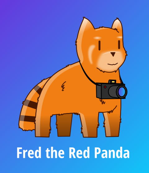
So that made me curious, what if the logo was based on Fred?

SVG CC-BY-SA-4.0
BTW: Fred is portmanteau of Fed and Red (Panda) :D
 dabnotu
commented
6 years ago
dabnotu
commented
6 years ago Hello there. Here are my submissions for the PixelFed logo contest:
Pixelfed logo proposal, 60 × 60 px (enlarged, 600 × 600 px)
Pixelfed logo proposal, 80 × 60 px (enlarged, 600 × 600 px)
Pixelfed header/hero proposal, 1920 × 1080 px
Made with Inkscape. Published with a CC BY-NC-ND 4.0 License. The font used is my own, 5X5 (http://www.1001fonts.com/5x5-font.html).
Thanks for your consideration, and appreciation for the inspiring entries so far.
Julianoe
commented
6 years ago So !
I've been looking for a logo idea with my bro Arcez0. He does not have a github account and doesn't speak english so i'll be posting only as myself here but it's designed by him.
We have worked on 3 propositions this past few days.
Obviously inspired by the centralized version of Pixelfed (Instragram, ever heard of it?) this one aims at making it clear that Pixelfed is a federated self-hostable (hence the cloud shape) app, making use of the famous "share" symbol, looking like connected stars of a constellation.


In this one we keep exploring the cloud aspect of it to make it clear that it is a decentralized self-hostable app and making use of the first letter P of Pixelfed as the lens of our camera inspired icon


This one takes another direction. A variation of the use of the P of Pixelfed as the lens, center part of the logo. The rainbow like colored aperture underlines the values of diversity (for diverse and fediverse) and sharing that self-hostable apps like Pixelfed are aiming for.


Designs by Arcez0
 Licensed under Creative Commons 4.0 BY-NC-SA
Font used is a modified Montserrat Alternates (licensed OFL) by Julieta Ulanovsky
SVG file with all logos - PNG files.
Not everything is perfectly clean but if selected will be improved and optimized of course.
The hero images are not yet included. We could discuss it and how they will be used if selected :)
 nicolasmaia
commented
6 years ago
nicolasmaia
commented
6 years ago @Julianoe I love your first proposition but I'm not sure any of them could be used on pixelfed with a nonfree license
Julianoe
commented
6 years ago We might have been confused in the choice of the licence. Which one would you think is the most suitable here? Should I let the modifications authorized in any case?
According to Creative Commons, a NC (non commercial) license is not "free culture" anyways. Yet it could be used in that case :) @dansup let me know if you have any problem with that license in particular
hellcp
commented
6 years ago @Julianoe that prevents us from creating T-shirts and stickers with that logo if we ever choose to have merch store to support the project. It's def not optimal ;)
qwazix
commented
6 years ago May I propose to license the logo as AGPL the same as the software? It helps because then you can regard the .svg as source and require the source of modifications.
Graphic designs are as much software as is a website, imo.
hellcp
commented
6 years ago I wonder if printing AGPL licensed stuff on T-shirts require us to provide source for said T-shirts :smile:
Also wouldn't that mean that every website using that logo would need to be open source too? That kinda limits ability to promote PixelFed, especially on Instagram :thinking:
 simotek
commented
6 years ago
simotek
commented
6 years ago Yeah using source code licenses for images always ends you up in a really hard place as there are alot of things that are not explicitly clear (especially with licenses that have derivative work clauses), further to that there are very few cases where such things have been taken to court so there is also no legal precedents to look at. Whereas by licensing artwork under a Creative Commons license its explicit and clear whats allowed and where so its a much better option. I generally recommend that open source projects always explicitly state one license for code and another for media / artwork to make this clear.
Julianoe
commented
6 years ago Hey all just a follow-up about the license question. Creative Commons Non Commercial is quite broad. It does not mean for example that it forbids the use of the image created for creating merchs, tshirts, stickers. BUT it means that it's not by default intended to be done for profit.
The Q&A is a good place to have answers about the Creative Commons https://creativecommons.org/faq/#does-my-use-violate-the-noncommercial-clause-of-the-licenses
Also i agree with @simotek that using source code related license for artwork and media is not a good way to go. An artwork is more than the code is made of ... and this analysis does not apply then to real world uses.
Anyways as it's our first graphic contribution to a project like that we are opened to discuss it with @dansup and other contributors to define the best license possible for the project.
I really don't see why we should define it as usable in for-profit activities right now.
 mrk-us
commented
6 years ago
mrk-us
commented
6 years ago Love the work that's going into PixelFed and wanted to contribute, so here are a few logo designs I put together. Not sure if you have decided on a color palette yet, so that can be changed if needed. Font used are a modified version of the lovely open source inter UI by Rasmus Andersson


Download Source Files Licensed under CC BY-SA 4.0
 y6nH
commented
6 years ago
y6nH
commented
6 years ago 
Here's something... less rounded, at least. @rnarrkus, I've pinched your pink-orange gradient, it's nice.
My logo is obviously a PF, though I hope it also evokes a grid of pixels, a network, and some kind of streamlined animal - maybe a fat swift, or a fancy goldfish. The square pixel grid is rotated to isometric, for a dynamic feeling. This also lets it tessellate into beautiful hexagons.
The lettering is pretty hard to read, so it's an optional component at best.
Here's a more sober screenshot of the logo in the header - not a full redesign at this point, though I'll update it if I have time.

hellcp
commented
6 years ago Maybe slightly different idea, based on much older cameras than anything here:
 Which is a random image I found on internet (realistically idea isn't based on this one in particular, but on style/period of cameras):
 SVG CC-BY-SA-4.0
 dawidpotocki
commented
6 years ago
dawidpotocki
commented
6 years ago Hello! There are some of my concepts for PixelFed logo. Font used is inter UI. If you want me to change colors or make P and F big, there is no problem with that. I made rectangles rounded to feel more friendly, but I didn't want to go with circles.


This work is licensed under a Creative Commons Attribution-ShareAlike 4.0 International License.
Download SVG and PNG logo images here.
 Aurnytoraink
commented
6 years ago
Aurnytoraink
commented
6 years ago I don't think that I'm good designer. In fact, I'm not a designer

Ce(tte) œuvre est mise à disposition selon les termes de la Licence Creative Commons Attribution - Partage dans les Mêmes Conditions 4.0 International.
You can download it PixelFed LOGO.zip here
 BienOuBien
commented
6 years ago
BienOuBien
commented
6 years ago Hi all, I tried to use the "p" as a shutter. Typography is Free Sans

Another version with color

CC-BY-SA-4.0
 TakenOrNot
commented
6 years ago
TakenOrNot
commented
6 years ago Hey there !
This is what Inkscape and I came to, hope you'll like them. Typography : Grand Hotel
My favorite :
Various concepts (click to see in full size) :

Vector file :
CC-BY-SA-4.0
 IAnandhu
commented
6 years ago
IAnandhu
commented
6 years ago 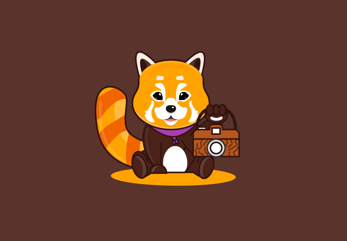
My contribution to the Mascot entry! Hope you guys like it.
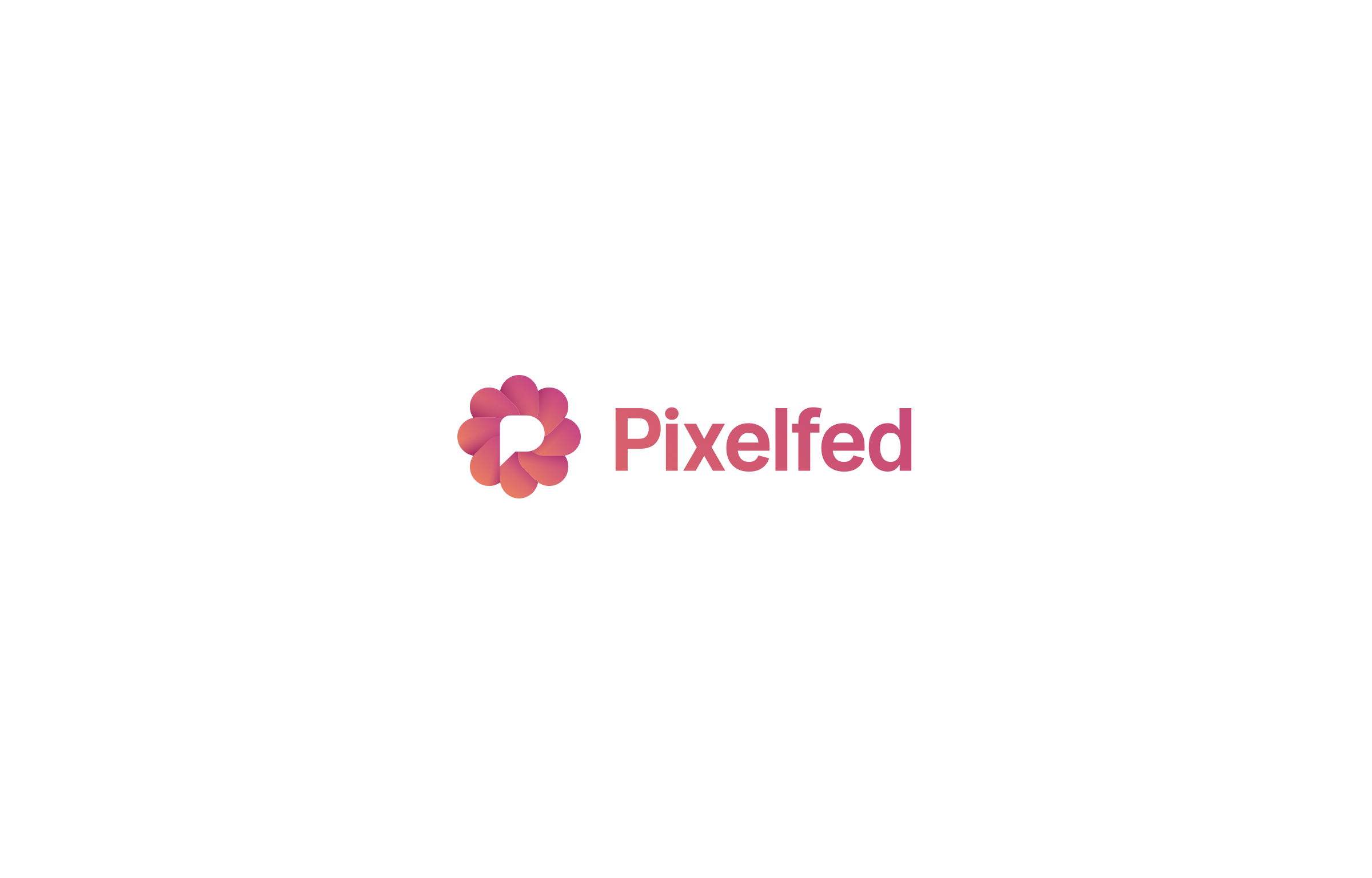
The logo contest is now closed. Thank you to all that participated.
1st place logo: https://github.com/dansup/pixelfed/issues/182#issuecomment-396067684 (congrats @rnarrkus!) 2nd place logo: https://github.com/dansup/pixelfed/issues/182#issuecomment-394402432 3rd place logo: https://github.com/dansup/pixelfed/issues/182#issuecomment-394215601 4th place logo: https://github.com/dansup/pixelfed/issues/182#issuecomment-395436435 5th place logo: https://github.com/dansup/pixelfed/issues/182#issuecomment-394203797
Winning mascot: https://github.com/dansup/pixelfed/issues/182#issuecomment-395280862
I will reach out to each winner to handle the prize money transfer!
Some very generous donors have offered $450 USD to the winning PixelFed logo, and $250 for other prizes!
$200 pledge: https://mastodon.art/@Curator/100142757740094921 for 1st place logo $50 pledge: https://djs.social/@damien/100142799177194385 for 1st place logo $200 pledge: https://mastodon.social/@moritzheiber/100143287247845055 for 1st place logo $200 pledge by https://mastodon.art/@Curator to split between 2nd, 3rd, 4th and 5th place logos ($50 ea)! $50 pledge by @dansup for the winning mascot.
Rules:
Prizes:
Good luck!