 cpsievert
commented
9 years ago
cpsievert
commented
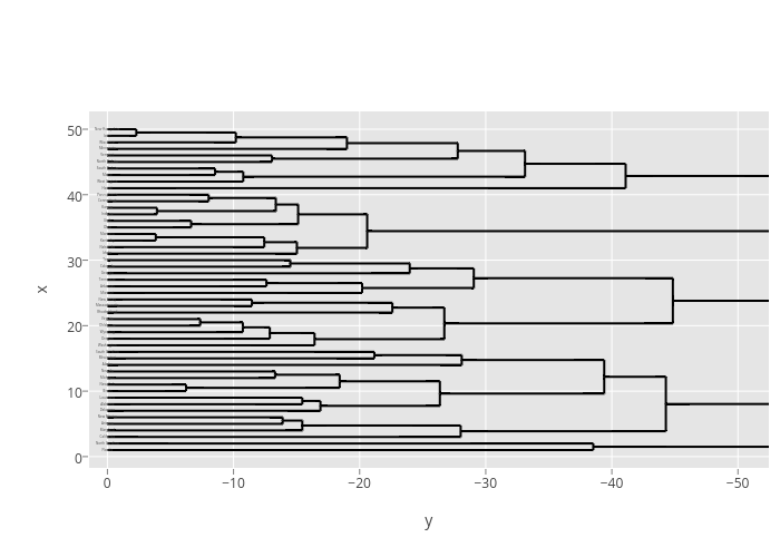
9 years ago Do you by chance have the code for that one? It looks like plotly almost translates this more basic example, but not quite.
library(ggplot2)
library(ggdendro)
hc <- hclust(dist(USArrests), "ave")
hcdata <- dendro_data(hc, type="rectangle")
p <- ggplot() +
    geom_segment(data=segment(hcdata), aes(x=x, y=y, xend=xend, yend=yend)) +
    geom_text(data=label(hcdata), aes(x=x, y=y, label=label, hjust=0), size=3) +
    coord_flip() +
    scale_y_reverse(expand=c(0.2, 0))
versus
 jackparmer
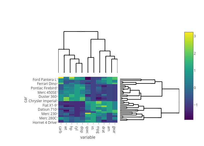
 chriddyp
Would be cool if we had a wrapper function to make heatmap dendrograms like this: