 rsandler00
commented
6 years ago
rsandler00
commented
6 years ago Would also love this feature!
Closed etpinard closed 4 years ago
rsandler00
commented
6 years ago Would also love this feature!
 pditommaso
commented
6 years ago
pditommaso
commented
6 years ago Yes, this would be very useful.
 nicheath
commented
6 years ago
nicheath
commented
6 years ago This would be incredibly helpful! I assume if this is implemented on the javascript side it'll be available on the Python side as well?
 fabiomolinar
commented
5 years ago
fabiomolinar
commented
5 years ago Waiting on this one as well!
 sylfel
commented
5 years ago
sylfel
commented
5 years ago It would be very very usefull to have this functionnality !!
 ekalosak
commented
5 years ago
ekalosak
commented
5 years ago This is a vital feature for industrial readiness. If data needed to compute quantiles cannot fit in memory or are expensive to shuttle across a netowork, the aggregations must be computed near the data store (SQL: materialized views, Hadoop: Map-Reduce). If we need to compute quantiles near the data store, it would be convenient to pass those summary stats directly to the plotting routine.
 alexcjohnson
commented
5 years ago
alexcjohnson
commented
5 years ago Note: should still accept a data array alongside the precomputed stats, that you can use to pass in either all points or just outliers.
 etpinard
commented
5 years ago
etpinard
commented
5 years ago During box/calc.js we compute:
A few thoughts:
A somewhat deeper thought:
box/calc.js for very large datasets?If the latter, then making users sort their samples before calling Plotly.newPlot (with an addition flag turned on in their box traces) may be enough of a performance boost for most users.
 ellisonch
commented
5 years ago
ellisonch
commented
5 years ago @etpinard The goal, in my eyes, is i. I would like to use plotly.js to make graphs. I don't want to be forced into crunching data using plotly.js.
Recently I wanted to use plotly.js to graph a box and whiskers plot where my raw data was billions of rows of data that live in a database server side. This kind of data can never be sent to the front end. Any calculations on it will always happen in SQL. I want to be able to summarize it in sql, once a day, and use the resulting parameters in constructing visualizations. Plotly.js will never be able to loop over that data, no matter how fast you make it.
 chriddyp
commented
4 years ago
chriddyp
commented
4 years ago Pulling from the community discussion linked above (https://community.plot.ly/t/box-plots-manually-supply-median-and-quartiles-performance-for-alrge-sample-sizes/2459/3) from 2016, I believe this is still possible by supplying your own data
Alternatively, I'm pretty sure that you can create the box plot that you are looking for by just supplying your y data as
[q1, q2, q2, median, q3, q3, q4]. Here is an example: https://plot.ly/~chris/18051/.
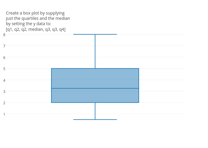
@chriddyp I came across this post as I was describing for another user how to do this - just to standardize terminology, I think you mean:
[min, q1, q1, median, q3, q3, max]
And @alexcjohnson responded
There are an infinite variety of ways to do this, but the one I've used is:
[min, q1, median, median, q3, max]This is actually used internally by plotly.js to construct candlestick charts out of boxes, usingq1=openandq3=median=close- mine has one less duplicated value, though it occurs to me that your version is probably robust in other box plot software that makes a different choice of how to calculate quartiles - as discussed in https://community.plot.ly/t/boxplot-quartile-seems-wrong/2234
chriddyp
commented
4 years ago (Not to say we shouldn't do it, but just surfacing the workaround since this is such a popular topic)
 ngnpope
commented
4 years ago
ngnpope
commented
4 years ago I currently use the mentioned workaround, but it is very limiting. You are effectively forced to provide 0%, 25%, 50%, 75%, and 100% for min, q1, q2, q3, and max. This is means that you cannot have fences at -1.5IQR and +1.5IQR using precalculated values which is what will be provided if you plug in all of the values and allow plotly to calculate the values itself. It is also not possible to have notches on the box, etc. as you cannot provide precalculated mean and standard deviation. Nor can you provide a list of outlier values only.
I see that this has been dropped again from the v1.52.0 milestone, but I really hope you will reconsider implementing this soon as the workaround is barely suitable and leaves this trace type rather impossible to use for precomputed values.
ellisonch
commented
4 years ago Like @pope1ni, I also had to use this workaround, but then was still unable to make the actual graph I wanted to make. I wanted to show 1%/99% as the ends of the whiskers, not min/max. I wanted to use outliers to mark out the actual min/max.
Again, because I'll never be able to/want to give actual billions of raw data points to your library anyway, I just want to give the summary statistics that are necessary for making the graph. Whisker endpoints, box endpoints, "median line", and "outlier" points. This would solve multiple problems.
It's kind of like, for error bars on a bar chart... I'd never imagine you'd make me give you the raw data so that your library could compute it for me. There's 10 different algorithms for computing confidence intervals on binomial data. Would we really want all of those in the library? What about confidence intervals on other types of data? What about graphing standard error instead? There's no way to make that work in general. Instead, the library just accepts "draw a line at the end of the bar charts +X and -Y" and then I can provide my own X and Y so to be as general as possible.
 2803media
commented
4 years ago
2803media
commented
4 years ago For the record this workaround doesn't work for multi series in horizontal mode.... It repeat the x axis
chriddyp
commented
4 years ago Thanks for the feedback everybody, very helpful.
As always, if your organization has a software budget, you can fund & priotize the development of this feature directly. The majority of the development of our free & open source software is funded this way: https://plot.ly/products/consulting-and-oem/.
We'll keep this issue updated with any progress.
etpinard
commented
4 years ago To allow users to "precompute" all the boxplot statistics, we'd need to add the following attributes:
q1q3medianlf or lowerfence / uf or upperfence OR fences as a 2-item arraymean and sd (would make meanline true / 'sd' by default if set)ln or lowernotch / un or uppernotch OR notches as a 2-item array (would make notched true by default if set)outliers as a data array OR as https://github.com/plotly/plotly.js/issues/1059#issuecomment-535574204 suggest maybe we can reuse the y (x for horizontal boxes) for thatNote that we don't need attributes that denote the sample's min/max as setting the outliers attribute would be enough to replicate how the sample's min/max are currently used at the moment.
Now, Here are a few scenarios I'd like to clarify.
Should something like
{
  type: 'box',
  q1: 1
}
be allowed? I personally think so: this feels similar to {type: 'box', y: [1]} which renders as an horizontal segment at y=0.
Next, what should
{
  type: 'box',
  q1: 1,
  y: [1, 2, 3, 4]
}
do?
y and have this trace render as a horizontal line segment at y=1q1 and compute Q1 and friends using yq1, but use y to compute all the other box statistics - in other words override the Q1 value computed from the sample in y with the value input in q1Personally, I think the third option could be interesting as one could want to override Q1 and Q3 (using some other quartile-finding algorithm) and have plotly compute all the other statistics - including those that depend on Q1 and Q3 (i.e. the fences, the outlier bounds and the notches).
alexcjohnson
commented
4 years ago
lforlowerfence/uforupperfenceORfencesas a 2-item array
Separate attrs feels cleaner to me.
lnorlowernotch/unoruppernotchORnotchesas a 2-item array (would makenotchedtrue by default if set)
Allowing the notch to be asymmetric? We could go with notchwidth or confidenceinterval to keep it symmetric.
outliersas a data array OR as #1059 (comment) suggest maybe we can reuse they(xfor horizontal boxes) for that
The only problem I see with reusing x or y is the partial definition case below. Which do you think would be less confusing for users to work with:
upperfence omitted or matching q3 for example - which can happen if there are no outliers within what would be the fenced range, even if there are outliers beyond it)outliers even though 99% of the time using x or y would work exactly the same. Then we have to answer what we'd do if you provide only outliers, or outliers with partial stats...
{type: 'box', q1: 1}be allowed? I personally think so
Seems reasonable at first glance - values above what you provide match the last one below it, and vice versa. But it's a bit confusing to think about what happens if you're missing some in the middle. You provide q1 and q3 but not median - do you use the average of the two? Seems sketchy. What if you provide only lowerfence and upperfence? Seems even sketchier. So I might say you need to at least provide q1, q3, and median
{type: 'box', q1: 1, y: [1, 2, 3, 4]}Personally, I think the third option could be interesting as one could want to override Q1 and Q3 (using some other quartile-finding algorithm) and have plotly compute all the other statistics - including those that depend on Q1 and Q3 (i.e. the fences, the outlier bounds and the notches).
Sounds good to me. To be clear, for the values that depend on q1 and q3 we would insert the user-provided values, so the derived values would change as well, correct?
etpinard
commented
4 years ago Separate attrs [for the lower & upper fences] feels cleaner to me. So I might say you need to at least provide q1, q3, and median
Yeah good call. Thanks!! In fact, I'm starting think perhaps all these new precomputed attributes should be valType: 'data_array' (or at least arrayOk: true) so that we can draw multiple boxes with a single trace e.g.:
{
  type: 'box',
  x: ['apple', 'banana', 'orange'],
  q1: [1, 2, 3],
  median: [2, 3, 4],
  q3: [3, 4, 5]
}

// would draw three boxes
Things get trickier for defining outliers though, but using a 2d array should be good enough e.g:
{
  type: 'box',
  x: ['apple', 'banana', 'orange'],
  q1: [1, 2, 3],
  median: [2, 3, 4],
  q3: [3, 4, 5],
  outliers: [
    [-10, 10], // outliers for 'apple'
    [12], // outliers for 'banana'
    [-20, -10, 15] // outliers for 'orange'
  ]
}
By allowing array q1, median, q3 and friends, it might be best to split the box API into two signatures so that the trace length (i.e. trace._length) is always well defined.
y (x, for horizontal boxes) to set the sample and x or x0 (y or y0) to position the boxes. Here _length corresponds to the sum of the sample sizes from each box to be drawnq1/median/q3 and optionally lowerfence/upperfence/outliers/mean/sd/notchspan to describe how to draw the boxes and x (or y, for horizontal boxes) to position them. Here _length corresponds to the number of boxes to be drawn.alexcjohnson
commented
4 years ago it might be best to split the
boxAPI into two signatures
That makes a lot of sense to me - could even extend this to the original full-sample case: x is just one value per box, and y is a 2D array, with an outer length that matches x and the inner arrays - which need not all have the same length - are the samples for each x.
For precomputed statistics I wouldn’t want to prohibit single values (or force those to be wrapped in an array) when your goal is a single box; so I’d go with arrayOk
Does this introduce any ambiguities? I don't see any... there would be nonsensical inputs (q1 is an array but median is a scalar, etc) but that's fine, wouldn't need to impose a meaning, we'd just need to not break.
@nicolaskruchten any concerns about this from the standpoint of RCE?
etpinard
commented
4 years ago For precomputed statistics I wouldn’t want to prohibit single values (or force those to be wrapped in an array) when your goal is a single box; so I’d go with
arrayOk
At the moment, I think enforcing (data) arrays for q1, median, q3 and friends is a better idea - mostly become allowing something like:
{
  type: 'box',
  q1: 0,
  median: 1,
  q3: 2
}
would mean having a visible trace with no set valType: 'data_array' attributes. I guess that wouldn't be a first (indicator comes to mind), but that looks a little odd to me.
 nicolaskruchten
commented
4 years ago
nicolaskruchten
commented
4 years ago Does "splitting into two signatures" mean a new trace-type boxmanual or something? I'm not sure of the implication there but I'm fine with a new trace-type if that's what's needed.
I have no a priori concerns from the POV of RCE, no, but thanks for asking!
etpinard
commented
4 years ago Does "splitting into two signatures" mean a new trace-type
boxmanualor something?
No, more like if q1 / median / q3 are set, x and y means something different than if they're not set.
That said, I wouldn't be opposed to making this a new trace type. Documenting the two APIs inside the same trace might be difficult.
nicolaskruchten
commented
4 years ago new trace type works for me :)
nicolaskruchten
commented
4 years ago Also, I would favour adding attrs for upper and lower outlier thresholds, and then accepting y with a mode that says "show all points" vs "show outlier points". That way if the user specifies only outliers, they can show that, but if they want to show all points they can do that also.
alexcjohnson
commented
4 years ago Given all the variants we've been discussing, it's not entirely clear to me where we would draw the line between the two trace types. Anyway we have plenty of precedent for variable dimensionality and varying degrees of manual control - I'd keep a single trace type.
nicolaskruchten
commented
4 years ago it's not entirely clear to me where we would draw the line between the two trace types
the new one would accept the q1/q2 etc options and the old one wouldn't
Anyway we have plenty of precedent for variable dimensionality
what's an example of a trace where the expected dimensionality of attrA is the same as attrB unless attrC is set, in which case it's expected to be something else?
alexcjohnson
commented
4 years ago the new one would accept the q1/q2 etc options and the old one wouldn't
So the new one would also accept y (for all points) if you just want to override the quartile calculations but leave everything else calculated? Or we won't allow that option? Moreover the idea of extending the 2D option to the original full-sample case (x is just one value per box, and y is a 2D array) seems to further blur the lines.
what's an example of a trace where the expected dimensionality of attrA is the same as attrB unless attrC is set, in which case it's expected to be something else?
Not sure if we have exactly that situation... we certainly have attributes where the allowed values depend on other attributes. And we have one that I'd argue should have dimensionality interdependencies though it doesn't right now: surface currently accepts 1D or 2D x/y arrays, and a 2D z array. But I'd argue it should also allow all 3 arrays to be 1D so that you could always take a heatmap or contour and convert it to surface. Currently you can pass all 1D arrays to mesh3d, but it behaves rather differently than surface (and different from heatmap and contour) and anyway it breaks the very simple idea of "show me this heatmap as 3D" by just converting to surface. And if we were to support that, then you could only tell whether 2D x & y are valid by looking at z.
Regardless, I don't think the criterion of coupled dimensionality requirements is enough to warrant calling this a new trace type. Most of the attributes are the same, the result is the same, it's just a few additional attributes and a few with a different dimensionality.
At the moment, I think enforcing (data) arrays for q1, median, q3 and friends is a better idea ... a visible trace with no set valType: 'data_array' attributes. I guess that wouldn't be a first (indicator comes to mind), but that looks a little odd to me.
I see your point, and I guess it's nice from the standpoint of making it obvious you can include multiple boxes in the same trace - if you first learn the scalar form you might never realize the array form exists. Sure, we can do that.
nicolaskruchten
commented
4 years ago So the new one would also accept y (for all points) if you just want to override the quartile calculations but leave everything else calculated? Or we won't allow that option?
We just wouldn't allow this
Moreover the idea of extending the 2D option to the original full-sample case (x is just one value per box, and y is a 2D array) seems to further blur the lines.
I also wouldn't do this.
alexcjohnson
commented
4 years ago I can see nice uses of both of those variants (though they could both certainly be later additions), and to me this kind of polymorphism doesn't feel particularly out of character. So if the choices are (a) add a new trace type that's a little easier to document or (b) put all this in the existing trace and allow for future expansion along these lines, I'd choose (b).
Note the first one (full y alongside explicit stats) could also be useful with all stats provided, and would allow things like including your own jitter in the y direction - perhaps y has low precision so just x jitter obscures the density - without affecting the stats. Or perhaps you have a requirement to use a certain rounding for the stats but you still want the raw data displayed.
For example:
See http://community.plot.ly/t/box-plots-manually-supply-median-and-quartiles-performance-for-alrge-sample-sizes/2459