 jackparmer
commented
6 years ago
jackparmer
commented
6 years ago This looks very useful @apalchys !
To make sure I'm understanding the PR correctly, this new hover mode would be enabled by setting:
layout.xaxis.showcrossline and/or layout.yaxis.showcrossline to true?
The crosslinecolor, crosslinethickness, and crosslinedash could also be optionally set in the axis object for styling?
@chriddyp and @cpsievert - Any opinions on this feature from a Dash and Shiny perspective?
In particular, from the PR description #2150
- crosslines do not depend on the selected hovermode
- crosslines are always drawn over the nearest x|y point, regardless of whether this point is within the max hover distance or not
- crosslines are always drawn across the entire plot area
Thoughts @alexcjohnson ?

Seems like a reasonable addition to me.
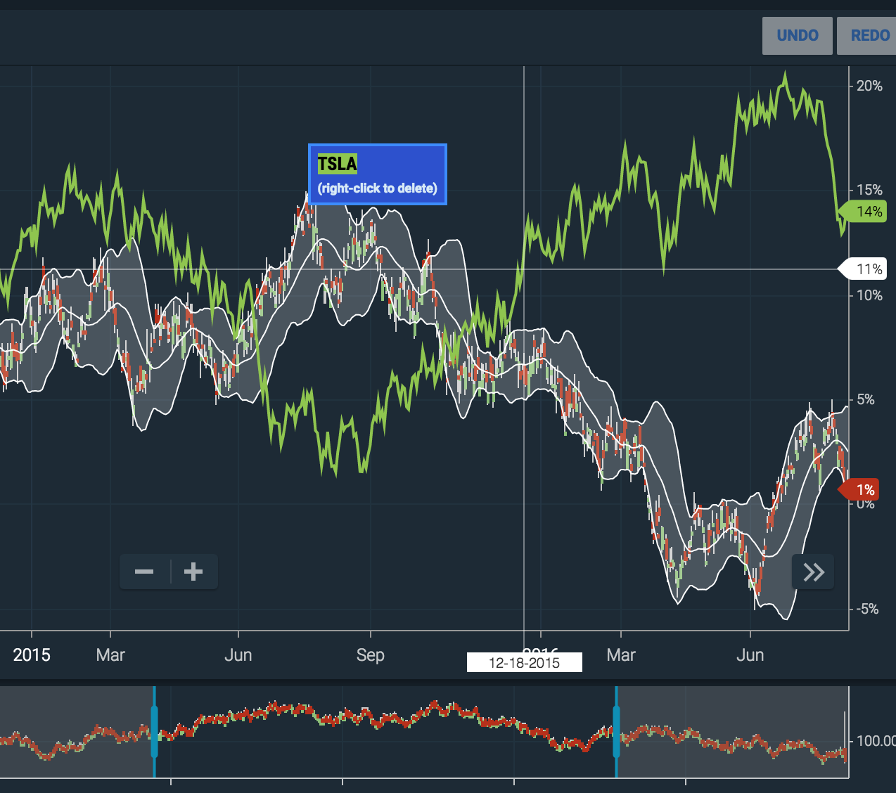
Just curious @apalchys - in which financial software have you seen this feature? Looks like Highcharts has a similar hover line on the x-axis for example: https://www.highcharts.com/stock/demo/lazy-loading
 chriddyp
 alexcjohnson
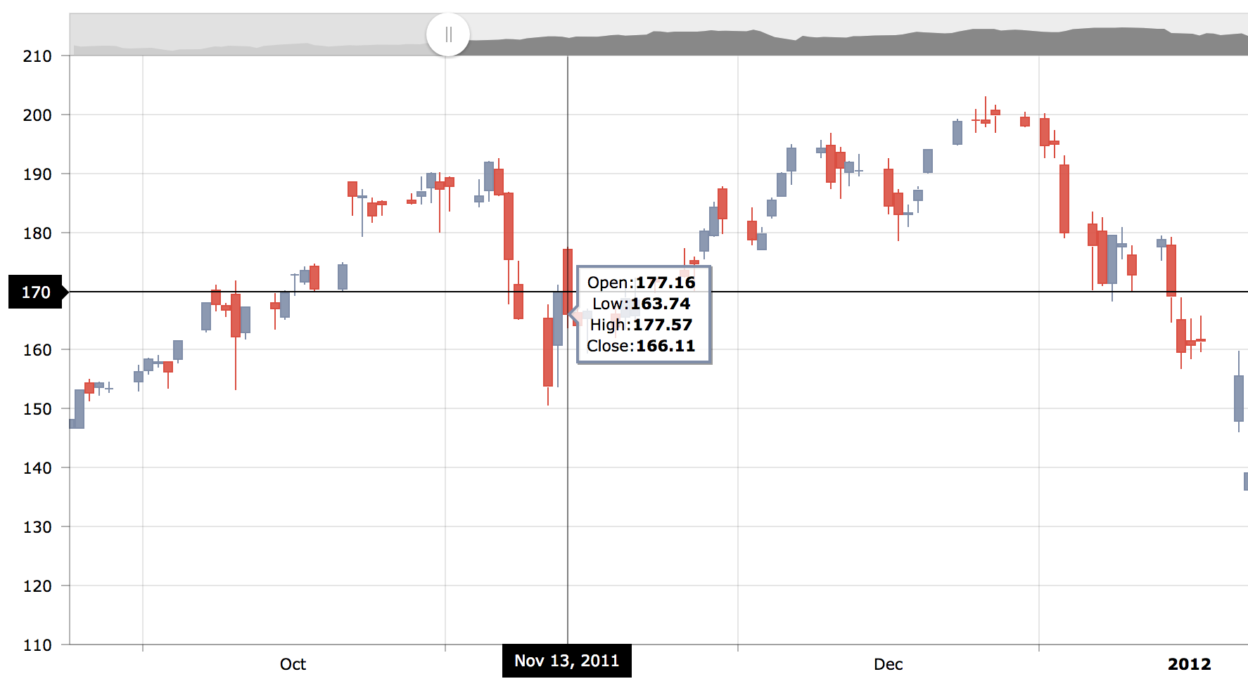
 kratzert
 apalchys
 etpinard


 deechiw


 ghost
ghost
 JohnCos247
 sleighsoft
 lvmajor
 droid192
 GF-Huang
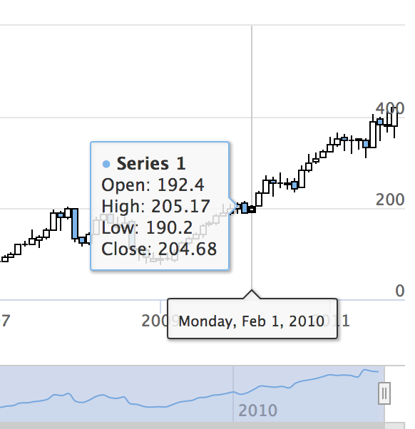
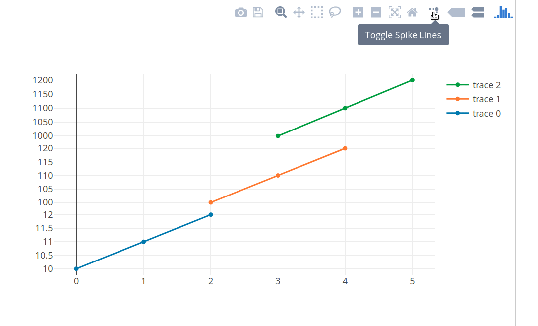
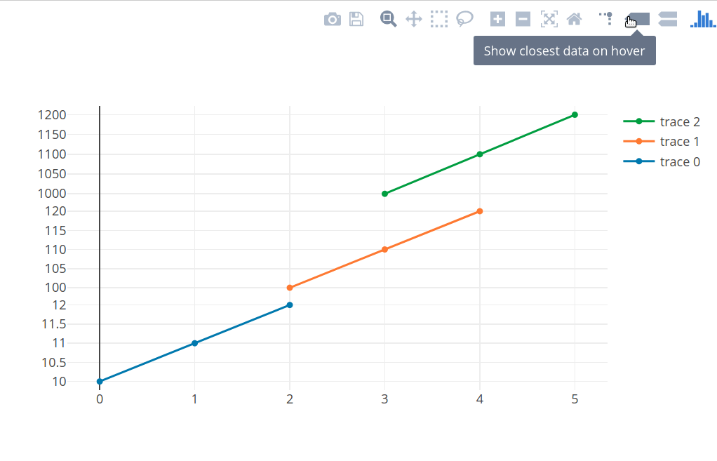
It would be nice to have an option in plotly.js to toggle on a vertical or/and horizontal line across the entire plot area on hover.
The behavior of the line should be similar to the behavior of the spikes feature, but there are several differences:
This feature could be very useful for financial and stock charts
Related to #2026, #1959
PR #2150