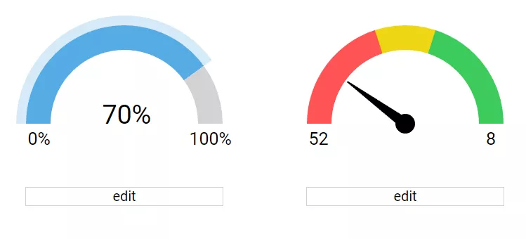
- on its own subplot, like pies ... each trace makes its own subplot
Closed nicolaskruchten closed 5 years ago
There are a bunch of ideas in #12004 for the big-number mode that we should incorporate.
In addition to those, we should have the ability to have 'ranges' against which the indicator value can be visually compared in a gauge or bullet chart, as well as a 'comparison measure':

Here are some possible gauge chart variants we should think about:

Here's a nice "bullet vs gauge" blog post to stimulate reflection also: http://duelingdata.blogspot.com/2017/07/bullet-vs-gauge.html
@nicolaskruchten here's a prototype for sparkline+bignumber:
 Right now it is very lightweight (it's just one svg path) and does not support hover/select/zooming/panning since those are already implemented in
 scatter. I'm thinking that if the users want those, they can simply overlay bignumber on top of scatter. The advantage of the current implementation is that it is very simple and lightweight. :thinking:
Codepen showcasing animations of text and gauge: https://codepen.io/antoinerg/pen/arKrGO
workshopping the spec:
no sparklines
*scalar/no aggregation

mode: "number+delta+gauge"
value
title {
  positioning
  font, color
}
domain
number: {
  precision, formatting
}
gauge: {
  shape: "bullet"
  reference ranges
  ticks, axis container (log scales)
}
delta: {
  reference/base
  increasing, decreasing
  precision, formatting
}Confirmed: value will be scalar for the 1.49 release. We can revisit array+aggregations in a future release :)
@nicolaskruchten I adapted bullet to have the number be on the right as you suggested. Although it looks great when the figure is wide:
 it is wasting space when it's narrow:

You'll probably agree that in the second example, it would be preferable to have the number be above the bullet. Similarly, we may want to have the title be on the left, right, top or bottom.
This brings us to the question of positions: how should they be specified by the user? Should they be values in pixel, in domain value or rather in vaguer but user-friendly above, below, left and right? :thinking:
Also, you can follow my work in branch indicator
My feeling is that we should do the simplest thing for this version and see what people ask for. What you have there is fine by me, and users can just make the box vertically shorter to control title positioning. If you want to spec out a top/bottom/left/right API i don’t mind but I don’t want layout considerations to add a week to the LOE ;)
Do an image search for bullet charts and you’ll see they are often used inside tables or other short/wide contexts... not so much squarer aspect ratios
Also, you can follow my work in branch
indicator
Nicely done @antoinerg! You're on the right track. Let me know if you need help in trying to reuse Axes.tickText and/or Axes.drawTicks / Axes.drawLabels
Also, you can follow my work in branch
indicatorCompareindicatortomaster
@etpinard now could be a good time to check new progress on indicator branch before I submit a PR. The attributes are almost final except for the delta container which should have a more general API to allow the user to display both relative and absolute changes at the same time (right now it's one or the other).
Also, it should be possible for the users to specify whether they want to automatically scale down numbers to fit the figure or not. I think this deserves a separate top-level attribute resizenumbers which would default to true unless both number.font.size or delta.font.size are specified in mode bignumber+delta. What do you think?
The attributes are almost final except for the
deltacontainer which should have a more general API to allow the user to display both relative and absolute changes at the same time (right now it's one or the other).
Hmm. Is this a requirement? If so, we might want to think about adding another trace-level mode e.g
{
  type: 'indicator',
  mode: 'bignumber+deltarel+deltaabs'`,
  // ...
}
Also, it should be possible for the users to specify whether they want to automatically scale down numbers to fit the figure or not. I think this deserves a separate top-level attribute
resizenumberswhich would default totrue
Wait. I thought the only scenario where we "scale down" now is on circular gauges?
@etpinard now could be a good time to check new progress on
indicatorbranch before I submit a PR.
Nice! As GitHub doesn't allow reviewers to make comments on combine diff in the compare view, would you mind rebasing your branch (or do that on a new branch) so that it includes ~10 commits or less. Thanks!
Nice! As GitHub doesn't allow reviewers to make comments on combine diff in the compare view, would you mind rebasing your branch (or do that on a new branch) so that it includes ~10 commits or less. Thanks!
There you go: Compare indicator-rc1 to master
Wait. I thought the only scenario where we "scale down" now is on circular gauges?
The current implementation will scale down "numbers" (ie. the big number and the delta) to fit in the available space. Depending on the mode, the available space is different:
The attributes are almost final except for the
deltacontainer which should have a more general API to allow the user to display both relative and absolute changes at the same time (right now it's one or the other).Hmm. Is this a requirement? If so, we might want to think about adding another trace-level mode e.g
I think @nicolaskruchten would like it to be possible to add down the road (although it's not a requirement for v1). I'm starting to think the user could provide a template ala hovertemplate to specify both the formatting and the final string (ex.: changed by %{absolute:0.3s} (%{relative:2%})) :thinking:
Ok, almost ready to make a PR. I refactored the code to make it much easier to read:
Let's tackle three of the ones from #2221 in a single
indicatortrace type.