 cameronwhite
commented
2 years ago
cameronwhite
commented
2 years ago Yep, the score colours could definitely use a bit of tweaking!
The rest of the widgets are following the system theme, so if you have a dark theme set that should be respected (e.g. https://powertab.github.io/images/screenshot_macos.png) . It would be possible to add some customization on our end, though
 BigHonkinDaddy


 luzpaz
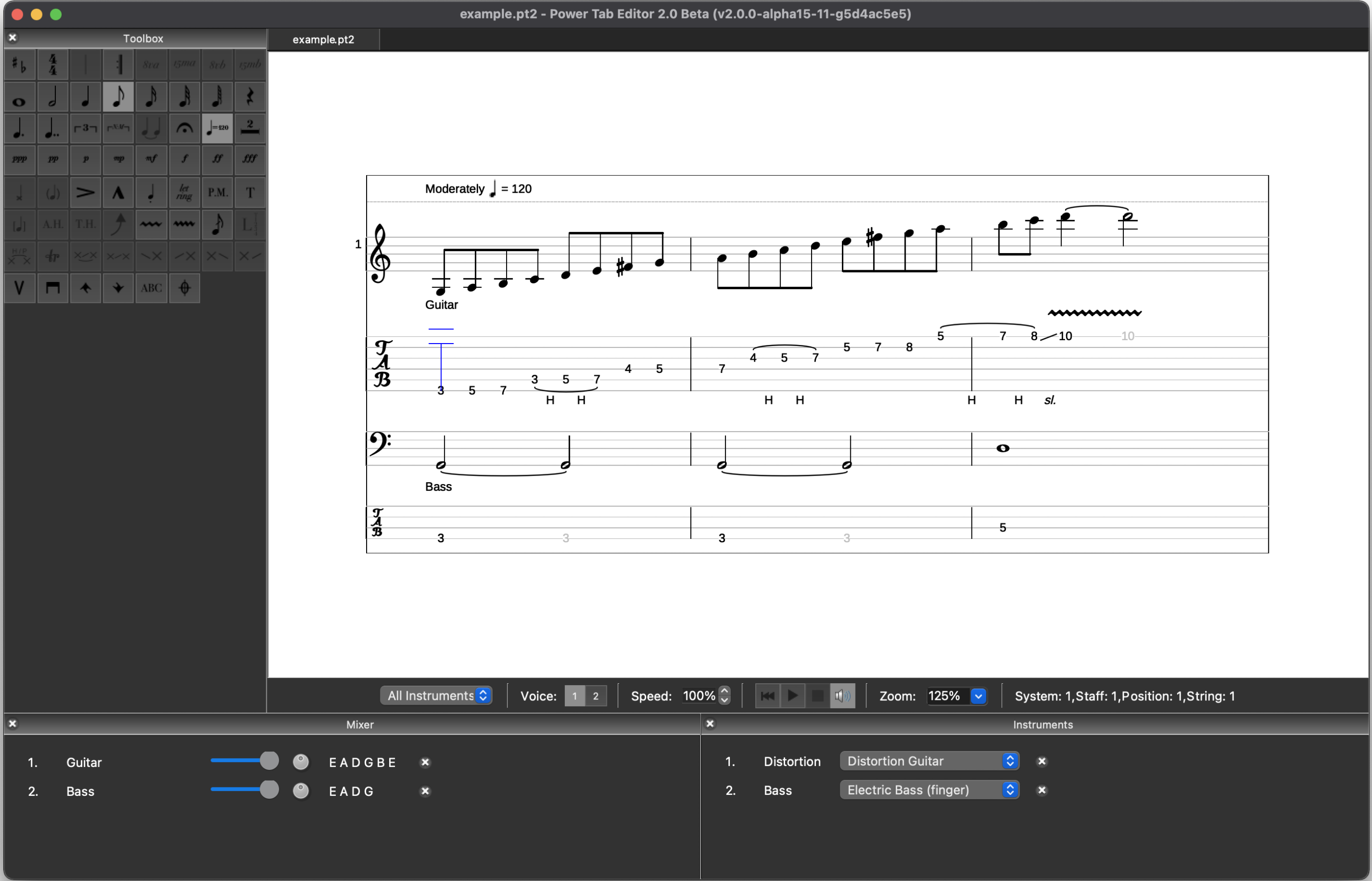
Description The Dark score theme (accessed under File->Preferences->General is my preference and is useful especially for creating split screen videos that combine video of my performances with the video screen capture of the tabs from Powertab's Midi player. The "dark" them works best, visually, for this. However, the midi player controls (blue and red) are hard to see and follow in the dark theme. Furthermore, tied notes which are light grey are not easily distinguishable from the white notes/tabs in the dark theme.
Would love to see the color scheme under the "dark" theme improved - maybe even allow for users to assign their own colors to the midi player and score elements.
Lastly, the "Dark" theme seems only to apply to the score itself, leaving the menu bar, toolbar, mixer, and instrument windows still in the default light grey. Would like to see the "dark" theme apply to the entire application.