Team's Response
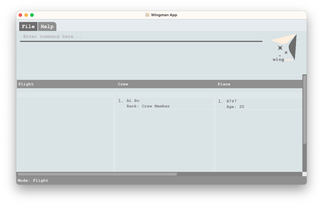
You scroll down too much. We have visual indications of what it is.

Items for the Tester to Verify
:question: Issue response
Team chose [response.Rejected]
- [x] I disagree
Reason for disagreement: It took me a while to figure out what was actually going wrong.
Dev team, it is wrong to classify this bug as scrolling down too much, as I genuinely encountered this bug upon boot up of the application. However, after playing around with the application for a while, the headers for the columns popped up.
So I decided to experiment with what was going on and realised that the Ui simply had very buggy interactions. Refer to the clip below.

From a UX perspective, the header should not be disappearing in this way. And the scroll bars are very unintuitive. I feel that there are multiple ways to overcome this Ui bug easily. One of the potential fixes is to prevent such resizing.
Anyways, I would have accepted a decrease to the severity of the bug, but it is hard for me to accept a complete rejection, given how buggy the Ui is. Thus, I will reject the dev team's response.
Brief description
Steps to reproduce
add /n Bob /r 3Expected
Actual
Screenshots